Coolhunting like a Streetfighter

bk_pydata
One of the most exciting applications of Social Media data is the automated identification, evaluation and prediction of trends. I already sketched some ideas in this blog post. Last year – and this was one of my personal highlights – I had the opportunity to speak at the PyData 2014 Berlin on the topic of Street Fighting Trend Research.

In my talk I presented some more general thoughts on trend research (or “coolhunting” as it is called nowadays) on the Internet. But at the core were three examples on how to identify research trends from the web (see this blogpost), how to mine conference proposals (see this analysis of Strata abstracts) and how to identify trending locations on Foursquare (see here). All three examples are also available as IPython Notebooks on my Github page. And here’s the recorded version of the talk.

The PyData conference was one of the best conferences I attended. Not only were the topics very diverse – ranging from GPU optimization to the representation of women in the PyData community – but also the people attending the conference were coming from different backgrounds: lawyers, engineers, physicists, computer scientists (of course) or statisticians. But still, with every talk and every conversation in the hallways, you could feel the wild euphoria connecting us all with the programming language and the incredible curiosity.

Work in Progress – 3 great (almost) unpublished data science books

One thing that’s particularly great about the Internet is the Sharing Economy. So much information, know-how, content is given out for free on a daily basis. Here’s three fascinating unpublished books that you can take a look at right now. And to make them even greater, you can always give the authors your feedback, bugs you’ve discovered or just a big thank you!

masteringbitcoin_coverThe first book from O’Reilly’s Early Release series is “Mastering Bitcoin” by Andreas Antonopoulos. If you want to learn more about how the new crypto-currency works or if you want to imagine how this concept will change the world or just understand how you can use the Bitcoin APIs to build your own tools, this is the place to start. I hope this book will give me lots of inspiration about analyzing and visualizing the Blockchain (see this blogpost).

“Deep Learning” is the somewhat humble title of the second book. This work by Yoshua Bengio, Ian J. Goodfellow and Aaron Courville (University of Montréal) on the theory and practice of neural networks a.k.a. deep learning could someday become a standard introduction. On their webpage, you can download and read the book chapter by chapter – but as this is work in progress, there could be quite a lot of updates in the future. So grab it while it is still fresh.

barabasi_coverThe third one is already a classic and very well received by the peer group: “Network Science” by Albert-László Barabási. This book explains the science of networks and social network analysis from the beginning (history- and concept-wise) right to the 21. century. From finding and identifying Terrorists to analyzing and optimizing organizational structure – this book abounds with colorful examples and real applications. Everyone who has been thinking “Yeah, network visualizations look pretty nice, but what’s the real use-case besides that?” should definitely take a look at this work. The best thing: it will stay free because it’s published under a Creative Commons license. Thanks, László!

The Top 7 Beautiful Data Blog Posts in 2014

Domo_After2014 was a great year in data science – and also an exciting year for me personally from a very inspirational Strata Conference in Santa Clara to a wonderful experience of speaking at PyData Berlin to founding the data visualization company DataLion. But it also was a great year blogging about data science. Here’s the Beautiful Data blog posts our readers seemed to like the most:

  1. Datalicious Notebookmania – My personal list of the 7 IPython notebooks I like the most. Some of them are great for novices, some can even be challenging for advanced statisticians and datascientists
  2. Trending Topics at Strata Conferences 2011-2014 – An analysis of the topics most frequently mentioned in Strata Conference abstracts that clearly shows the rising importance of Python, IPython and Pandas.
  3. Big Data Investment Map 2014 – I’ve been tracking and analysing the developments in Big Data investments and IPOs for quite a long time. This was the 2014 update of the network mapping the investments of VCs in Big Data companies.
  4. Analyzing VC investment strategies with Crunchbase data – This blog post explains the code used to create the network.
  5. How to create a location graph from the Foursquare API – In this post, I explain a way to make sense out of the Foursquare API and to create geospatial network visualizations from the data showing how locations in a city are connected via Foursquare checkins.
  6. Text-Mining the DLD Conference 2014 – A very similar approach as I used for the Strata conference has been applied to the Twitter corpus refering to Hubert Burda Media DLD conference showing the trending topics in tech and media.
  7. Identifying trends in the German Google n-grams corpus – This tutorial shows how to analyze Big data-sets such as the Google Book ngram corpus with Hive on the Amazon Cloud.

Querying the Bitcoin blockchain with R

The crypto-currency Bitcoin and the way it generates “trustless trust” is one of the hottest topics when it comes to technological innovations right now. The way Bitcoin transactions always backtrace the whole transaction list since the first discovered block (the Genesis block) does not only work for finance. The first startups such as Blockstream already work on ways how to use this mechanism of “trustless trust” (i.e. you can trust the system without having to trust the participants) on related fields such as corporate equity.

So you could guess that Bitcoin and especially its components the Blockchain and various Sidechains should also be among the most exciting fields for data science and visualization. For the first time, the network of financial transactions many sociologists such as Georg Simmel theorized about becomes visible. Although there are already a lot of technical papers and even some books on the topic, there isn’t much material that allows for a more hands-on approach, especially on how to generate and visualize the transaction networks.

The paper on “Bitcoin Transaction Graph Analysis” by Fleder, Kester and Pillai is especially recommended. It traces the FBI seizure of $28.5M in Bitcoin through a network analysis.

So to get you started with R and the Blockchain, here’s a few lines of code. I used the package “Rbitcoin” by Jan Gorecki.

Here’s our first example, querying the Kraken exchange for the exchange value of Bitcoin vs. EUR:

library(Rbitcoin)
## Loading required package: data.table
## You are currently using Rbitcoin 0.9.2, be aware of the changes coming in the next releases (0.9.3 - github, 0.9.4 - cran). Do not auto update Rbitcoin to 0.9.3 (or later) without testing. For details see github.com/jangorecki/Rbitcoin. This message will be removed in 0.9.5 (or later).
wait <- antiddos(market = 'kraken', antispam_interval = 5, verbose = 1)
market.api.process('kraken',c('BTC','EUR'),'ticker')
##    market base quote           timestamp market_timestamp  last     vwap
## 1: kraken  BTC   EUR 2015-01-02 13:12:03             <NA&gt; 263.2 262.9169
##      volume    ask    bid
## 1: 458.3401 263.38 263.22

The function antiddos makes sure that you’re not overusing the Bitcoin API. A reasonable query interval should be one query every 10s.

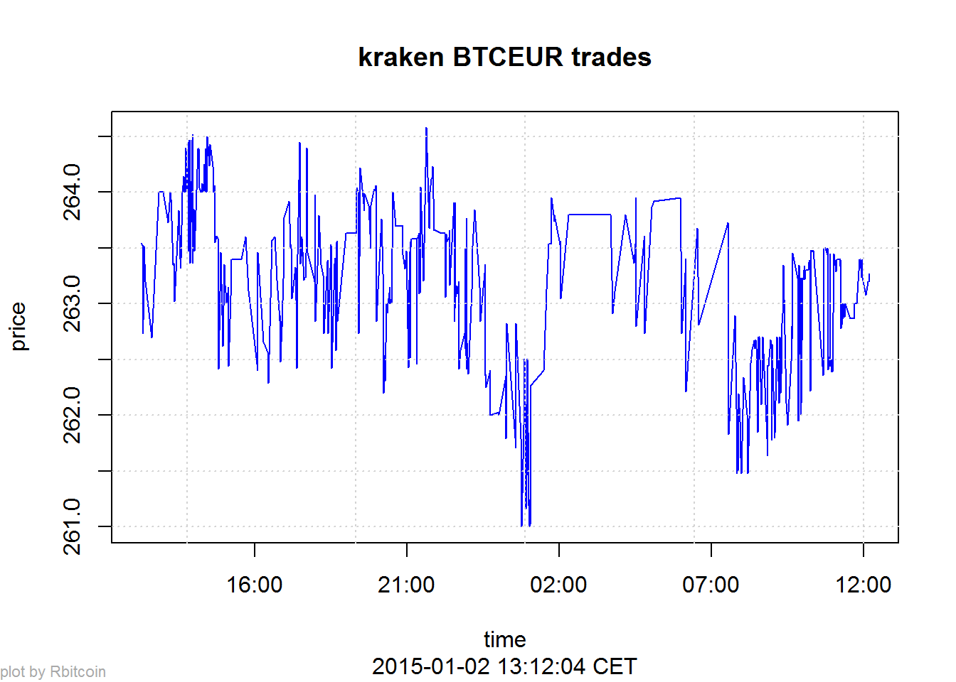
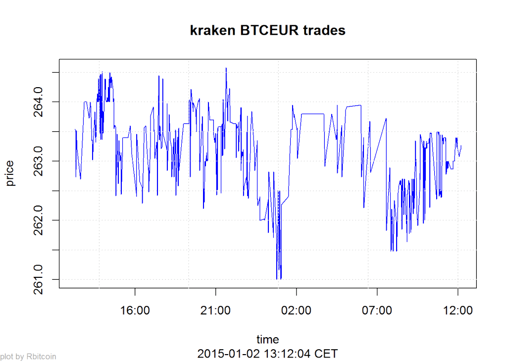
Here’s a second example that gives you a time-series of the lastest exchange values:

trades <- market.api.process('kraken',c('BTC','EUR'),'trades')
Rbitcoin.plot(trades, col='blue')

btc_kraken

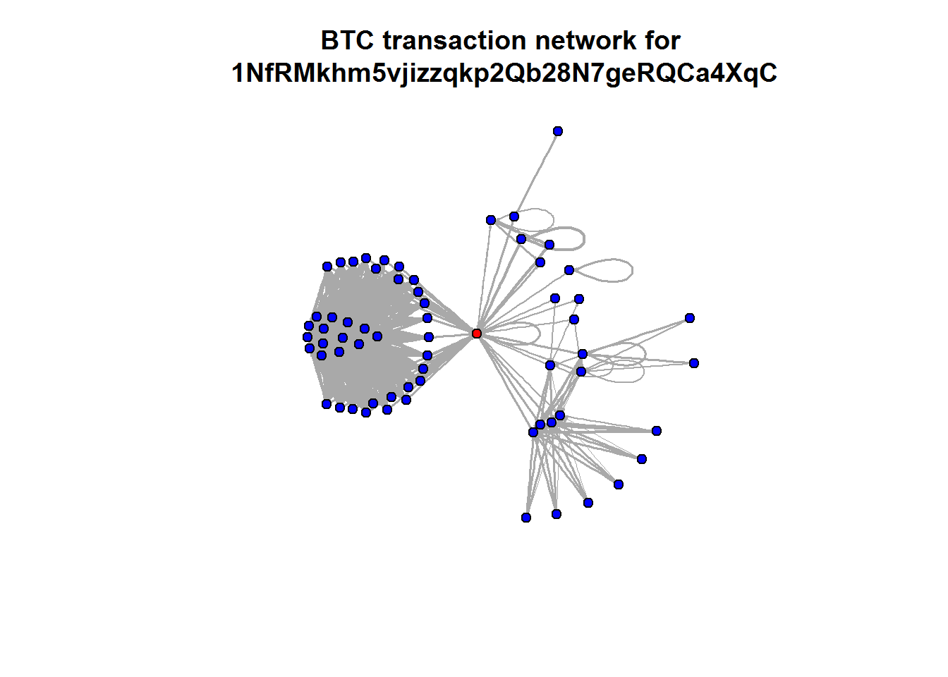
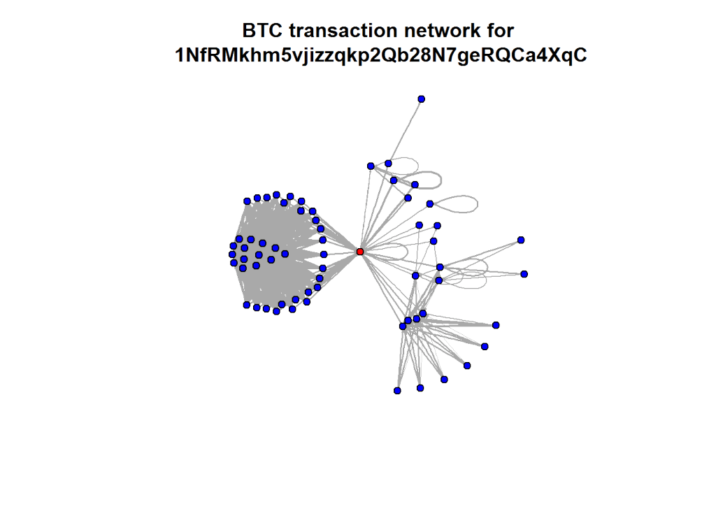
The last two examples all were based on aggregated values. But the Blockchain API allows to read every single transaction in the history of Bitcoin. Here’s a slightly longer code example on how to query historical transactions for one address and then mapping the connections between all addresses in this strand of the Blockchain. The red dot is the address we were looking at (so you can change the value to one of your own Bitcoin addresses):

wallet <- blockchain.api.process('15Mb2QcgF3XDMeVn6M7oCG6CQLw4mkedDi')
seed <- '1NfRMkhm5vjizzqkp2Qb28N7geRQCa4XqC'
genesis <- '1A1zP1eP5QGefi2DMPTfTL5SLmv7DivfNa'
singleaddress <- blockchain.api.query(method = 'Single Address', bitcoin_address = seed, limit=100)
txs <- singleaddress$txs

bc <- data.frame()
for (t in txs) {
  hash <- t$hash
  for (inputs in t$inputs) {
    from <- inputs$prev_out$addr
    for (out in t$out) {
      to <- out$addr
      va <- out$value
      bc <- rbind(bc, data.frame(from=from,to=to,value=va, stringsAsFactors=F))
    }
  }
}

After downloading and transforming the blockchain data, we’re now aggregating the resulting transaction table on address level:

library(plyr)
btc <- ddply(bc, c("from", "to"), summarize, value=sum(value))

Finally, we’re using igraph to calculate and draw the resulting network of transactions between addresses:

library(igraph)
btc.net <- graph.data.frame(btc, directed=T)
V(btc.net)$color <- "blue"
V(btc.net)$color[unlist(V(btc.net)$name) == seed] <- "red"
nodes <- unlist(V(btc.net)$name)
E(btc.net)$width <- log(E(btc.net)$value)/10
plot.igraph(btc.net, vertex.size=5, edge.arrow.size=0.1, vertex.label=NA, main=paste("BTC transaction network for\n", seed))

btc_network

How to create a location graph from the Foursquare API

Monday, I’ll be speaking on “Linked Data” at the 49th German Market Research Congress 2014. In my talk, there will be many examples of how to apply the basic approach and measurements of Social Network Analysis to various topics ranging from brand affinities as measured in the market-media study best for planning, the financial network between venture capital firms and start-ups and the location graph on Foursquare.

Because I haven’t seen many examples on using the Foursquare API to generate location graphs, I would like to explain my approach a little bit deeper. At first sight, the Foursquare API differs from many other Social Media APIs because it just allows you to access data about your own account. So, there is no general stream (or firehose) of check-in events that could be used to calculate user journeys or the relations between different places.

Fortunately, there’s another method that is very helpful for this purpose: You can query the API for any given Foursquare location to output up to five venues that were most frequently accessed after this location. This begs for a recursive approach of downloading the next locations for the next locations for the next locations and so on … and transform this data into the location graph.

I’ve written down this approach in an IPython Notebook, so you just have to find your API credentials and then you can start downloading your cities’ location graph. For Munich it looks like this (click to zoom):

Munich seen through Foursquare check-ins

The resulting network is very interesting, because the “distance” between the different locations is a fascinating mixture of

  • spatial distance: places that are nearby are more likely to be connected (think of neighborhoods)
  • temporal distance: places that can be reached in a short time are more likely to be connected (think of places that are quite far apart but can be reached in no time by highway)
  • affective/social distance: places that belong to a common lifestyle are more likely to be connected

    Feel free to clone the code from my github. I’m looking forward to seeing the network visualizations of your cities.

Datalicious Notebookmania – My favorite 7 IPython Notebooks

One of the most remarkable features of this year’s Strataconf was the almost universal use of IPython notebooks in presentations and tutorials. This framework not only allows the speakers to demonstrate each step in the data science approach but also gives the audience an opportunity to do the same – either during the session or afterwards.

Here’s a list of my favorite IPython notebooks on machine learning and data science. You can always find a lot more on this webpage. Furthermore, there’s also the great notebookviewer platform that can render Github’bed notebooks as they would appear in your browser. All the following notebooks can be downloaded or cloned from the GitHub page to work on your own computer or you can view (but not edit) them with nbviewer.

So, if you want to learn about predictions, modeling and large-scale data analysis, the following resources should give you a fantastic deep dive into these topics:

1) Mining the Social Web by Matthew A. Russell

miningIf you want to learn how to automatically extract information from Twitter streams, Facebook fanpages, Google+ posts, Github accounts and many more information sources, this is the best resource to start. It started out as the code repository for Matthew’s O’Reilly published book, but since the 2nd edition has become an active learning community. The code comes with a complete setup for a virtual machine (Vagrant based) which saves you a lot of configuring and version-checking Python packages. Highly recommended!

2) Probabilistic Programming and Bayesian Methods for Hackers by Cameron Davidson-Pilon

bayesianThis is another heavy weight among my IPython notebook repositories. Here, Cameron teaches you Bayesian data analysis from your first calculation of posteriors to a real-time analysis of GitHub repositories forks. Probabilistic programming is one of the hottest topics in the data science community right now – Beau Cronin gave a mind-blowing talk at this year’s Strata Conference (here’s the speaker deck) – so if you want to join the Bayesian gang and learn probabilistic programming systems such as PyMC, this is your notebook.

3) Parallel Machine Learning Tutorial by Olivier Grisel

bigdata_alchemyThe tutorial session on parallel machine learning and the Python package scikit-learn by Olivier Grisel was one of my highlights at Strata 2014. In this notebook, Olivier explains how to set up and tune machine learning projects such as predictive modeling with the famous Titanic data-set on Kaggle. Modeling has far too long been a secret science – some kind of Statistical Alchemy, see the talk I gave at Siemens on this topic – and the time has come to democratize the methods and approaches that are behind many modern technologies from behavioral targeting to movie recommendations. After the introduction, Olivier also explains how to use parallel processing for machine learning projects on really large data-sets.

4) 538 Election Forecasting Model by Skipper Seabold

538_reverseengineeredEver wondered how Nate Silver calculated his 2012 presidential election forecasts? Don’t look any further. This notebook is reverse engineering Nate’s approach as he described it on his blog and in various interviews. The notebook comes with the actual polling data, so you can “do the Nate Silver” on your own laptop. I am currently working on transforming this model to work with German elections – so if you have any ideas on how to improve or complete the approach, I’d love to hear from you in the comments section.

5) Six Degrees of Kevin Bacon by Brian Kent

graphlab_sixdegreesThis notebook is one of the showcases for the new GraphLab Python package demonstrated at Strata Conference 2014. The GraphLab library allows very fast access to large data structures with a special data frame format called the SFrame. This notebook works on the Freebase movie database to find out whether the Kevin Bacon number really holds true or whether there are other actors that are more central in the movie universe. The GraphLab package is currently in public beta.

6) Get Close to Your Data with Python and JavaScript by Brian Granger

plotlyThe days of holecount and 1000+ pages of statistical tables are finally history. Today, data science and data visualization go together like Bayesian priors and posteriors. One of the hippest and most powerful technologies in modern browser-based visualization is the d3.js framework. If you want to learn about the current state-of-the-art in combining the beauty of d3.js with the ease and convenience of IPython, Brian’s Strata talk is the perfect introduction to this topic.

7) Regex Golf by Peter Norvig

I found the final notebook through the above mentioned talk. Peter Norvig is not only the master mind behind the Google economy, teacher of a wonderful introduction to Python programming at Udacity and author of many scientific papers on applied statistics and modeling, but he also seems to be the true nerd. Who else would take a xkcd comic strip by the word and work out the regular expression matching patterns that provide a solution to the problem posed in the comic strip. I promise that your life will never be the same after you went through this notebook – you’ll start to see programming problems in almost every Internet meme from now on. Let me know, when you found some interesting solutions!

Crowdsourcing Science

Open foresight is a great way to look into future developments. Open data is the foundation to do this comprehensively and in a transparent way. As with most big data projects, the difficult part in open foresight is to collect the data and wrangle it to a form that can actually be processed. While in classic social research you’d have experimental measurements or field notes in a well defined format, dealing with open data is always a pain: not only is there no standard – the meaningful numbers might be found anywhere in your source and be called arbitrarily; also the context is not given by some structure that you’d have imposed into your data in advanced (as we used to do it in our hypothesis-driven set-ups).

In the last decade, crowdsourcing has proven to be a remedy to dealing with all kinds of challenges that are still to complex to be fully automatized, but which are not too hard to be worked out by humans. A nice example is zooniverse.org featuring many “citizen science projects”, from finding exoplanets or classifying galaxies, to helping to model global climate history by entering historic ships’ log data.

Climate change caused by humanity might be the best defended hypothesis in science; no other theory had do be defended against more money and effort to disprove it (except perhaps evolution, which has do fight a similar battle about ideology). But apart from the description, how climate will change and how that will effect local weather conditions, we might still be rather little aware of the consequences of different scenarios. But aside from the effect of climate-driven economic change on people’s lives, the change of economy itself cannot be ignored when studying climate and understand possible feedback loops that might or might not lead into local or global catastrophe.

Zeean.net is an open data / open source project aiming at the economic impact of climate change. Collecting data is crowdsourced – everyone can contribute key indicators of geo-economic dependency like interregional and domestic flow of supply and demand in an easy “Wikipedia-like” way. And like Wikipedia, the validation is done by crowd-crosscheck of registered users. Once data is there, it can be fed into simulations. The team behind Zeean, lead by Anders Levermann at Potsdam Institute for Climate Impact Research is directly tied into the Intergovernmental Panel on Climate Change IPCC, leading research on climate change for the UN and thus being one of the most prominent scientific organizations in this field.

A first quick glance on the flows of supply shows how a conflict in the Ukraine effect the rest of the world economically.
The results are of course not limited to climate. If markets default for other reasons, the effect on other regions can be modeled in the same way.
So I am looking forward to the data itself being made public (by then brought into a meaningful structure), we could start calculating our own models and predictions, using the powerful open source tools that have been made available during the last years.

Before and After Series C funding – a network analysis of Domo

One of the most interesting Big Data companies in this network analysis of Venture Capital connections has in my opinion been Domo. Not only did it receive clearly above average funding for such a young company, but it was also one of the nodes with the best connections through Venture Capital firms and their investments. It had one of the highest values for Betweenness Centrality, which means it connects a lot of the other nodes in the Big Data landscape.

Then, some days after I did the analysis and visualization, news broke that Domo received $125M from Greylock, Fidelity, Morgan Stanley and Salesforce among others. This is a great opportunity to see what this new financing round means in terms of network structure. Here’s Domo before the round:

Domo_Before

And this is Domo $125M later. Notice how its huge Betweenness Centrality almost dwarfs the other nodes in the network. And through its new connections it is strongly connected to MongoDB:

Domo_After

Here’s a look at the numbers, before Series C:

Company Centrality
1 Domo 0.1459
2 Cloudera 0.0890
3 MemSQL 0.0738
4 The Climate Corporation 0.0734
5 Identified 0.0696
6 MongoDB, Inc. 0.0673
7 Greenplum Software 0.0541
8 CrowdFlower 0.0501
9 DataStax 0.0489
10 Fusion-io 0.0488

And now:

Company Centrality
1 Domo 0.1655
2 MemSQL 0.0976
3 Cloudera 0.0797
4 MongoDB, Inc. 0.0722
5 Identified 0.0706
6 The Climate Corporation 0.0673
7 Greenplum Software 0.0535
8 CrowdFlower 0.0506
9 DataStax 0.0459
10 Fusion-io 0.0442

The new funding round now only increases Domo’s centrality but also MongoDB’s because of the shared investors Salesforce, T. Rowe Price and Fidelity Investments.

How content is propagated might tell what it’s about

Memes – images, jokes, content snippets that get spread virally on the net – have been a popular topic in the Net’s pop culture for some time. A year ago, we started thinking about, how we could operationalise the Meme-concept and detect memetic content. Thus we started the Human Meme Project (the name an innuendo on mixing culture and genetics). We collected all available links to images that had been posted on social networks together with the meta data that would go with these posts, like date and time, language, count of followers, etc.

With referers to some 100 million images, we could then look into the interesting question: how would “the real memes” get propagated and could we see differences in certain types of images regarding their pattern of propagation. Soon we detected several distinct pathes of content being spread. And after having done this for a while, these propagation patterns could tell us often more facts about an image than we could have extracted of the caption or the post’s text.

Case 1: detection of “Astroturfing” and “Twitter-bombing

Of course this kind of analysis is not limited to pictorial content. A good example how the insights of propagation analyses can be used is shown in sciencenews.org. Astroturfing or Twitter-bombing – flooding discussions with messages that would seam to be angry and very critical towards some candidate or some position, and would look like authentic rage at first sight, although in reality it would be machine generated Spam – could pose a thread to political discussion in social networks and even harm democratic elections.
This new type of “Black PR”, however can be detected by analysing the propagation pattern.

Two examples of how memetic images are shared within communities. The vertices represent the shared images, edges connect images posted by the same user. The left graph results of a set of images that get propagated with almost equal probability in the supporting community, the right graph shows an image that made its path into two disjoint communities before getting further spread.

Case 2: identification of insurgent pamphletesy

After the first wave of uprising in Northern Africa, the remaining regimes became more cautious and installed many kinds of surveillance and filter technologies on the Net. To avoid the governmental crawlers, insurgents started to write their pamphletes by hand in some calligraphic type that no OCR would decipher. These handwritten notes would get photographed and then posted on the social web with some insuspicous text. But what might have tricked out spooks in the good old times, would not deceive the data scientist. These calls for protests, although artfully disguised, leave a distinct trace on their way through Facebook, Twitter and the like. It is not our intention to deliver our findings to the tyrants to close their gap in surveillance. We are in fact convinced that similar approaces are already in place in many authoritarian regimes (and maybe some democracies as well). Thus we think the fact should be as widespread and recognised as possible.

Both examples show again, that just looking at the containers and their dynamic can be as fruitful to tell about their content, than a direct approach.

Pastagram

While preparing and arranging today’s meal – Penne al Forno con Polpettine – to be documented and posted on Instagram, I thought: Why not preparing and arranging a pasta network with the help of the Instagram API and the Gephi network visualization software. I did this before for many other things such as Chinese cities or spring.

The special Instagram magic lies in the hashtags users are posting to their (and their friends’) images. These hashtags can be used to create social network datasets out of the image streams of the API. If someone is posting an image of their pasta dish and is tagging it with “#salmon”, then this tag is the link to all other images also tagged with “#salmon”. Theoretically one could do the next search for salmon and find out which images are referred to by this hashtag. This would produce a large map of human concepts plus their visualization in photographs.

What I did was taking a really small sample of 40 pasta images posted to Instagram during the last week and calculated the links between a) images and b) hashtags. The result is a bimodal network: images are connected to hashtags; and hashtags are connected to images and other hashtags. This is the resulting network:

Pasta Social Network Analysis

I also created a version with all the images in the network as thumbnail, so you can see the different qualities in the image (brightness, colours, composition, filters etc.) Right now I am working an a way to automatically assemble and publish image based networks that would properly embed the images.

Some facts about pasta imagery on Instagram:

  • There’s dinner pasta (upper left) and lunch pasta (upper right). Lunch pasta tends to be more colorful and bright, while dinner pasta can be very dim arrangements on restaurant tables or unboxed pizza and pasta deliveries.
  • Another interesting category is tagged with “distasters”. This hashtags clearly corresponds to the images.
  • The most important hashtags are: pasta, food, chicken, foodporn, delicious, italian, cooking, yummy, foodgasm, foodie.
  • When looking at a larger sample of pasta pictures, the most important hashtags change a bit, but our small sample seems to be quite representative: pasta, food, foodporn, yummy, lunch, dinner, delicious, yum, italian, cheese, spaghetti, homemade …
  • Filters are very frequently used in pasta photography: only 22% of all images are posted without any filters.

Finally, here’s a look at the top five pasta images:

4 out of 5 are photographed by Japanese IGers. So the next thing to look at will be the regional distribution of food hashtags. To be continued.

Telling stories with network data: Spring on Instagram

The days are getting longer, the first flowers come into bloom and a very specific set of hashtags are spreading through Social Media platforms – it’s spring again! In this blogpost I took a look at spring-related pictures on Instagram. Right now, the use of hashtags on Instagram has not entered the mainstream. For this analysis, I took a look at the latest 938 images tagged with “#spring”. The average rate was 12 spring-tagged pictures a day, but this rate will be increasing during the next days and weeks.

The following hashtags were most frequently used in combination with the #spring hashtag:

  1. Flower(s) (198 mentions, 2639 likes)
  2. Sun (160, 2018)
  3. Tree(s) (130, 2230)
  4. Nature (128, 2718)
  5. Love (119, 1681)
  6. Girl (107, 1469)
  7. Sky (89, 2057)
  8. Fashion (64, 924)
  9. Beautiful (61, 1050)
  10. Blue (59, 1234)

Although I would associate spring with green, the Instagram community has other preferences:

  1. Blue (59 mentions, 1234 likes)
  2. Pink (42, 396)
  3. Green (40, 444)
  4. White (29, 457)
  5. Yellow (22, 369)
  6. Red (17, 230)
  7. Black (16, 267)
  8. Brown (7, 117)
  9. Orange (7, 77)
  10. Grey (3, 50)

So these are the spring colors according to Instagram hashtags

Here are the top 15 most liked spring pictures on Instagram right now:

Here’s the tag network that is showing the relations between the 2445 other unique hashtags that appeared in connection with #spring (see PDF):

Instagram wouldn’t be half the fun without the various filters to apply to the images. But #spring is best enjoyed in natural form. 28% of all #spring posts were posted without any additional filter:

  1. Normal (261)
  2. X-Pro II (91)
  3. Rise (83)
  4. Amaro (81)
  5. Lo-fi (68)
  6. Hefe (54)
  7. Earlybird (48)
  8. Hudson (41)
  9. Sierra (34)
  10. Valencia (33)

Strata Conference – the first day

Here’s a network visualization of all tweets referring to the hashtag “#strataconf” (click to enlarge). The node size is representing the number of incoming links, i.e. the number of times this person has been mentioned in other people’s tweets:

This network map has been generated in three steps:

1) Data collection: I collected the twitter data with the open source application YourTwapperKeeper. This is the DIY version of the TwapperKeeper platform that had been very popular in the scientific community. Unfortunately after the acquisition by HootSuite it is no longer available to the general public, but John O’Brien has made the scripts available via his githup. I am running yTK on a Amazon EC2 instance. What it does is connecting to the Twitter Streaming API and fetching all tweets with “#strataconf” in realtime and additionally doing regular searches via the Search API to find tweets that had been overlooked by the Streaming API.

2) Data processing: What is so great about yTK: It offers different methods to fetch the tweets you collected. I am using the JSON API to get the tweets downloaded to my computer. This is done with a Python script. The script opens the JSON file and then scans the tweets for mentions or retweets with the following regular expressions I borrowed from Matthew Russell’s book Mining the Social Web:

rt_patterns = re.compile(r"(RT|via)((?:\b\W*@\w+)+)", re.IGNORECASE)
at_pattern = re.compile(r"@(\w+)", re.IGNORECASE)

Then I am using the very convenient library igraph to write the results in the generic graphml file format that can be processed by various network analysis tools. Basically I am just using this snipped of code on all tweets I found to generate the list of nodes:

if not tweet['from_user'].lower() in nodes:
    nodes.append(tweet['from_user'].lower())

… and edges:

for mention in at_pattern.findall(tweet['text']):
    mentioned.append(mention.lower())
    if not mention.lower() in nodes:
        nodes.append(mention.lower())
    edges.append((nodes.index(tweet['from_user'].lower()),nodes.index(mention.lower())))

The graph is generated with the following lines of code:

g = Graph(len(nodes), directed=True)
g.vs["label"] = nodes
g.add_edges(edges)

This is almost the whole code for processing the network data.

3) Visualization: The visualization of the graph is done with the wonderful cross-platform tool Gephi. To generate the graph above, I reduced the network to all nodes that have at least one other node referring to it. Then I sized the nodes according to their total number of degrees, that is how often they were mentioned in other people’s tweets or how often they were mentioning other users. The color is determined by the modularity clustering algorithm. Then I used the Force Atlas layout algorithm and voilà – here’s the network map.

Social Network Analysis of the Twitter conversations at the WEF in Davos

The minute, the World Economic Forum at Davos said farewell to about 2,500 participants from almost 100 countries, our network analytical machines switched into production mode. Here’s the first result: a network map of the Twitter conversations related to the hashtags “#WEF” and “#Davos”. While there are only 2,500 participants, there are almost 36,000 unique Twitter accounts in this global conversation about the World Economic Forum. Its digital footprint is larger than the actual event (click on map to enlarge).

There are three different elements to note in this visualization: the dots are Twitter accounts. As soon as somebody used one of the two Davosian hashtags, he became part of our data set. The size of the notes relates to its influence within the network – the betweenness centrality. The better nodes are connecting other nodes, the more influential they are and the larger they are drawn. The lines are mentions or retweets between two or more Twitter accounts. And finally, the color refers to the subnetworks or clusters generated by replying or retweeting some users more often than others. In this infographic, I have labelled the clusters with the name of the node that is in the center of this cluster.

DLD Conference – what were Twitter users discussing?

While I was taking a look at the network dynamics and relations of the Twitter conversations at the DLD conference in Munich, Salesforce and Radian6 took a more “traditional” approach and segmented the conversations in terms of topics, users and countries. While a tag cloud is able to give a first impression on the relevant content of the discussions, a semantic analysis goes much deeper and shows the relations between the terms used by the conference attendants. Here’s a look at the most important and most frequently connected words related to the Twitter hashtags “#DLD12” and “#DLD”:

The most frequently used words and related concepts have been the following:

See also: Networking at the DLD conference part 1 and part 2