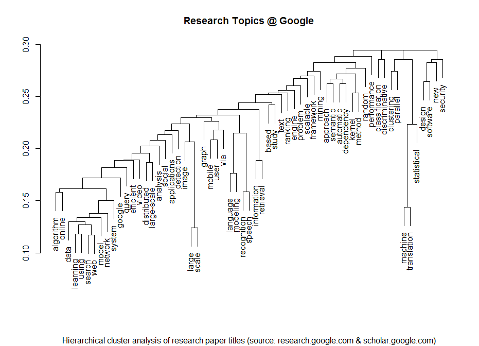
If you look at the investments in Big Data companies in the last few years, one thing is obvious: This is a very dynamic and fast growing market. I am producing regular updates of this network map of Big Data investments with a Python program (actually an IPython Notebook).
But what insights can be gained by directly analyzing the Crunchbase investment data? Today I revved up my RStudio to take a closer look at the data beneath the nodes and links.
Load the data and required packages:
library(reshape)
library(plyr)
library(ggplot2)
data <- read.csv('crunchbase_monthly_export_201403_investments.csv', sep=';', stringsAsFactors=F)
inv <- data[,c("investor_name", "company_name", "company_category_code", "raised_amount_usd", "investor_category_code")]
inv$raised_amount_usd[is.na(inv$raised_amount_usd)] <- 1
In the next step, we are selecting only the 100 top VC firms for our analysis:
inv <- inv[inv$investor_category_code %in% c("finance", ""),]
top <- ddply(inv, .(investor_name), summarize, sum(raised_amount_usd))
names(top) <- c("investor_name", "usd")
top <- top[order(top$usd, decreasing=T),][1:100,]
invtop <- inv[inv$investor_name %in% top$investor_name[1:100],]
Right now, each investment from a VC firm to a Big Data company is one row. But to analyze the similarities between the VC companies in term of their investment in the various markets, we have to transform the data into a matrix. Fortunately, this is exactly, what Hadley Wickham’s reshape package can do for us:
inv.mat <- cast(invtop[,1:4], investor_name~company_category_code, sum)
inv.names <- inv.mat$investor_name
inv.mat <- inv.mat[,3:40] # drop the name column and the V1 column (unknown market)
These are the most important market segments in the Crunchbase (Top 100 VCs only):
inv.seg <- ddply(invtop, .(company_category_code), summarize, sum(raised_amount_usd))
names(inv.seg) <- c("Market", "USD")
inv.seg <- inv.seg[inv.seg$Market != "",]
inv.seg$Market <- as.factor(inv.seg$Market)
inv.seg$Market <- reorder(inv.seg$Market, inv.seg$USD)
ggplot(inv.seg, aes(Market, USD/1000000))+geom_bar(stat="identity")+coord_flip()+ylab("$1M USD")

What’s interesting now: Which branches are related to each other in terms of investments (e.g. VCs who invested in biotech also invested in cleantech and health …). This question can be answered by running the data through a K-means cluster analysis. In order to downplay the absolute differences between the categories, I am using the log values of the investments:
inv.market <- log(t(inv.mat))
inv.market[inv.market == -Inf] <- 0

fit <- kmeans(inv.market, 7, nstart=50)
pca <- prcomp(inv.market)
pca <- as.matrix(pca$x)
plot(pca[,2], pca[,1], type="n", xlab="Principal Component 1", ylab="Principal Component 2", main="Market Segments")
text(pca[,2], pca[,1], labels = names(inv.mat), cex=.7, col=fit$cluster)

My 7 cluster solution has identified the following clusters:
- Health
- Cleantech / Semiconductors
- Manufacturing
- News, Search and Messaging
- Social, Finance, Analytics, Advertising
- Automotive & Sports
- Entertainment
The same can of course be done for the investment firms. Here the question will be: Which clusters of investment strategies can be identified? The first variant has been calculated with the log values from above:
inv.log <- log(inv.mat)
inv.log[inv.log == -Inf] <- 0
inv.rel <- scale(inv.mat)

fit <- kmeans(inv.log, 6, nstart=15)
pca <- prcomp(inv.log)
pca <- as.matrix(pca$x)
plot(pca[,2], pca[,1], type="n", xlab="Principal Component 1", ylab="Principal Component 2", main="VC firms")
text(pca[,2], pca[,1], labels = inv.names, cex=.7, col=fit$cluster)

The second variant uses scaled values:
inv.rel <- scale(inv.mat)

fit <- kmeans(inv.rel, 6, nstart=15)
pca <- prcomp(inv.rel)
pca <- as.matrix(pca$x)
plot(pca[,2], pca[,1], type="n", xlab="Principal Component 1", ylab="Principal Component 2", main="VC firms")
text(pca[,2], pca[,1], labels = inv.names, cex=.7, col=fit$cluster)


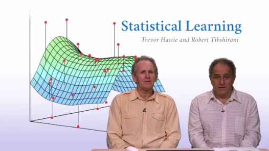
 2014 was a great year in data science – and also an exciting year for me personally from a very inspirational
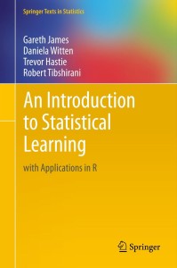 The course is based on the textbook “Introduction to Statistical Learning” (or short: ISL,


")
")
")
")
")
")


