In one week, the 2015 edition of Strata Conference (or rather: Strata + Hadoop World) will open its doors to data scientists and big data practitioners from all over the world. What will be the most important big data technology trends for this year? As last year, I ran an analysis on the Strata abstract for 2015 and compared them to the previous years.
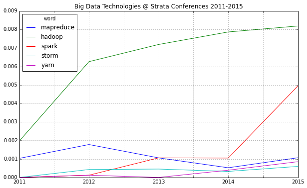
One thing immediately strikes: 2015 will be probably known as the “Spark Strata”:
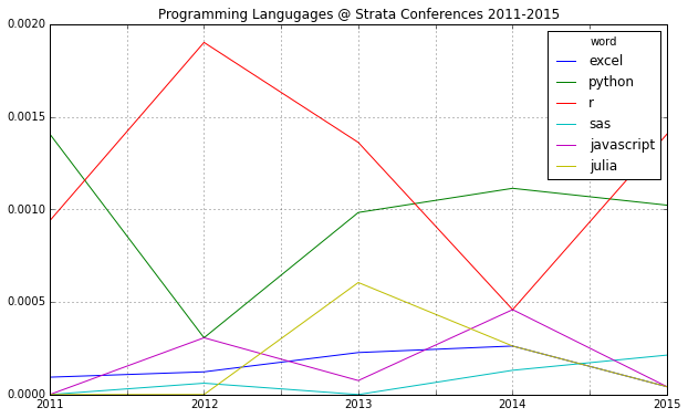
If you compare mentions of the major programming languages in data science, there’s another interesting find: R seems to have a comeback and Python may be losing some of its momentum:
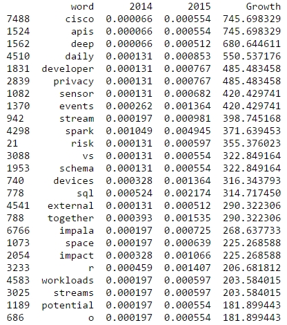
R is also among the rising topics if you look at the word frequencies for 2015 and 2014:
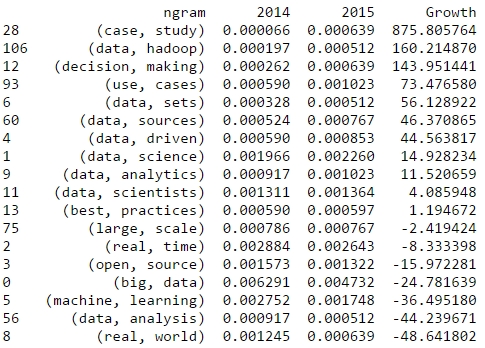
Now, let’s take a look at bigrams that have been gaining a lot of traction since the last Strata conference. From the following table, we could expect a lot more case studies than in the previous years:
This analysis has been done with IPython and Pandas. See the approach in this notebook.
Looking forward to meeting you all at Strata Conference next week! I’ll be around all three days and always in for a chat on data science.
One of the most exciting applications of Social Media data is the automated identification, evaluation and prediction of trends. I already sketched some ideas in this blog post. Last year – and this was one of my personal highlights – I had the opportunity to speak at the PyData 2014 Berlin on the topic of Street Fighting Trend Research.
In my talk I presented some more general thoughts on trend research (or “coolhunting” as it is called nowadays) on the Internet. But at the core were three examples on how to identify research trends from the web (see this blogpost), how to mine conference proposals (see this analysis of Strata abstracts) and how to identify trending locations on Foursquare (see here). All three examples are also available as IPython Notebooks on my Github page. And here’s the recorded version of the talk.
The PyData conference was one of the best conferences I attended. Not only were the topics very diverse – ranging from GPU optimization to the representation of women in the PyData community – but also the people attending the conference were coming from different backgrounds: lawyers, engineers, physicists, computer scientists (of course) or statisticians. But still, with every talk and every conversation in the hallways, you could feel the wild euphoria connecting us all with the programming language and the incredible curiosity.
2014 was a great year in data science – and also an exciting year for me personally from a very inspirational Strata Conference in Santa Clara to a wonderful experience of speaking at PyData Berlin to founding the data visualization company DataLion. But it also was a great year blogging about data science. Here’s the Beautiful Data blog posts our readers seemed to like the most:
Datalicious Notebookmania – My personal list of the 7 IPython notebooks I like the most. Some of them are great for novices, some can even be challenging for advanced statisticians and datascientists
Trending Topics at Strata Conferences 2011-2014 – An analysis of the topics most frequently mentioned in Strata Conference abstracts that clearly shows the rising importance of Python, IPython and Pandas.
Big Data Investment Map 2014 – I’ve been tracking and analysing the developments in Big Data investments and IPOs for quite a long time. This was the 2014 update of the network mapping the investments of VCs in Big Data companies.
How to create a location graph from the Foursquare API – In this post, I explain a way to make sense out of the Foursquare API and to create geospatial network visualizations from the data showing how locations in a city are connected via Foursquare checkins.
Text-Mining the DLD Conference 2014 – A very similar approach as I used for the Strata conference has been applied to the Twitter corpus refering to Hubert Burda Media DLD conference showing the trending topics in tech and media.
Monday, I’ll be speaking on “Linked Data” at the 49th German Market Research Congress 2014. In my talk, there will be many examples of how to apply the basic approach and measurements of Social Network Analysis to various topics ranging from brand affinities as measured in the market-media study best for planning, the financial network between venture capital firms and start-ups and the location graph on Foursquare.
Because I haven’t seen many examples on using the Foursquare API to generate location graphs, I would like to explain my approach a little bit deeper. At first sight, the Foursquare API differs from many other Social Media APIs because it just allows you to access data about your own account. So, there is no general stream (or firehose) of check-in events that could be used to calculate user journeys or the relations between different places.
Fortunately, there’s another method that is very helpful for this purpose: You can query the API for any given Foursquare location to output up to five venues that were most frequently accessed after this location. This begs for a recursive approach of downloading the next locations for the next locations for the next locations and so on … and transform this data into the location graph.
I’ve written down this approach in an IPython Notebook, so you just have to find your API credentials and then you can start downloading your cities’ location graph. For Munich it looks like this (click to zoom):
Munich seen through Foursquare check-ins
The resulting network is very interesting, because the “distance” between the different locations is a fascinating mixture of
spatial distance: places that are nearby are more likely to be connected (think of neighborhoods)
temporal distance: places that can be reached in a short time are more likely to be connected (think of places that are quite far apart but can be reached in no time by highway)
affective/social distance: places that belong to a common lifestyle are more likely to be connected
Feel free to clone the code from my github. I’m looking forward to seeing the network visualizations of your cities.
One of the most remarkable features of this year’s Strataconf was the almost universal use of IPython notebooks in presentations and tutorials. This framework not only allows the speakers to demonstrate each step in the data science approach but also gives the audience an opportunity to do the same – either during the session or afterwards.
Here’s a list of my favorite IPython notebooks on machine learning and data science. You can always find a lot more on this webpage. Furthermore, there’s also the great notebookviewer platform that can render Github’bed notebooks as they would appear in your browser. All the following notebooks can be downloaded or cloned from the GitHub page to work on your own computer or you can view (but not edit) them with nbviewer.
So, if you want to learn about predictions, modeling and large-scale data analysis, the following resources should give you a fantastic deep dive into these topics:
If you want to learn how to automatically extract information from Twitter streams, Facebook fanpages, Google+ posts, Github accounts and many more information sources, this is the best resource to start. It started out as the code repository for Matthew’s O’Reilly published book, but since the 2nd edition has become an active learning community. The code comes with a complete setup for a virtual machine (Vagrant based) which saves you a lot of configuring and version-checking Python packages. Highly recommended!
This is another heavy weight among my IPython notebook repositories. Here, Cameron teaches you Bayesian data analysis from your first calculation of posteriors to a real-time analysis of GitHub repositories forks. Probabilistic programming is one of the hottest topics in the data science community right now – Beau Cronin gave a mind-blowing talk at this year’s Strata Conference (here’s the speaker deck) – so if you want to join the Bayesian gang and learn probabilistic programming systems such as PyMC, this is your notebook.
The tutorial session on parallel machine learning and the Python package scikit-learn by Olivier Grisel was one of my highlights at Strata 2014. In this notebook, Olivier explains how to set up and tune machine learning projects such as predictive modeling with the famous Titanic data-set on Kaggle. Modeling has far too long been a secret science – some kind of Statistical Alchemy, see the talk I gave at Siemens on this topic – and the time has come to democratize the methods and approaches that are behind many modern technologies from behavioral targeting to movie recommendations. After the introduction, Olivier also explains how to use parallel processing for machine learning projects on really large data-sets.
Ever wondered how Nate Silver calculated his 2012 presidential election forecasts? Don’t look any further. This notebook is reverse engineering Nate’s approach as he described it on his blog and in various interviews. The notebook comes with the actual polling data, so you can “do the Nate Silver” on your own laptop. I am currently working on transforming this model to work with German elections – so if you have any ideas on how to improve or complete the approach, I’d love to hear from you in the comments section.
This notebook is one of the showcases for the new GraphLab Python package demonstrated at Strata Conference 2014. The GraphLab library allows very fast access to large data structures with a special data frame format called the SFrame. This notebook works on the Freebase movie database to find out whether the Kevin Bacon number really holds true or whether there are other actors that are more central in the movie universe. The GraphLab package is currently in public beta.
The days of holecount and 1000+ pages of statistical tables are finally history. Today, data science and data visualization go together like Bayesian priors and posteriors. One of the hippest and most powerful technologies in modern browser-based visualization is the d3.js framework. If you want to learn about the current state-of-the-art in combining the beauty of d3.js with the ease and convenience of IPython, Brian’s Strata talk is the perfect introduction to this topic.
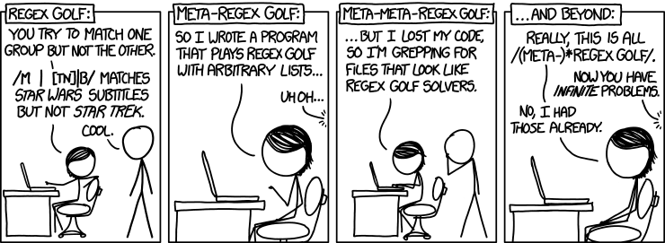
I found the final notebook through the above mentioned talk. Peter Norvig is not only the master mind behind the Google economy, teacher of a wonderful introduction to Python programming at Udacity and author of many scientific papers on applied statistics and modeling, but he also seems to be the true nerd. Who else would take a xkcd comic strip by the word and work out the regular expression matching patterns that provide a solution to the problem posed in the comic strip. I promise that your life will never be the same after you went through this notebook – you’ll start to see programming problems in almost every Internet meme from now on. Let me know, when you found some interesting solutions!
The growth does look quite exponential to me. BTW: The early spike in 2007 has been the huge investment in VMWare by Intel and Cisco. Currently, I have not included IPOs and acquisitions in my calculations.
Here’s an updated version of our Big Data Investment Map. I’ve collected information about ca. 50 of the most important Big Data startups via the Crunchbase API. The funding rounds were used to create a weighted directed network with investments being the edges between the nodes (investors and/or startups). If there were multiple companies or persons participating in a funding round, I split the sum between all investors.
This is an excerpt from the resulting network map – made with Gephi. Click to view or download the full graphic:
If you feel, your company is missing in the network map, please tell us in the comments.
The size of the nodes is relative to the logarithmic total result of all their funding rounds. There’s also an alternative view focused on the funding companies – here, the node size is relative to their Big Data investments. Here’s the list of the top Big Data companies:
Company
Funding
(M$, Source: Crunchbase API)
VMware
369
Palantir Technologies
343
MongoDB, Inc.
231
DataStax
167
Cloudera
141
Domo
123
Fusion-io
112
The Climate Corporation
109
Pivotal
105
Talend
102
And here’s the top investing companies:
Company
Big Data funding
(M$, Source: Crunchbase API)
Founders Fund
286
Intel
219
Cisco
153
New Enterprise Associates
145
Sequoia Capital
109
General Electric
105
Accel Partners
86
Lightspeed Venture Partners
72
Greylock Partners
63
Meritech Capital Partners
62
We can also use network analytical measures to find out about which investment company is best connected to the Big Data start-up ecosystem. I’ve calculated the Betweenness Centrality measure which captures how good nodes are at connecting all the other nodes. So here are the best connected Big Data investors and their investments starting with New Enterprise Associates, Andreessen Horowitz and In-Q-Tel (the venture capital firm for the CIA and the US intelligence community).
To fill the gap until this year’s Strata Conference in Santa Clara, I thought of a way to find out trends in big data and data science. As this conference should easily be the leading edge gathering of practitioners, theorists and followers of big data analytics, the abstracts submitted and accepted for Strataconf should give some valuable input. So, I collected the abstracts from the last Santa Clara Strata conferences and applied some Python nltk magic to it – all in a single IPython Notebook, of course.
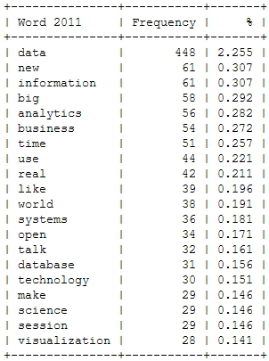
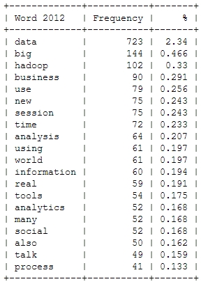
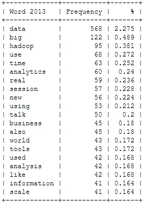
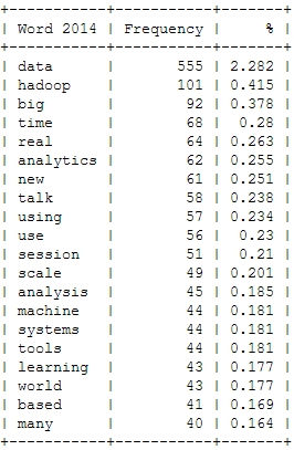
Here’s a look at the resulting insights. First, I analyzed the most frequent words, people used in their abstracts (after excluding common English language stop words). As a starter, here’s the Top 20 words for the last four Strata conferences:
This is just to check, whether all the important buzzwords are there and we’re measuring the right things here: Data – check! Hadoop – check! Big – check! Business – check! Already with this simple frequency count, one thing seems very interesting: Hadoop didn’t seem to be a big topic in the community until 2012. Another random conclusion could be that 2011 was the year where Big Data really was “new”. This word loses traction in the following years.
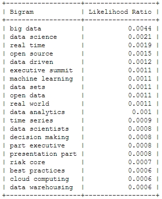
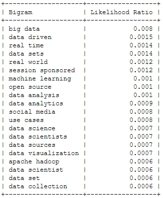
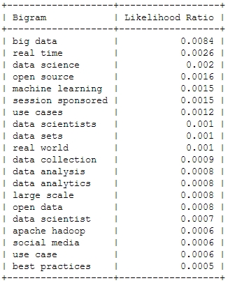
And now for something a bit more sophisticated: Bigrams or frequently used word combinations:
2011
2012
2013
2014
Of course, the top bigram through all the years is “big data”, which is not entirely unexpected. But you can clearly see some variation among the Top 20. Looking at the relative frequency of the mentions, you can see that the most important topic “Big Data” will probably not be as important in this years conference – the topical variety seems to be increasing:
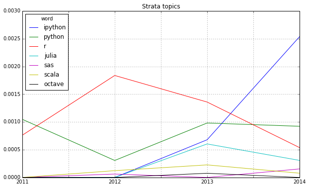
Looking at some famous programming and mathematical languages, the strong dominance of R seems to be broken by Python or IPython (and its Notebook environment) which seems to have established itself as the ideal programming tool for the nerdy real-time presentation of data hacks. \o/
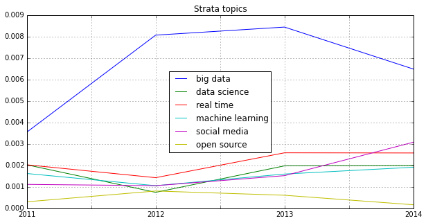
Another trend can be seen in the following chart: Big Data seems to become more and more faceted over the years. The dominant focus on business applications of data analysis seems to be over and the number of different topics discussed on the conference seems to be increasing:
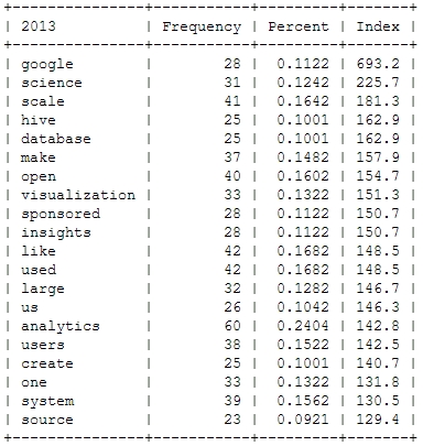
Finally, let’s take a more systematic look at rising topics at Strata Conferences. To find out which topics were gaining momentum, I calculated the relative frequencies of all the words and compared them to the year before. So, here’s the trending topics:
These charts show that 2012 was indeed the “Hadoop-Strata” where this technology was the great story for the community, but also the programming language R became the favorite Swiss knife for data scientists. 2013 was about applications like Hive that run on top of Hadoop, data visualizations and Google seemed to generate a lot of buzz in the community. Also, 2013 was the year, data really became a science – this is the second most important trending topic. And this was exactly the way, I experienced the 2013 Strata “on the ground” in Santa Clara.
What will 2014 bring? The data suggests, it will be the return of the hardware (e.g. high performance clusters), but also about building data architectures, bringing data know-how into organizations and on a more technical dimension about graph processing. Sounds very promising in my ears!
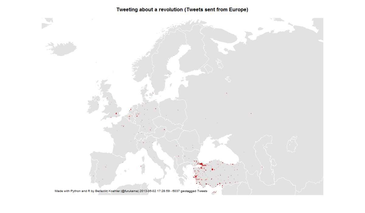
Twitter has become an important communications tool for political protests. While mass media are often censored during large-scale political protests, Social Media channels remain relatively open and can be used to tell the world what is happening and to mobilize support all over the world. From an analytic perspective tweets with geo information are especially interesting.
Here’s some maps I did on the basis of ~ 6,000 geotagged tweets from ~ 12 hours on 1 and 2 Jun 2013 referring to the “Gezi Park Protests” in Istanbul (i.e. mentioning the hashtags “occupygezi”, “direngeziparki”, “turkishspring”* etc.). The tweets were collected via the Twitter streaming API and saved to a CouchDB installation. The maps were produced by R (unfortunately the shapes from the map package are a bit outdated).
*”Turkish Spring” or “Turkish Summer” are misleading terms as the situation in Turkey cannot be compared to the events during the “Arab Spring”. Nonetheless I have included them in my analysis because they were used in the discussion (e.g. by mass media twitter channels) Thanks @Taksim for the hint.
International Attention for Gezi Park protests 1-2 Jun
On the next day, there even was one tweet mentioning the protests crossing the dateline:
International Attention for Gezi Park protests 1-3 Jun
First, I took a look at the international attention (or even cosmopolitan solidarity) of the events in Turkey. The following maps are showing geotagged tweets from all over the world and from Europe that are referring to the events. About 1% of all tweets containing the hashtags carry exact geographical coordinates. The fact, that there are so few tweets from Germany – a country with a significant population of Turkish immigrants – should not be overrated. It’s night-time in Germany and I would expect a lot more tweets tomorrow.
European Attention for Gezi Park protests 1-2 Jun
14,000 geo-tagged tweets later the map looks like this:
European Attention for Gezi Park protests 1-3 Jun
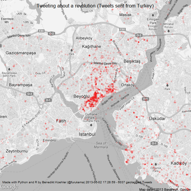
The next map is zooming in closer to the events: These are the locations in Turkey where tweets were sent with one of the hashtags mentioned above. The larger cities Istanbul, Ankara and Izmir are active, but tweets are coming from all over the country:
Turkish Tweets about the Gezi Park protests 1-2 Jun
On June 3rd, the activity has spread across the country:
Turkish Tweets about the Gezi Park protests 1-3 Jun
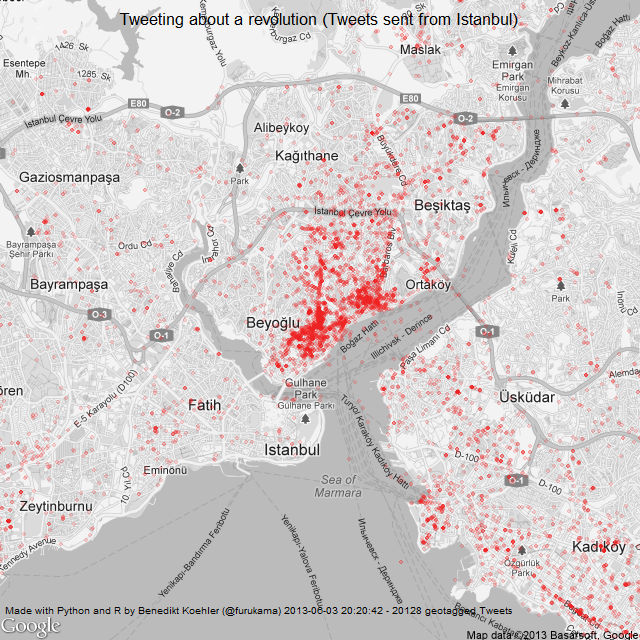
And finally, here’s a look at the tweet locations in Istanbul. The map is centered on Gezi Park – and the activity on Twitter as well:
Istanbul Tweets about Gezi Park protests 1-2 Jun
Here’s the same map a day later (I decreased the size of the dots a bit while the map is getting clearer):
Istanbul Tweets about Gezi Park protests 1-3 Jun
The R code to create the maps can be found on my GitHub.
Since I’ve seen this beautiful color wheel visualizing the colors of Flickr images, I’ve been fascinated with large scale automated image analysis. At the German Market Research association’s conference in late April, I presented some analyses that went in the same direction (click to enlarge):
Color values of Flickr images from Germany
On the image above you can see the color values ordered by their hue from images taken in Germany between August 2010 and April 2013. Each row represents the aggregation of 2.000 images downloaded from the Flickr API. I did this with the following R code:
bbox <- "5.866240,47.270210,15.042050,55.058140"

pages <- 10

maxdate <- "2010-08-31"

mindate <- "2010-08-01"


for (i in 1:pages) {

api <- paste("http://www.flickr.com/services/rest/?method=flickr.photos.search&format=json&api_key=YOUR_API_KEY_HERE &nojsoncallback=1&page=", i, "&per_page=500&bbox=", bbox, "&min_taken_date=", mindate, "&max_taken_date=", maxdate, sep="")

raw_data <- getURL(api, ssl.verifypeer = FALSE)


data <- fromJSON(raw_data, unexpected.escape="skip", method="R")

# This gives a list of the photo URLs including the information

# about id, farm, server, secret that is needed to download

# them from staticflickr.com

}
To aggregate the color values, I used Vijay Pandurangans Python script he wrote to analyze the color values of Indian movie posters. Fortunately, he open sourced the code and uploaded it on GitHub (thanks, Vijay!)
The monthly analysis of Flickr colors clearly hints at seasonal trends, e.g. the long and cold winter of 2012/2013 can be seen in the last few rows of the image. Also, the soft winter of 2011/2012 with only one very cold February appears in the image.
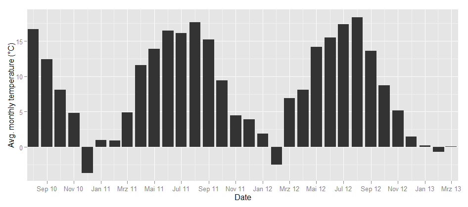
To take the analysis even further, I used weather data from the repository of the German weather service and plotted the temperatures for the same time frame:
Temperature in Germany
Could this be the same seasonality? To find out how the image color values above and the temperature curve below are related, I calculated the correlation between the dominance of the colors and the average temperature. Each month can not only be represented as a hue band, but also as a distribution of colors, e.g. the August 2010 looks like this:
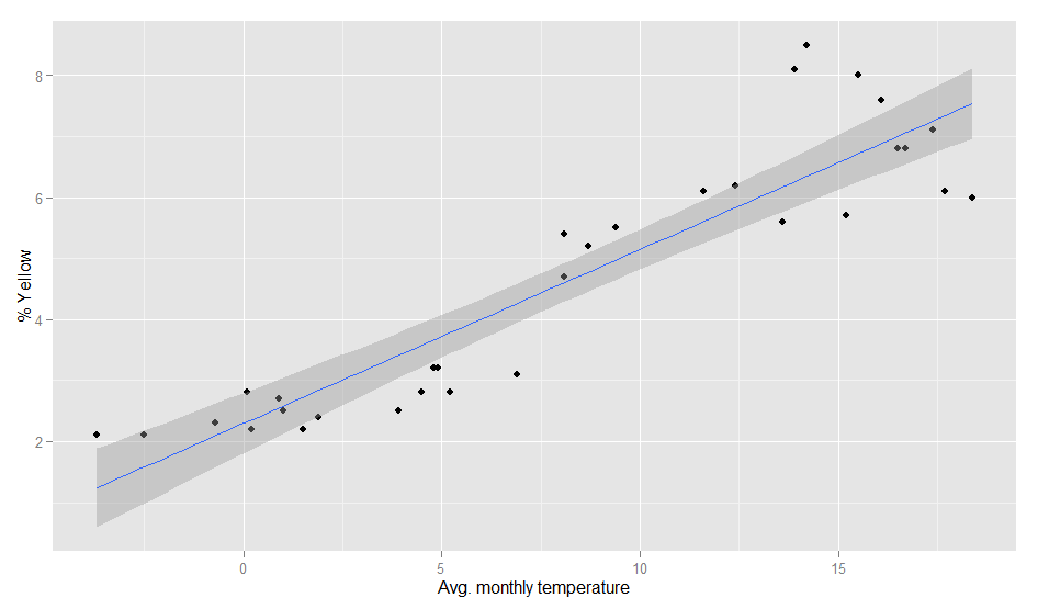
So there’s a percent value for each color and each month. When I correlated the temperature values and the color values, the colors with the highest correlations were green (positive) and grey (negative). So, the more green is in a color band, the higher the average temperature in this month. This is how the correlation looks like:
Temperature and color values
The model actually is pretty good:
> fit <- lm(temp~yellow, weather)

> summary(fit)

Call:

lm(formula = temp ~ yellow, data = weather)

Residuals:

Min 1Q Median 3Q Max

-5.3300 -1.7373 -0.3406 1.9602 6.1974


Coefficients:

Estimate Std. Error t value Pr(>|t|)

(Intercept) -5.3832 1.2060 -4.464 0.000105 ***

yellow 2.9310 0.2373 12.353 2.7e-13 ***

---

Signif. codes: 0 '***' 0.001 '**' 0.01 '*' 0.05 '.' 0.1 ' ' 1

Residual standard error: 2.802 on 30 degrees of freedom

Multiple R-squared: 0.8357, Adjusted R-squared: 0.8302

F-statistic: 152.6 on 1 and 30 DF, p-value: 2.695e-13
Of course, it can even be improved a bit by calculating it with a polynomial formula. With second order polynomials lm(temp~poly(yellow,2), weather), we even get a R-squared value of 0.89. So, even when the pictures I analysed are not always taken outside, there seems to be a strong relationship between the colors in our Flickr photostreams and the temperature outside.
One of the most interesting sources of social media data right now is the iPhone based image sharing platform Instagram. This social networking platform is based on images, which can be compared with Flickr, but with Instagram the global dimension is much more visible. And because of the seamless Twitter and Facebook integration, the networking component is stronger. And it has a great API 😉
The first thing that came to my mind when looking at the many options, the API is providing to developers, has been the tags. In the Instagram application, there is no separate field for tagging your (or other peoples’) images. Instead you would write it in the comment field as you would do in Twitter. But the API allows to fetch data by hashtags. After reading this fascinating article (and looking at the great images) in Monocle about the northern Chinese city of Harbin, I wanted to learn more about the visual representation of this city in Instagram.
What I did was the following: I wrote a short Python program that fetched the 1.000 most recently posted images for any hashtag. As I could not get the two available Instagram Python modules to work properly, I wrote my own interface to Instagram based on pycurl. The data is then transformed into a network based on the co-occurence of hashtags for the images and saved in GraphML format with the Python module igraph. Other data (such as filters, users, locations etc.) that can be evaluated is saved in separate data sets. Here’s the network visualizations for China, Shanghai, Beijing, Hongkong, Shenzen and Harbin – not the whole network, but a reduced version only with the tags that were mentioned at least five times (click to enlarge):
I also calculated some interesting indicators for the six hashtags I explored:
The first thing to notice is that Harbin obviously is not as often being instagrammed as the Shanghai, Shenzhen, Hongkong or Beijing. An interesting indicator here is in the second data column: the daily number of images tagged with this location. Shenzhen seems to be the most active city with 3.4 images tagged “#shenzen”. Beijing is almost as active, while Shanghai is a bit behind. Finally, for Harbin, there’s not even one image every day. The unique tags is showing the diversity of hashtags used to describe images. Here, China is clearly in the lead. The next two indicators tell something about the connections between the tags: The density is calculated as the relation of actual to possible edges between the network nodes. Here, the smaller network of Harbin has the highest density and China and Shanghai the lowest. The average path length is a little below 2 for all hashtags.
Now, let’s take a look at the most frequently used hashtags:
What is interesting here: Harbin clearly does tell a story about snow, cold weather and a ice sculpture park, while Shanghai seems to be home for users frequently tagging themselves to advertise their instagramming skills (I marked the tags that refer to usernames with an asterisk). Most of the frequently used hashtags are Instagram lingo (instagood, instagram, ig, igers, instamood), refer to the equipment (iphonesia, iphoneography) or the region (china). Topical hashtags, that tell something about the city or the community can seldom be found in the top hashtags. Nonetheless, they are there. Here’s a selection of hashtags telling a story about the cities:
Finally, here is the most frequently liked image for each of the hashtags – to remind us that the numbers and networks only tell half the story. Enjoy and see if you can spot the ice sculptures in Harbin!
 2014 was a great year in data science – and also an exciting year for me personally from a very inspirational
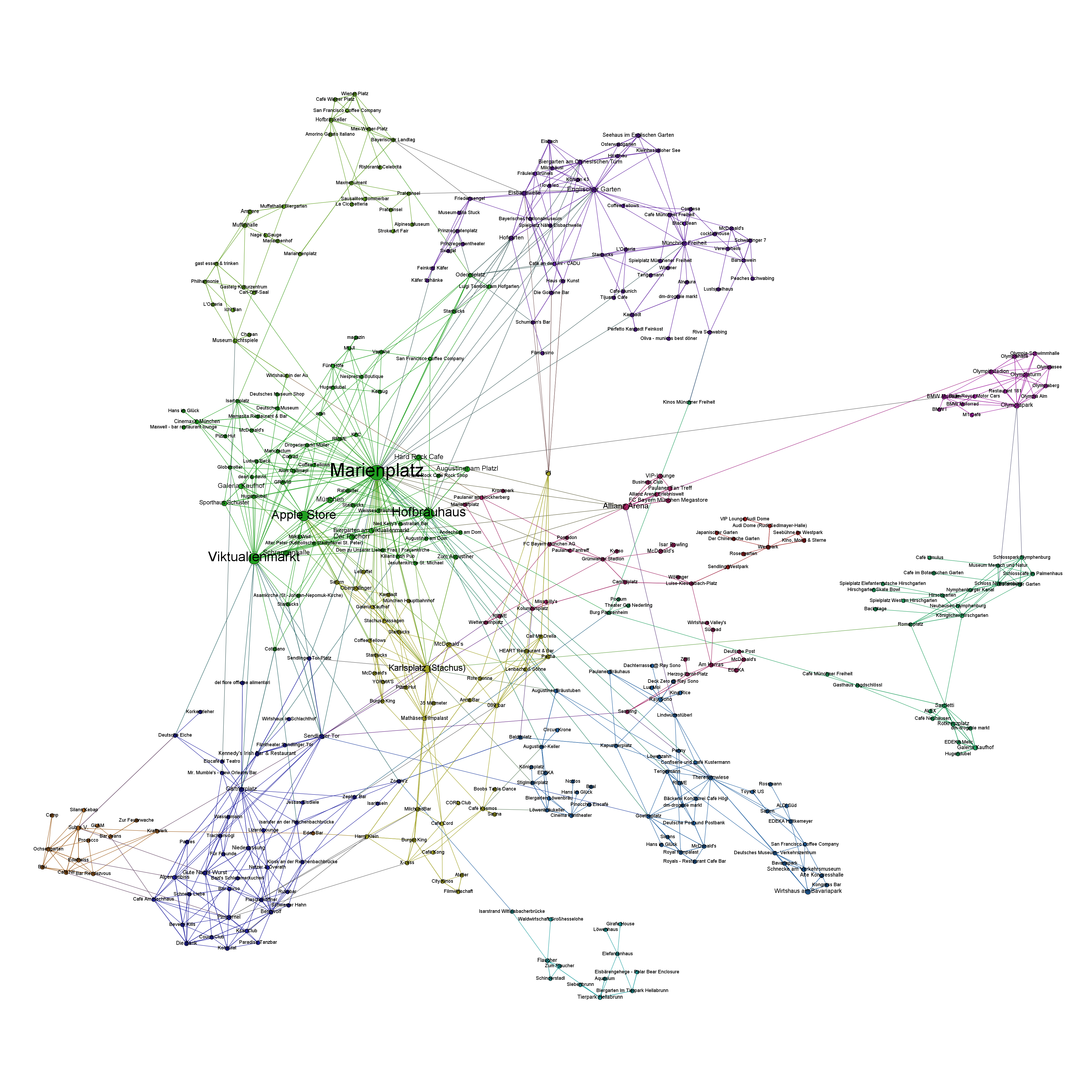


