Yesterday, Jörg has written a blog post on Data Storytelling with Smartphone sensor data. Here’s a practical approach on how to analyze smartphone sensor data with R. In this example I will be using the accelerometer smartphone data that Datarella provided in its Data Fiction competition. The dataset shows the acceleration along the three axes of the smartphone:
- x – sideways acceleration of the device
- y – forward and backward acceleration of the device
- z – acceleration up and down
The interpretation of these values can be quite tricky because on the one hand there are manufacturer, device and sensor specific variations and artifacts. On the other hand, all acceleration is measured relative to the sensor orientation of the device. So, for example, the activity of taking the smartphone out of your pocket and reading a tweet can look the following way:
- y acceleration – the smartphone had been in the pocket top down and is now taken out of the pocket
- z and y acceleration – turning the smartphone so that is horizontal
- x acceleration – moving the smartphone from the left to the middle of your body
- z acceleration – lifting the smartphone so you can read the fine print of the tweet
And third, there is gravity influencing all the movements.
So, to find out what you are really doing with your smartphone can be quite challenging. In this blog post, I will show how to do one small task – identifying breakpoints in the dataset. As a nice side effect, I use this opportunity to introduce an application of the Twitter BreakoutDetection Open Source library (see Github) that can be used for Behavioral Change Point analysis.
First, I load the dataset and take a look at it:
setwd("~/Documents/Datarella")
accel <- read.csv("SensorAccelerometer.csv", stringsAsFactors=F)
head(accel)

  user_id           x          y        z                 updated_at                 type
1      88 -0.06703765 0.05746084 9.615114 2014-05-09 17:56:21.552521 Probe::Accelerometer
2      88 -0.05746084 0.10534488 9.576807 2014-05-09 17:56:22.139066 Probe::Accelerometer
3      88 -0.04788403 0.03830723 9.605537 2014-05-09 17:56:22.754616 Probe::Accelerometer
4      88 -0.01915361 0.04788403 9.567230 2014-05-09 17:56:23.372244 Probe::Accelerometer
5      88 -0.06703765 0.08619126 9.615114 2014-05-09 17:56:23.977817 Probe::Accelerometer
6      88 -0.04788403 0.07661445 9.595961  2014-05-09 17:56:24.53004 Probe::Accelerometer
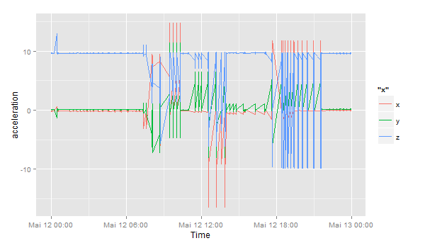
This is the sensor data for one user on one day:
accel$day <- substr(accel$updated_at, 1, 10)
df <- accel[accel$day == '2014-05-12' & accel$user_id == 88,]
df$timestamp <- as.POSIXlt(df$updated_at) # Transform to POSIX datetime
library(ggplot2)
ggplot(df) + geom_line(aes(timestamp, x, color="x")) +
             geom_line(aes(timestamp, y, color="y")) +
             geom_line(aes(timestamp, z, color="z")) +
             scale_x_datetime() + xlab("Time") + ylab("acceleration")

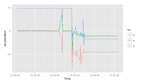
Let’s zoom in to the period between 12:32 and 13:00:
ggplot(df[df$timestamp >= '2014-05-12 12:32:00' & df$timestamp < '2014-05-12 13:00:00',]) +
  geom_line(aes(timestamp, x, color="x")) +
  geom_line(aes(timestamp, y, color="y")) +
  geom_line(aes(timestamp, z, color="z")) +
  scale_x_datetime() + xlab("Time") + ylab("acceleration")

Then, I load the Breakoutdetection library:
install.packages("devtools")
devtools::install_github("twitter/BreakoutDetection")
library(BreakoutDetection)
bo <- breakout(df$x[df$timestamp >= '2014-05-12 12:32:00' & df$timestamp < '2014-05-12 12:35:00'],
               min.size=10, method='multi', beta=.001, degree=1, plot=TRUE)
bo$plot

This quick analysis of the acceleration in the x direction gives us 4 change points, where the acceleration suddenly changes. In the beginning, the smartphone seems to lie flat on a horizontal surface – the sensor is reading a value of around 9.8 in positive direction – this means, the gravitational force only effects this axis and not the x and y axes. Ergo: the smartphone is lying flat. But then things change and after a few movements (our change points) the last observation has the smartphone on a position where the x axis has around -9.6 acceleration, i.e. the smartphone is being held in landscape orientation pointing to the right.

