Risk vs. Loss

A risk is defined as the probability of an undesirable event to take place. Since most risks are not totally random but rather dependent of a range of influences, we try to quantify a risk function, that gives the probability for each set of influences. We then calculate the expected loss by multiplying the costs that are caused by the occurrence of this event with the risk, i.e. its probability.

Often, the influences can be changed by our actions. We might have a choice. So it makes sense to look for a course of actions that would minimize the loss function, i.e. lead to as little expected damages as possible.

Algorithms that run in many procedures and on many devices often make decisions. Prominent examples are credit scoring or shop recommendation systems. In both cases it is clear that the algorithm should be designed to optimize the economic outcome of its decision. In both cases, two risks emerge: The risk of a false negative (i.e. wrongly give credit to someone who cannot pay it back, resp. make a recommendation that does not fit the customer’s preferences), and the risk of a false positive (not granting credit to a person that would have been creditworthy, resp. not offering something that would have been exactly what the customer was looking for).

There is however an asymmetry in the losses of these two risks. For the vast majority of cases, it is far more easy to calculate the loss for a false negative than for the false positive. The cost of credit default is straightforward. The cost of someone not getting the money is however most certainly bigger than just the missed interests; the potential borrower might very well go away and never come back, without us ever realizing.

Even worse, while calculating risk is (more or less) just maths and statistics, different people might not even agree on the losses. In our credit scoring example: One might say, let’s just take what we know for sure, i.e. the opportunity costs of missed interests, the other might insist to evaluate a broader range of damages. The line where to stop is obviously arbitrary. So while the risk function can be made somehow objective, the loss function will be much more tricky and most of the time prone to doubt and discussion.

Collision decision

In the IoT – the world of connected devices, of programmable object, the problem of risks and losses becomes vital. Self-driving cars will cause accidents, too, even if they are much safer than human drivers. If a collision is inevitable, how should the car react? This was the key question ask by Majken Sander in our talk on algorithm ethics at Strata+Hadoop World. If it is just me in the car, a possible manoeuvre would turn the car sideways. If however my children sit next to me, I might very well prefer a frontal crash and rather have me injured than my passengers. Whatever I would see as the right way to act, it is clear that I want to make the decision myself. I would not want to have it decided remotely without my even knowing on what grounds.

Sometimes people mention that even for human casualties, a monetary calculation could be done -no matter how cruel that might sound. We could e.g. take the valuation of humans according to their life expectancy, insurance costs, or any other financial indicator. However, this is clearly not, how we would usually deal with lethal risks. “No man left behind” -how could we explain Saving-Private-Ryan-ish campaigns on economic grounds? Since the human casualty in the values of our society is regarded as total, not commensurable (even if a compensation can be defined), we get a singularity in our loss function. Our metric just doesn’t work here. Hence there will be no just algorithm to deal with a decision of that dimension.

Calculate risks, let losses be open

We will nevertheless have to find a solution. One suggestion for the car example is, that in risky situations, the car would re-delegate the driving back to a human to let them decide.
This can be generalized: Since the losses might be valuated differently by different people, it should always be well documented and fully transparent to the users, how the losses are calculated. In many cases, the loss function could be kept open. The algorithm could offer different sets of parameters to let the users decide on the behavior of product.

As a society we have to demand to be in charge defining the ethics behind the algorithms. It is a strong cause for regulation, I am convinced about that. It is not an economic, but a political task.

Further reading

Algorithm Ethics

Data begs to be used

The Sword and Shield - this was the metaphor for intelligence agencies in the Soviet world. For me, this is much stronger than NSA's key-clutching eagle. We should rather shield things we care for, and fight for our beliefs than just lock pick into other peoples lives.
The Sword and Shield – the metaphor for intelligence in the Soviet world, much stronger than NSA’s key-clutching eagle. Let us fight for our cause with our fiery swords of spirit and blind them with our armour of bright data.

“The NSA is basically applied data science.”
Jason Cust

The European Court of Justice declared the EU directive on data retention void the same day #hartbleed caused the grosset panic about password security the Net had seen so far.

This tells one story:
Get out into the open! Stop hiding! There are no remote places. No privileges will keep your data from the public. No genius open source hack will protect your informational self determination. And spooks, listen: your voyerism is not accepted as OK, not even by the law.

We’re living in a world with more transparency, we need to learn to do intelligence with more transparency too.
Bruce Schneier, #unowned

I was fighting against Europe’s data retention directive, too, and of course I was feeling victorious when it was declared void by the ECJ. But, don’t we know how futile all efforts are, to keep data protected? No cypher can be unbreakable, except the one-time-pad (and that is just of academic interest). No program-code can be proven safe, either – these are mathematical facts. Haven’t you learned how wrong all promisses of security are by #heartbleed? Data protection lulls us into feeling save from data breeches, where we should rather care to make things robust, no matter if the data becomes public intentionally or not.

The far more important battle was won the same week, when the European Parliament decided to protect net neutrality by law. This is the real data protection for me: protecting the means of data production from being engrossed in private.

The intelligence agencies’ damaging the Net by undermining the trust of its users in the integrity of its technology, is a serious thing by inself. However burrying this scandal just under the clutter of civil rights or under constitutional law’s aspects will not do justice. It is of our living in societies in transition from the modern nation state to the after-modern … what ever, liquid community; into McLuhan’s Global Village which is much more serious and much more interesting. We will have to go through the changes of the world and it might not be nice all the time until we come out the other end.

Data begs to be used.
Bruce Schneier, #unowned

In “Snow Crash”, Neal Stephenson imagines a Central Intelligence Corporation, the CIA and NSA becoming a commercial service where everybody just purchases the information they’d need. This was, what came immediately to my mind when I read through the transcript of the talk on “Intelligence Gathering and the Unowned Internet” that was held by the Berkman Center for Internet and Society at Harvard, starring Bruce Schneier, who for every Mathematician in my generation is just the godfather of cryptography. Representatives of the intelligence community were also present. Bruce has been arguing for living “beyond fear” for more than a decade, advocating openness instead of digging trenches and winding up barbed wire. I am convinced, that information does not want to be free (as many of my comrades in arms tend to phrase). However I strongly belief Bruce is right: We can hear data’s call.

The Quantified Self, life-logging, self-tracking – many people making public even their most intimate data, like health, mood, or even our visual field of sight at any moment of our day. An increasingly strong urge to do this rises from social responsibility – health care, climate research, but also from quite profane uses like insurances offering discounts when you let your driving be tracked. So the data is there now, about everything there is to know. Not using it because of fear for privacy would be like having abandond the steam engine and abstinate from the industrialization in anticipation of the climate change.

Speak with us, don’t speak for us.
statement of autonomy of #OccupyWallStreet

Dinosaurs of modern warfare, like the NSA are already escamotating into dragons, fighting their death-match like Smaug at Lake Esgaroth. We have to deal with the dragon, kill it, but this is not, what we should set our political goal to. It will happen anyway.

We should take provision for what real changes we are going to face. We will find ourselves in a form of society that McLuhan would have called re-tribalized, or Tönnies would not have called society at all, but community. In a community, the concept of privacy is usually rather weak. But at the same time, there is no surveillance, no panoptic elevated watchmen who themself cannot be watched. Everyone is every other one’s keeper. Communal vigilance doesn’t sound like fun. However it will be the consequence of after-modern communal structures replacing the modern society. “In the electric world, we wear all mankind as our skin.”, so McLuhan speaketh.

Noi vogliamo cantare l’amor del pericolo.
M5S

Every aspect of life gets quantized, datarized, tangible by computers. Our aggregated models of human behavior get replaced by exact description of the single person’s life and thus the predictions of that person’s future actions. We witness the rise of non-representative democratic forms like occupy assemblies or liquid democracy. What room can privacy have in a world like this whatsoever? So maybe we should concentrate in shaping our data-laden future, rather then protecting a fantasy of data being contained in some “virtual reality” that could be kept separate from our lives.

The data calls us from the depth; let us hear to its voice!

Further reading:

Transcript of the discussion “The unowned Internet”
Declaration of Liquid Culture
Disrupt Politics!

and
Organizing a System of 10 Billion People

“Zur Sozialdynamik bewegter Körper”

Statistics is often regarded as the mathematics of gambling, and it has some roots in theorizing about games, indeed. But it was the steam engine that really made statistics do something: Thermodynamics, the physics of heat, energy, and gases. Aggregating over huge masses of particles – not observable on an individual level – by means of probability distribution was the paradigm of 19th century science. And this metaphor also was successfully adopted to describing not only masses of molecules, but also masses of people in a mass society.

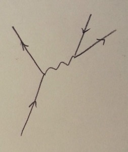
Particle or Person? This could be someone walking down a street, seeing her friend on the other side, waving her, and then just walking on. Of course it could also be my drawing of a neutron beta-decaying to a proton.
For physics, at the end of the 19th century it had become clear, that models reduced on aggregates and distributions where not able to explain many observations that where experimentally proven, like black body radiation or the photo-electric effect. It was Max Planck and Albert Einstein that moved the perspective from statistical aggregates to something that had not been usually taken into consideration: the particle. Quantum physics is the description of physical phenomena on the most granular level possible. By changing focus from the indistinct mass to the individual particle, also the macroscopic level of physics started to make sense again, combining probabilistic concepts like entropy with the behavior of the single particle that we might visualize in a Feynman-diagram.

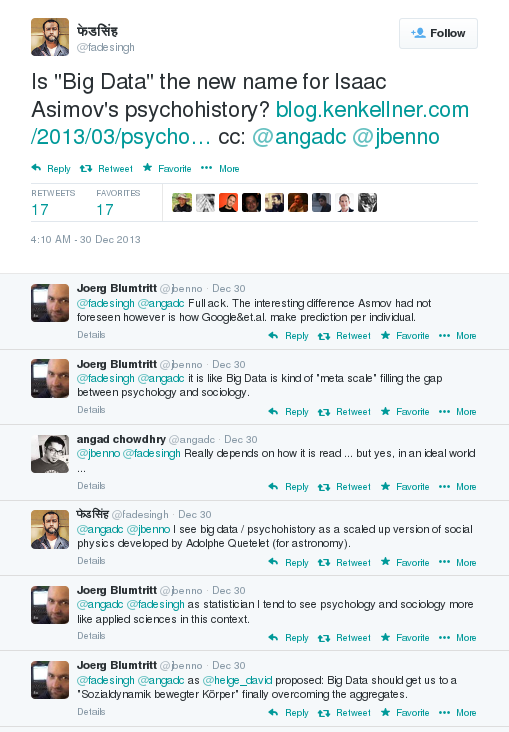
Special relativity or rather psychohistory?
The Web presented for the first time a tool to collect data describing (nearly) everyone on the individual level. The best data came not from intentional research but from cookie-tracking, done to optimize advertising effectiveness. Social Media brought us the next level: semantic data, people talking about their lives, their preferences, their actions and feelings. And people connected with each other, the social graph showed who was talking to whom and about which topics – and how tight social bonds were knit.

We now have the data to model behavior without the need of aggregating. The role of statistics for the humanities changes – like it has done in physics 150 years ago. Statistics is now the tool to deal with distributions as phenomena as such rather than just generalizing from small samples to an unknown population. ‘Data humanity’ would be a much better term for what is usually called ‘data science’ – this I had written after O’Reilly’s Strata conference last year. But I think I might have been wrong as we move from social science to computational social science.

Social research is moving from humanities to science.

Further reading:

“Our Pythagorean World”

Animated Twitter Networks

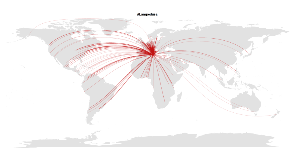
In this blogpost I presented a visualization made with R that shows how almost the whole world expresses its attention to political crises abroad. Here’s another visualization with Tweets in October 2013 that referred to the Lampedusa tragedy in the Mediterranean.

#Lampedusa on Twitter

But this transnational public space isn’t quite as static as it seems on these images. To show how these geographical hashtag links develop over time, I analyzed the timestamps of the (geo-coded) Tweets mentioning the hashtag #lampedusa. This is the resulting animation showing the choreography of global solidarity:

The code is quite straightforward. After collecting the Tweets via the Twitter Streaming API e.g. with Pablo Barberá’s R package streamR, I quantized the dates to hourly values and then calculated the animation frame by frame inspired by Jeff Hemsley’s approach.

One trick that is very helpful when plotting geospatial connections with great circles is the following snippet that correctly assembles lines that cross the dateline:

library("geosphere")
for (i in 1:length(l$long)) {
inter <- gcIntermediate(c(l$long[i], l$lat[i]), c(12.6, 35.5), n=500, addStartEnd=TRUE, breakAtDateLine=TRUE) if (length(inter) > 2) {
lines(inter, col=col, lwd=l$n[i])
} else {
lines(inter[[1]], col=col, lwd=l$n[i])
lines(inter[[2]], col=col, lwd=l$n[i])
}
}

Cosmopolitan Public Spaces

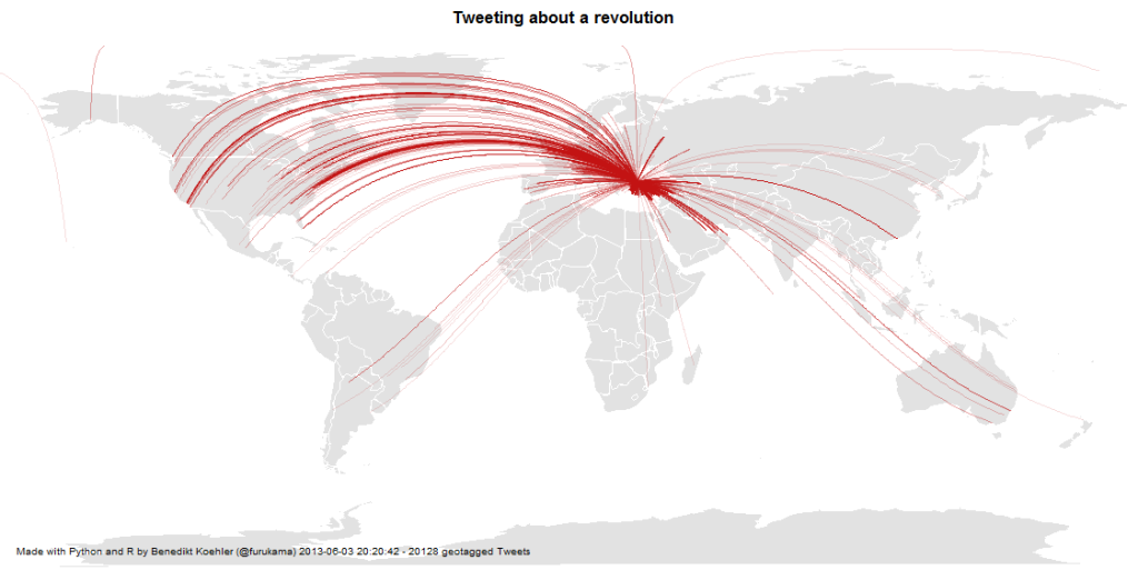
Mentions of the Gezi Park protests on Twitter

In my PhD and post-doc research projects at the university, I did a lot of research on the new cosmopolitanism together with Ulrich Beck. Our main goal was to test the hypothesis of an “empirical cosmopolitanization”. Maybe the term is confusing and too abstract, but what we were looking for were quite simple examples for ties between humans that undermine national borders. We were trying to unveil the structures and processes of a real-existing cosmopolitanism.

I looked at a lot of statistics on transnational corporations and the evolution of transnational economic integration. But one of the most exciting dimensions of the theory of cosmopolitanism is the rise of a cosmopolitan public sphere. This is not the same as a global public that can be found in features such as world music, Hollywood blockbusters or global sports events. A cosmopolitan public sphere refers to solidarity with other human beings.

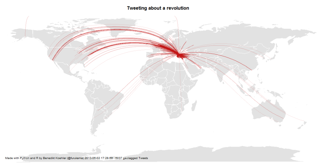
When I discovered the discussions on Twitter about the Gezi Park protests in Istanbul, this kind of cosmopolitan solidarity seems to assume a definite form: The lines that connect people all over Europe with the Turkish protesters are not the usual international relations, but they are ties that e.g. connect Turkish emigrants, political activists, “Wutbürger” or generally political aware citizens with the events in Istanbul. Because only about 1% of all tweets carry information about the geo-position of the user, you should imagine about 100 times more lines to see the true dimension of this phenomenon.

Mapping a Revolution

Twitter has become an important communications tool for political protests. While mass media are often censored during large-scale political protests, Social Media channels remain relatively open and can be used to tell the world what is happening and to mobilize support all over the world. From an analytic perspective tweets with geo information are especially interesting.

Here’s some maps I did on the basis of ~ 6,000 geotagged tweets from ~ 12 hours on 1 and 2 Jun 2013 referring to the “Gezi Park Protests” in Istanbul (i.e. mentioning the hashtags “occupygezi”, “direngeziparki”, “turkishspring”* etc.). The tweets were collected via the Twitter streaming API and saved to a CouchDB installation. The maps were produced by R (unfortunately the shapes from the map package are a bit outdated).

*”Turkish Spring” or “Turkish Summer” are misleading terms as the situation in Turkey cannot be compared to the events during the “Arab Spring”. Nonetheless I have included them in my analysis because they were used in the discussion (e.g. by mass media twitter channels) Thanks @Taksim for the hint.

International Attention for Gezi Park protests 1-2 Jun

On the next day, there even was one tweet mentioning the protests crossing the dateline:

International Attention for Gezi Park protests 1-3 Jun

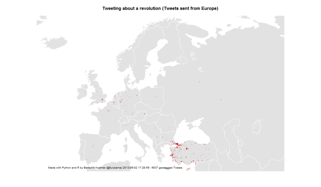
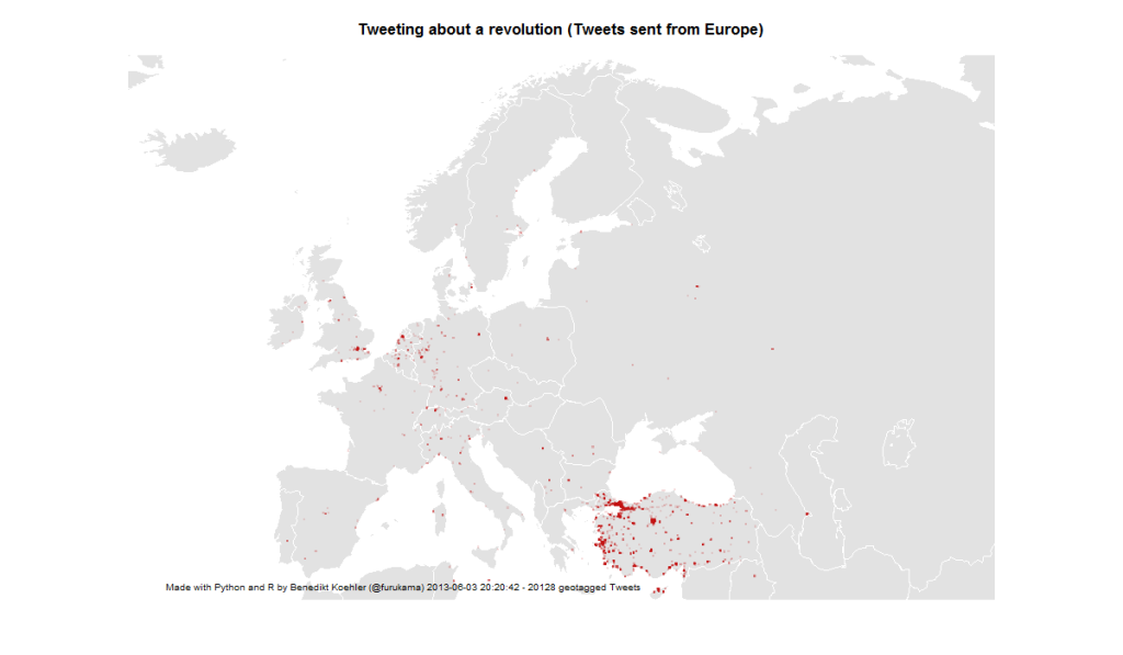
First, I took a look at the international attention (or even cosmopolitan solidarity) of the events in Turkey. The following maps are showing geotagged tweets from all over the world and from Europe that are referring to the events. About 1% of all tweets containing the hashtags carry exact geographical coordinates. The fact, that there are so few tweets from Germany – a country with a significant population of Turkish immigrants – should not be overrated. It’s night-time in Germany and I would expect a lot more tweets tomorrow.

European Attention for Gezi Park protests 1-2 Jun

14,000 geo-tagged tweets later the map looks like this:

European Attention for Gezi Park protests 1-3 Jun

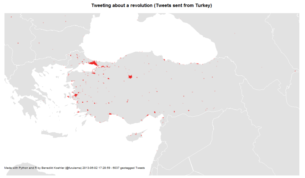
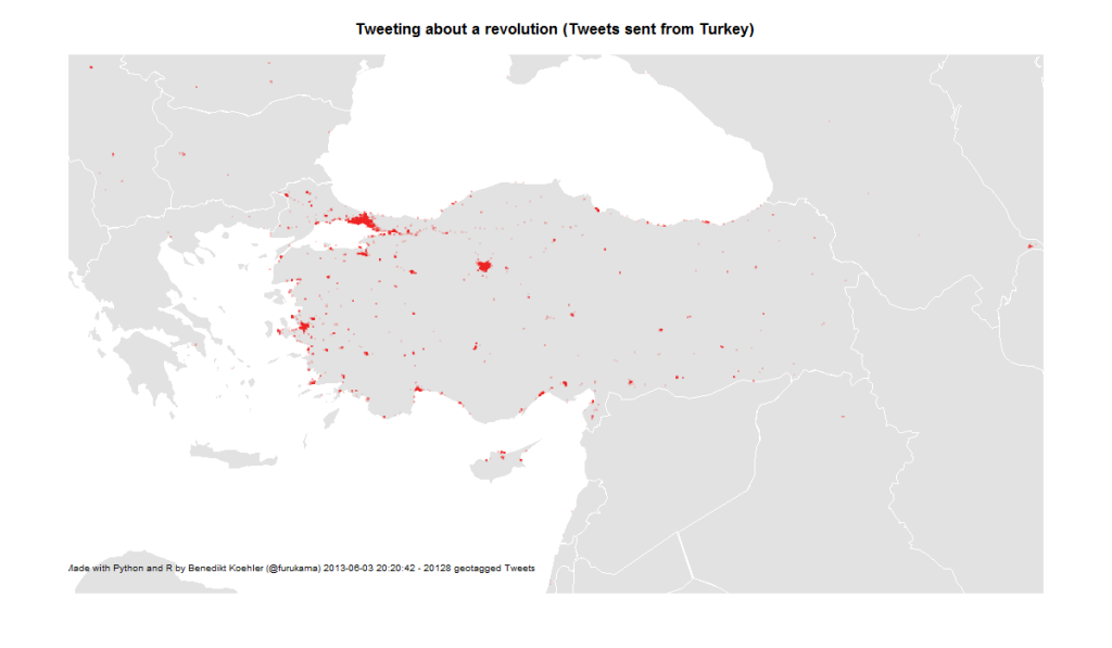
The next map is zooming in closer to the events: These are the locations in Turkey where tweets were sent with one of the hashtags mentioned above. The larger cities Istanbul, Ankara and Izmir are active, but tweets are coming from all over the country:

Turkish Tweets about the Gezi Park protests 1-2 Jun

On June 3rd, the activity has spread across the country:

Turkish Tweets about the Gezi Park protests 1-3 Jun

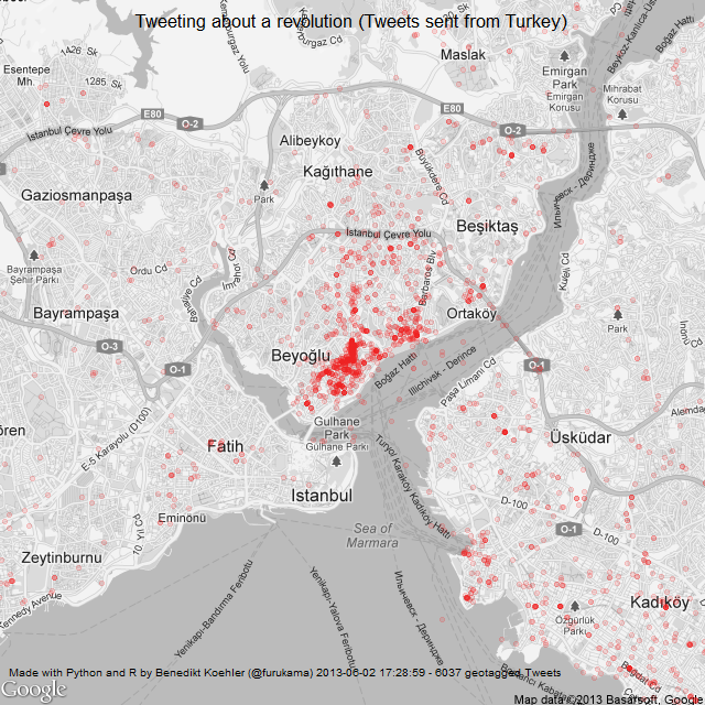
And finally, here’s a look at the tweet locations in Istanbul. The map is centered on Gezi Park – and the activity on Twitter as well:

Istanbul Tweets about Gezi Park protests 1-2 Jun

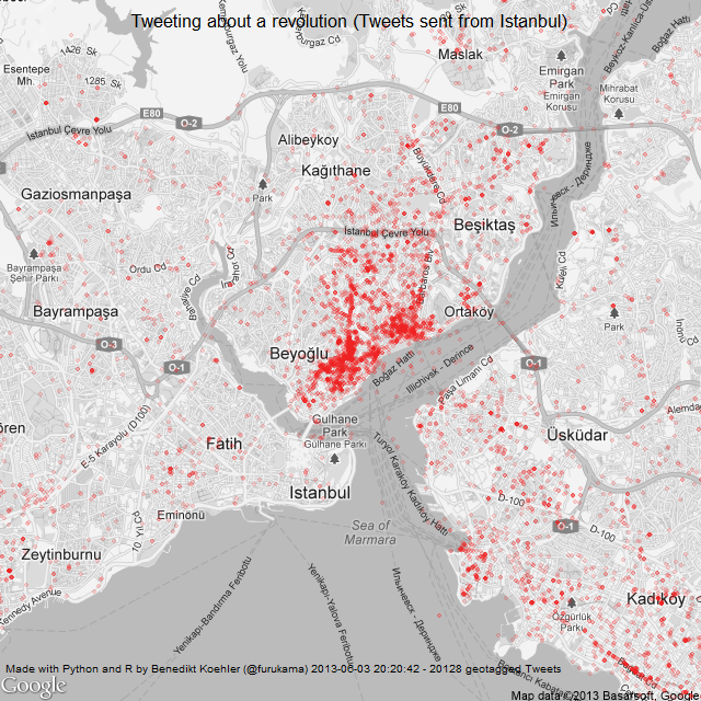
Here’s the same map a day later (I decreased the size of the dots a bit while the map is getting clearer):

Istanbul Tweets about Gezi Park protests 1-3 Jun

The R code to create the maps can be found on my GitHub.

Algorithm Ethics

An algorithm is a structured description on how to calculate things. Some of the most prominent examples of algorithms have been around for more than 2500 years like Euklid’s algorithm that gives you the greatest common divisor or Erathostenes’ sieve to give you all prime numbers up to a given maximum. These two algorithms do not contain any kind of value judgement. If I define a new method for selecting prime numbers – and many of those have been publicized! – every algorithm will come to the same solution. A number is prime or not.

But there is a different kind of algorithmic processes, that is far more common in our daily life. These are algorithms that have been chosen to find a solution to some task, that others would probably have done in a different way. Although obvious value judgments done by calculation like credit scoring and rating immediately come to our mind, when we think about ethics in the context of calculations. However there is a multitude of “hidden” ethic algorithms that far more pervasive.

On example that I encountered was given by Gary Wolf on the Quantified Self Conference in Amsterdam. Wolf told of his experiment in taking different step-counting gadgets and analyzing the differing results. His conclusion: there is no common concept of what is defined as “a step”. And he is right. The developers of the different gadgets have arbitrarily chosen one or another method to map the data collected by the gadgets’ gyroscopic sensors into distinct steps to be counted.

So the first value judgment comes with choosing a method.

Many applications we use work on a fixed set of parameters – like the preselection of a mobile optimized CSS when the web server encounters what it takes for a mobile browser. Often we get the choice to switch to the “Web-mode”, but still there are many sites that would not allow our changing the view unless we trick the server into believing that our browser would be a “PC-version” and not mobile. This of course is a very simple example but the case should be clear: someone set a parameter without asking for our opinion.

The second way of having to deal with ethics is the setting of parameters.

A good example is given by Kraemer et. al in their paper. In medical imaging technologies like MRI, an image is calculated from data like tiny elecromagnetic distortions. Most doctors (I asked some explicitly) take these images as such (like they have taken photographs without much bothering about the underlying technology before). However, there are many parameters, that the developers of such an algorithmic imaging technology have predefined and that will effect the outcome in an important way. If a blood vessel is already clotted by arteriosclerosis or can be regarded still as healthy is a typical decision where we would like be on the safe side and thus tend to underestimate the volume of the vessel, i.e. prefer a more blurry image, while when a surgeon plans her cut, she might ask for a very sharp image that overestimates the vessel’s volume by trend.

The third value judgment is – as this illustrates – how to deal with uncertainty and misclassification.

This is what we call alpha and beta errors. Most people (especially in business context) concentrate on the alpha error, that is to minimize false positives. But when we take the cost of a misjudgement into account, the false negative often is much more expensive. Employers e.g. tend to look for “the perfect” candidate and by trend turn down applications that raise their doubts. By doing so, it is obvious that they will miss many opportunities for the best hire. The cost to fire someone that was hired under false expectations is far less than the cost of not having the chance in learning about someone at all – who might have been the hidden beauty.

The problem of the two types of errors is, you can’t optimize both simultaneously. So we have to make a decision. This is always a value judgment, always ethical.

With drones prepared for autonomous kill decisions this discussion becomes existential.

All three judgments – What method? What parameters? How to deal with misclassification? – are more often than not made implicitly. For many applications, the only way to understand these presumptions is to “open the black box” – hence to hack.

Given all that, I would like to demand three points of action:
– to the developers: you have to keep as many options open as possible and give others a chance in changing the presets (and customers: you must insist of this, when you order the programming of applications);
– to the educational systems: teach people to hack, to become curious about seeing behind things.
– to our legislative bodies: make hacking things legal. Don’t let copyright, DRM and the like being used against people who re-engineer things. Only what gets hacked, gets tested. Let us have sovereignty over the things we have to deal with, let us shape our surroundings according to our ethics.

Notes

My slides on this topic:

At the last re:pubica conference I gave a talk and hosted a discussion on “Algorithm ethics” that was recorded. (in German):

Social Sensors

“So, what’s the mood of America?”
Interface, 1994

One of the most fascinating novels so far on data-driven politics is Neal Stephenson’s and J. Frederick George’s “Interface“, first published in 1994. Although written almost 20 years ago, many of the technologies discussed in this book, would still be cutting edge if employed right now in 2013. One of the most original political devices is the PIPER wristwatch, a device for watching political content such as debates or candidate’s news coverage, while analyzing the wearers’ emotional reaction to these images in real-time by measuring bodily reactions such as pulse, blood pressure or galvanic skin response. This device is a miniaturized polygraph embedded in a controlled political feedback loop.

Social sensors on Twitter for conversations and trends in modern arts

What’s really interesting about the PIPER project: These sensors are not applied to all Americans or to a sample of them, but to a rather small number of types. Here are some examples from a rather extensive list of the types that are monitored this way (p. 360-1):

  • irrelevant mouth breather
  • 400-pound tab drinker
  • burger-flipping history major
  • bible-slinging porch monkey
  • pretentious urban-lifestyle slave
  • formerly respectable bankruptcy survivor

In the novel, the interface of this technology is described as follows:

By examining those graphs in detail, Ogle could assess the emotional status of any one of the PIPER 100. But they provided more detail than Ogle could really handle during the real-time stress of a major campaign event. So Aaron had come up with a very simple, general color-coding scheme […] Red denoted fear, stress, anger, anxiety. Blue denoted negative emotions centered in higher parts of the brain: disagreement, hostility, a general lack of receptiveness. And green meant that the subject liked what they saw. (p. 372)

This immediately grabbed my attention because this is exactly what we are doing in advanced market research projects at the moment: Segmenting a population (in this case: the US electorate) in different personae that represent a larger and more important relevant part of the population under study. And a similar approach is used in innovation research, where one would also focus on “lead-users” that are ahead of their peers when it comes to the identification and experimentation with trends in their respective subject.

Quite recently, this kind of approach has surfaced in various academic publications on Twitter analysis and prediction under the name of “social sensors” (e.g. Sakaki, Okazaki and Matsuo on Twitter earthquake detection or Uddin, Amin, Le, Abdelzaher, Szymanski and Guyen on the right choice of Twitter sensors). The idea is, not to monitor the whole Twitter firehose or everything that is being posted about some hashtag (this would be the regular Social Media Monitoring approach), but to select a smaller number of Twitter accounts that have a history of delivering fast and reliable information.

Wikipedia Attention for the Presidential Elections (Update)

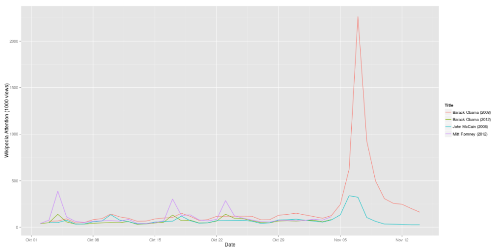
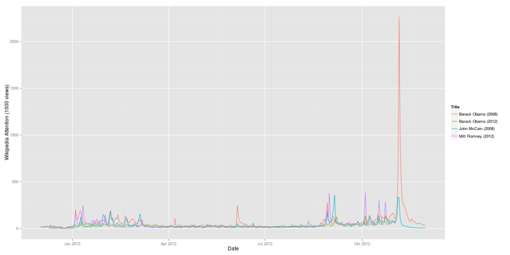
Here’s another update on the analysis of Wikipedia data for the presidential candidates. What’s quite interesting, the attention value vor Mitt Romney is almost at the same level where Barack Obama has been four years ago. And Barack Obama is exactly where John McCain has been 2008:

Obama vs. Romney 2012 compared to Obama vs. McCain 2008 (Wikipedia data)

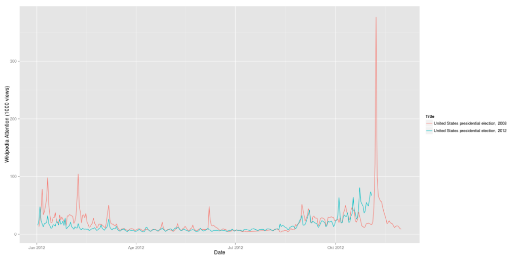
But one thing has changed: The elections as such are much more interesting to the Wikipedia users than they were 2008:

US Presidential Elections 2012 vs. 2008 (Wikipedia, daily visits)

2012 there is no pre-ballot gap as there has been four years ago.

Will Obama succeed to rally Hispanic voters? Some evidence from Wikipedia data.

Just a few hours before the ballots open for the 57th presidential election, the key question for us data scientists is: which data set could really show some special information, that would not be easily available through a classic poll. We have already seen some interesting correlations of Wikipedia usage with the ongoing campaign – just looking on how many people would search for the page on the candidates would provide a time series with many fascinating details.

Today we focused on the question, if the Democrats had been successful to rally Hispanic voters for Obama’s support. We took the Spanish Wikipedia, checkt the daily views of the Obama’s Spanish language Wikipedia-page and compared this with 2008 and also with the time series of his Republican competitors.

This table shows the monthly average for the daily views in 2008 and 2012:

McCain Romney Obama Obama
2008 2012 2008 2012
Feb 549 674 23% 2297 3154 37%
Mar 265 532 101% 949 3009 217%
Apr 181 399 120% 574 2748 379%
May 240 466 94% 817 2759 238%
Jun 435 331 -24% 2052 2477 21%
Jul 423 448 6% 668 2161 224%
Aug 501 918 83% 1289 2226 73%
Sep 1155 1285 11% 1757 2915 66%
Oct 1252 2064 65% 3005 3502 17%
Nov 2458 19110
506 841 66% 1385 2801 102%

Obama clearly leads – not only in absolute numbers but in particular regarding the increase of this year’s views with four years ago. While Romney would have gained 66% in views compared with McCain, Obama’s views would have more than doubled.

The daily views of Obama’s Spanish Wikipedia-Page have been constantly higher than four years ago while the Repubican candidates would at least at the beginning of the campaign have remained more or less on the same level. However: results for last week show an interesting difference: both candidates loose attraction regarding their Wikipedia relevance.

However, if we look just on the last week prior election day, we can see something strange happen: the view’s of Obama’s es.wikipedia-page have droped from the daily average of 5065 in 2008 to merely 3752 in 2012. The same is true for Romney versus McCain: 1795 average views in this year’s 44th week compared to 1986 in 2008.

This decreasing interest in the candidates is not reflected in the numbers that we see on other election-related search-terms. If we e.g. take ‘US Presidential Election’, we count 2672 daily views during the week before election day in 2008 and 3812 views in 2012 – the same rise in interest that we found in the English Wikipedia, too. (See the last post “Why the 2012 US elections are more exciting than 2008”). While the general interest in the elections is huge, the candidates no longer draw that much attention of the Spanish speaking community.
Maybe “Sandy” would work as an explanation since the campaing was halted during the Hurican – nevertheless it would not be plausible why only the candidates but not the election in general would suffer in awareness from this.

So we cannot draw a clear conclusion from our findings. There is evidence that Obama would have succeded to some extend to activate the interest of Hispanic people but regarding the unexpected drop we will have to drill further down. The real work, though, will anyway start right after the vote: to learn what would have been a signal and how we can seperate these from the noise next time.

Why the 2012 US elections are more exciting than 2008

Here’s an addition to my last post on using Wikipedia data to analyse attention for the US presidential elections 2012. Here’s another look at the interest not for the candidates’ Wikipedia pages but the general pages for the elections 2008 and 2012. Compared to the candidates’ pages, the attention for the general election page is much lower than for the candidates. Here’s the average values for October 2012:

  1. Mitt Romney (2012): 98,138 Views / day
  2. Barack Obama (2012): 63,104 Views / day
  3. United States presidential election, 2012 (2012): 38,770
  4. United States presidential election, 2008 (2008): 27,907

This monthly average hints at the 2012 elections being very exciting as the general election pages on Wikipedia have seen a 39% traffic increase compared to last elections. This also hold for the following time-series:

US Presidential Elections 2012 vs. 2008 (Wikipedia, daily visits)

While the attention for the election pages in 2012 did not reach the level it had during the 2008 primaries, from mid October the 2012 campaigns were much more interesting according to the Wikipedia numbers. In 2008 we have seen a drop in attention before election day, in 2012 the suspense seems to build up.

Wikipedia Attention and the US elections

One of the most interesting challenges of data science are predictions for important events such as national elections. With all those data streams of billions of posts, comments, likes, clicks etc. there should be a way to identify the most important correlations to make predictions about real-world behavior such as: going to the voting booth and chosing a candidate.

A very interesting data source in this respect is the Wikipedia. Why? Because Wikipedia is

  1. a) open (data on page-views, edits, discussions are freely available on daily or even hourly basis),
  2. b) huge (WP currently ranks as #6 of all web sites worldwide and reaches about a quarter of all online users),
  3. c) specific (people visit the Wikipedia because they want to know something about some topic)

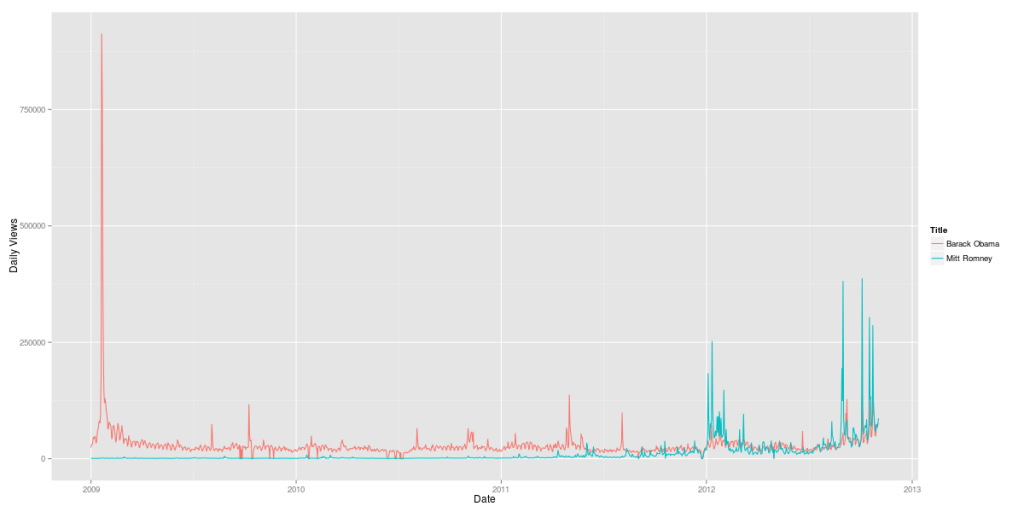
The first step was comparing the candidates Barack Obama and Mitt Romney over time. The resulting graph clearly shows the pivoting points of Obama’s presidential career (click to zoom):

Obama vs. Romney 2009-2012 (Wikipedia data)

But it also shows how strong Mitt Romney has been since the Republican primaries in January 2012. His Wikipedia page had attracted a lot more visitors in August and September 2012 than his presidential rival’s. Of course, this measure only shows attention, not sentiment. So it cannot be inferred from this data whether the peaks were positive or negative peaks. In terms of Wikipedia attention, Romney’s infamous 47% comments in September 2012 were more than 1/3 as important as Obama’s inauguration in January 2009.

Now, let’s add some further curves to this graph: Obama’s and McCain’s Wikipedia attention during the last elections:

Obama vs. Romney 2012 compared to Obama vs. McCain 2008 (Wikipedia data)

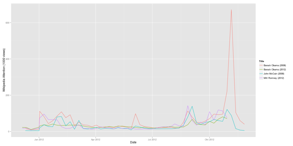
Here’s another version with weekly data:

Obama vs. Romney 2012 compared to Obama vs. McCain 2008 (Wikipedia data, weeks)

It’s almost instantly clear how much more attention Obama’s 2008 campaign (in red) gathered in comparison with his 2012 campaign (in green). On the other hand, Mitt Romney is at least when it comes to Wikipedia attention more interesting than McCain had been.

Here’s a comparison of Obama’s 2008 campaign vs. his 2012 campaign:

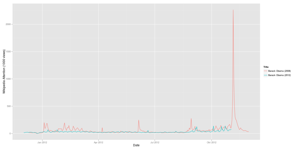
Obama 2008 vs. Obama 2012 (Wikipedia data)

The last question: Is Mitt Romney 2012 as strong as Obama had been in 2008? Here’s a direct comparison:

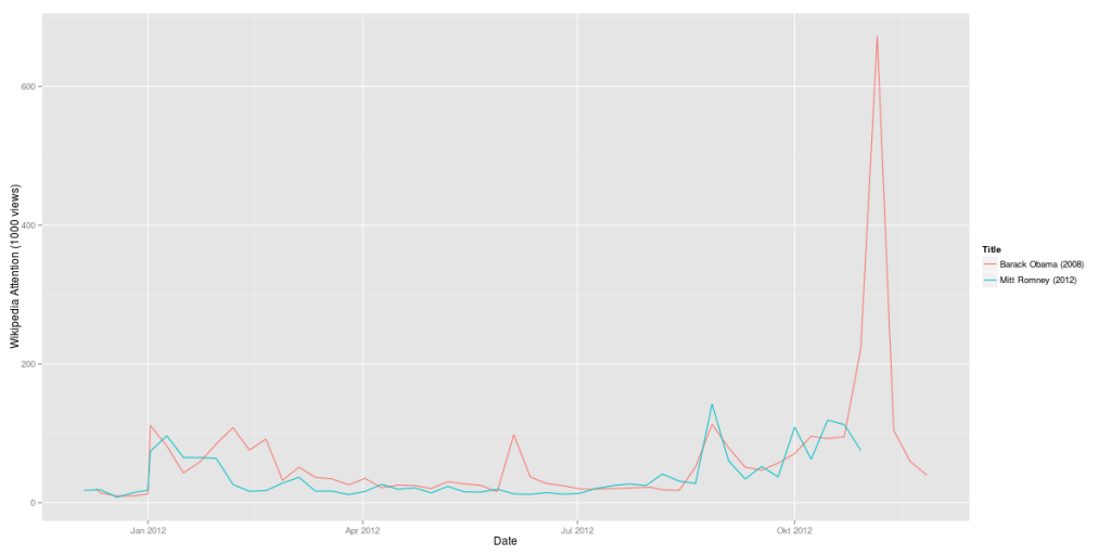
Obama 2008 vs. Romney 2012 (Wikipedia data, weekly)

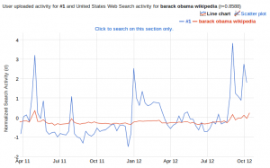
A side-remark: I also did a correlation of this data set with Google Correlate. And guess what: The strongest correlation of the data for Obama’s 2012 campaign is the Google search query for “barack obama wikipedia”. There still seem to be a huge number of people using Google as their Wikipedia search-engine.

Google Correlate result for the Wikipedia time series "Barack Obama"
Google Correlate result for the Wikipedia time series “Barack Obama”

But this result could also be interpreted the other way round: If there is a strong correlation between Wikipedia usage and Google search queries, this makes Wikipedia an even more important data source for analyses.