How to analyze smartphone sensor data with R and the BreakoutDetection package

Yesterday, Jörg has written a blog post on Data Storytelling with Smartphone sensor data. Here’s a practical approach on how to analyze smartphone sensor data with R. In this example I will be using the accelerometer smartphone data that Datarella provided in its Data Fiction competition. The dataset shows the acceleration along the three axes of the smartphone:

  • x – sideways acceleration of the device
  • y – forward and backward acceleration of the device
  • z – acceleration up and down

The interpretation of these values can be quite tricky because on the one hand there are manufacturer, device and sensor specific variations and artifacts. On the other hand, all acceleration is measured relative to the sensor orientation of the device. So, for example, the activity of taking the smartphone out of your pocket and reading a tweet can look the following way:

  • y acceleration – the smartphone had been in the pocket top down and is now taken out of the pocket
  • z and y acceleration – turning the smartphone so that is horizontal
  • x acceleration – moving the smartphone from the left to the middle of your body
  • z acceleration – lifting the smartphone so you can read the fine print of the tweet

And third, there is gravity influencing all the movements.

So, to find out what you are really doing with your smartphone can be quite challenging. In this blog post, I will show how to do one small task – identifying breakpoints in the dataset. As a nice side effect, I use this opportunity to introduce an application of the Twitter BreakoutDetection Open Source library (see Github) that can be used for Behavioral Change Point analysis.

First, I load the dataset and take a look at it:

setwd("~/Documents/Datarella")
accel <- read.csv("SensorAccelerometer.csv", stringsAsFactors=F)
head(accel)

  user_id           x          y        z                 updated_at                 type
1      88 -0.06703765 0.05746084 9.615114 2014-05-09 17:56:21.552521 Probe::Accelerometer
2      88 -0.05746084 0.10534488 9.576807 2014-05-09 17:56:22.139066 Probe::Accelerometer
3      88 -0.04788403 0.03830723 9.605537 2014-05-09 17:56:22.754616 Probe::Accelerometer
4      88 -0.01915361 0.04788403 9.567230 2014-05-09 17:56:23.372244 Probe::Accelerometer
5      88 -0.06703765 0.08619126 9.615114 2014-05-09 17:56:23.977817 Probe::Accelerometer
6      88 -0.04788403 0.07661445 9.595961  2014-05-09 17:56:24.53004 Probe::Accelerometer

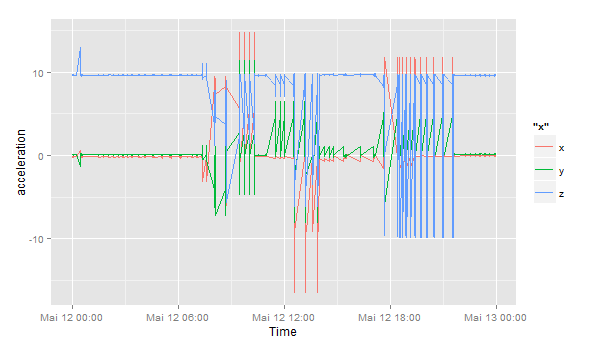
This is the sensor data for one user on one day:

accel$day <- substr(accel$updated_at, 1, 10)
df <- accel[accel$day == '2014-05-12' & accel$user_id == 88,]
df$timestamp <- as.POSIXlt(df$updated_at) # Transform to POSIX datetime
library(ggplot2)
ggplot(df) + geom_line(aes(timestamp, x, color="x")) + 
             geom_line(aes(timestamp, y, color="y")) + 
             geom_line(aes(timestamp, z, color="z")) + 
             scale_x_datetime() + xlab("Time") + ylab("acceleration")

sensor_all

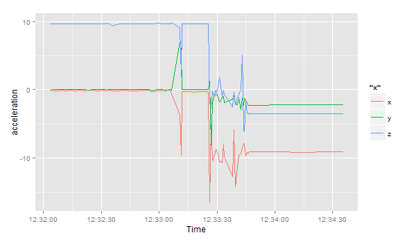
Let’s zoom in to the period between 12:32 and 13:00:

ggplot(df[df$timestamp >= '2014-05-12 12:32:00' & df$timestamp < '2014-05-12 13:00:00',]) +
  geom_line(aes(timestamp, x, color="x")) + 
  geom_line(aes(timestamp, y, color="y")) + 
  geom_line(aes(timestamp, z, color="z")) + 
  scale_x_datetime() + xlab("Time") + ylab("acceleration")

sensor_zoom

Then, I load the Breakoutdetection library:

install.packages("devtools")
devtools::install_github("twitter/BreakoutDetection")
library(BreakoutDetection)
bo <- breakout(df$x[df$timestamp >= '2014-05-12 12:32:00' & df$timestamp < '2014-05-12 12:35:00'], 
               min.size=10, method='multi', beta=.001, degree=1, plot=TRUE)
bo$plot

sensor_breakout

This quick analysis of the acceleration in the x direction gives us 4 change points, where the acceleration suddenly changes. In the beginning, the smartphone seems to lie flat on a horizontal surface – the sensor is reading a value of around 9.8 in positive direction – this means, the gravitational force only effects this axis and not the x and y axes. Ergo: the smartphone is lying flat. But then things change and after a few movements (our change points) the last observation has the smartphone on a position where the x axis has around -9.6 acceleration, i.e. the smartphone is being held in landscape orientation pointing to the right.

Anomaly Detection with Wikipedia Page View Data

Today, the Twitter engineering team released another very interesting Open Source R package for working with time series data: “AnomalyDetection“. This package uses the Seasonal Hybrid ESD (S-H-ESD) algorithm to identify local anomalies (= variations inside seasonal patterns) and global anomalies (= variations that cannot be explained with seasonal patterns).

As a kind of warm up and practical exploration of the new package, here’s a short example on how to download Wikipedia PageView statistics and mine them for anomalies (inspired by this blog post, where this package wasn’t available yet):

First, we install and load the necessary packages:

library(RJSONIO)
library(RCurl)
library(ggplot2)
install.packages("devtools")
devtools::install_github("twitter/AnomalyDetection")
library(AnomalyDetection)

Then we choose an interesting Wikipedia page and download the last 90 days of PageView statistics:

page <- "USA"
raw_data <- getURL(paste("http://stats.grok.se/json/en/latest90/", page, sep=""))
data <- fromJSON(raw_data)
views <- data.frame(timestamp=paste(names(data$daily_views), " 12:00:00", sep=""), stringsAsFactors=F)
views$count <- data$daily_views
views$timestamp <- as.POSIXlt(views$timestamp) # Transform to POSIX datetime
views <- views[order(views$timestamp),]

I also did some pre-processing and transformation of the dates in POSIX datetime format. A first plot shows this pattern:

ggplot(views, aes(timestamp, count)) + geom_line() + scale_x_datetime() + xlab("") + ylab("views")

wikipedia_views_USA

Now, let’s look for anomalies. The usual way would be to feed a dataframe with a date-time and a value column into the AnomalyDetection function AnomalyDetectionTs(). But in this case, this doesn’t work because our data is much too coarse. It doesn’t seem to work with data on days. So, we use the more generic function AnomalyDetectionVec() that just needs the values and some definition of a period. In this case, the period is 7 (= 7 days for one week):

res = AnomalyDetectionVec(views$count, max_anoms=0.05, direction='both', plot=TRUE, period=7)
res$plot

wikipedia_anomalies_usa

In our case, the algorithm has discovered 4 anomalies. The first on October 30 2014 being an exceptionally high value overall, the second is a very high Sunday, the third a high value overall and the forth a high Saturday (normally, this day is also quite weak).

The Top 7 Beautiful Data Blog Posts in 2014

Domo_After2014 was a great year in data science – and also an exciting year for me personally from a very inspirational Strata Conference in Santa Clara to a wonderful experience of speaking at PyData Berlin to founding the data visualization company DataLion. But it also was a great year blogging about data science. Here’s the Beautiful Data blog posts our readers seemed to like the most:

  1. Datalicious Notebookmania – My personal list of the 7 IPython notebooks I like the most. Some of them are great for novices, some can even be challenging for advanced statisticians and datascientists
  2. Trending Topics at Strata Conferences 2011-2014 – An analysis of the topics most frequently mentioned in Strata Conference abstracts that clearly shows the rising importance of Python, IPython and Pandas.
  3. Big Data Investment Map 2014 – I’ve been tracking and analysing the developments in Big Data investments and IPOs for quite a long time. This was the 2014 update of the network mapping the investments of VCs in Big Data companies.
  4. Analyzing VC investment strategies with Crunchbase data – This blog post explains the code used to create the network.
  5. How to create a location graph from the Foursquare API – In this post, I explain a way to make sense out of the Foursquare API and to create geospatial network visualizations from the data showing how locations in a city are connected via Foursquare checkins.
  6. Text-Mining the DLD Conference 2014 – A very similar approach as I used for the Strata conference has been applied to the Twitter corpus refering to Hubert Burda Media DLD conference showing the trending topics in tech and media.
  7. Identifying trends in the German Google n-grams corpus – This tutorial shows how to analyze Big data-sets such as the Google Book ngram corpus with Hive on the Amazon Cloud.

Querying the Bitcoin blockchain with R

The crypto-currency Bitcoin and the way it generates “trustless trust” is one of the hottest topics when it comes to technological innovations right now. The way Bitcoin transactions always backtrace the whole transaction list since the first discovered block (the Genesis block) does not only work for finance. The first startups such as Blockstream already work on ways how to use this mechanism of “trustless trust” (i.e. you can trust the system without having to trust the participants) on related fields such as corporate equity.

So you could guess that Bitcoin and especially its components the Blockchain and various Sidechains should also be among the most exciting fields for data science and visualization. For the first time, the network of financial transactions many sociologists such as Georg Simmel theorized about becomes visible. Although there are already a lot of technical papers and even some books on the topic, there isn’t much material that allows for a more hands-on approach, especially on how to generate and visualize the transaction networks.

The paper on “Bitcoin Transaction Graph Analysis” by Fleder, Kester and Pillai is especially recommended. It traces the FBI seizure of $28.5M in Bitcoin through a network analysis.

So to get you started with R and the Blockchain, here’s a few lines of code. I used the package “Rbitcoin” by Jan Gorecki.

Here’s our first example, querying the Kraken exchange for the exchange value of Bitcoin vs. EUR:

library(Rbitcoin)
## Loading required package: data.table
## You are currently using Rbitcoin 0.9.2, be aware of the changes coming in the next releases (0.9.3 - github, 0.9.4 - cran). Do not auto update Rbitcoin to 0.9.3 (or later) without testing. For details see github.com/jangorecki/Rbitcoin. This message will be removed in 0.9.5 (or later).
wait <- antiddos(market = 'kraken', antispam_interval = 5, verbose = 1)
market.api.process('kraken',c('BTC','EUR'),'ticker')
##    market base quote           timestamp market_timestamp  last     vwap
## 1: kraken  BTC   EUR 2015-01-02 13:12:03             <NA&gt; 263.2 262.9169
##      volume    ask    bid
## 1: 458.3401 263.38 263.22

The function antiddos makes sure that you’re not overusing the Bitcoin API. A reasonable query interval should be one query every 10s.

Here’s a second example that gives you a time-series of the lastest exchange values:

trades <- market.api.process('kraken',c('BTC','EUR'),'trades')
Rbitcoin.plot(trades, col='blue')

btc_kraken

The last two examples all were based on aggregated values. But the Blockchain API allows to read every single transaction in the history of Bitcoin. Here’s a slightly longer code example on how to query historical transactions for one address and then mapping the connections between all addresses in this strand of the Blockchain. The red dot is the address we were looking at (so you can change the value to one of your own Bitcoin addresses):

wallet <- blockchain.api.process('15Mb2QcgF3XDMeVn6M7oCG6CQLw4mkedDi')
seed <- '1NfRMkhm5vjizzqkp2Qb28N7geRQCa4XqC'
genesis <- '1A1zP1eP5QGefi2DMPTfTL5SLmv7DivfNa'
singleaddress <- blockchain.api.query(method = 'Single Address', bitcoin_address = seed, limit=100)
txs <- singleaddress$txs

bc <- data.frame()
for (t in txs) {
  hash <- t$hash
  for (inputs in t$inputs) {
    from <- inputs$prev_out$addr
    for (out in t$out) {
      to <- out$addr
      va <- out$value
      bc <- rbind(bc, data.frame(from=from,to=to,value=va, stringsAsFactors=F))
    }
  }
}

After downloading and transforming the blockchain data, we’re now aggregating the resulting transaction table on address level:

library(plyr)
btc <- ddply(bc, c("from", "to"), summarize, value=sum(value))

Finally, we’re using igraph to calculate and draw the resulting network of transactions between addresses:

library(igraph)
btc.net <- graph.data.frame(btc, directed=T)
V(btc.net)$color <- "blue"
V(btc.net)$color[unlist(V(btc.net)$name) == seed] <- "red"
nodes <- unlist(V(btc.net)$name)
E(btc.net)$width <- log(E(btc.net)$value)/10
plot.igraph(btc.net, vertex.size=5, edge.arrow.size=0.1, vertex.label=NA, main=paste("BTC transaction network for\n", seed))

btc_network

How to create a location graph from the Foursquare API

Monday, I’ll be speaking on “Linked Data” at the 49th German Market Research Congress 2014. In my talk, there will be many examples of how to apply the basic approach and measurements of Social Network Analysis to various topics ranging from brand affinities as measured in the market-media study best for planning, the financial network between venture capital firms and start-ups and the location graph on Foursquare.

Because I haven’t seen many examples on using the Foursquare API to generate location graphs, I would like to explain my approach a little bit deeper. At first sight, the Foursquare API differs from many other Social Media APIs because it just allows you to access data about your own account. So, there is no general stream (or firehose) of check-in events that could be used to calculate user journeys or the relations between different places.

Fortunately, there’s another method that is very helpful for this purpose: You can query the API for any given Foursquare location to output up to five venues that were most frequently accessed after this location. This begs for a recursive approach of downloading the next locations for the next locations for the next locations and so on … and transform this data into the location graph.

I’ve written down this approach in an IPython Notebook, so you just have to find your API credentials and then you can start downloading your cities’ location graph. For Munich it looks like this (click to zoom):

Munich seen through Foursquare check-ins

The resulting network is very interesting, because the “distance” between the different locations is a fascinating mixture of

  • spatial distance: places that are nearby are more likely to be connected (think of neighborhoods)
  • temporal distance: places that can be reached in a short time are more likely to be connected (think of places that are quite far apart but can be reached in no time by highway)
  • affective/social distance: places that belong to a common lifestyle are more likely to be connected

    Feel free to clone the code from my github. I’m looking forward to seeing the network visualizations of your cities.

Datalicious Notebookmania – My favorite 7 IPython Notebooks

One of the most remarkable features of this year’s Strataconf was the almost universal use of IPython notebooks in presentations and tutorials. This framework not only allows the speakers to demonstrate each step in the data science approach but also gives the audience an opportunity to do the same – either during the session or afterwards.

Here’s a list of my favorite IPython notebooks on machine learning and data science. You can always find a lot more on this webpage. Furthermore, there’s also the great notebookviewer platform that can render Github’bed notebooks as they would appear in your browser. All the following notebooks can be downloaded or cloned from the GitHub page to work on your own computer or you can view (but not edit) them with nbviewer.

So, if you want to learn about predictions, modeling and large-scale data analysis, the following resources should give you a fantastic deep dive into these topics:

1) Mining the Social Web by Matthew A. Russell

miningIf you want to learn how to automatically extract information from Twitter streams, Facebook fanpages, Google+ posts, Github accounts and many more information sources, this is the best resource to start. It started out as the code repository for Matthew’s O’Reilly published book, but since the 2nd edition has become an active learning community. The code comes with a complete setup for a virtual machine (Vagrant based) which saves you a lot of configuring and version-checking Python packages. Highly recommended!

2) Probabilistic Programming and Bayesian Methods for Hackers by Cameron Davidson-Pilon

bayesianThis is another heavy weight among my IPython notebook repositories. Here, Cameron teaches you Bayesian data analysis from your first calculation of posteriors to a real-time analysis of GitHub repositories forks. Probabilistic programming is one of the hottest topics in the data science community right now – Beau Cronin gave a mind-blowing talk at this year’s Strata Conference (here’s the speaker deck) – so if you want to join the Bayesian gang and learn probabilistic programming systems such as PyMC, this is your notebook.

3) Parallel Machine Learning Tutorial by Olivier Grisel

bigdata_alchemyThe tutorial session on parallel machine learning and the Python package scikit-learn by Olivier Grisel was one of my highlights at Strata 2014. In this notebook, Olivier explains how to set up and tune machine learning projects such as predictive modeling with the famous Titanic data-set on Kaggle. Modeling has far too long been a secret science – some kind of Statistical Alchemy, see the talk I gave at Siemens on this topic – and the time has come to democratize the methods and approaches that are behind many modern technologies from behavioral targeting to movie recommendations. After the introduction, Olivier also explains how to use parallel processing for machine learning projects on really large data-sets.

4) 538 Election Forecasting Model by Skipper Seabold

538_reverseengineeredEver wondered how Nate Silver calculated his 2012 presidential election forecasts? Don’t look any further. This notebook is reverse engineering Nate’s approach as he described it on his blog and in various interviews. The notebook comes with the actual polling data, so you can “do the Nate Silver” on your own laptop. I am currently working on transforming this model to work with German elections – so if you have any ideas on how to improve or complete the approach, I’d love to hear from you in the comments section.

5) Six Degrees of Kevin Bacon by Brian Kent

graphlab_sixdegreesThis notebook is one of the showcases for the new GraphLab Python package demonstrated at Strata Conference 2014. The GraphLab library allows very fast access to large data structures with a special data frame format called the SFrame. This notebook works on the Freebase movie database to find out whether the Kevin Bacon number really holds true or whether there are other actors that are more central in the movie universe. The GraphLab package is currently in public beta.

6) Get Close to Your Data with Python and JavaScript by Brian Granger

plotlyThe days of holecount and 1000+ pages of statistical tables are finally history. Today, data science and data visualization go together like Bayesian priors and posteriors. One of the hippest and most powerful technologies in modern browser-based visualization is the d3.js framework. If you want to learn about the current state-of-the-art in combining the beauty of d3.js with the ease and convenience of IPython, Brian’s Strata talk is the perfect introduction to this topic.

7) Regex Golf by Peter Norvig

I found the final notebook through the above mentioned talk. Peter Norvig is not only the master mind behind the Google economy, teacher of a wonderful introduction to Python programming at Udacity and author of many scientific papers on applied statistics and modeling, but he also seems to be the true nerd. Who else would take a xkcd comic strip by the word and work out the regular expression matching patterns that provide a solution to the problem posed in the comic strip. I promise that your life will never be the same after you went through this notebook – you’ll start to see programming problems in almost every Internet meme from now on. Let me know, when you found some interesting solutions!

Crowdsourcing Science

Open foresight is a great way to look into future developments. Open data is the foundation to do this comprehensively and in a transparent way. As with most big data projects, the difficult part in open foresight is to collect the data and wrangle it to a form that can actually be processed. While in classic social research you’d have experimental measurements or field notes in a well defined format, dealing with open data is always a pain: not only is there no standard – the meaningful numbers might be found anywhere in your source and be called arbitrarily; also the context is not given by some structure that you’d have imposed into your data in advanced (as we used to do it in our hypothesis-driven set-ups).

In the last decade, crowdsourcing has proven to be a remedy to dealing with all kinds of challenges that are still to complex to be fully automatized, but which are not too hard to be worked out by humans. A nice example is zooniverse.org featuring many “citizen science projects”, from finding exoplanets or classifying galaxies, to helping to model global climate history by entering historic ships’ log data.

Climate change caused by humanity might be the best defended hypothesis in science; no other theory had do be defended against more money and effort to disprove it (except perhaps evolution, which has do fight a similar battle about ideology). But apart from the description, how climate will change and how that will effect local weather conditions, we might still be rather little aware of the consequences of different scenarios. But aside from the effect of climate-driven economic change on people’s lives, the change of economy itself cannot be ignored when studying climate and understand possible feedback loops that might or might not lead into local or global catastrophe.

Zeean.net is an open data / open source project aiming at the economic impact of climate change. Collecting data is crowdsourced – everyone can contribute key indicators of geo-economic dependency like interregional and domestic flow of supply and demand in an easy “Wikipedia-like” way. And like Wikipedia, the validation is done by crowd-crosscheck of registered users. Once data is there, it can be fed into simulations. The team behind Zeean, lead by Anders Levermann at Potsdam Institute for Climate Impact Research is directly tied into the Intergovernmental Panel on Climate Change IPCC, leading research on climate change for the UN and thus being one of the most prominent scientific organizations in this field.

A first quick glance on the flows of supply shows how a conflict in the Ukraine effect the rest of the world economically.
The results are of course not limited to climate. If markets default for other reasons, the effect on other regions can be modeled in the same way.
So I am looking forward to the data itself being made public (by then brought into a meaningful structure), we could start calculating our own models and predictions, using the powerful open source tools that have been made available during the last years.

Before and After Series C funding – a network analysis of Domo

One of the most interesting Big Data companies in this network analysis of Venture Capital connections has in my opinion been Domo. Not only did it receive clearly above average funding for such a young company, but it was also one of the nodes with the best connections through Venture Capital firms and their investments. It had one of the highest values for Betweenness Centrality, which means it connects a lot of the other nodes in the Big Data landscape.

Then, some days after I did the analysis and visualization, news broke that Domo received $125M from Greylock, Fidelity, Morgan Stanley and Salesforce among others. This is a great opportunity to see what this new financing round means in terms of network structure. Here’s Domo before the round:

Domo_Before

And this is Domo $125M later. Notice how its huge Betweenness Centrality almost dwarfs the other nodes in the network. And through its new connections it is strongly connected to MongoDB:

Domo_After

Here’s a look at the numbers, before Series C:

Company Centrality
1 Domo 0.1459
2 Cloudera 0.0890
3 MemSQL 0.0738
4 The Climate Corporation 0.0734
5 Identified 0.0696
6 MongoDB, Inc. 0.0673
7 Greenplum Software 0.0541
8 CrowdFlower 0.0501
9 DataStax 0.0489
10 Fusion-io 0.0488

And now:

Company Centrality
1 Domo 0.1655
2 MemSQL 0.0976
3 Cloudera 0.0797
4 MongoDB, Inc. 0.0722
5 Identified 0.0706
6 The Climate Corporation 0.0673
7 Greenplum Software 0.0535
8 CrowdFlower 0.0506
9 DataStax 0.0459
10 Fusion-io 0.0442

The new funding round now only increases Domo’s centrality but also MongoDB’s because of the shared investors Salesforce, T. Rowe Price and Fidelity Investments.

Big Data Investment Map 2014

Here’s an updated version of our Big Data Investment Map. I’ve collected information about ca. 50 of the most important Big Data startups via the Crunchbase API. The funding rounds were used to create a weighted directed network with investments being the edges between the nodes (investors and/or startups). If there were multiple companies or persons participating in a funding round, I split the sum between all investors.

This is an excerpt from the resulting network map – made with Gephi. Click to view or download the full graphic:

BigDataInvestmentMap_2014_Small

If you feel, your company is missing in the network map, please tell us in the comments.

The size of the nodes is relative to the logarithmic total result of all their funding rounds. There’s also an alternative view focused on the funding companies – here, the node size is relative to their Big Data investments. Here’s the list of the top Big Data companies:

Company Funding
(M$, Source: Crunchbase API)
VMware 369
Palantir Technologies 343
MongoDB, Inc. 231
DataStax 167
Cloudera 141
Domo 123
Fusion-io 112
The Climate Corporation 109
Pivotal 105
Talend 102

And here’s the top investing companies:

Company Big Data funding
(M$, Source: Crunchbase API)
Founders Fund 286
Intel 219
Cisco 153
New Enterprise Associates 145
Sequoia Capital 109
General Electric 105
Accel Partners 86
Lightspeed Venture Partners 72
Greylock Partners 63
Meritech Capital Partners 62

We can also use network analytical measures to find out about which investment company is best connected to the Big Data start-up ecosystem. I’ve calculated the Betweenness Centrality measure which captures how good nodes are at connecting all the other nodes. So here are the best connected Big Data investors and their investments starting with New Enterprise Associates, Andreessen Horowitz and In-Q-Tel (the venture capital firm for the CIA and the US intelligence community).

Investor Centrality Big Data Companies
1 New Enterprise Associates 0.0863 GraphLab, MapR Technologies, Fusion-io, MongoDB, Inc., WibiData, Pentaho, CloudFlare, The Climate Corporation, MemSQL
2 Andreessen Horowitz 0.0776 ClearStory Data, Domo, Fusion-io, Databricks, GoodData, Continuuity, Platfora
3 In-Q-Tel 0.0769 Cloudera, Recorded Future, Cloudant, MongoDB, Inc., Platfora, Palantir Technologies
4 Founders Fund 0.0623 Declara, CrowdFlower, The Climate Corporation, Palantir Technologies, Domo
5 SV Angel 0.0602 Cloudera, Domo, WibiData, Citus Data, The Climate Corporation, MemSQL
6 Khosla Ventures 0.0540 ParStream, Metamarkets, MemSQL, ClearStory Data, The Climate Corporation
7 IA Ventures 0.0510 Metamarkets, Recorded Future, DataSift, MemSQL
8 Data Collective 0.0483 Trifacta, ParStream, Continuuity, Declara, Citus Data, Platfora, MemSQL
9 Hummer Winblad Venture Partners 0.0458 NuoDB, Karmasphere, Domo
10 Battery Ventures 0.0437 Kontagent, SiSense, Continuuity, Platfora

Street Fighting Trend Research

One of the most intriguing tools for the Street Fighting Data Science approach is the new Google Trends interface (formerly known as Google Insights for Search). This web application allows to analyze the volume of search requests for particular keywords over time (from 2004 on). This can be very useful for evaluating product life-cycle – assuming a product or brand that is not being searched on Google is no longer relevant. Here’s the result for the most important products in the Samsung Galaxy range:

For the S3 and S4 model the patterns are almost the same:

  • Stage 1: a slow build-up starting in the moment on the product was first mentioned in the Internet
  • Stage 2: a sudden burst at the product launch
  • Stage 3: a plateau phase with additional spikes when product modifications are launched
  • Stage 4: a slow decay of attention when other products have appeared

The S2 on the other hand does not have this sudden burst at launch while the Galaxy Note does not decay yet but displays multiple bursts of attention.

But in South Korea, the cycles seem quite different:

If you take a look at the relative numbers, the Galaxy Note is much stronger in South Korea and at the moment is at no. 1 of the products examined.

An interesting question is: do these patterns also hold for other mobile / smartphone brands? Here’s a look at the iPhone generations as searched for by Google users:

The huge spike at the launch of the iPhone 5 hints at the most successful launch in terms of Google attention. But this doesn’t say anything about the sentiment of the attention. Interestingly enough, the iPhone 5 had a first burst at the same moment the iPhone 4S has been launched. The reason for this anomany: people were expecting that Apple would be launching the iPhone 5 in Sep/Oct 2011 but then were disappointed that the Cupertino launch event was only about a iPhone 4S.

Analyses like this are especially useful at the beginning of a trend research workflow. The next steps would involve digging deeper in the patterns, taking a look at the audiences behind the data, collecting posts, tweets and news articles for the peaks in the timelines, looking for correlations of the timelines in other data sets e.g. with Google Correlate, brand tracking data or consumer surveys.

Animated Twitter Networks

In this blogpost I presented a visualization made with R that shows how almost the whole world expresses its attention to political crises abroad. Here’s another visualization with Tweets in October 2013 that referred to the Lampedusa tragedy in the Mediterranean.

#Lampedusa on Twitter

But this transnational public space isn’t quite as static as it seems on these images. To show how these geographical hashtag links develop over time, I analyzed the timestamps of the (geo-coded) Tweets mentioning the hashtag #lampedusa. This is the resulting animation showing the choreography of global solidarity:

The code is quite straightforward. After collecting the Tweets via the Twitter Streaming API e.g. with Pablo Barberá’s R package streamR, I quantized the dates to hourly values and then calculated the animation frame by frame inspired by Jeff Hemsley’s approach.

One trick that is very helpful when plotting geospatial connections with great circles is the following snippet that correctly assembles lines that cross the dateline:

library("geosphere")
for (i in 1:length(l$long)) {
inter <- gcIntermediate(c(l$long[i], l$lat[i]), c(12.6, 35.5), n=500, addStartEnd=TRUE, breakAtDateLine=TRUE) if (length(inter) > 2) {
lines(inter, col=col, lwd=l$n[i])
} else {
lines(inter[[1]], col=col, lwd=l$n[i])
lines(inter[[2]], col=col, lwd=l$n[i])
}
}

Cosmopolitan Public Spaces

Mentions of the Gezi Park protests on Twitter

In my PhD and post-doc research projects at the university, I did a lot of research on the new cosmopolitanism together with Ulrich Beck. Our main goal was to test the hypothesis of an “empirical cosmopolitanization”. Maybe the term is confusing and too abstract, but what we were looking for were quite simple examples for ties between humans that undermine national borders. We were trying to unveil the structures and processes of a real-existing cosmopolitanism.

I looked at a lot of statistics on transnational corporations and the evolution of transnational economic integration. But one of the most exciting dimensions of the theory of cosmopolitanism is the rise of a cosmopolitan public sphere. This is not the same as a global public that can be found in features such as world music, Hollywood blockbusters or global sports events. A cosmopolitan public sphere refers to solidarity with other human beings.

When I discovered the discussions on Twitter about the Gezi Park protests in Istanbul, this kind of cosmopolitan solidarity seems to assume a definite form: The lines that connect people all over Europe with the Turkish protesters are not the usual international relations, but they are ties that e.g. connect Turkish emigrants, political activists, “Wutbürger” or generally political aware citizens with the events in Istanbul. Because only about 1% of all tweets carry information about the geo-position of the user, you should imagine about 100 times more lines to see the true dimension of this phenomenon.

Mapping a Revolution

Twitter has become an important communications tool for political protests. While mass media are often censored during large-scale political protests, Social Media channels remain relatively open and can be used to tell the world what is happening and to mobilize support all over the world. From an analytic perspective tweets with geo information are especially interesting.

Here’s some maps I did on the basis of ~ 6,000 geotagged tweets from ~ 12 hours on 1 and 2 Jun 2013 referring to the “Gezi Park Protests” in Istanbul (i.e. mentioning the hashtags “occupygezi”, “direngeziparki”, “turkishspring”* etc.). The tweets were collected via the Twitter streaming API and saved to a CouchDB installation. The maps were produced by R (unfortunately the shapes from the map package are a bit outdated).

*”Turkish Spring” or “Turkish Summer” are misleading terms as the situation in Turkey cannot be compared to the events during the “Arab Spring”. Nonetheless I have included them in my analysis because they were used in the discussion (e.g. by mass media twitter channels) Thanks @Taksim for the hint.

International Attention for Gezi Park protests 1-2 Jun

On the next day, there even was one tweet mentioning the protests crossing the dateline:

International Attention for Gezi Park protests 1-3 Jun

First, I took a look at the international attention (or even cosmopolitan solidarity) of the events in Turkey. The following maps are showing geotagged tweets from all over the world and from Europe that are referring to the events. About 1% of all tweets containing the hashtags carry exact geographical coordinates. The fact, that there are so few tweets from Germany – a country with a significant population of Turkish immigrants – should not be overrated. It’s night-time in Germany and I would expect a lot more tweets tomorrow.

European Attention for Gezi Park protests 1-2 Jun

14,000 geo-tagged tweets later the map looks like this:

European Attention for Gezi Park protests 1-3 Jun

The next map is zooming in closer to the events: These are the locations in Turkey where tweets were sent with one of the hashtags mentioned above. The larger cities Istanbul, Ankara and Izmir are active, but tweets are coming from all over the country:

Turkish Tweets about the Gezi Park protests 1-2 Jun

On June 3rd, the activity has spread across the country:

Turkish Tweets about the Gezi Park protests 1-3 Jun

And finally, here’s a look at the tweet locations in Istanbul. The map is centered on Gezi Park – and the activity on Twitter as well:

Istanbul Tweets about Gezi Park protests 1-2 Jun

Here’s the same map a day later (I decreased the size of the dots a bit while the map is getting clearer):

Istanbul Tweets about Gezi Park protests 1-3 Jun

The R code to create the maps can be found on my GitHub.

Color analysis of Flickr images

Since I’ve seen this beautiful color wheel visualizing the colors of Flickr images, I’ve been fascinated with large scale automated image analysis. At the German Market Research association’s conference in late April, I presented some analyses that went in the same direction (click to enlarge):

Color values of Flickr images from Germany

On the image above you can see the color values ordered by their hue from images taken in Germany between August 2010 and April 2013. Each row represents the aggregation of 2.000 images downloaded from the Flickr API. I did this with the following R code:

bbox <- "5.866240,47.270210,15.042050,55.058140"
pages <- 10
maxdate <- "2010-08-31"
mindate <- "2010-08-01"
 
for (i in 1:pages) {
api <- paste("http://www.flickr.com/services/rest/?method=flickr.photos.search&format=json&api_key=YOUR_API_KEY_HERE &nojsoncallback=1&page=", i, "&per_page=500&bbox=", bbox, "&min_taken_date=", mindate, "&max_taken_date=", maxdate, sep="")
raw_data <- getURL(api, ssl.verifypeer = FALSE)

data <- fromJSON(raw_data, unexpected.escape="skip", method="R")
# This gives a list of the photo URLs including the information
# about id, farm, server, secret that is needed to download
# them from staticflickr.com
}

To aggregate the color values, I used Vijay Pandurangans Python script he wrote to analyze the color values of Indian movie posters. Fortunately, he open sourced the code and uploaded it on GitHub (thanks, Vijay!)

The monthly analysis of Flickr colors clearly hints at seasonal trends, e.g. the long and cold winter of 2012/2013 can be seen in the last few rows of the image. Also, the soft winter of 2011/2012 with only one very cold February appears in the image.

To take the analysis even further, I used weather data from the repository of the German weather service and plotted the temperatures for the same time frame:

Temperature in Germany

Could this be the same seasonality? To find out how the image color values above and the temperature curve below are related, I calculated the correlation between the dominance of the colors and the average temperature. Each month can not only be represented as a hue band, but also as a distribution of colors, e.g. the August 2010 looks like this:

So there’s a percent value for each color and each month. When I correlated the temperature values and the color values, the colors with the highest correlations were green (positive) and grey (negative). So, the more green is in a color band, the higher the average temperature in this month. This is how the correlation looks like:

Temperature and color values

The model actually is pretty good:

> fit <- lm(temp~yellow, weather)
> summary(fit)
Call:
lm(formula = temp ~ yellow, data = weather)
Residuals:
Min 1Q Median 3Q Max
-5.3300 -1.7373 -0.3406 1.9602 6.1974

Coefficients:
Estimate Std. Error t value Pr(>|t|)
(Intercept) -5.3832 1.2060 -4.464 0.000105 ***
yellow 2.9310 0.2373 12.353 2.7e-13 ***
---
Signif. codes: 0 '***' 0.001 '**' 0.01 '*' 0.05 '.' 0.1 ' ' 1
Residual standard error: 2.802 on 30 degrees of freedom
Multiple R-squared: 0.8357, Adjusted R-squared: 0.8302
F-statistic: 152.6 on 1 and 30 DF, p-value: 2.695e-13

Of course, it can even be improved a bit by calculating it with a polynomial formula. With second order polynomials lm(temp~poly(yellow,2), weather), we even get a R-squared value of 0.89. So, even when the pictures I analysed are not always taken outside, there seems to be a strong relationship between the colors in our Flickr photostreams and the temperature outside.

Our Pythagorean World

Crystals like the flourite, calcite, or garnet here show properties, that can easily be expressed in mathematical terms. Social behavior seams to be random, however, data science can help us detect laws and patterns, that can be expressed in mathematical functions like the shape of the crystals.
Crystals like the flourite, calcite, or garnet here show properties, that can easily be expressed in mathematical terms. This inspired the legendary Pythagoras an his students to postulate the whole world to be genuinly mathematical. Social behavior seams to be random, however data science can help us detect laws and patterns, that can be expressed in mathematical functions like the shape of the crystals.
Our senses are adapted to detect of our environment, what is necessary for our survival. In that way, evolution turns St. Augustin’s postulate of our world as being naturally conceivable to our minds from its head onto the feet. What we define as laws of nature are just the mostly linear correlations and the most regular patterns we could observe in our world.

When I had my first computer with graphical capabilities (an Atari Mega ST) in 1986, I, like everybody else, started hacking fractals. Rather simple functions produced remarkably complex and unpredictable visualizations. It was clear, that there might be many more patterns and laws to be discovered in nature, as soon as we could enhance our minds and senses with the computer – structures and patterns way to subtle to be recognised with our unarmed eye. In that way, the computer became, what the microscope or the telescope hat been to the researchers at the dawn of modernity: an enhancement of our mind and senses.

“Number is an extension and separation of our most intimate and interrelating activity, our sense of touch” (McLuhan)

The origin of the word digital stems from digitus, Latin for the finger. Counting is to separate, to cluster and summarize – as Beda the Venerable did with his fingers when he coined the term digit. With the Net, human behavior became trackable in unprecedented totality. Our lives are becoming digitized, everything we do becomes quantified that is, put in quants.

With the first graphically capable computers, we could suddenly experience the irritating complexity of the fractals. Now we can put almost anything into our calculations – and we find patterns and laws everywhere.

What is quantified, can be fed into algorithms. Algorithms extend our mind into the realm of data. We are already used to algorithms recommending us merchandise, handling many services at home or in business, like supporting our driving a car by navigating us around traffic jams. With data based design and innovation processes, algorithms take part in shaping our things. Algorithms also start making ethical judgments – drones that decide autonomously on the taking or sparing the life of people, or – less dramatic but very effectiv though – financial services granting us a better or worse credit score. We have already mentioned “Posthuman Advertising” earlier.

The world is not only recognisable, the world in every detail is quantifiable. Our datarized word is the final victory of the Pythagoreans – all and everything to be expressed in mathematics. Data science in this way leads us to a similar revolution of mind, than that of the time of Copernicus, Galileo and Kepler.