Anomaly Detection with Wikipedia Page View Data

Today, the Twitter engineering team released another very interesting Open Source R package for working with time series data: “AnomalyDetection“. This package uses the Seasonal Hybrid ESD (S-H-ESD) algorithm to identify local anomalies (= variations inside seasonal patterns) and global anomalies (= variations that cannot be explained with seasonal patterns).

As a kind of warm up and practical exploration of the new package, here’s a short example on how to download Wikipedia PageView statistics and mine them for anomalies (inspired by this blog post, where this package wasn’t available yet):

First, we install and load the necessary packages:

library(RJSONIO)
library(RCurl)
library(ggplot2)
install.packages("devtools")
devtools::install_github("twitter/AnomalyDetection")
library(AnomalyDetection)

Then we choose an interesting Wikipedia page and download the last 90 days of PageView statistics:

page <- "USA"
raw_data <- getURL(paste("http://stats.grok.se/json/en/latest90/", page, sep=""))
data <- fromJSON(raw_data)
views <- data.frame(timestamp=paste(names(data$daily_views), " 12:00:00", sep=""), stringsAsFactors=F)
views$count <- data$daily_views
views$timestamp <- as.POSIXlt(views$timestamp) # Transform to POSIX datetime
views <- views[order(views$timestamp),]

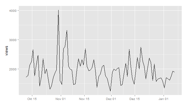
I also did some pre-processing and transformation of the dates in POSIX datetime format. A first plot shows this pattern:

ggplot(views, aes(timestamp, count)) + geom_line() + scale_x_datetime() + xlab("") + ylab("views")

wikipedia_views_USA

Now, let’s look for anomalies. The usual way would be to feed a dataframe with a date-time and a value column into the AnomalyDetection function AnomalyDetectionTs(). But in this case, this doesn’t work because our data is much too coarse. It doesn’t seem to work with data on days. So, we use the more generic function AnomalyDetectionVec() that just needs the values and some definition of a period. In this case, the period is 7 (= 7 days for one week):

res = AnomalyDetectionVec(views$count, max_anoms=0.05, direction='both', plot=TRUE, period=7)
res$plot

wikipedia_anomalies_usa

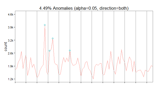
In our case, the algorithm has discovered 4 anomalies. The first on October 30 2014 being an exceptionally high value overall, the second is a very high Sunday, the third a high value overall and the forth a high Saturday (normally, this day is also quite weak).

Crowdsourcing Science

Open foresight is a great way to look into future developments. Open data is the foundation to do this comprehensively and in a transparent way. As with most big data projects, the difficult part in open foresight is to collect the data and wrangle it to a form that can actually be processed. While in classic social research you’d have experimental measurements or field notes in a well defined format, dealing with open data is always a pain: not only is there no standard – the meaningful numbers might be found anywhere in your source and be called arbitrarily; also the context is not given by some structure that you’d have imposed into your data in advanced (as we used to do it in our hypothesis-driven set-ups).

In the last decade, crowdsourcing has proven to be a remedy to dealing with all kinds of challenges that are still to complex to be fully automatized, but which are not too hard to be worked out by humans. A nice example is zooniverse.org featuring many “citizen science projects”, from finding exoplanets or classifying galaxies, to helping to model global climate history by entering historic ships’ log data.

Climate change caused by humanity might be the best defended hypothesis in science; no other theory had do be defended against more money and effort to disprove it (except perhaps evolution, which has do fight a similar battle about ideology). But apart from the description, how climate will change and how that will effect local weather conditions, we might still be rather little aware of the consequences of different scenarios. But aside from the effect of climate-driven economic change on people’s lives, the change of economy itself cannot be ignored when studying climate and understand possible feedback loops that might or might not lead into local or global catastrophe.

Zeean.net is an open data / open source project aiming at the economic impact of climate change. Collecting data is crowdsourced – everyone can contribute key indicators of geo-economic dependency like interregional and domestic flow of supply and demand in an easy “Wikipedia-like” way. And like Wikipedia, the validation is done by crowd-crosscheck of registered users. Once data is there, it can be fed into simulations. The team behind Zeean, lead by Anders Levermann at Potsdam Institute for Climate Impact Research is directly tied into the Intergovernmental Panel on Climate Change IPCC, leading research on climate change for the UN and thus being one of the most prominent scientific organizations in this field.

A first quick glance on the flows of supply shows how a conflict in the Ukraine effect the rest of the world economically.
The results are of course not limited to climate. If markets default for other reasons, the effect on other regions can be modeled in the same way.
So I am looking forward to the data itself being made public (by then brought into a meaningful structure), we could start calculating our own models and predictions, using the powerful open source tools that have been made available during the last years.

Wikipedia Attention for the Presidential Elections (Update)

Here’s another update on the analysis of Wikipedia data for the presidential candidates. What’s quite interesting, the attention value vor Mitt Romney is almost at the same level where Barack Obama has been four years ago. And Barack Obama is exactly where John McCain has been 2008:

Obama vs. Romney 2012 compared to Obama vs. McCain 2008 (Wikipedia data)

But one thing has changed: The elections as such are much more interesting to the Wikipedia users than they were 2008:

US Presidential Elections 2012 vs. 2008 (Wikipedia, daily visits)

2012 there is no pre-ballot gap as there has been four years ago.

Will Obama succeed to rally Hispanic voters? Some evidence from Wikipedia data.

Just a few hours before the ballots open for the 57th presidential election, the key question for us data scientists is: which data set could really show some special information, that would not be easily available through a classic poll. We have already seen some interesting correlations of Wikipedia usage with the ongoing campaign – just looking on how many people would search for the page on the candidates would provide a time series with many fascinating details.

Today we focused on the question, if the Democrats had been successful to rally Hispanic voters for Obama’s support. We took the Spanish Wikipedia, checkt the daily views of the Obama’s Spanish language Wikipedia-page and compared this with 2008 and also with the time series of his Republican competitors.

This table shows the monthly average for the daily views in 2008 and 2012:

McCain Romney Obama Obama
2008 2012 2008 2012
Feb 549 674 23% 2297 3154 37%
Mar 265 532 101% 949 3009 217%
Apr 181 399 120% 574 2748 379%
May 240 466 94% 817 2759 238%
Jun 435 331 -24% 2052 2477 21%
Jul 423 448 6% 668 2161 224%
Aug 501 918 83% 1289 2226 73%
Sep 1155 1285 11% 1757 2915 66%
Oct 1252 2064 65% 3005 3502 17%
Nov 2458 19110
506 841 66% 1385 2801 102%

Obama clearly leads – not only in absolute numbers but in particular regarding the increase of this year’s views with four years ago. While Romney would have gained 66% in views compared with McCain, Obama’s views would have more than doubled.

The daily views of Obama’s Spanish Wikipedia-Page have been constantly higher than four years ago while the Repubican candidates would at least at the beginning of the campaign have remained more or less on the same level. However: results for last week show an interesting difference: both candidates loose attraction regarding their Wikipedia relevance.

However, if we look just on the last week prior election day, we can see something strange happen: the view’s of Obama’s es.wikipedia-page have droped from the daily average of 5065 in 2008 to merely 3752 in 2012. The same is true for Romney versus McCain: 1795 average views in this year’s 44th week compared to 1986 in 2008.

This decreasing interest in the candidates is not reflected in the numbers that we see on other election-related search-terms. If we e.g. take ‘US Presidential Election’, we count 2672 daily views during the week before election day in 2008 and 3812 views in 2012 – the same rise in interest that we found in the English Wikipedia, too. (See the last post “Why the 2012 US elections are more exciting than 2008”). While the general interest in the elections is huge, the candidates no longer draw that much attention of the Spanish speaking community.
Maybe “Sandy” would work as an explanation since the campaing was halted during the Hurican – nevertheless it would not be plausible why only the candidates but not the election in general would suffer in awareness from this.

So we cannot draw a clear conclusion from our findings. There is evidence that Obama would have succeded to some extend to activate the interest of Hispanic people but regarding the unexpected drop we will have to drill further down. The real work, though, will anyway start right after the vote: to learn what would have been a signal and how we can seperate these from the noise next time.

Why the 2012 US elections are more exciting than 2008

Here’s an addition to my last post on using Wikipedia data to analyse attention for the US presidential elections 2012. Here’s another look at the interest not for the candidates’ Wikipedia pages but the general pages for the elections 2008 and 2012. Compared to the candidates’ pages, the attention for the general election page is much lower than for the candidates. Here’s the average values for October 2012:

  1. Mitt Romney (2012): 98,138 Views / day
  2. Barack Obama (2012): 63,104 Views / day
  3. United States presidential election, 2012 (2012): 38,770
  4. United States presidential election, 2008 (2008): 27,907

This monthly average hints at the 2012 elections being very exciting as the general election pages on Wikipedia have seen a 39% traffic increase compared to last elections. This also hold for the following time-series:

US Presidential Elections 2012 vs. 2008 (Wikipedia, daily visits)

While the attention for the election pages in 2012 did not reach the level it had during the 2008 primaries, from mid October the 2012 campaigns were much more interesting according to the Wikipedia numbers. In 2008 we have seen a drop in attention before election day, in 2012 the suspense seems to build up.

Wikipedia Attention and the US elections

One of the most interesting challenges of data science are predictions for important events such as national elections. With all those data streams of billions of posts, comments, likes, clicks etc. there should be a way to identify the most important correlations to make predictions about real-world behavior such as: going to the voting booth and chosing a candidate.

A very interesting data source in this respect is the Wikipedia. Why? Because Wikipedia is

  1. a) open (data on page-views, edits, discussions are freely available on daily or even hourly basis),
  2. b) huge (WP currently ranks as #6 of all web sites worldwide and reaches about a quarter of all online users),
  3. c) specific (people visit the Wikipedia because they want to know something about some topic)

The first step was comparing the candidates Barack Obama and Mitt Romney over time. The resulting graph clearly shows the pivoting points of Obama’s presidential career (click to zoom):

Obama vs. Romney 2009-2012 (Wikipedia data)

But it also shows how strong Mitt Romney has been since the Republican primaries in January 2012. His Wikipedia page had attracted a lot more visitors in August and September 2012 than his presidential rival’s. Of course, this measure only shows attention, not sentiment. So it cannot be inferred from this data whether the peaks were positive or negative peaks. In terms of Wikipedia attention, Romney’s infamous 47% comments in September 2012 were more than 1/3 as important as Obama’s inauguration in January 2009.

Now, let’s add some further curves to this graph: Obama’s and McCain’s Wikipedia attention during the last elections:

Obama vs. Romney 2012 compared to Obama vs. McCain 2008 (Wikipedia data)

Here’s another version with weekly data:

Obama vs. Romney 2012 compared to Obama vs. McCain 2008 (Wikipedia data, weeks)

It’s almost instantly clear how much more attention Obama’s 2008 campaign (in red) gathered in comparison with his 2012 campaign (in green). On the other hand, Mitt Romney is at least when it comes to Wikipedia attention more interesting than McCain had been.

Here’s a comparison of Obama’s 2008 campaign vs. his 2012 campaign:

Obama 2008 vs. Obama 2012 (Wikipedia data)

The last question: Is Mitt Romney 2012 as strong as Obama had been in 2008? Here’s a direct comparison:

Obama 2008 vs. Romney 2012 (Wikipedia data, weekly)

A side-remark: I also did a correlation of this data set with Google Correlate. And guess what: The strongest correlation of the data for Obama’s 2012 campaign is the Google search query for “barack obama wikipedia”. There still seem to be a huge number of people using Google as their Wikipedia search-engine.

Google Correlate result for the Wikipedia time series "Barack Obama"
Google Correlate result for the Wikipedia time series “Barack Obama”

But this result could also be interpreted the other way round: If there is a strong correlation between Wikipedia usage and Google search queries, this makes Wikipedia an even more important data source for analyses.