Before and After Series C funding – a network analysis of Domo

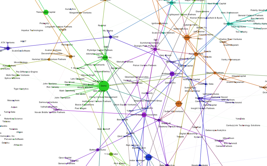
One of the most interesting Big Data companies in this network analysis of Venture Capital connections has in my opinion been Domo. Not only did it receive clearly above average funding for such a young company, but it was also one of the nodes with the best connections through Venture Capital firms and their investments. It had one of the highest values for Betweenness Centrality, which means it connects a lot of the other nodes in the Big Data landscape.

Then, some days after I did the analysis and visualization, news broke that Domo received $125M from Greylock, Fidelity, Morgan Stanley and Salesforce among others. This is a great opportunity to see what this new financing round means in terms of network structure. Here’s Domo before the round:

Domo_Before

And this is Domo $125M later. Notice how its huge Betweenness Centrality almost dwarfs the other nodes in the network. And through its new connections it is strongly connected to MongoDB:

Domo_After

Here’s a look at the numbers, before Series C:

Company Centrality
1 Domo 0.1459
2 Cloudera 0.0890
3 MemSQL 0.0738
4 The Climate Corporation 0.0734
5 Identified 0.0696
6 MongoDB, Inc. 0.0673
7 Greenplum Software 0.0541
8 CrowdFlower 0.0501
9 DataStax 0.0489
10 Fusion-io 0.0488

And now:

Company Centrality
1 Domo 0.1655
2 MemSQL 0.0976
3 Cloudera 0.0797
4 MongoDB, Inc. 0.0722
5 Identified 0.0706
6 The Climate Corporation 0.0673
7 Greenplum Software 0.0535
8 CrowdFlower 0.0506
9 DataStax 0.0459
10 Fusion-io 0.0442

The new funding round now only increases Domo’s centrality but also MongoDB’s because of the shared investors Salesforce, T. Rowe Price and Fidelity Investments.

Big Data Investment Map 2014

Here’s an updated version of our Big Data Investment Map. I’ve collected information about ca. 50 of the most important Big Data startups via the Crunchbase API. The funding rounds were used to create a weighted directed network with investments being the edges between the nodes (investors and/or startups). If there were multiple companies or persons participating in a funding round, I split the sum between all investors.

This is an excerpt from the resulting network map – made with Gephi. Click to view or download the full graphic:

BigDataInvestmentMap_2014_Small

If you feel, your company is missing in the network map, please tell us in the comments.

The size of the nodes is relative to the logarithmic total result of all their funding rounds. There’s also an alternative view focused on the funding companies – here, the node size is relative to their Big Data investments. Here’s the list of the top Big Data companies:

Company Funding
(M$, Source: Crunchbase API)
VMware 369
Palantir Technologies 343
MongoDB, Inc. 231
DataStax 167
Cloudera 141
Domo 123
Fusion-io 112
The Climate Corporation 109
Pivotal 105
Talend 102

And here’s the top investing companies:

Company Big Data funding
(M$, Source: Crunchbase API)
Founders Fund 286
Intel 219
Cisco 153
New Enterprise Associates 145
Sequoia Capital 109
General Electric 105
Accel Partners 86
Lightspeed Venture Partners 72
Greylock Partners 63
Meritech Capital Partners 62

We can also use network analytical measures to find out about which investment company is best connected to the Big Data start-up ecosystem. I’ve calculated the Betweenness Centrality measure which captures how good nodes are at connecting all the other nodes. So here are the best connected Big Data investors and their investments starting with New Enterprise Associates, Andreessen Horowitz and In-Q-Tel (the venture capital firm for the CIA and the US intelligence community).

Investor Centrality Big Data Companies
1 New Enterprise Associates 0.0863 GraphLab, MapR Technologies, Fusion-io, MongoDB, Inc., WibiData, Pentaho, CloudFlare, The Climate Corporation, MemSQL
2 Andreessen Horowitz 0.0776 ClearStory Data, Domo, Fusion-io, Databricks, GoodData, Continuuity, Platfora
3 In-Q-Tel 0.0769 Cloudera, Recorded Future, Cloudant, MongoDB, Inc., Platfora, Palantir Technologies
4 Founders Fund 0.0623 Declara, CrowdFlower, The Climate Corporation, Palantir Technologies, Domo
5 SV Angel 0.0602 Cloudera, Domo, WibiData, Citus Data, The Climate Corporation, MemSQL
6 Khosla Ventures 0.0540 ParStream, Metamarkets, MemSQL, ClearStory Data, The Climate Corporation
7 IA Ventures 0.0510 Metamarkets, Recorded Future, DataSift, MemSQL
8 Data Collective 0.0483 Trifacta, ParStream, Continuuity, Declara, Citus Data, Platfora, MemSQL
9 Hummer Winblad Venture Partners 0.0458 NuoDB, Karmasphere, Domo
10 Battery Ventures 0.0437 Kontagent, SiSense, Continuuity, Platfora

Pastagram

While preparing and arranging today’s meal – Penne al Forno con Polpettine – to be documented and posted on Instagram, I thought: Why not preparing and arranging a pasta network with the help of the Instagram API and the Gephi network visualization software. I did this before for many other things such as Chinese cities or spring.

The special Instagram magic lies in the hashtags users are posting to their (and their friends’) images. These hashtags can be used to create social network datasets out of the image streams of the API. If someone is posting an image of their pasta dish and is tagging it with “#salmon”, then this tag is the link to all other images also tagged with “#salmon”. Theoretically one could do the next search for salmon and find out which images are referred to by this hashtag. This would produce a large map of human concepts plus their visualization in photographs.

What I did was taking a really small sample of 40 pasta images posted to Instagram during the last week and calculated the links between a) images and b) hashtags. The result is a bimodal network: images are connected to hashtags; and hashtags are connected to images and other hashtags. This is the resulting network:

Pasta Social Network Analysis

I also created a version with all the images in the network as thumbnail, so you can see the different qualities in the image (brightness, colours, composition, filters etc.) Right now I am working an a way to automatically assemble and publish image based networks that would properly embed the images.

Some facts about pasta imagery on Instagram:

  • There’s dinner pasta (upper left) and lunch pasta (upper right). Lunch pasta tends to be more colorful and bright, while dinner pasta can be very dim arrangements on restaurant tables or unboxed pizza and pasta deliveries.
  • Another interesting category is tagged with “distasters”. This hashtags clearly corresponds to the images.
  • The most important hashtags are: pasta, food, chicken, foodporn, delicious, italian, cooking, yummy, foodgasm, foodie.
  • When looking at a larger sample of pasta pictures, the most important hashtags change a bit, but our small sample seems to be quite representative: pasta, food, foodporn, yummy, lunch, dinner, delicious, yum, italian, cheese, spaghetti, homemade …
  • Filters are very frequently used in pasta photography: only 22% of all images are posted without any filters.

Finally, here’s a look at the top five pasta images:

4 out of 5 are photographed by Japanese IGers. So the next thing to look at will be the regional distribution of food hashtags. To be continued.

Telling stories with network data: Spring on Instagram

The days are getting longer, the first flowers come into bloom and a very specific set of hashtags are spreading through Social Media platforms – it’s spring again! In this blogpost I took a look at spring-related pictures on Instagram. Right now, the use of hashtags on Instagram has not entered the mainstream. For this analysis, I took a look at the latest 938 images tagged with “#spring”. The average rate was 12 spring-tagged pictures a day, but this rate will be increasing during the next days and weeks.

The following hashtags were most frequently used in combination with the #spring hashtag:

  1. Flower(s) (198 mentions, 2639 likes)
  2. Sun (160, 2018)
  3. Tree(s) (130, 2230)
  4. Nature (128, 2718)
  5. Love (119, 1681)
  6. Girl (107, 1469)
  7. Sky (89, 2057)
  8. Fashion (64, 924)
  9. Beautiful (61, 1050)
  10. Blue (59, 1234)

Although I would associate spring with green, the Instagram community has other preferences:

  1. Blue (59 mentions, 1234 likes)
  2. Pink (42, 396)
  3. Green (40, 444)
  4. White (29, 457)
  5. Yellow (22, 369)
  6. Red (17, 230)
  7. Black (16, 267)
  8. Brown (7, 117)
  9. Orange (7, 77)
  10. Grey (3, 50)

So these are the spring colors according to Instagram hashtags

Here are the top 15 most liked spring pictures on Instagram right now:

Here’s the tag network that is showing the relations between the 2445 other unique hashtags that appeared in connection with #spring (see PDF):

Instagram wouldn’t be half the fun without the various filters to apply to the images. But #spring is best enjoyed in natural form. 28% of all #spring posts were posted without any additional filter:

  1. Normal (261)
  2. X-Pro II (91)
  3. Rise (83)
  4. Amaro (81)
  5. Lo-fi (68)
  6. Hefe (54)
  7. Earlybird (48)
  8. Hudson (41)
  9. Sierra (34)
  10. Valencia (33)

Strata Conference – the first day

Here’s a network visualization of all tweets referring to the hashtag “#strataconf” (click to enlarge). The node size is representing the number of incoming links, i.e. the number of times this person has been mentioned in other people’s tweets:

This network map has been generated in three steps:

1) Data collection: I collected the twitter data with the open source application YourTwapperKeeper. This is the DIY version of the TwapperKeeper platform that had been very popular in the scientific community. Unfortunately after the acquisition by HootSuite it is no longer available to the general public, but John O’Brien has made the scripts available via his githup. I am running yTK on a Amazon EC2 instance. What it does is connecting to the Twitter Streaming API and fetching all tweets with “#strataconf” in realtime and additionally doing regular searches via the Search API to find tweets that had been overlooked by the Streaming API.

2) Data processing: What is so great about yTK: It offers different methods to fetch the tweets you collected. I am using the JSON API to get the tweets downloaded to my computer. This is done with a Python script. The script opens the JSON file and then scans the tweets for mentions or retweets with the following regular expressions I borrowed from Matthew Russell’s book Mining the Social Web:

rt_patterns = re.compile(r"(RT|via)((?:\b\W*@\w+)+)", re.IGNORECASE)
at_pattern = re.compile(r"@(\w+)", re.IGNORECASE)

Then I am using the very convenient library igraph to write the results in the generic graphml file format that can be processed by various network analysis tools. Basically I am just using this snipped of code on all tweets I found to generate the list of nodes:

if not tweet['from_user'].lower() in nodes:
    nodes.append(tweet['from_user'].lower())

… and edges:

for mention in at_pattern.findall(tweet['text']):
    mentioned.append(mention.lower())
    if not mention.lower() in nodes:
        nodes.append(mention.lower())
    edges.append((nodes.index(tweet['from_user'].lower()),nodes.index(mention.lower())))

The graph is generated with the following lines of code:

g = Graph(len(nodes), directed=True)
g.vs["label"] = nodes
g.add_edges(edges)

This is almost the whole code for processing the network data.

3) Visualization: The visualization of the graph is done with the wonderful cross-platform tool Gephi. To generate the graph above, I reduced the network to all nodes that have at least one other node referring to it. Then I sized the nodes according to their total number of degrees, that is how often they were mentioned in other people’s tweets or how often they were mentioning other users. The color is determined by the modularity clustering algorithm. Then I used the Force Atlas layout algorithm and voilà – here’s the network map.

DLD Conference – what were Twitter users discussing?

While I was taking a look at the network dynamics and relations of the Twitter conversations at the DLD conference in Munich, Salesforce and Radian6 took a more “traditional” approach and segmented the conversations in terms of topics, users and countries. While a tag cloud is able to give a first impression on the relevant content of the discussions, a semantic analysis goes much deeper and shows the relations between the terms used by the conference attendants. Here’s a look at the most important and most frequently connected words related to the Twitter hashtags “#DLD12” and “#DLD”:

The most frequently used words and related concepts have been the following:

See also: Networking at the DLD conference part 1 and part 2

Networking at Davos – 1st day

Now, that the World Economic Forum at Davos has started, also the conversational buzz on Twitter is increasing. While yesterday news agencies and journalists dominated the buzz, this morning (data ranging from 10:15 to 11:40) clearly has been a Paulo Coelho moment. The following tweet has been the most frequently retweeted #WEF tweet:

The most mentioned accounts in this time frame have been the following: @paulocoelho (265 mentions and retweets), @jeffjarvis (81), @bill_gross (74), @davos (63) and @loic (39). Interestingly, these five most frequently mentioned accounts did not contribute much to the Davos related Twitter conversations: Paulo Coelho mentioned #WEF in a tweet that has been resounding in the analyzed time frame and Jeff Jarvis did post three tweets. Here’s a visualization of the Twitter users mentioning each other. The larger a node, the more often it has been mentioned by other users.

If we take a look at the content, the most frequently mentioned words have been: wef (1001 times), davos (886), rt (= retweet, 827), need (301 times) and going (281 times). The last two words are clearly related to Paulo Coelhos tweet mentioned above. Other interesting words that have been connected to WEF and Davos are: crisis (89 times), world (88), bankers (61), responsibility (57), people (55), refuse (55), CEO (51) and fear (49):

Networking at the DLD conference (Part II)

As promised, here’s the second part of the DLD conference network analysis. We left the conference Monday afternoon. The remaining day looked like this:

The conference account @DLDConference and Idealab founder @Bill_Gross still are the most important Twitter discussions nodes in terms of PageRank. But there are also some new names and clusters in this map, for example enterpreneur Martin Varsawsky (@martinvars), the NGO @ashoka and BestBuy CTO @rstephens. On Tuesday, it looks quite different. This clearly has been Jeff Jarvis’ day. Not only did he take Bill Gross’ place but also overtook the official DLD conference account. But he hasn’t been the only new influencer today: Wikipedia’s Jimmy Wales, Huffington Post’s Arianna Huffington and Facebook’s COO Sheryl Sandberg also were important nodes in the DLD Twitter conversational network.

Here’s the map for the final DLD day:

Visually spoken: The conference is starting to dissolve. And people are moving on to Davos and getting ready for the World Economic Forum there.

Networking at Davos – getting ready for the WEF [updated]

The same thing that can be done for the DLD conference in Munich can of course be done for the WEF in Davos. This gives us a good opportunity to compare pre-conference and conference buzz of the two gatherings and compare actors, topics and network structures. Here’s a first glance at the Twitter conversation network for the hashtags #WEF and #Davos (recorded from Mon 7:15 pm to Tue 11:30 am):

One thing is very obvious from this structure: The WEF is much more of a news media event than the DLD (see the visualization of the DLD network from the day before the event). There are two very densely populated clusters of journalists from Reuters (red in the top right of the map) dominated by @rtrs_biztravel, @reuters_davos and journalist @reuters_davos and another BBC cluster (light brown on the right) dominated by @bbcworld. And there is also the guardian (deep blue on the bottom left) Other actors that have influential network positions are @worldbank and (this could become interesting) @occupy_wef. All in all the buzz generated by #WEF and #Davos appears to be significantly larger than the DLD related buzz.

Most frequently mentioned are: @davos (222 mentions), @bbcworld (94), @worldbank (58), @reuters_davos (49) and @wef (44). Most active users are Bloomberg’s @tomkeene (16 Davos tweets), @loupo85 (10), journalist Ken Graggs @betweenmyths (8), Reuters Social Media editor @antderosa (7) and Schwab Foundation @schwabfound (7).

UPDATE: And here is the first update to the network graphic. The data is now covering Tue 11:30 am to Tue 6:15 pm. That’s 1,600 tweets within 6.75 hours. So, the pace is clearly accelerating. For the first WEF analysis, we analysed 1,600 tweets within 16.25 hours. Now let’s take a look at the resulting network diagram:

Now, the Reuters and BBC clusters that dominated the Twitter discussions in the morning, have somewhat dissolved. Instead, there are new clusters centering on Bloomberg (light green and pink on the right), Angela D. Merkel (violet bottom right) – which by the way is not the official account of the German chancellor -, Yunus centre (violet at the top), Scott Gilmore (green at the top) and a very dense minicluster of Turkish EU affairs minister Egemen Bagis and Ozlem Denizmen (green at the top left). So it’s definitely starting to get more political 😉 The Occupy WEF cluster has been joined (structurally) by Amnesty WEF and has been connected (or interwoven) to the former Reuters cluster.

Here’s a list of the most frequently mentioned Twitter accounts in conversations with the hashtags “#WEF’ or ‘#Davos’: @davos (109 mentions), @ozlem_denizmen (45), @bloombergnews (43), @egemen_bagis (39) and @wef (36). The most active conversationalists are: @competia (12 posts), @antderosa (11), @mccarthyryanj (9), @wfp_business (9) and @sachailichopra (9).

Networking at the DLD conference

A rather traditional application of network analysis is taking a look at conference talk on social networks such as Twitter. Right now, Burda’s DLD conference in Munich is the best research object for this purpose – especially because Twitter’s CEO Jack Dorsey is one of the speakers. I began my tracking of conference on the day before. I thought it would be rather interesting to compare pre-conference and conference chatter in terms of the volume of buzz and the most influential people or accounts. So, here’s a look at the buzz up to Saturday, the night before the official conference launch:

Obviously, the activity is quite limited and the official account of the conference, @DLDConference, is the most frequently mentioned Twitter account (129 times) followed by @marcelreichart (24 times) who is one of the hosts. Other people who have been mentioned more than once are @sinaafra (12), @bill_gross (7) and @yokoono (7):

If we switch the perspective from the people most frequently mentioned to the most active people, suddenly there is a quite different set of Twitter users with aninanet (60 tweets), livestream (11) and idit (10) most frequently tweeting about “#DLD12”. Here’s the information in a bit more structured format:

Now take a look at the next visualization that captures the Twitter activity from afternoon to midnight on the first DLD day: The difference to the first network is striking. Now, @DLDConference has lost some influence – which is good because it’s not a good sign if the official conference account is the only one posting Tweets about a conference. And there are new people who are mentioned very frequently: @DLDConference (106 mentions), @bill_gross (84), @jack (70), @martinvars (31) and @jeffjarvis (31). The most active users were @jessicascorpio (15 tweets), @powercoach (14) and @DLDconference (12).

The size of the nodes in this visualization is the account’s page rank. The higher the page rank the higher the probability of reaching this node by chance while traveling through the network. Nodes with a high page rank have a high influence in the network. Nodes with a very high page rank were: @DLDconference, @lindastone, @hlmorgan and @bill_gross. The width of the arrows reflects the number of times one Twitter account has mentioned or retweeted another account. The strongest links were: @powercoach mentioning @jack, @burda_news mentioning @DLDConference and @mammonaetheevil mentioning @alecjross.

Finally, here’s a quick glance at the network for Monday. All DLD-related tweets from 0:00 until 16:00 have been counted and analyzed. The network is getting more and more dense.

Tomorrow I’m posting another update with the remaining Monday and Tuesday tweets and I’ll take a look at the content posted by the users. Read the update in part 2 of the article.

The rise of the data scientists

One of the most important market research buzzwords in 2012 will be big data. Even the future of a large Internet company like Yahoo! can be reduced to this question: What’s your approach on big data (AdAge published an interesting interview with new Yahoo! CEO Scott Thompson about this topic). At first glance, this phenomenon does not appear to be new: There are large masses of data waiting to be analyzed and interpreted. These data oceans have been there before – just think of the huge databases of customer transactions, classic web server log files or astronomical data from the observatories.
bigdata_network
But there does seem to be a new twist on this topic. I believe the following four dimensions really hint at a new understanding of big data:

  1. Democratization of technology: The tools that are needed to analyze terabytes of data have been democratized. Everyone who has some old desktop PCs in his basement, can transform them into a high-performance Hadoop cluster and start analyzing big data. The software for data gathering, storage, analysis and visualization is more often than not freely available open source software. For those that don’t happen to have a lot of PCs around, there’s always the option of buying computing time and storage at Amazon.
  2. A new ecosystem: In the meanwhile there is a very active global scene of big data hackers, who are working on various big data technologies and exchanging their use cases in presentations and papers. If you look at the bios of these big data hackers, it becomes apparent that this ecosystem is not dominated by academic research teams, but data scientists working for large Internet companies such as Google, Yahoo!, Twitter or Facebook. This clearly is a difference to e.g. the Python developer community or the R statistics community. In the moment people seem to be moving away from Google, Facebook and the like and joining the ranks of specialized big data companies.
  3. Network visualization: Visual exploration of data has become almost as important as the classic statistic methodology of looking for causalities. This has the effect that social network analysis (SNA) has gained importance. Almost all social phenomena and large data sets from venture capitalists to LOLcat memes can be visualized and interpreted as networks. Here again, open source software and open data interfaces are playing an important roles. In the near future, software such as the network analysis and visualization tool Gephi can connect directly to the interfaces (APIs) of Facebook, Twitter, Wikipedia and the like and processed the retrieved data immediately.
  4. New skills and job descriptions: One particular hot buzzword in the big data community is the “data scientist”, who is responsible for gathering and leveraging all data produced in “classic” companies as well as Internet companies. On Smart Planet, I found a very good description of the various new data jobs: There will be a) system administrators who are setting up and maintaining large Hadoop clusters and ensure that the data flow will not be disrupted, b) developers (or “map reducers”) who are developing applications needed to access and evaluate data, c) the data scientists or analysts whose job is telling stories with data and to craft products and solutions and finally d) the data curators who watch over quality and linkage of the data.

To gain a better understanding of how the big data community is seeing itself, I analyzed the Twitter bios of 200 leading big data analysts, developers and entrepreneurs: I transformed all the short bios into a textual network with the words and concepts as nodes and shared mentions of concepts as edges. So, every time, someone is describing himself as “Hadoop committer”, there will be another edge in this network between “Hadoop” and “Committer”. All in all, this network encompasses 800 concepts and 3200 links between concepts. To explore and visualize the network, I reduced it to approximately 15 per cent of its volume and focused on the most frequently mentioned terms (e.g. Big Data, founder, analytics, Apache, Hadoop, Cloudera). The resulting visualization made with Gephi can be seen above.