DLD Conference – what were Twitter users discussing?

While I was taking a look at the network dynamics and relations of the Twitter conversations at the DLD conference in Munich, Salesforce and Radian6 took a more “traditional” approach and segmented the conversations in terms of topics, users and countries. While a tag cloud is able to give a first impression on the relevant content of the discussions, a semantic analysis goes much deeper and shows the relations between the terms used by the conference attendants. Here’s a look at the most important and most frequently connected words related to the Twitter hashtags “#DLD12” and “#DLD”:

The most frequently used words and related concepts have been the following:

See also: Networking at the DLD conference part 1 and part 2

Networking at Davos – 1st day

Now, that the World Economic Forum at Davos has started, also the conversational buzz on Twitter is increasing. While yesterday news agencies and journalists dominated the buzz, this morning (data ranging from 10:15 to 11:40) clearly has been a Paulo Coelho moment. The following tweet has been the most frequently retweeted #WEF tweet:

The most mentioned accounts in this time frame have been the following: @paulocoelho (265 mentions and retweets), @jeffjarvis (81), @bill_gross (74), @davos (63) and @loic (39). Interestingly, these five most frequently mentioned accounts did not contribute much to the Davos related Twitter conversations: Paulo Coelho mentioned #WEF in a tweet that has been resounding in the analyzed time frame and Jeff Jarvis did post three tweets. Here’s a visualization of the Twitter users mentioning each other. The larger a node, the more often it has been mentioned by other users.

If we take a look at the content, the most frequently mentioned words have been: wef (1001 times), davos (886), rt (= retweet, 827), need (301 times) and going (281 times). The last two words are clearly related to Paulo Coelhos tweet mentioned above. Other interesting words that have been connected to WEF and Davos are: crisis (89 times), world (88), bankers (61), responsibility (57), people (55), refuse (55), CEO (51) and fear (49):

Networking at the DLD conference (Part II)

As promised, here’s the second part of the DLD conference network analysis. We left the conference Monday afternoon. The remaining day looked like this:

The conference account @DLDConference and Idealab founder @Bill_Gross still are the most important Twitter discussions nodes in terms of PageRank. But there are also some new names and clusters in this map, for example enterpreneur Martin Varsawsky (@martinvars), the NGO @ashoka and BestBuy CTO @rstephens. On Tuesday, it looks quite different. This clearly has been Jeff Jarvis’ day. Not only did he take Bill Gross’ place but also overtook the official DLD conference account. But he hasn’t been the only new influencer today: Wikipedia’s Jimmy Wales, Huffington Post’s Arianna Huffington and Facebook’s COO Sheryl Sandberg also were important nodes in the DLD Twitter conversational network.

Here’s the map for the final DLD day:

Visually spoken: The conference is starting to dissolve. And people are moving on to Davos and getting ready for the World Economic Forum there.

Networking at Davos – getting ready for the WEF [updated]

The same thing that can be done for the DLD conference in Munich can of course be done for the WEF in Davos. This gives us a good opportunity to compare pre-conference and conference buzz of the two gatherings and compare actors, topics and network structures. Here’s a first glance at the Twitter conversation network for the hashtags #WEF and #Davos (recorded from Mon 7:15 pm to Tue 11:30 am):

One thing is very obvious from this structure: The WEF is much more of a news media event than the DLD (see the visualization of the DLD network from the day before the event). There are two very densely populated clusters of journalists from Reuters (red in the top right of the map) dominated by @rtrs_biztravel, @reuters_davos and journalist @reuters_davos and another BBC cluster (light brown on the right) dominated by @bbcworld. And there is also the guardian (deep blue on the bottom left) Other actors that have influential network positions are @worldbank and (this could become interesting) @occupy_wef. All in all the buzz generated by #WEF and #Davos appears to be significantly larger than the DLD related buzz.

Most frequently mentioned are: @davos (222 mentions), @bbcworld (94), @worldbank (58), @reuters_davos (49) and @wef (44). Most active users are Bloomberg’s @tomkeene (16 Davos tweets), @loupo85 (10), journalist Ken Graggs @betweenmyths (8), Reuters Social Media editor @antderosa (7) and Schwab Foundation @schwabfound (7).

UPDATE: And here is the first update to the network graphic. The data is now covering Tue 11:30 am to Tue 6:15 pm. That’s 1,600 tweets within 6.75 hours. So, the pace is clearly accelerating. For the first WEF analysis, we analysed 1,600 tweets within 16.25 hours. Now let’s take a look at the resulting network diagram:

Now, the Reuters and BBC clusters that dominated the Twitter discussions in the morning, have somewhat dissolved. Instead, there are new clusters centering on Bloomberg (light green and pink on the right), Angela D. Merkel (violet bottom right) – which by the way is not the official account of the German chancellor -, Yunus centre (violet at the top), Scott Gilmore (green at the top) and a very dense minicluster of Turkish EU affairs minister Egemen Bagis and Ozlem Denizmen (green at the top left). So it’s definitely starting to get more political 😉 The Occupy WEF cluster has been joined (structurally) by Amnesty WEF and has been connected (or interwoven) to the former Reuters cluster.

Here’s a list of the most frequently mentioned Twitter accounts in conversations with the hashtags “#WEF’ or ‘#Davos’: @davos (109 mentions), @ozlem_denizmen (45), @bloombergnews (43), @egemen_bagis (39) and @wef (36). The most active conversationalists are: @competia (12 posts), @antderosa (11), @mccarthyryanj (9), @wfp_business (9) and @sachailichopra (9).

Networking at the DLD conference

A rather traditional application of network analysis is taking a look at conference talk on social networks such as Twitter. Right now, Burda’s DLD conference in Munich is the best research object for this purpose – especially because Twitter’s CEO Jack Dorsey is one of the speakers. I began my tracking of conference on the day before. I thought it would be rather interesting to compare pre-conference and conference chatter in terms of the volume of buzz and the most influential people or accounts. So, here’s a look at the buzz up to Saturday, the night before the official conference launch:

Obviously, the activity is quite limited and the official account of the conference, @DLDConference, is the most frequently mentioned Twitter account (129 times) followed by @marcelreichart (24 times) who is one of the hosts. Other people who have been mentioned more than once are @sinaafra (12), @bill_gross (7) and @yokoono (7):

If we switch the perspective from the people most frequently mentioned to the most active people, suddenly there is a quite different set of Twitter users with aninanet (60 tweets), livestream (11) and idit (10) most frequently tweeting about “#DLD12”. Here’s the information in a bit more structured format:

Now take a look at the next visualization that captures the Twitter activity from afternoon to midnight on the first DLD day: The difference to the first network is striking. Now, @DLDConference has lost some influence – which is good because it’s not a good sign if the official conference account is the only one posting Tweets about a conference. And there are new people who are mentioned very frequently: @DLDConference (106 mentions), @bill_gross (84), @jack (70), @martinvars (31) and @jeffjarvis (31). The most active users were @jessicascorpio (15 tweets), @powercoach (14) and @DLDconference (12).

The size of the nodes in this visualization is the account’s page rank. The higher the page rank the higher the probability of reaching this node by chance while traveling through the network. Nodes with a high page rank have a high influence in the network. Nodes with a very high page rank were: @DLDconference, @lindastone, @hlmorgan and @bill_gross. The width of the arrows reflects the number of times one Twitter account has mentioned or retweeted another account. The strongest links were: @powercoach mentioning @jack, @burda_news mentioning @DLDConference and @mammonaetheevil mentioning @alecjross.

Finally, here’s a quick glance at the network for Monday. All DLD-related tweets from 0:00 until 16:00 have been counted and analyzed. The network is getting more and more dense.

Tomorrow I’m posting another update with the remaining Monday and Tuesday tweets and I’ll take a look at the content posted by the users. Read the update in part 2 of the article.

Telling stories with network data: Instagram in China

One of the most interesting sources of social media data right now is the iPhone based image sharing platform Instagram. This social networking platform is based on images, which can be compared with Flickr, but with Instagram the global dimension is much more visible. And because of the seamless Twitter and Facebook integration, the networking component is stronger. And it has a great API 😉

The first thing that came to my mind when looking at the many options, the API is providing to developers, has been the tags. In the Instagram application, there is no separate field for tagging your (or other peoples’) images. Instead you would write it in the comment field as you would do in Twitter. But the API allows to fetch data by hashtags. After reading this fascinating article (and looking at the great images) in Monocle about the northern Chinese city of Harbin, I wanted to learn more about the visual representation of this city in Instagram.

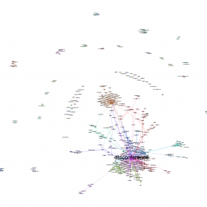
What I did was the following: I wrote a short Python program that fetched the 1.000 most recently posted images for any hashtag. As I could not get the two available Instagram Python modules to work properly, I wrote my own interface to Instagram based on pycurl. The data is then transformed into a network based on the co-occurence of hashtags for the images and saved in GraphML format with the Python module igraph. Other data (such as filters, users, locations etc.) that can be evaluated is saved in separate data sets. Here’s the network visualizations for China, Shanghai, Beijing, Hongkong, Shenzen and Harbin – not the whole network, but a reduced version only with the tags that were mentioned at least five times (click to enlarge):

I also calculated some interesting indicators for the six hashtags I explored:

The first thing to notice is that Harbin obviously is not as often being instagrammed as the Shanghai, Shenzhen, Hongkong or Beijing. An interesting indicator here is in the second data column: the daily number of images tagged with this location. Shenzhen seems to be the most active city with 3.4 images tagged “#shenzen”. Beijing is almost as active, while Shanghai is a bit behind. Finally, for Harbin, there’s not even one image every day. The unique tags is showing the diversity of hashtags used to describe images. Here, China is clearly in the lead. The next two indicators tell something about the connections between the tags: The density is calculated as the relation of actual to possible edges between the network nodes. Here, the smaller network of Harbin has the highest density and China and Shanghai the lowest. The average path length is a little below 2 for all hashtags.

Now, let’s take a look at the most frequently used hashtags:

What is interesting here: Harbin clearly does tell a story about snow, cold weather and a ice sculpture park, while Shanghai seems to be home for users frequently tagging themselves to advertise their instagramming skills (I marked the tags that refer to usernames with an asterisk). Most of the frequently used hashtags are Instagram lingo (instagood, instagram, ig, igers, instamood), refer to the equipment (iphonesia, iphoneography) or the region (china). Topical hashtags, that tell something about the city or the community can seldom be found in the top hashtags. Nonetheless, they are there. Here’s a selection of hashtags telling a story about the cities:

Finally, here is the most frequently liked image for each of the hashtags – to remind us that the numbers and networks only tell half the story. Enjoy and see if you can spot the ice sculptures in Harbin!

China:

Shanghai:

Beijing:

Hongkong:

Shenzhen:

Harbin:

The rise of the data scientists

One of the most important market research buzzwords in 2012 will be big data. Even the future of a large Internet company like Yahoo! can be reduced to this question: What’s your approach on big data (AdAge published an interesting interview with new Yahoo! CEO Scott Thompson about this topic). At first glance, this phenomenon does not appear to be new: There are large masses of data waiting to be analyzed and interpreted. These data oceans have been there before – just think of the huge databases of customer transactions, classic web server log files or astronomical data from the observatories.
bigdata_network
But there does seem to be a new twist on this topic. I believe the following four dimensions really hint at a new understanding of big data:

  1. Democratization of technology: The tools that are needed to analyze terabytes of data have been democratized. Everyone who has some old desktop PCs in his basement, can transform them into a high-performance Hadoop cluster and start analyzing big data. The software for data gathering, storage, analysis and visualization is more often than not freely available open source software. For those that don’t happen to have a lot of PCs around, there’s always the option of buying computing time and storage at Amazon.
  2. A new ecosystem: In the meanwhile there is a very active global scene of big data hackers, who are working on various big data technologies and exchanging their use cases in presentations and papers. If you look at the bios of these big data hackers, it becomes apparent that this ecosystem is not dominated by academic research teams, but data scientists working for large Internet companies such as Google, Yahoo!, Twitter or Facebook. This clearly is a difference to e.g. the Python developer community or the R statistics community. In the moment people seem to be moving away from Google, Facebook and the like and joining the ranks of specialized big data companies.
  3. Network visualization: Visual exploration of data has become almost as important as the classic statistic methodology of looking for causalities. This has the effect that social network analysis (SNA) has gained importance. Almost all social phenomena and large data sets from venture capitalists to LOLcat memes can be visualized and interpreted as networks. Here again, open source software and open data interfaces are playing an important roles. In the near future, software such as the network analysis and visualization tool Gephi can connect directly to the interfaces (APIs) of Facebook, Twitter, Wikipedia and the like and processed the retrieved data immediately.
  4. New skills and job descriptions: One particular hot buzzword in the big data community is the “data scientist”, who is responsible for gathering and leveraging all data produced in “classic” companies as well as Internet companies. On Smart Planet, I found a very good description of the various new data jobs: There will be a) system administrators who are setting up and maintaining large Hadoop clusters and ensure that the data flow will not be disrupted, b) developers (or “map reducers”) who are developing applications needed to access and evaluate data, c) the data scientists or analysts whose job is telling stories with data and to craft products and solutions and finally d) the data curators who watch over quality and linkage of the data.

To gain a better understanding of how the big data community is seeing itself, I analyzed the Twitter bios of 200 leading big data analysts, developers and entrepreneurs: I transformed all the short bios into a textual network with the words and concepts as nodes and shared mentions of concepts as edges. So, every time, someone is describing himself as “Hadoop committer”, there will be another edge in this network between “Hadoop” and “Committer”. All in all, this network encompasses 800 concepts and 3200 links between concepts. To explore and visualize the network, I reduced it to approximately 15 per cent of its volume and focused on the most frequently mentioned terms (e.g. Big Data, founder, analytics, Apache, Hadoop, Cloudera). The resulting visualization made with Gephi can be seen above.