Since I’ve seen this beautiful color wheel visualizing the colors of Flickr images, I’ve been fascinated with large scale automated image analysis. At the German Market Research association’s conference in late April, I presented some analyses that went in the same direction (click to enlarge):

On the image above you can see the color values ordered by their hue from images taken in Germany between August 2010 and April 2013. Each row represents the aggregation of 2.000 images downloaded from the Flickr API. I did this with the following R code:
bbox <- "5.866240,47.270210,15.042050,55.058140"

pages <- 10

maxdate <- "2010-08-31"

mindate <- "2010-08-01"


for (i in 1:pages) {

api <- paste("http://www.flickr.com/services/rest/?method=flickr.photos.search&format=json&api_key=YOUR_API_KEY_HERE &nojsoncallback=1&page=", i, "&per_page=500&bbox=", bbox, "&min_taken_date=", mindate, "&max_taken_date=", maxdate, sep="")

raw_data <- getURL(api, ssl.verifypeer = FALSE)


data <- fromJSON(raw_data, unexpected.escape="skip", method="R")

# This gives a list of the photo URLs including the information

# about id, farm, server, secret that is needed to download

# them from staticflickr.com

}
To aggregate the color values, I used Vijay Pandurangans Python script he wrote to analyze the color values of Indian movie posters. Fortunately, he open sourced the code and uploaded it on GitHub (thanks, Vijay!)
The monthly analysis of Flickr colors clearly hints at seasonal trends, e.g. the long and cold winter of 2012/2013 can be seen in the last few rows of the image. Also, the soft winter of 2011/2012 with only one very cold February appears in the image.
To take the analysis even further, I used weather data from the repository of the German weather service and plotted the temperatures for the same time frame:
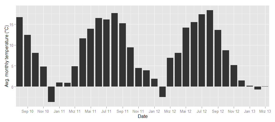
Could this be the same seasonality? To find out how the image color values above and the temperature curve below are related, I calculated the correlation between the dominance of the colors and the average temperature. Each month can not only be represented as a hue band, but also as a distribution of colors, e.g. the August 2010 looks like this:
So there’s a percent value for each color and each month. When I correlated the temperature values and the color values, the colors with the highest correlations were green (positive) and grey (negative). So, the more green is in a color band, the higher the average temperature in this month. This is how the correlation looks like:
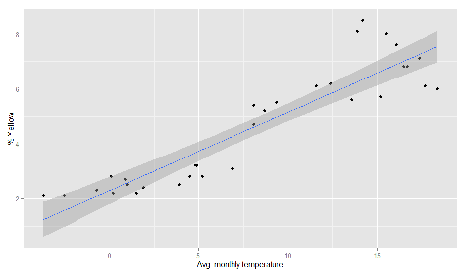
The model actually is pretty good:
> fit <- lm(temp~yellow, weather)

> summary(fit)

Call:

lm(formula = temp ~ yellow, data = weather)

Residuals:

Min 1Q Median 3Q Max

-5.3300 -1.7373 -0.3406 1.9602 6.1974


Coefficients:

Estimate Std. Error t value Pr(>|t|)

(Intercept) -5.3832 1.2060 -4.464 0.000105 ***

yellow 2.9310 0.2373 12.353 2.7e-13 ***

---

Signif. codes: 0 '***' 0.001 '**' 0.01 '*' 0.05 '.' 0.1 ' ' 1

Residual standard error: 2.802 on 30 degrees of freedom

Multiple R-squared: 0.8357, Adjusted R-squared: 0.8302

F-statistic: 152.6 on 1 and 30 DF, p-value: 2.695e-13
Of course, it can even be improved a bit by calculating it with a polynomial formula. With second order polynomials lm(temp~poly(yellow,2), weather), we even get a R-squared value of 0.89. So, even when the pictures I analysed are not always taken outside, there seems to be a strong relationship between the colors in our Flickr photostreams and the temperature outside.