Cosmopolitan Public Spaces

Mentions of the Gezi Park protests on Twitter

In my PhD and post-doc research projects at the university, I did a lot of research on the new cosmopolitanism together with Ulrich Beck. Our main goal was to test the hypothesis of an “empirical cosmopolitanization”. Maybe the term is confusing and too abstract, but what we were looking for were quite simple examples for ties between humans that undermine national borders. We were trying to unveil the structures and processes of a real-existing cosmopolitanism.

I looked at a lot of statistics on transnational corporations and the evolution of transnational economic integration. But one of the most exciting dimensions of the theory of cosmopolitanism is the rise of a cosmopolitan public sphere. This is not the same as a global public that can be found in features such as world music, Hollywood blockbusters or global sports events. A cosmopolitan public sphere refers to solidarity with other human beings.

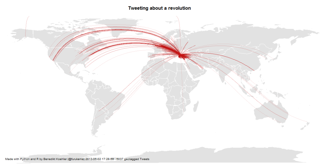
When I discovered the discussions on Twitter about the Gezi Park protests in Istanbul, this kind of cosmopolitan solidarity seems to assume a definite form: The lines that connect people all over Europe with the Turkish protesters are not the usual international relations, but they are ties that e.g. connect Turkish emigrants, political activists, “Wutbürger” or generally political aware citizens with the events in Istanbul. Because only about 1% of all tweets carry information about the geo-position of the user, you should imagine about 100 times more lines to see the true dimension of this phenomenon.

Mapping a Revolution

Twitter has become an important communications tool for political protests. While mass media are often censored during large-scale political protests, Social Media channels remain relatively open and can be used to tell the world what is happening and to mobilize support all over the world. From an analytic perspective tweets with geo information are especially interesting.

Here’s some maps I did on the basis of ~ 6,000 geotagged tweets from ~ 12 hours on 1 and 2 Jun 2013 referring to the “Gezi Park Protests” in Istanbul (i.e. mentioning the hashtags “occupygezi”, “direngeziparki”, “turkishspring”* etc.). The tweets were collected via the Twitter streaming API and saved to a CouchDB installation. The maps were produced by R (unfortunately the shapes from the map package are a bit outdated).

*”Turkish Spring” or “Turkish Summer” are misleading terms as the situation in Turkey cannot be compared to the events during the “Arab Spring”. Nonetheless I have included them in my analysis because they were used in the discussion (e.g. by mass media twitter channels) Thanks @Taksim for the hint.

International Attention for Gezi Park protests 1-2 Jun

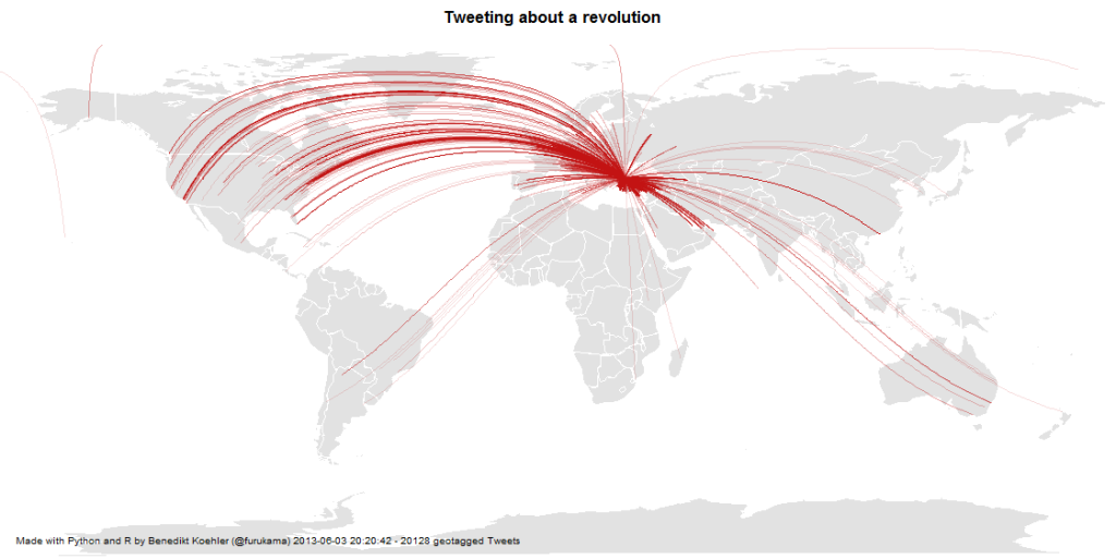
On the next day, there even was one tweet mentioning the protests crossing the dateline:

International Attention for Gezi Park protests 1-3 Jun

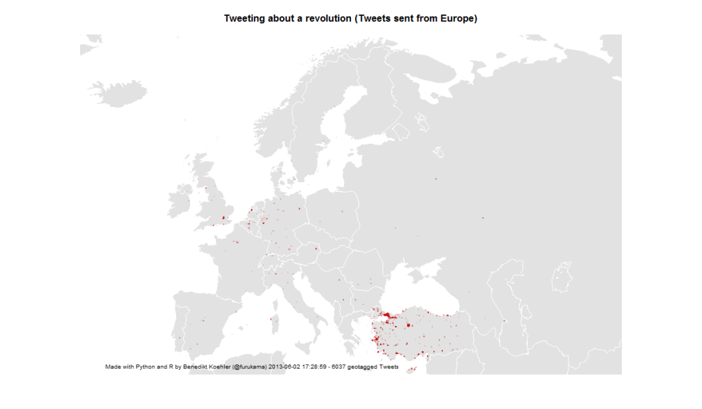
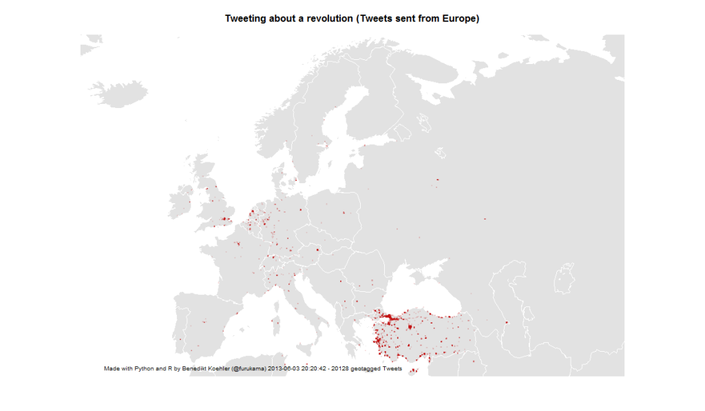
First, I took a look at the international attention (or even cosmopolitan solidarity) of the events in Turkey. The following maps are showing geotagged tweets from all over the world and from Europe that are referring to the events. About 1% of all tweets containing the hashtags carry exact geographical coordinates. The fact, that there are so few tweets from Germany – a country with a significant population of Turkish immigrants – should not be overrated. It’s night-time in Germany and I would expect a lot more tweets tomorrow.

European Attention for Gezi Park protests 1-2 Jun

14,000 geo-tagged tweets later the map looks like this:

European Attention for Gezi Park protests 1-3 Jun

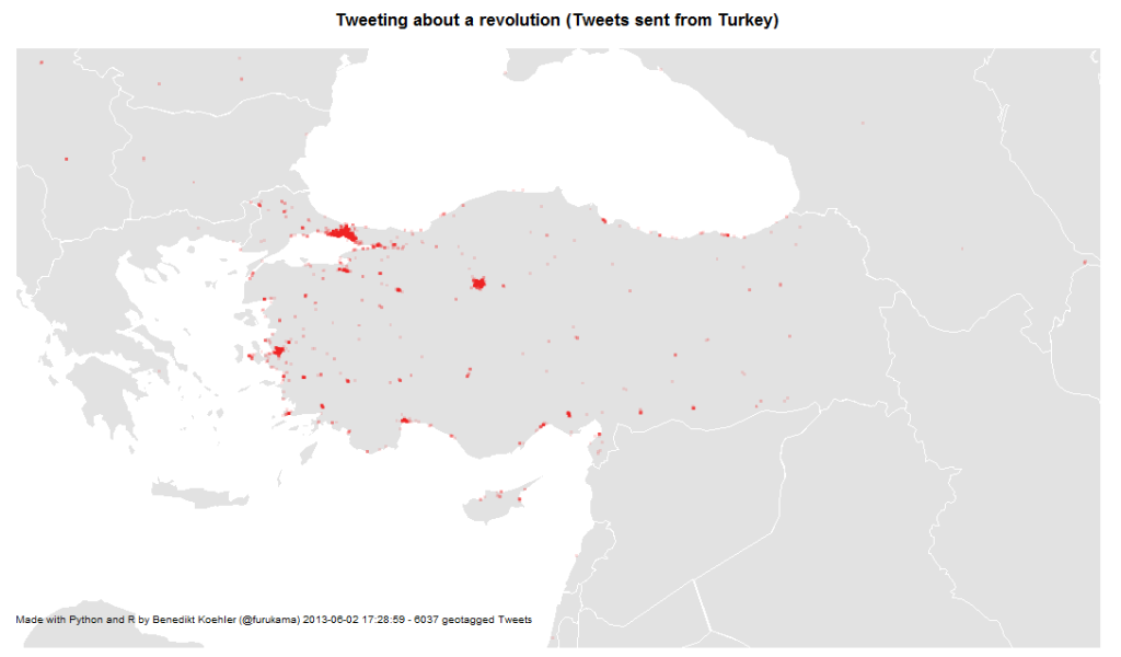
The next map is zooming in closer to the events: These are the locations in Turkey where tweets were sent with one of the hashtags mentioned above. The larger cities Istanbul, Ankara and Izmir are active, but tweets are coming from all over the country:

Turkish Tweets about the Gezi Park protests 1-2 Jun

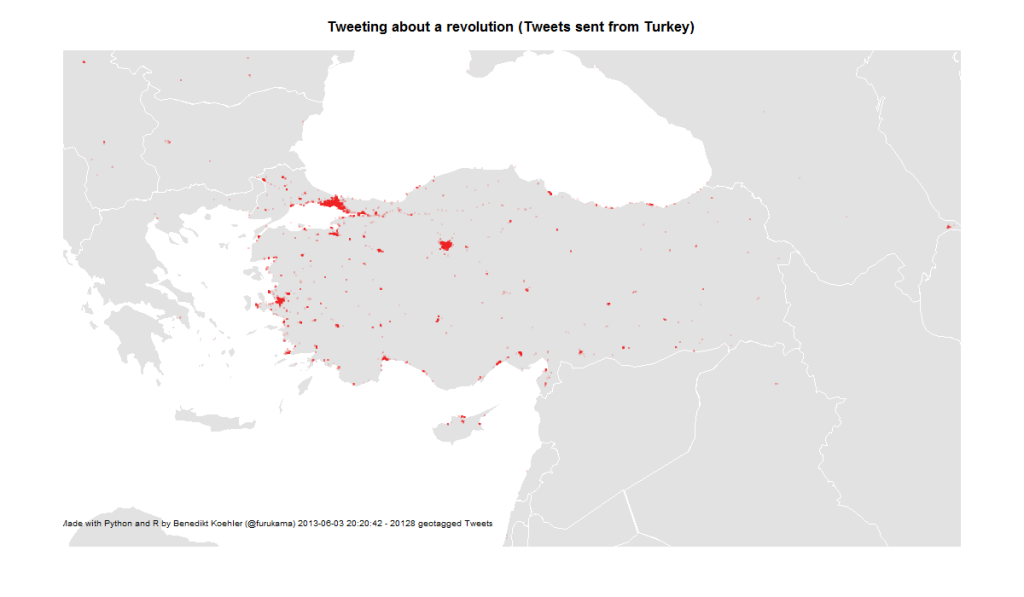
On June 3rd, the activity has spread across the country:

Turkish Tweets about the Gezi Park protests 1-3 Jun

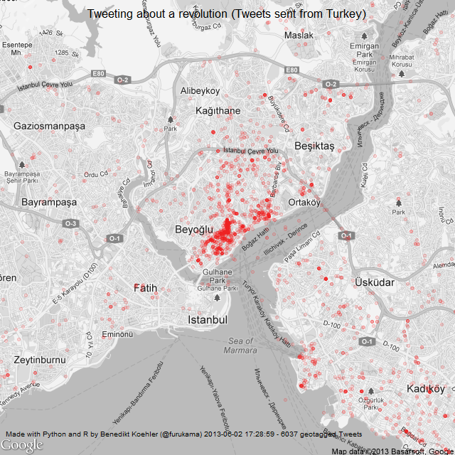
And finally, here’s a look at the tweet locations in Istanbul. The map is centered on Gezi Park – and the activity on Twitter as well:

Istanbul Tweets about Gezi Park protests 1-2 Jun

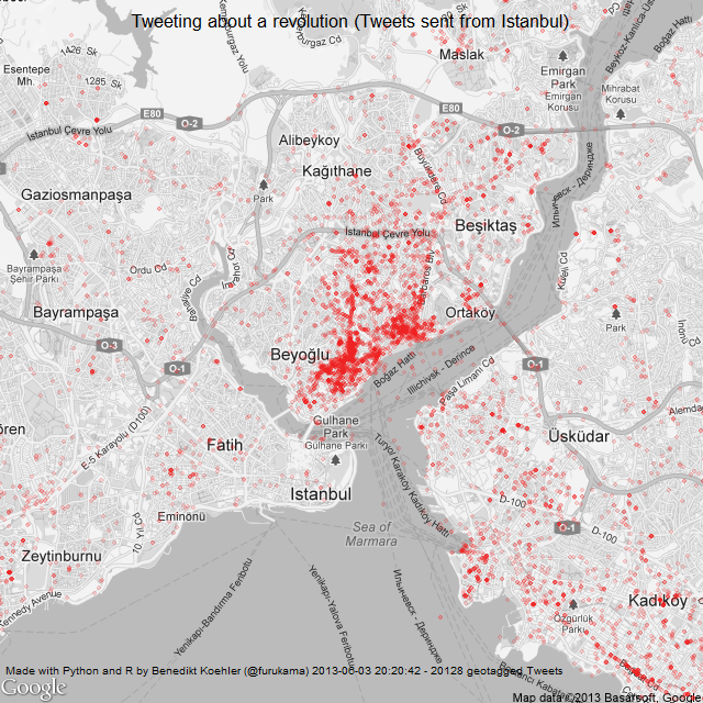
Here’s the same map a day later (I decreased the size of the dots a bit while the map is getting clearer):

Istanbul Tweets about Gezi Park protests 1-3 Jun

The R code to create the maps can be found on my GitHub.

Algorithm Ethics

An algorithm is a structured description on how to calculate things. Some of the most prominent examples of algorithms have been around for more than 2500 years like Euklid’s algorithm that gives you the greatest common divisor or Erathostenes’ sieve to give you all prime numbers up to a given maximum. These two algorithms do not contain any kind of value judgement. If I define a new method for selecting prime numbers – and many of those have been publicized! – every algorithm will come to the same solution. A number is prime or not.

But there is a different kind of algorithmic processes, that is far more common in our daily life. These are algorithms that have been chosen to find a solution to some task, that others would probably have done in a different way. Although obvious value judgments done by calculation like credit scoring and rating immediately come to our mind, when we think about ethics in the context of calculations. However there is a multitude of “hidden” ethic algorithms that far more pervasive.

On example that I encountered was given by Gary Wolf on the Quantified Self Conference in Amsterdam. Wolf told of his experiment in taking different step-counting gadgets and analyzing the differing results. His conclusion: there is no common concept of what is defined as “a step”. And he is right. The developers of the different gadgets have arbitrarily chosen one or another method to map the data collected by the gadgets’ gyroscopic sensors into distinct steps to be counted.

So the first value judgment comes with choosing a method.

Many applications we use work on a fixed set of parameters – like the preselection of a mobile optimized CSS when the web server encounters what it takes for a mobile browser. Often we get the choice to switch to the “Web-mode”, but still there are many sites that would not allow our changing the view unless we trick the server into believing that our browser would be a “PC-version” and not mobile. This of course is a very simple example but the case should be clear: someone set a parameter without asking for our opinion.

The second way of having to deal with ethics is the setting of parameters.

A good example is given by Kraemer et. al in their paper. In medical imaging technologies like MRI, an image is calculated from data like tiny elecromagnetic distortions. Most doctors (I asked some explicitly) take these images as such (like they have taken photographs without much bothering about the underlying technology before). However, there are many parameters, that the developers of such an algorithmic imaging technology have predefined and that will effect the outcome in an important way. If a blood vessel is already clotted by arteriosclerosis or can be regarded still as healthy is a typical decision where we would like be on the safe side and thus tend to underestimate the volume of the vessel, i.e. prefer a more blurry image, while when a surgeon plans her cut, she might ask for a very sharp image that overestimates the vessel’s volume by trend.

The third value judgment is – as this illustrates – how to deal with uncertainty and misclassification.

This is what we call alpha and beta errors. Most people (especially in business context) concentrate on the alpha error, that is to minimize false positives. But when we take the cost of a misjudgement into account, the false negative often is much more expensive. Employers e.g. tend to look for “the perfect” candidate and by trend turn down applications that raise their doubts. By doing so, it is obvious that they will miss many opportunities for the best hire. The cost to fire someone that was hired under false expectations is far less than the cost of not having the chance in learning about someone at all – who might have been the hidden beauty.

The problem of the two types of errors is, you can’t optimize both simultaneously. So we have to make a decision. This is always a value judgment, always ethical.

With drones prepared for autonomous kill decisions this discussion becomes existential.

All three judgments – What method? What parameters? How to deal with misclassification? – are more often than not made implicitly. For many applications, the only way to understand these presumptions is to “open the black box” – hence to hack.

Given all that, I would like to demand three points of action:
– to the developers: you have to keep as many options open as possible and give others a chance in changing the presets (and customers: you must insist of this, when you order the programming of applications);
– to the educational systems: teach people to hack, to become curious about seeing behind things.
– to our legislative bodies: make hacking things legal. Don’t let copyright, DRM and the like being used against people who re-engineer things. Only what gets hacked, gets tested. Let us have sovereignty over the things we have to deal with, let us shape our surroundings according to our ethics.

Notes

My slides on this topic:

At the last re:pubica conference I gave a talk and hosted a discussion on “Algorithm ethics” that was recorded. (in German):

The Quantified Self

The most common words in the Tweets tagged #qseu13 posted over the weekend.
The most common words in the Tweets tagged #qseu13 posted over the weekend. Here you find another visualization: [Wordcloud]
Last weekend the 4th Conference on Quantified Self took place in Amsterdam. Quantified Self is a movement or direction of thought that summarizes many aspects of datarization of the live of people by themselves. The term “QS” was coined by Kevin Kelly and Gary Wolf, who hosted the conference. Thus it cannot be denied that some roots of QS lie in the Bay-Area techno-optimistic libertarianism best represented by Wired. However a second root stems from people who started quantifying themselves to better deal with manifest health problems – be it polar disorder, insomnia or even Parkinson and cancer. In both aspects the own self acts as object and subject to first analyze and then shape itself. Both have to do with self-empowerment and acting on our human condition.

“For Quantified Self, ‘big data’ is more ‘near data’, data that surrounds us.”
Gary Wolf

Quantified Self can be viewed as taking action to reclaim the collection of personal data, not because of privacy but because of curiosity. Why not take the same approach that made Google, Amazon and the like so successful and use big data on yourself?

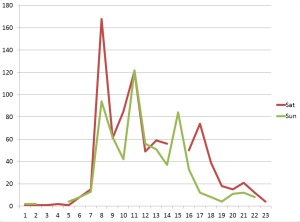
Tweets per hour during the conference weekend. Of course our physical life finds its expression in data ....
Tweets per hour during the conference weekend. Of course our physical life finds its expression in data ….
Since many QS-people use off-the-shelf gadgets, it is not only important to get full access to the data collected but also transparency on the algorithms that are implemented within. Like Gary Wolf pointed out, if two step-counters vary in their results, it tells us one thing: there is no common concept of ‘What is a step?’. These questions of algorithm ethics become more pressing as our daily life becomes more and more dependent on algorithms but we would usually not have a chance to see into that “black box” and the implicit value judgements that are programmed into it. (I just gave a talk on that specific topic at re:publica last Monday which I will post here later). I think that in no field the problems of algorithms taking ethic decisions becomes more obvious than when data deals immediately with yourself.

What self is there to be quantified?

What is the “me”? What is left, when we deconstruct what we are used to regard as “our self” into quanta? Is there a ghost in the shell? The idea of self-quantification implies an objective self that can be measured. With QS, the rather abstract outcomes of neuroscience or human genetics become tangible. The more we have quantitatively deconstructed us, the less is left for mind/body-dualism.

On est obligé d’ailleurs de confesser que la Perception et ce qui en dépend, est inexplicable par des raisons mécaniques.
G. W. Leibniz

As a Catholic, I was never fond that our Conscious Mind would just be a Mechanical Turk. As a mathematician, I feel deep satisfaction in seeing our world including my very own self becoming datarizable – Pythagoras was right, after all! This dialectic deconstruction of suspicious dualism and materialistic reductionism was discussed in three sessions I attended – Whitney Boesel’s “The missing trackers”, Sarah Watson’s “The self in data” and Natasha Schüll’s “Algorithmic Selfhood”.

“Quantifying yourself is like art: constructing a kind of expression.”
Robin Barooah

Many projects I saw at #qseu13 can be classified as art projects in their effort to find the right language to express the usually unexpresseble. But compared to most “classic” artists I know, the QS-apologetes are far less self-centered (sounds more contradictory than it is) and much more directed to in changing things by using data to find the sweetspot to set their levers.

What starts with counting your steps ends consequently in shaping yourself with technological means. Enhancing your bodily life with technology is the definition of becoming a Cyborg, as my friend Enno Park points out. Enno got Cochlea-implants to overcome his deafness. He now advocates for Cyborg rights – starting with his right to hack into his implants. Enno demands his right to tweak the technology that became part of his head.

Self-hacking will become as common as taking Aspirin to cure a headache. Even more: we will have to get literate in the quantification techniques to keep up with others that would anyway do it for us: biometric security systems, medical imaging and auto-diagnosis. To express ourselves with our data will become part of our communication culture as Social Media have today. So there will be not much of an alternative left for those who have doubts about quantifying themself. “The cost of abstention will drive people to QS.” as Whitney Boesel mentioned.

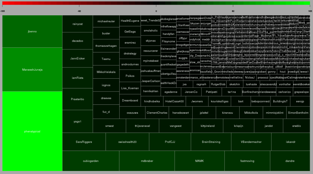
Top Twitterers for #qseu13-conference: 1) Whitney Erin Boesel, 2) Maneesh Juneja 3) that's me ;)
Top Twitterers for #qseu13-conference: 1) Whitney Erin Boesel, 2) Maneesh Juneja 3) that’s me 😉

Color analysis of Flickr images

Since I’ve seen this beautiful color wheel visualizing the colors of Flickr images, I’ve been fascinated with large scale automated image analysis. At the German Market Research association’s conference in late April, I presented some analyses that went in the same direction (click to enlarge):

Color values of Flickr images from Germany

On the image above you can see the color values ordered by their hue from images taken in Germany between August 2010 and April 2013. Each row represents the aggregation of 2.000 images downloaded from the Flickr API. I did this with the following R code:

bbox <- "5.866240,47.270210,15.042050,55.058140"
pages <- 10
maxdate <- "2010-08-31"
mindate <- "2010-08-01"
 
for (i in 1:pages) {
api <- paste("http://www.flickr.com/services/rest/?method=flickr.photos.search&format=json&api_key=YOUR_API_KEY_HERE &nojsoncallback=1&page=", i, "&per_page=500&bbox=", bbox, "&min_taken_date=", mindate, "&max_taken_date=", maxdate, sep="")
raw_data <- getURL(api, ssl.verifypeer = FALSE)

data <- fromJSON(raw_data, unexpected.escape="skip", method="R")
# This gives a list of the photo URLs including the information
# about id, farm, server, secret that is needed to download
# them from staticflickr.com
}

To aggregate the color values, I used Vijay Pandurangans Python script he wrote to analyze the color values of Indian movie posters. Fortunately, he open sourced the code and uploaded it on GitHub (thanks, Vijay!)

The monthly analysis of Flickr colors clearly hints at seasonal trends, e.g. the long and cold winter of 2012/2013 can be seen in the last few rows of the image. Also, the soft winter of 2011/2012 with only one very cold February appears in the image.

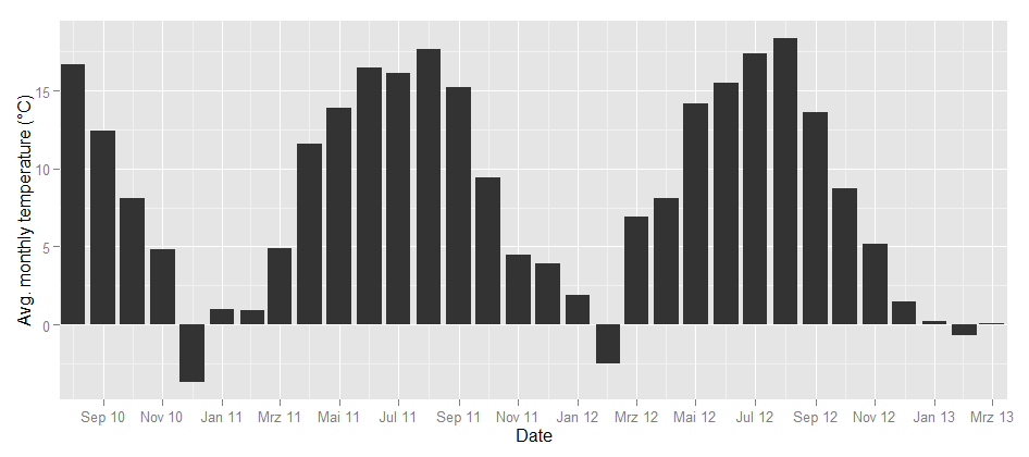
To take the analysis even further, I used weather data from the repository of the German weather service and plotted the temperatures for the same time frame:

Temperature in Germany

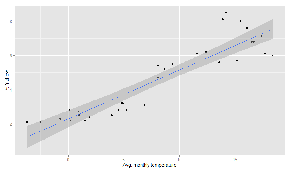
Could this be the same seasonality? To find out how the image color values above and the temperature curve below are related, I calculated the correlation between the dominance of the colors and the average temperature. Each month can not only be represented as a hue band, but also as a distribution of colors, e.g. the August 2010 looks like this:

So there’s a percent value for each color and each month. When I correlated the temperature values and the color values, the colors with the highest correlations were green (positive) and grey (negative). So, the more green is in a color band, the higher the average temperature in this month. This is how the correlation looks like:

Temperature and color values

The model actually is pretty good:

> fit <- lm(temp~yellow, weather)
> summary(fit)
Call:
lm(formula = temp ~ yellow, data = weather)
Residuals:
Min 1Q Median 3Q Max
-5.3300 -1.7373 -0.3406 1.9602 6.1974

Coefficients:
Estimate Std. Error t value Pr(>|t|)
(Intercept) -5.3832 1.2060 -4.464 0.000105 ***
yellow 2.9310 0.2373 12.353 2.7e-13 ***
---
Signif. codes: 0 '***' 0.001 '**' 0.01 '*' 0.05 '.' 0.1 ' ' 1
Residual standard error: 2.802 on 30 degrees of freedom
Multiple R-squared: 0.8357, Adjusted R-squared: 0.8302
F-statistic: 152.6 on 1 and 30 DF, p-value: 2.695e-13

Of course, it can even be improved a bit by calculating it with a polynomial formula. With second order polynomials lm(temp~poly(yellow,2), weather), we even get a R-squared value of 0.89. So, even when the pictures I analysed are not always taken outside, there seems to be a strong relationship between the colors in our Flickr photostreams and the temperature outside.

Our Pythagorean World

Crystals like the flourite, calcite, or garnet here show properties, that can easily be expressed in mathematical terms. Social behavior seams to be random, however, data science can help us detect laws and patterns, that can be expressed in mathematical functions like the shape of the crystals.
Crystals like the flourite, calcite, or garnet here show properties, that can easily be expressed in mathematical terms. This inspired the legendary Pythagoras an his students to postulate the whole world to be genuinly mathematical. Social behavior seams to be random, however data science can help us detect laws and patterns, that can be expressed in mathematical functions like the shape of the crystals.
Our senses are adapted to detect of our environment, what is necessary for our survival. In that way, evolution turns St. Augustin’s postulate of our world as being naturally conceivable to our minds from its head onto the feet. What we define as laws of nature are just the mostly linear correlations and the most regular patterns we could observe in our world.

When I had my first computer with graphical capabilities (an Atari Mega ST) in 1986, I, like everybody else, started hacking fractals. Rather simple functions produced remarkably complex and unpredictable visualizations. It was clear, that there might be many more patterns and laws to be discovered in nature, as soon as we could enhance our minds and senses with the computer – structures and patterns way to subtle to be recognised with our unarmed eye. In that way, the computer became, what the microscope or the telescope hat been to the researchers at the dawn of modernity: an enhancement of our mind and senses.

“Number is an extension and separation of our most intimate and interrelating activity, our sense of touch” (McLuhan)

The origin of the word digital stems from digitus, Latin for the finger. Counting is to separate, to cluster and summarize – as Beda the Venerable did with his fingers when he coined the term digit. With the Net, human behavior became trackable in unprecedented totality. Our lives are becoming digitized, everything we do becomes quantified that is, put in quants.

With the first graphically capable computers, we could suddenly experience the irritating complexity of the fractals. Now we can put almost anything into our calculations – and we find patterns and laws everywhere.

What is quantified, can be fed into algorithms. Algorithms extend our mind into the realm of data. We are already used to algorithms recommending us merchandise, handling many services at home or in business, like supporting our driving a car by navigating us around traffic jams. With data based design and innovation processes, algorithms take part in shaping our things. Algorithms also start making ethical judgments – drones that decide autonomously on the taking or sparing the life of people, or – less dramatic but very effectiv though – financial services granting us a better or worse credit score. We have already mentioned “Posthuman Advertising” earlier.

The world is not only recognisable, the world in every detail is quantifiable. Our datarized word is the final victory of the Pythagoreans – all and everything to be expressed in mathematics. Data science in this way leads us to a similar revolution of mind, than that of the time of Copernicus, Galileo and Kepler.

Data Humanities

Mathematics is usually not regared as a science but as part of philosophy - although it has some relation to the "real world" - as shown in this 18 century cut.
Mathematics is usually not regared as a science but as part of philosophy – although it has some relation to the “real world” – as shown in this 18 century cut.
There is a reason why we differentiate science and the humanities. And although sociology, experimental psychology and even history nowadays deploy many scientific methods, the difference is still fundamental. Humantites deal with correlations; the causalities are way further speculative than the “laws of nature” that are formulated in physics or chemistry. Also the data that supports social research is always and inherrently biased, no matter how much care we take in sampling, representativeness and other precautions we might take.

In her remarkable talk at Strataconf, Kate Crawford warned us, that we should always suspect our “Big Data” sources as highly biased, since the standard tools of dealing with samples (as mentioned above) are usualy neglected when the data is collected.

Nevertheless, also the most biased data gives us valuable information – we just have to be careful with generalizing. Of course this is only relevant for data relating to humans using some kind of technology or service (like websites collecting cookie-data or people using some app on their phone). However, I am anyway much more interested in the humanities’ side of data: Data describing human behavior, data as an aditional dimension of people’s lives.

Taken all this, I suggest to call this field of behavior data “Data Humanities” rather than “Data Science”.

The immutability paradigm – or: how to add the “fourth dimension” to our data

Our brain is wired to experiencing the world as one consistent model of reality. New data we interpret either as confirmation of the model or as an update to replace one of its parameters with a new value. Our sensory organs also reduces the incoming stimuli, drop most of the impressions, preprocess what is identified as signals to simple patterns that are propagated to our mind. What we remember as the edge of our table – a straight line, limiting the surface – was in fact received as a fine grid of multicoloured pixels by our retina. For sake of saving computation and storage power, and to keep a stable, consistent view, we forsake the richness of information. And we use to build our data bases to work exactly that way.

One of the realy disruptive shifts in our business is imo to break this paradigm: “Make your source of truth immutable.” Nathan Marz (who has just yesterday left the Twitter team) tells us to have a base layer of incoming data. Nothing here gets updated or changed. New records are just attached. From such an immutable data source, we can reconstruct the state of our data set at any given point of time in the past; even if someone messes with the database, we could roll back without the need to reset everything. This rather unstructured worm is of course not fit to get access to information with low latency. In Marz’ paradigm it is the “source of truth”, is a repository to feed into a second level of more “classic” data bases that provides precalculated, prepopulated tables that can be accessed at real time.

What Nathan Marz advocates as a way to make data bases more tolerant against human fault entails in fact a deep, even philosophical perspective. With the classic database we would keep master data and transaction data in different tables. We would regard a master record as something that should provide one consistent view on the object recorded. Take a clients data base of some retailer: Address or payment information we would expect to be a static property of the client, to be kept “up to date” – if the person moves, we would update the record. Other information we would even regard as unchangeable: Name, gender or birthday for example. This is exactly how we would be looking at the world if we had remained at the state of the naive phenomenology of the early modern ages. Concepts like “identity” of a human being reflect this integral perspective of an object with master properties – ideas like “character” (individual or even bound to ethnicity or nation) stem from this taking an object as in reality being independent from the temporal state of data that we could comprehend. (Please excuse my getting rather abstract now.)

Temporal logic was developed not in philosophy but rather in computer science. The idea is, that those apodictical clauses of “true” or “false” – tertium non datur” – that we are used to deal with in propositional calculus since the time of the ancient Greeks, would not be correctly applicable to real world systems like people interacting with other in time. – The “classic” example would be a sentence like “I am hungry” that would never necessaryly be true or false because it would depend on the specific circumstances at that point in time when I would have stated it; nevertheless it should be regarded as a valid property to describe me at that time.

In such way, the immutable database might not reflect our gut feeling about reality, but it certainly is a far more accurate “source of truth”, and not only because it is more tolerant against human operators tampering with the data.

With the concept of one immutable source of truth, this “master record” is just a view on the data at one given point in time. We would finally have “the forth dimension” in our data.

Prediction vs. Description or: Data Science vs. Market Research

“My market research indicates that 50% of your customers are above the median age. But the shocking discovery was that 50% were below the median age.”
(Dilbert; read it somewhere, cant remember the source)

It was funny to see everyone at O’Reilly’s Strata Conference talk about data science and hear just the dinosaurs like Microsoft, Intel or SAP still calling it “Big Data”. Now, for me, too, data science is the real change; and I tell you, why:

What always annoyed me when working with market researchers: you never get an answer. All you get is a description of the sample. Drawing samples was for sure a difficult task 50 years ago. You had to send interviews arround, using a kish grid (does anyone remember this – at least outside Germany?). The data had to be coded into punch cards and clumsy software was used to plot elementary descriptives from ascii-letters. If you still use SPSS, you might know what I am talking about. When I studied statistics in the early 90s, testing hypotheses was much more important than predictions, and visualisaton was not invented yet. The typical presentation of a market researcher would thus start with describing the sample (50% male, 25% from 20 to 39 years, etc.) and in the end, they would leave the client with some more or less trivialy aggregated Excel-Tables.

When I became in charge of pricing ad breaks of a large TV network, all this research was useless for my purposes. My job required predicting the measured audiences of each of the approximately 40 ad breaks for every of our four national stations six weeks in advance. I had to make the decission in real time, no matter how accurate the information I calculated the risks on would have been.

Market research is bad in supporting real time management decissions. So managers tend to decide on their “gut feelings”. But the framework has changed. The last decade brought to us the possibility to access huge data sets with low latency and run highly multivariate models. You cant do online advertising targeting based on gut feelings.

But most market researchers would still argue that the analytics behind ad targeting are not market research because they would just rely on probabilistic decissions, on predictions based on correlations rather than causality. Machine learning does not test a hypothesis that was derived from a theoretical construct of ideas. It identifies patterns and the prediction would be taken as accurate just if the effect on the ROI would be better then before.

I can very well live with the researchers keeping to their custom as long as I may use my data to do the predictions I need. When attending Strata Conference, I realized this deep paradigm shift from market research, describing data as its own end to data science, getting to predicitons.

Maybe it is thus a good thing to differentiate between market research and data science.

(This is the first in a row of posts on our impressions at Strata this year; the others will follow quickly …)

Why is there something like the Hype Cycle?

In computer science we have learned that we can do with non-linear models only in very unlikely examples. Not only our machines – also our minds are not capable to foresee non-linear developments. One of the achievements of Mandelbrot’s works and the ‘Chaos Theory’ is that we now better understand how this works and that we truly have no alternative.

You might have wondered, why the phenomenon of the Hype has such a distinct form, that consultancies like Gartner can even draw a curve – the famous “Garnter Hype Cycle of Emerging Technologies“. We will try to give a simple explanation.

Fig. 1: the development from inventing a new technology to reaching the market potential can take more or less time.
If a new technology or business model is invented, it is often possible to estimate the market potential in the long run. There are futurists that come up with the social and behavioural changes the new technology will entail and analysts that calculate the economical consequences. And now enter the scenarios. The analysts will estimate the range of time in which the expected development would take place – a “best case” with no resistance and a “worst case” with high persistence of the existing markets (Fig. 1)

Even if we don’t really believe the “best case”, it is wise to prepare for the changes, a “better case” would deliver. We start observing the market figures. We see that the new technology is quickly adopted by our peers (or those how we would love to be peer with …). We see that the new technology gets funding, a valuation that reflects the expected market potential but is effective today.

In reality, it is not that simple to produce and distribute novel technologies or services to mass markets. This requires more skills than just inventing it. There is usually some economy of scale in production and logistics, time to build business relationships and negotiate sales contracts.

Fig. 2: We want to be on the safe side, thus we take the "best case" scenario (and at the same time we experience that the market potential of the new technology is truly there).
Fig. 2: We want to be on the safe side, thus we take the “best case” scenario (and at the same time we experience that the market potential of the new technology is truly there).
So we always tend to overestimate the short term effect. And after we recognise that the thing was over hyped, we feel disappointed and the expectations are adjusted accordingly – the “valley of tears” through almost every start-up has to go. (Fig. 2)

Fig. 3: all linear projections overestimate the short term effect and underestimate the longterm effect.
But this adjusting of our expectations bears more risk than the over hypeing: by projecting the slower growth up to limit of our expected the market potential, we completely underestimate the long-run effect, as you can see in the “belly” that is caught between the sections of the blue arrow and the red curve in Fig. 3.

Why do we find this sigmoid shape of the growth curve? First: the “hype” does normally not happen in the sales numbers of our technology; the “early adopters” are just too few to make a real impact. And after having said this: it is the law of decreasing marginal costs – every new piece is produced (or resp. sold) easier than the lots we had produced before. Just very shortly before hitting the ceiling of the market potential, we see a saturation – diminishing marginal profits when we “reach the plateau”.

We have experienced this with many industries during the last decades: the newspaper publishers – very early experimenting with the new, digital distribution but then completely failing to be ready when time was due; same with the phone makers (we will come to this example later), and we will see this happen again: electric cars, head-up displays, 3d-printing, market research, just to name a few. The astonishing fact is that all these disruptions have already taken place. It is just the linear projections and bad scenario planning that prevents us from taking the right decisions to cope with them.

Foresight: Scenarios vs. Strategies

Chess is a game that does not depend from chance. Every move can be exactly valuated mathematically, and in theory we can calculate the optimal strategy for both colors from any arbitrary position up to the end of the match.

Interestingly there is hardly any “intelligent” chess program. Almost everything that was coded during the last 40 years, solves the match with brute force: just calculating the results for almost every path for a few steps in advance and then choosing a move that is optimal in short term. This works, because the computer can crunch millions of variations after every move. However this can hardly be called strategic.

Regarding foresight in economy, culture, society, etc., we are used to scenarios: we play through all possible developments by changing on parameter at a time. Most prominent is the “Worst Case Scenario”, where we just put all controls of our model to the minimum.

Like in chess, we defeat apparently the most complex problems with this mindless computation. What we will never get are insights on disruptions, epochal changes, revolutions.

Disruptions occur at those points where the curve bends. Mathematically speaking, “bend” means, that the function that describes the development has no derivative at this point, thus it changes its direction spontaneously. If we imagine a car driving along the so far smooth curve, the driver will be caught in complete surprise by the bend in the track.

In reality, these bends almost never happen without some augury. Disruptions evolve by the transposition of processes. We might think of the processes as oscillations, like waves. Not every new wave that adds its influence to the development we have in focus, will cause a noticeable distortion. Many such processes tune into the main waves of the development unrecognized.

Critical are those distortions, new processes, that occur and start to build up with the existing development, like a feedback loop, to finally dominate the development completely.

The art of foresight is to identify exactly these waves that have the potential to build up and break through the system.

We will discuss some examples of this occasionally.

10 hot big data startups to watch in 2013

What will be the most promising startups in the Big Data field in the year 2013? Just like last year, we did a lot of research and analyses to compile our hotlist of 45 companies we think that could change the market in 2013 either through awesome product innovations or great funding rounds or take-overs. Our criteria for this hotlist were as follows:

  • Main area of business should be related to big data challenges – i.e. aggregation, storage, retrieval, analysis or visualization of large, heterogeneous or real-time data.
  • To satisfy the concept of being a startup, the company should be no older than 5 years old and not be majority owned by another company.

So, here’s the list of the top acts on the Big Data stage:

logo_10gen10gen is the Company behind MongoDB. Thus 10gen has been right in the Epicenter of Big Data. MongoDB has become synonymous with scheme free data base technology. The heap of unstructred documents that wait to be indexed is growing exponentially and will continue to rise until most document generating processes are automated (and therefor only mapping structured data form some other source). 10gen received $42M of funding in 2012 among others by the intelligence community’s VC In-Q-Tel and Sequoia Capital.

bityotaWhile MongoDB is a well known name in the NoSQL movement, you may not have heard of BitYota. This 2011 founded company that only left stealth mode in November 2012 promises to simplify Big Data storage with its Warehouse-as-a-Service approach that could be a very interesting offer for small and midsize companies with a high data analytics need. The BY management teams has a lot of experience by working the Big Data shift at companies such as Yahoo!, Oracle, Twitter and Salesforce. They received a surprising $12M in 2012 by the likes of Andreessen Horowitz, Globespan, Crosslink and others.

clearstorydataBig Data analytics, integration and exploration will be a huge topic in 2013. ClearStory Data, the company co-founded by digital serial entrepreneur Sharmila Shahani-Mulligan, has drawn a lot of attention with a $9M A round in December 2012 by KPCB, Andreessen Horowitz and Google Ventures. ClearStory’s main promise of integrating all the different and heterogeneous data sources within and around companies should be a very attractive segment of the Big Data business in the coming years. We’re eagerly awaiting the launch of this company.

climatecorpAnd now for something completely different. Climate. Insurances have always been looking into the past, modelling risks and losses – usually based on aggregated data. Climate Corporation calculates micrometeorological predictions and promises to thus to be able to offer weather related insurances far more effective. We certainly will see more such technological approaces, bridging from one “Big Data Field” to another – like Climete Corp does with weather forcast and insurances. $42M funding in 2011 and another $50M in 2012 – weather data seems to be a very promising business.

We already had this one on our last year’s list. Then in stealth mode, now – one year and $10M later – Continuuity have disclosed more of their business model. And we’re excited. When the Web started in the 90s, everyone got excited about the fantastic possibilities that html, cgi and the like would offer. But setting up a website was an expert task – just to keep the links consitent ment continuusly updating every page; this did not change until the easy-to-use content management systems where programmed, that we are all using today. With Big Data, its the same: we recognise, how great everything is in theory, but there are only few apps and the recurring tasks to maintain the environment are hardly aggregated into management tools. Continuuity builds a layer of standard APIs that translate into Hadoop and its periphery, so companies can concentrate on developing their applications instead of keeping their data running.

dataguiseOkay, this company is no longer a start-up age-wise. But it is representative of many other Big Data companies that will address a more and more important topic when it comes to the modern data environment: security. Dataguise has received $3.25M of funding in 2011 for its approach of protecting all the valuable information buried in your Hadoop clusters. Other companies on our shortlist in this field are Threat Metrix and Risk I/O.

ERNOn our hotlist, we had a lot of Big Data start-ups focusing on finance or retail. One of our favorites, ERN offers an integrated payment and loyalty solution. The founding team of this British startup hails from companies like MasterCard, Telefónica o2 or Barclay Card, so they should have good insight into the needs of this market. Up to now, they have received $2M funding. But especially with the focus on mobile transactions, we believe this market holds a lot more than that.

nuodbDatabase technology is at the core of the current Big Data revolution. But with all the talk about NoSQL, you shouldn’t say good-bye to SQL prematurely. 2013 could also be the year of the great SQL comeback. One of the people who could make this happen is NuoDB’s Jim Starkey. He developed one of the very first professional databases, Interbase, and invented the binary large object or: BLOB. Now he co-founded NuoDB and received $20M of funding in 2012 to re-invent SQL.

parstreamHere’s another non-US Big Data start-up: Germany’s Parstream. Big Data does not always mean unstructred data. Check-out-transactions, sensor data, financial record or holiday bookings are just examples of data that comes usually well structured and is kept in flat tables. However these tables can become very very large – billions, even trillions of records, millions of columns. Parstream offers highly robust data base analytics in real time with extremely low latency. No matter how big your tables are – each cell is to be addressed in milliseconds standard SQL-Statements. This makes Parstream an interesting alternative to Google’s BigQuery for applications like web analytics, smart meetering, fraud detection etc. In 2012, they received $5.6M of funding.

zoomdataOf course, as in 2012, data viz will still be one of the most fascinating Big Data topics. Zooming into data is what we are used to do with data mining tools – to quickly cut any kind of cross section and drag-and-drop the results into well formated reports. However this was only working on static dumps. Zoomdata offers seamless data access on data streamed from any kind of input source in real time with state-of-the-art visualisation that users can swipe together from the menu in real time. Still at seed stage with $1.1M of funding, we’re looking forward to hearing from this company.

Social Sensors

“So, what’s the mood of America?”
Interface, 1994

One of the most fascinating novels so far on data-driven politics is Neal Stephenson’s and J. Frederick George’s “Interface“, first published in 1994. Although written almost 20 years ago, many of the technologies discussed in this book, would still be cutting edge if employed right now in 2013. One of the most original political devices is the PIPER wristwatch, a device for watching political content such as debates or candidate’s news coverage, while analyzing the wearers’ emotional reaction to these images in real-time by measuring bodily reactions such as pulse, blood pressure or galvanic skin response. This device is a miniaturized polygraph embedded in a controlled political feedback loop.

Social sensors on Twitter for conversations and trends in modern arts

What’s really interesting about the PIPER project: These sensors are not applied to all Americans or to a sample of them, but to a rather small number of types. Here are some examples from a rather extensive list of the types that are monitored this way (p. 360-1):

  • irrelevant mouth breather
  • 400-pound tab drinker
  • burger-flipping history major
  • bible-slinging porch monkey
  • pretentious urban-lifestyle slave
  • formerly respectable bankruptcy survivor

In the novel, the interface of this technology is described as follows:

By examining those graphs in detail, Ogle could assess the emotional status of any one of the PIPER 100. But they provided more detail than Ogle could really handle during the real-time stress of a major campaign event. So Aaron had come up with a very simple, general color-coding scheme […] Red denoted fear, stress, anger, anxiety. Blue denoted negative emotions centered in higher parts of the brain: disagreement, hostility, a general lack of receptiveness. And green meant that the subject liked what they saw. (p. 372)

This immediately grabbed my attention because this is exactly what we are doing in advanced market research projects at the moment: Segmenting a population (in this case: the US electorate) in different personae that represent a larger and more important relevant part of the population under study. And a similar approach is used in innovation research, where one would also focus on “lead-users” that are ahead of their peers when it comes to the identification and experimentation with trends in their respective subject.

Quite recently, this kind of approach has surfaced in various academic publications on Twitter analysis and prediction under the name of “social sensors” (e.g. Sakaki, Okazaki and Matsuo on Twitter earthquake detection or Uddin, Amin, Le, Abdelzaher, Szymanski and Guyen on the right choice of Twitter sensors). The idea is, not to monitor the whole Twitter firehose or everything that is being posted about some hashtag (this would be the regular Social Media Monitoring approach), but to select a smaller number of Twitter accounts that have a history of delivering fast and reliable information.

Wikipedia Attention for the Presidential Elections (Update)

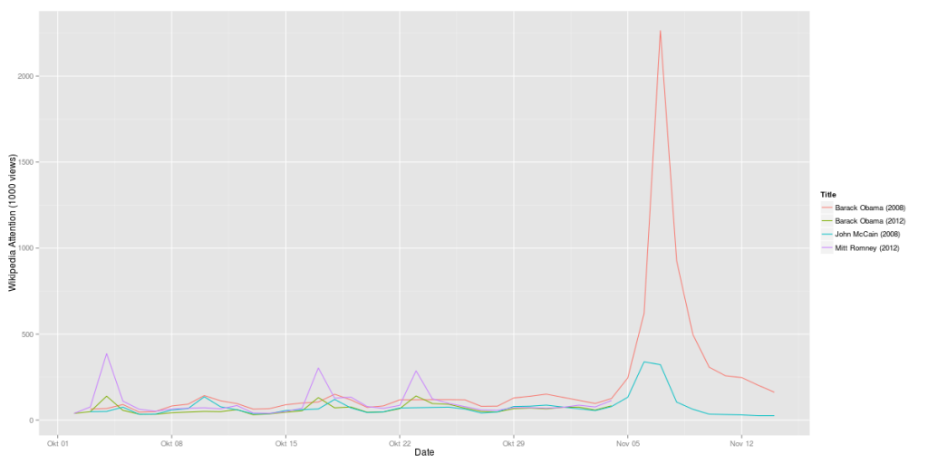
Here’s another update on the analysis of Wikipedia data for the presidential candidates. What’s quite interesting, the attention value vor Mitt Romney is almost at the same level where Barack Obama has been four years ago. And Barack Obama is exactly where John McCain has been 2008:

Obama vs. Romney 2012 compared to Obama vs. McCain 2008 (Wikipedia data)

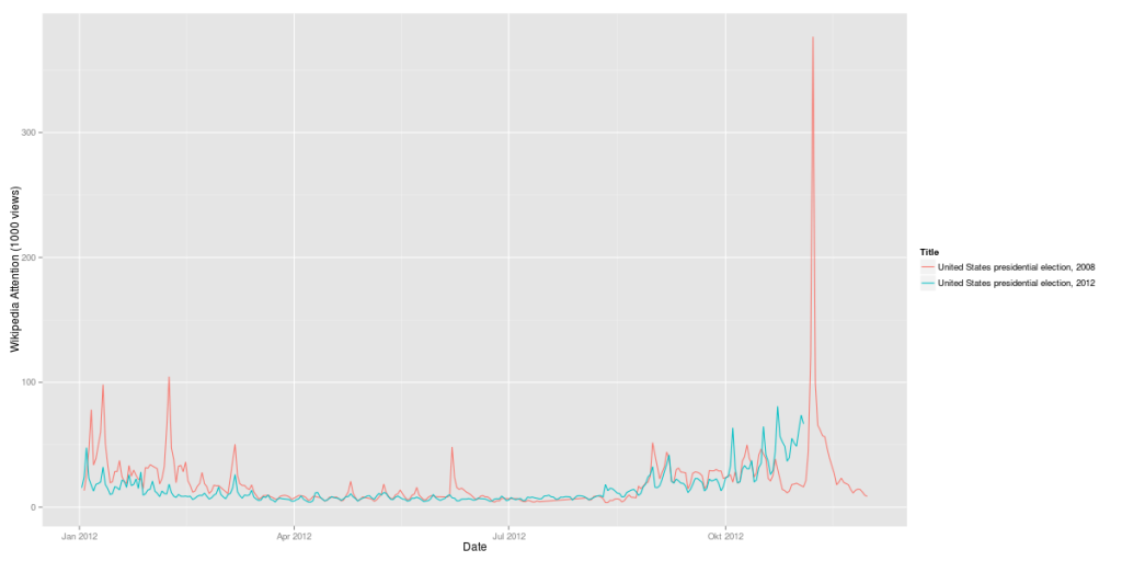
But one thing has changed: The elections as such are much more interesting to the Wikipedia users than they were 2008:

US Presidential Elections 2012 vs. 2008 (Wikipedia, daily visits)

2012 there is no pre-ballot gap as there has been four years ago.

Will Obama succeed to rally Hispanic voters? Some evidence from Wikipedia data.

Just a few hours before the ballots open for the 57th presidential election, the key question for us data scientists is: which data set could really show some special information, that would not be easily available through a classic poll. We have already seen some interesting correlations of Wikipedia usage with the ongoing campaign – just looking on how many people would search for the page on the candidates would provide a time series with many fascinating details.

Today we focused on the question, if the Democrats had been successful to rally Hispanic voters for Obama’s support. We took the Spanish Wikipedia, checkt the daily views of the Obama’s Spanish language Wikipedia-page and compared this with 2008 and also with the time series of his Republican competitors.

This table shows the monthly average for the daily views in 2008 and 2012:

McCain Romney Obama Obama
2008 2012 2008 2012
Feb 549 674 23% 2297 3154 37%
Mar 265 532 101% 949 3009 217%
Apr 181 399 120% 574 2748 379%
May 240 466 94% 817 2759 238%
Jun 435 331 -24% 2052 2477 21%
Jul 423 448 6% 668 2161 224%
Aug 501 918 83% 1289 2226 73%
Sep 1155 1285 11% 1757 2915 66%
Oct 1252 2064 65% 3005 3502 17%
Nov 2458 19110
506 841 66% 1385 2801 102%

Obama clearly leads – not only in absolute numbers but in particular regarding the increase of this year’s views with four years ago. While Romney would have gained 66% in views compared with McCain, Obama’s views would have more than doubled.

The daily views of Obama’s Spanish Wikipedia-Page have been constantly higher than four years ago while the Repubican candidates would at least at the beginning of the campaign have remained more or less on the same level. However: results for last week show an interesting difference: both candidates loose attraction regarding their Wikipedia relevance.

However, if we look just on the last week prior election day, we can see something strange happen: the view’s of Obama’s es.wikipedia-page have droped from the daily average of 5065 in 2008 to merely 3752 in 2012. The same is true for Romney versus McCain: 1795 average views in this year’s 44th week compared to 1986 in 2008.

This decreasing interest in the candidates is not reflected in the numbers that we see on other election-related search-terms. If we e.g. take ‘US Presidential Election’, we count 2672 daily views during the week before election day in 2008 and 3812 views in 2012 – the same rise in interest that we found in the English Wikipedia, too. (See the last post “Why the 2012 US elections are more exciting than 2008”). While the general interest in the elections is huge, the candidates no longer draw that much attention of the Spanish speaking community.
Maybe “Sandy” would work as an explanation since the campaing was halted during the Hurican – nevertheless it would not be plausible why only the candidates but not the election in general would suffer in awareness from this.

So we cannot draw a clear conclusion from our findings. There is evidence that Obama would have succeded to some extend to activate the interest of Hispanic people but regarding the unexpected drop we will have to drill further down. The real work, though, will anyway start right after the vote: to learn what would have been a signal and how we can seperate these from the noise next time.