Data begs to be used

The Sword and Shield - this was the metaphor for intelligence agencies in the Soviet world. For me, this is much stronger than NSA's key-clutching eagle. We should rather shield things we care for, and fight for our beliefs than just lock pick into other peoples lives.
The Sword and Shield – the metaphor for intelligence in the Soviet world, much stronger than NSA’s key-clutching eagle. Let us fight for our cause with our fiery swords of spirit and blind them with our armour of bright data.

“The NSA is basically applied data science.”
Jason Cust

The European Court of Justice declared the EU directive on data retention void the same day #hartbleed caused the grosset panic about password security the Net had seen so far.

This tells one story:
Get out into the open! Stop hiding! There are no remote places. No privileges will keep your data from the public. No genius open source hack will protect your informational self determination. And spooks, listen: your voyerism is not accepted as OK, not even by the law.

We’re living in a world with more transparency, we need to learn to do intelligence with more transparency too.
Bruce Schneier, #unowned

I was fighting against Europe’s data retention directive, too, and of course I was feeling victorious when it was declared void by the ECJ. But, don’t we know how futile all efforts are, to keep data protected? No cypher can be unbreakable, except the one-time-pad (and that is just of academic interest). No program-code can be proven safe, either – these are mathematical facts. Haven’t you learned how wrong all promisses of security are by #heartbleed? Data protection lulls us into feeling save from data breeches, where we should rather care to make things robust, no matter if the data becomes public intentionally or not.

The far more important battle was won the same week, when the European Parliament decided to protect net neutrality by law. This is the real data protection for me: protecting the means of data production from being engrossed in private.

The intelligence agencies’ damaging the Net by undermining the trust of its users in the integrity of its technology, is a serious thing by inself. However burrying this scandal just under the clutter of civil rights or under constitutional law’s aspects will not do justice. It is of our living in societies in transition from the modern nation state to the after-modern … what ever, liquid community; into McLuhan’s Global Village which is much more serious and much more interesting. We will have to go through the changes of the world and it might not be nice all the time until we come out the other end.

Data begs to be used.
Bruce Schneier, #unowned

In “Snow Crash”, Neal Stephenson imagines a Central Intelligence Corporation, the CIA and NSA becoming a commercial service where everybody just purchases the information they’d need. This was, what came immediately to my mind when I read through the transcript of the talk on “Intelligence Gathering and the Unowned Internet” that was held by the Berkman Center for Internet and Society at Harvard, starring Bruce Schneier, who for every Mathematician in my generation is just the godfather of cryptography. Representatives of the intelligence community were also present. Bruce has been arguing for living “beyond fear” for more than a decade, advocating openness instead of digging trenches and winding up barbed wire. I am convinced, that information does not want to be free (as many of my comrades in arms tend to phrase). However I strongly belief Bruce is right: We can hear data’s call.

The Quantified Self, life-logging, self-tracking – many people making public even their most intimate data, like health, mood, or even our visual field of sight at any moment of our day. An increasingly strong urge to do this rises from social responsibility – health care, climate research, but also from quite profane uses like insurances offering discounts when you let your driving be tracked. So the data is there now, about everything there is to know. Not using it because of fear for privacy would be like having abandond the steam engine and abstinate from the industrialization in anticipation of the climate change.

Speak with us, don’t speak for us.
statement of autonomy of #OccupyWallStreet

Dinosaurs of modern warfare, like the NSA are already escamotating into dragons, fighting their death-match like Smaug at Lake Esgaroth. We have to deal with the dragon, kill it, but this is not, what we should set our political goal to. It will happen anyway.

We should take provision for what real changes we are going to face. We will find ourselves in a form of society that McLuhan would have called re-tribalized, or Tönnies would not have called society at all, but community. In a community, the concept of privacy is usually rather weak. But at the same time, there is no surveillance, no panoptic elevated watchmen who themself cannot be watched. Everyone is every other one’s keeper. Communal vigilance doesn’t sound like fun. However it will be the consequence of after-modern communal structures replacing the modern society. “In the electric world, we wear all mankind as our skin.”, so McLuhan speaketh.

Noi vogliamo cantare l’amor del pericolo.
M5S

Every aspect of life gets quantized, datarized, tangible by computers. Our aggregated models of human behavior get replaced by exact description of the single person’s life and thus the predictions of that person’s future actions. We witness the rise of non-representative democratic forms like occupy assemblies or liquid democracy. What room can privacy have in a world like this whatsoever? So maybe we should concentrate in shaping our data-laden future, rather then protecting a fantasy of data being contained in some “virtual reality” that could be kept separate from our lives.

The data calls us from the depth; let us hear to its voice!

Further reading:

Transcript of the discussion “The unowned Internet”
Declaration of Liquid Culture
Disrupt Politics!


and
Organizing a System of 10 Billion People

Analyzing VC investment strategies with Crunchbase data

If you look at the investments in Big Data companies in the last few years, one thing is obvious: This is a very dynamic and fast growing market. I am producing regular updates of this network map of Big Data investments with a Python program (actually an IPython Notebook).

But what insights can be gained by directly analyzing the Crunchbase investment data? Today I revved up my RStudio to take a closer look at the data beneath the nodes and links.

Load the data and required packages:

library(reshape)
library(plyr)
library(ggplot2)
data <- read.csv('crunchbase_monthly_export_201403_investments.csv', sep=';', stringsAsFactors=F)
inv <- data[,c("investor_name", "company_name", "company_category_code", "raised_amount_usd", "investor_category_code")]
inv$raised_amount_usd[is.na(inv$raised_amount_usd)] <- 1

In the next step, we are selecting only the 100 top VC firms for our analysis:

inv <- inv[inv$investor_category_code %in% c("finance", ""),]
top <- ddply(inv, .(investor_name), summarize, sum(raised_amount_usd))
names(top) <- c("investor_name", "usd")
top <- top[order(top$usd, decreasing=T),][1:100,]
invtop <- inv[inv$investor_name %in% top$investor_name[1:100],]

Right now, each investment from a VC firm to a Big Data company is one row. But to analyze the similarities between the VC companies in term of their investment in the various markets, we have to transform the data into a matrix. Fortunately, this is exactly, what Hadley Wickham’s reshape package can do for us:

inv.mat <- cast(invtop[,1:4], investor_name~company_category_code, sum)
inv.names <- inv.mat$investor_name
inv.mat <- inv.mat[,3:40] # drop the name column and the V1 column (unknown market)

These are the most important market segments in the Crunchbase (Top 100 VCs only):

inv.seg <- ddply(invtop, .(company_category_code), summarize, sum(raised_amount_usd))
names(inv.seg) <- c("Market", "USD")
inv.seg <- inv.seg[inv.seg$Market != "",]
inv.seg$Market <- as.factor(inv.seg$Market)
inv.seg$Market <- reorder(inv.seg$Market, inv.seg$USD)
ggplot(inv.seg, aes(Market, USD/1000000))+geom_bar(stat="identity")+coord_flip()+ylab("$1M USD")

plot of chunk unnamed-chunk-4

What’s interesting now: Which branches are related to each other in terms of investments (e.g. VCs who invested in biotech also invested in cleantech and health …). This question can be answered by running the data through a K-means cluster analysis. In order to downplay the absolute differences between the categories, I am using the log values of the investments:

inv.market <- log(t(inv.mat))
inv.market[inv.market == -Inf] <- 0

fit <- kmeans(inv.market, 7, nstart=50)
pca <- prcomp(inv.market)
pca <- as.matrix(pca$x)
plot(pca[,2], pca[,1], type="n", xlab="Principal Component 1", ylab="Principal Component 2", main="Market Segments")
text(pca[,2], pca[,1], labels = names(inv.mat), cex=.7, col=fit$cluster)

plot of chunk unnamed-chunk-5

My 7 cluster solution has identified the following clusters:

  • Health
  • Cleantech / Semiconductors
  • Manufacturing
  • News, Search and Messaging
  • Social, Finance, Analytics, Advertising
  • Automotive & Sports
  • Entertainment

The same can of course be done for the investment firms. Here the question will be: Which clusters of investment strategies can be identified? The first variant has been calculated with the log values from above:

inv.log <- log(inv.mat)
inv.log[inv.log == -Inf] <- 0
inv.rel <- scale(inv.mat)

fit <- kmeans(inv.log, 6, nstart=15)
pca <- prcomp(inv.log)
pca <- as.matrix(pca$x)
plot(pca[,2], pca[,1], type="n", xlab="Principal Component 1", ylab="Principal Component 2", main="VC firms")
text(pca[,2], pca[,1], labels = inv.names, cex=.7, col=fit$cluster)

plot of chunk unnamed-chunk-6

The second variant uses scaled values:

inv.rel <- scale(inv.mat)

fit <- kmeans(inv.rel, 6, nstart=15)
pca <- prcomp(inv.rel)
pca <- as.matrix(pca$x)
plot(pca[,2], pca[,1], type="n", xlab="Principal Component 1", ylab="Principal Component 2", main="VC firms")
text(pca[,2], pca[,1], labels = inv.names, cex=.7, col=fit$cluster)

plot of chunk unnamed-chunk-7

Datalicious Notebookmania – My favorite 7 IPython Notebooks

One of the most remarkable features of this year’s Strataconf was the almost universal use of IPython notebooks in presentations and tutorials. This framework not only allows the speakers to demonstrate each step in the data science approach but also gives the audience an opportunity to do the same – either during the session or afterwards.

Here’s a list of my favorite IPython notebooks on machine learning and data science. You can always find a lot more on this webpage. Furthermore, there’s also the great notebookviewer platform that can render Github’bed notebooks as they would appear in your browser. All the following notebooks can be downloaded or cloned from the GitHub page to work on your own computer or you can view (but not edit) them with nbviewer.

So, if you want to learn about predictions, modeling and large-scale data analysis, the following resources should give you a fantastic deep dive into these topics:

1) Mining the Social Web by Matthew A. Russell

miningIf you want to learn how to automatically extract information from Twitter streams, Facebook fanpages, Google+ posts, Github accounts and many more information sources, this is the best resource to start. It started out as the code repository for Matthew’s O’Reilly published book, but since the 2nd edition has become an active learning community. The code comes with a complete setup for a virtual machine (Vagrant based) which saves you a lot of configuring and version-checking Python packages. Highly recommended!

2) Probabilistic Programming and Bayesian Methods for Hackers by Cameron Davidson-Pilon

bayesianThis is another heavy weight among my IPython notebook repositories. Here, Cameron teaches you Bayesian data analysis from your first calculation of posteriors to a real-time analysis of GitHub repositories forks. Probabilistic programming is one of the hottest topics in the data science community right now – Beau Cronin gave a mind-blowing talk at this year’s Strata Conference (here’s the speaker deck) – so if you want to join the Bayesian gang and learn probabilistic programming systems such as PyMC, this is your notebook.

3) Parallel Machine Learning Tutorial by Olivier Grisel

bigdata_alchemyThe tutorial session on parallel machine learning and the Python package scikit-learn by Olivier Grisel was one of my highlights at Strata 2014. In this notebook, Olivier explains how to set up and tune machine learning projects such as predictive modeling with the famous Titanic data-set on Kaggle. Modeling has far too long been a secret science – some kind of Statistical Alchemy, see the talk I gave at Siemens on this topic – and the time has come to democratize the methods and approaches that are behind many modern technologies from behavioral targeting to movie recommendations. After the introduction, Olivier also explains how to use parallel processing for machine learning projects on really large data-sets.

4) 538 Election Forecasting Model by Skipper Seabold

538_reverseengineeredEver wondered how Nate Silver calculated his 2012 presidential election forecasts? Don’t look any further. This notebook is reverse engineering Nate’s approach as he described it on his blog and in various interviews. The notebook comes with the actual polling data, so you can “do the Nate Silver” on your own laptop. I am currently working on transforming this model to work with German elections – so if you have any ideas on how to improve or complete the approach, I’d love to hear from you in the comments section.

5) Six Degrees of Kevin Bacon by Brian Kent

graphlab_sixdegreesThis notebook is one of the showcases for the new GraphLab Python package demonstrated at Strata Conference 2014. The GraphLab library allows very fast access to large data structures with a special data frame format called the SFrame. This notebook works on the Freebase movie database to find out whether the Kevin Bacon number really holds true or whether there are other actors that are more central in the movie universe. The GraphLab package is currently in public beta.

6) Get Close to Your Data with Python and JavaScript by Brian Granger

plotlyThe days of holecount and 1000+ pages of statistical tables are finally history. Today, data science and data visualization go together like Bayesian priors and posteriors. One of the hippest and most powerful technologies in modern browser-based visualization is the d3.js framework. If you want to learn about the current state-of-the-art in combining the beauty of d3.js with the ease and convenience of IPython, Brian’s Strata talk is the perfect introduction to this topic.

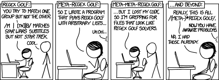
7) Regex Golf by Peter Norvig

I found the final notebook through the above mentioned talk. Peter Norvig is not only the master mind behind the Google economy, teacher of a wonderful introduction to Python programming at Udacity and author of many scientific papers on applied statistics and modeling, but he also seems to be the true nerd. Who else would take a xkcd comic strip by the word and work out the regular expression matching patterns that provide a solution to the problem posed in the comic strip. I promise that your life will never be the same after you went through this notebook – you’ll start to see programming problems in almost every Internet meme from now on. Let me know, when you found some interesting solutions!
“Zur Sozialdynamik bewegter Körper”

Statistics is often regarded as the mathematics of gambling, and it has some roots in theorizing about games, indeed. But it was the steam engine that really made statistics do something: Thermodynamics, the physics of heat, energy, and gases. Aggregating over huge masses of particles – not observable on an individual level – by means of probability distribution was the paradigm of 19th century science. And this metaphor also was successfully adopted to describing not only masses of molecules, but also masses of people in a mass society.

Particle or Person? This could be someone walking down a street, seeing her friend on the other side, waving her, and then just walking on. Of course it could also be my drawing of a neutron beta-decaying to a proton.
For physics, at the end of the 19th century it had become clear, that models reduced on aggregates and distributions where not able to explain many observations that where experimentally proven, like black body radiation or the photo-electric effect. It was Max Planck and Albert Einstein that moved the perspective from statistical aggregates to something that had not been usually taken into consideration: the particle. Quantum physics is the description of physical phenomena on the most granular level possible. By changing focus from the indistinct mass to the individual particle, also the macroscopic level of physics started to make sense again, combining probabilistic concepts like entropy with the behavior of the single particle that we might visualize in a Feynman-diagram.

Special relativity or rather psychohistory?
The Web presented for the first time a tool to collect data describing (nearly) everyone on the individual level. The best data came not from intentional research but from cookie-tracking, done to optimize advertising effectiveness. Social Media brought us the next level: semantic data, people talking about their lives, their preferences, their actions and feelings. And people connected with each other, the social graph showed who was talking to whom and about which topics – and how tight social bonds were knit.

We now have the data to model behavior without the need of aggregating. The role of statistics for the humanities changes – like it has done in physics 150 years ago. Statistics is now the tool to deal with distributions as phenomena as such rather than just generalizing from small samples to an unknown population. ‘Data humanity’ would be a much better term for what is usually called ‘data science’ – this I had written after O’Reilly’s Strata conference last year. But I think I might have been wrong as we move from social science to computational social science.

Social research is moving from humanities to science.

Further reading:

“Our Pythagorean World”

Crowdsourcing Science

Open foresight is a great way to look into future developments. Open data is the foundation to do this comprehensively and in a transparent way. As with most big data projects, the difficult part in open foresight is to collect the data and wrangle it to a form that can actually be processed. While in classic social research you’d have experimental measurements or field notes in a well defined format, dealing with open data is always a pain: not only is there no standard – the meaningful numbers might be found anywhere in your source and be called arbitrarily; also the context is not given by some structure that you’d have imposed into your data in advanced (as we used to do it in our hypothesis-driven set-ups).

In the last decade, crowdsourcing has proven to be a remedy to dealing with all kinds of challenges that are still to complex to be fully automatized, but which are not too hard to be worked out by humans. A nice example is zooniverse.org featuring many “citizen science projects”, from finding exoplanets or classifying galaxies, to helping to model global climate history by entering historic ships’ log data.

Climate change caused by humanity might be the best defended hypothesis in science; no other theory had do be defended against more money and effort to disprove it (except perhaps evolution, which has do fight a similar battle about ideology). But apart from the description, how climate will change and how that will effect local weather conditions, we might still be rather little aware of the consequences of different scenarios. But aside from the effect of climate-driven economic change on people’s lives, the change of economy itself cannot be ignored when studying climate and understand possible feedback loops that might or might not lead into local or global catastrophe.

Zeean.net is an open data / open source project aiming at the economic impact of climate change. Collecting data is crowdsourced – everyone can contribute key indicators of geo-economic dependency like interregional and domestic flow of supply and demand in an easy “Wikipedia-like” way. And like Wikipedia, the validation is done by crowd-crosscheck of registered users. Once data is there, it can be fed into simulations. The team behind Zeean, lead by Anders Levermann at Potsdam Institute for Climate Impact Research is directly tied into the Intergovernmental Panel on Climate Change IPCC, leading research on climate change for the UN and thus being one of the most prominent scientific organizations in this field.

A first quick glance on the flows of supply shows how a conflict in the Ukraine effect the rest of the world economically.
The results are of course not limited to climate. If markets default for other reasons, the effect on other regions can be modeled in the same way.
So I am looking forward to the data itself being made public (by then brought into a meaningful structure), we could start calculating our own models and predictions, using the powerful open source tools that have been made available during the last years.

Before and After Series C funding – a network analysis of Domo

One of the most interesting Big Data companies in this network analysis of Venture Capital connections has in my opinion been Domo. Not only did it receive clearly above average funding for such a young company, but it was also one of the nodes with the best connections through Venture Capital firms and their investments. It had one of the highest values for Betweenness Centrality, which means it connects a lot of the other nodes in the Big Data landscape.

Then, some days after I did the analysis and visualization, news broke that Domo received $125M from Greylock, Fidelity, Morgan Stanley and Salesforce among others. This is a great opportunity to see what this new financing round means in terms of network structure. Here’s Domo before the round:

Domo_Before

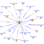
And this is Domo $125M later. Notice how its huge Betweenness Centrality almost dwarfs the other nodes in the network. And through its new connections it is strongly connected to MongoDB:

Domo_After

Here’s a look at the numbers, before Series C:

Company Centrality
1 Domo 0.1459
2 Cloudera 0.0890
3 MemSQL 0.0738
4 The Climate Corporation 0.0734
5 Identified 0.0696
6 MongoDB, Inc. 0.0673
7 Greenplum Software 0.0541
8 CrowdFlower 0.0501
9 DataStax 0.0489
10 Fusion-io 0.0488

And now:

Company Centrality
1 Domo 0.1655
2 MemSQL 0.0976
3 Cloudera 0.0797
4 MongoDB, Inc. 0.0722
5 Identified 0.0706
6 The Climate Corporation 0.0673
7 Greenplum Software 0.0535
8 CrowdFlower 0.0506
9 DataStax 0.0459
10 Fusion-io 0.0442

The new funding round now only increases Domo’s centrality but also MongoDB’s because of the shared investors Salesforce, T. Rowe Price and Fidelity Investments.

Big Data VC investments

As the data-base for the Big Data Investment Map 2014 also includes the dates for most of the funding rounds, it’s not hard to create a time-series plot from this data. This should answer the question whether Big Data is already over the peak (cf. Gartner seeing Big Data reaching the “trough of disillusionment”) or if we still are to experience unseen heights? The answer should be quite clear:

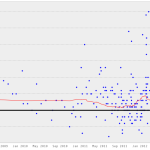
BigDataVC_02022014

The growth does look quite exponential to me. BTW: The early spike in 2007 has been the huge investment in VMWare by Intel and Cisco. Currently, I have not included IPOs and acquisitions in my calculations.

Big Data Investment Map 2014

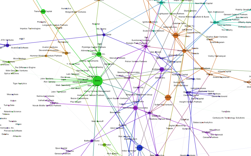
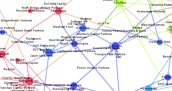
Here’s an updated version of our Big Data Investment Map. I’ve collected information about ca. 50 of the most important Big Data startups via the Crunchbase API. The funding rounds were used to create a weighted directed network with investments being the edges between the nodes (investors and/or startups). If there were multiple companies or persons participating in a funding round, I split the sum between all investors.

This is an excerpt from the resulting network map – made with Gephi. Click to view or download the full graphic:

BigDataInvestmentMap_2014_Small

If you feel, your company is missing in the network map, please tell us in the comments.

The size of the nodes is relative to the logarithmic total result of all their funding rounds. There’s also an alternative view focused on the funding companies – here, the node size is relative to their Big Data investments. Here’s the list of the top Big Data companies:

Company Funding
(M$, Source: Crunchbase API)
VMware 369
Palantir Technologies 343
MongoDB, Inc. 231
DataStax 167
Cloudera 141
Domo 123
Fusion-io 112
The Climate Corporation 109
Pivotal 105
Talend 102

And here’s the top investing companies:

Company Big Data funding
(M$, Source: Crunchbase API)
Founders Fund 286
Intel 219
Cisco 153
New Enterprise Associates 145
Sequoia Capital 109
General Electric 105
Accel Partners 86
Lightspeed Venture Partners 72
Greylock Partners 63
Meritech Capital Partners 62

We can also use network analytical measures to find out about which investment company is best connected to the Big Data start-up ecosystem. I’ve calculated the Betweenness Centrality measure which captures how good nodes are at connecting all the other nodes. So here are the best connected Big Data investors and their investments starting with New Enterprise Associates, Andreessen Horowitz and In-Q-Tel (the venture capital firm for the CIA and the US intelligence community).

Investor Centrality Big Data Companies
1 New Enterprise Associates 0.0863 GraphLab, MapR Technologies, Fusion-io, MongoDB, Inc., WibiData, Pentaho, CloudFlare, The Climate Corporation, MemSQL
2 Andreessen Horowitz 0.0776 ClearStory Data, Domo, Fusion-io, Databricks, GoodData, Continuuity, Platfora
3 In-Q-Tel 0.0769 Cloudera, Recorded Future, Cloudant, MongoDB, Inc., Platfora, Palantir Technologies
4 Founders Fund 0.0623 Declara, CrowdFlower, The Climate Corporation, Palantir Technologies, Domo
5 SV Angel 0.0602 Cloudera, Domo, WibiData, Citus Data, The Climate Corporation, MemSQL
6 Khosla Ventures 0.0540 ParStream, Metamarkets, MemSQL, ClearStory Data, The Climate Corporation
7 IA Ventures 0.0510 Metamarkets, Recorded Future, DataSift, MemSQL
8 Data Collective 0.0483 Trifacta, ParStream, Continuuity, Declara, Citus Data, Platfora, MemSQL
9 Hummer Winblad Venture Partners 0.0458 NuoDB, Karmasphere, Domo
10 Battery Ventures 0.0437 Kontagent, SiSense, Continuuity, Platfora

Text-Mining the DLD Conference 2014

Once a year, the cosmopolitan digital avantgarde gathers in Munich to listen to keynotes on topics all the way from underground gardening to digital publishing at the DLD, hosted by Hubert Burda. In the last years, I did look at the event from a network analytical perspective. This year, I am analyzing the content, people were posting on Twitter in order to make comparisons to last years’ events and the most important trends right now.

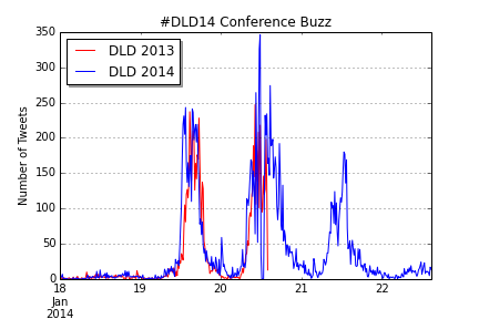
To do this in the spirit of Street Fighting Trend Research, I limited myself to openly available free tools to do the analysis. The data-gathering part was done in the Google Drive platform with the help of Martin Hawksey’s wonderful TAGS script that is collecting all the tweets (or almost all) to a chosen hashtag or keyword such as “#DLD14” or “#DLD” in this case. Of course, there can be minor outages in the access to the search API, that appear as zero lines in the data – but that’s not different to data-collection e.g. in nanophysics and could be reframed as adding an extra challenge to the work of the data scientist 😉 The resulting timeline of Tweets during the 3 DLD days from Sunday to Tuesday looks like this:

Twitter Buzz for #DLD14

You can clearly see three spikes for the conference days, the Monday spike being a bit higher than the first. Also, there is a slight decline during lunch time – so there doesn’t seem to be a lot food tweeting at the conference. To produce this chart (in IPython Notebook) I transformed the Twitter data to TimeSeries objects and carefully de-duplicated the data. In the next step, I time shifted the 2013 data to find out how the buzz levels differed between last years’ and this years’ event (unfortunately, I only have data for the first two days of DLD 2013.

DLD14_Buzz_Comp_Comparison

The similarity of the two curves is fascinating, isn’t it? Although there still are minor differences: DLD14 began somewhat earlier, had a small spike at midnight (the blogger meeting perhaps) and the second day was somewhat busier than at DLD13. But still, not only the relative, but also the absolute numbers were almost identical.

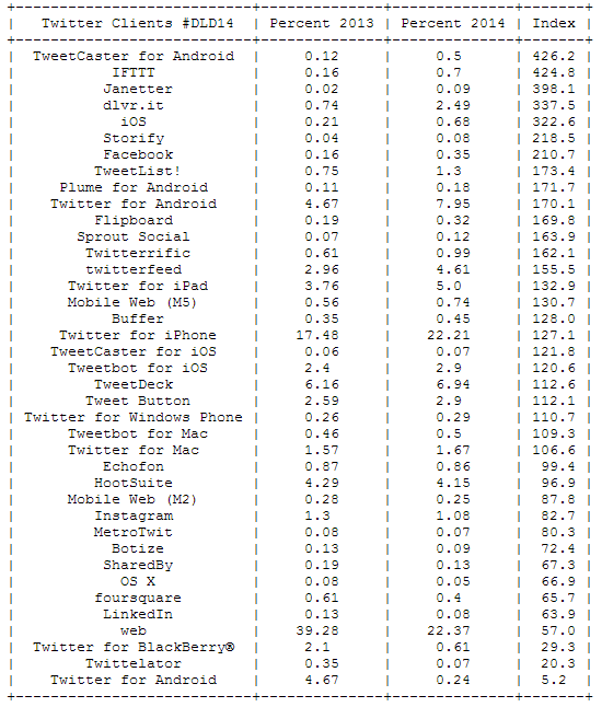
Now, let’s take a look at the devices used for sending Tweets from the event. Especially interesting is the relation between this years’ and last years’ percentages to see which devices are trending right now:

DLD14_Clients

The message is clear: mobile clients are on the rise. Twitter for Android has almost doubled its share between 2013 and 2014, but Twitter for iPad and iPhone have also gained a lot of traction. The biggest losers is the regular Twitter web site dropping from 39 per cent of all Tweets to only 22 per cent.

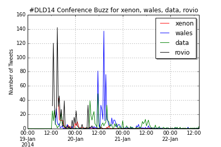
The most important trending word is “DLD14”, but this is not surprising. But the other trending words allow deeper insights into the discussions at the DLD: This event was about a lot of money (Jimmy Wales billion dollar donation), Google, Munich and of course the mobile internet:

DLD14_Words

Compare this with the top words for DLD 2013:

DLD13_Words

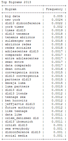
Wait – “sex” among the 25 most important words at this conference? To find out what’s behind this story, I analyzed the most frequently used bigrams or word combinations in 2013 and 2014:

DLD13_Bigrams DLD14_Bigrams

With a little background knowledge, it clearly shows that 2013’s “sex” is originating from a DJ Patil quote comparing “Big Data” (the no. 1 bigram) with “Teenage Sex”. You can also find this quotation appearing in Spanish fragments. Other bigrams that were defining the 2013 DLD were New York (Times) and (Arthur) Sulzberger, while in 2014 the buzz focused on Jimmy Wales, Rovio and the new Xenon processor and its implications for Moore’s law. In both years, a significant number of Tweets are written in Spanish language.

DLD14_Buzzwords_Comp

UPDATE: Here’s the  IPython Notebook with all the code, this analysis has been based on.

Trending Topics at Strata Conferences 2011-2014

To fill the gap until this year’s Strata Conference in Santa Clara, I thought of a way to find out trends in big data and data science. As this conference should easily be the leading edge gathering of practitioners, theorists and followers of big data analytics, the abstracts submitted and accepted for Strataconf should give some valuable input. So, I collected the abstracts from the last Santa Clara Strata conferences and applied some Python nltk magic to it – all in a single IPython Notebook, of course.

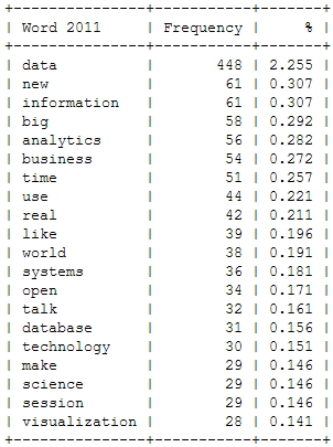
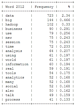
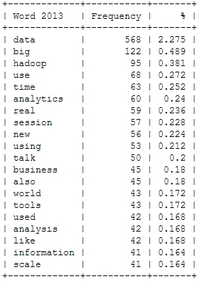
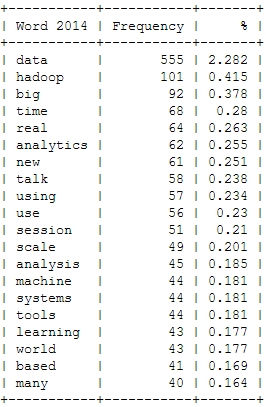
Here’s a look at the resulting insights. First, I analyzed the most frequent words, people used in their abstracts (after excluding common English language stop words). As a starter, here’s the Top 20 words for the last four Strata conferences:

Strata_Words_2011 Strata_Words_2012 Strata_Words_2013 Strata_Words_2014

This is just to check, whether all the important buzzwords are there and we’re measuring the right things here: Data – check! Hadoop – check! Big – check! Business – check! Already with this simple frequency count, one thing seems very interesting: Hadoop didn’t seem to be a big topic in the community until 2012. Another random conclusion could be that 2011 was the year where Big Data really was “new”. This word loses traction in the following years.
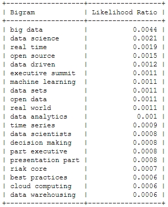
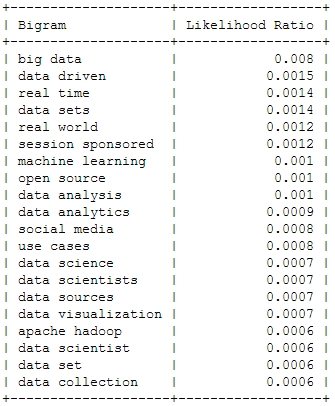
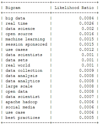
And now for something a bit more sophisticated: Bigrams or frequently used word combinations:

2011
Strata_Bigrams_2011
2012
Strata_Bigrams_2012
2013
Strata_Bigrams_2013
2014
Strata_Bigrams_2014

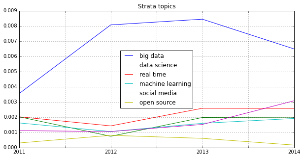
Of course, the top bigram through all the years is “big data”, which is not entirely unexpected. But you can clearly see some variation among the Top 20. Looking at the relative frequency of the mentions, you can see that the most important topic “Big Data” will probably not be as important in this years conference – the topical variety seems to be increasing:

Strata_Bigrams

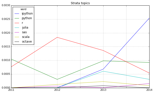
Looking at some famous programming and mathematical languages, the strong dominance of R seems to be broken by Python or IPython (and its Notebook environment) which seems to have established itself as the ideal programming tool for the nerdy real-time presentation of data hacks. \o/

Strata_Lang

Another trend can be seen in the following chart: Big Data seems to become more and more faceted over the years. The dominant focus on business applications of data analysis seems to be over and the number of different topics discussed on the conference seems to be increasing:

Strata_Fields

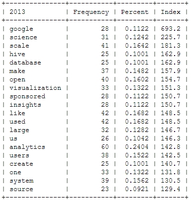
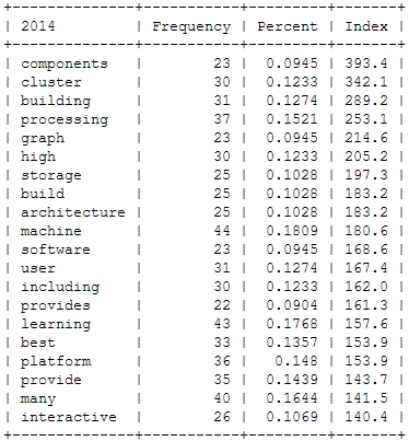
Finally, let’s take a more systematic look at rising topics at Strata Conferences. To find out which topics were gaining momentum, I calculated the relative frequencies of all the words and compared them to the year before. So, here’s the trending topics:

Strata_Trends_2012 Strata_Trends_2013 Strata_Trends_2014

These charts show that 2012 was indeed the “Hadoop-Strata” where this technology was the great story for the community, but also the programming language R became the favorite Swiss knife for data scientists. 2013 was about applications like Hive that run on top of Hadoop, data visualizations and Google seemed to generate a lot of buzz in the community. Also, 2013 was the year, data really became a science – this is the second most important trending topic. And this was exactly the way, I experienced the 2013 Strata “on the ground” in Santa Clara.

What will 2014 bring? The data suggests, it will be the return of the hardware (e.g. high performance clusters), but also about building data architectures, bringing data know-how into organizations and on a more technical dimension about graph processing. Sounds very promising in my ears!

Identifying trends in the German Google n-grams corpus (Tutorial)

A lot of people still have a lot of respect for Hadoop and MapReduce. I experience it regularly in workshops with market researchers and advertising people. Hadoop’s image is quite comparable with Linux’ perceived image in the 1990s: a tool for professional users that requires a lot of configuration. But in the same way, there were some user-friendly distributions (e.g. Suse), there are MapReduce tools that require almost no configuration.

One favorite example is the ease and speed, you can do serious analytical work on the Google n-grams corpus with Hive on Amazon’s Elastic MapReduce platform. I adapted the very helpful code from the AWS tutorial on the English corpus to find out the trending German words (or 1-grams) for the last century. You need to have an Amazon AWS account and valid SSH keys to connect to the machines you are running the MapReduce programs on (here’s the whole hive query file).

  • Start your Elastic MapReduce cluster on the EMR console. I used 1 Master and 19 slave nodes. Select your AWS ssh authorization key. Remember: from this moment on, your cluster is generating costs. So, don’t forget to terminate the cluster after the job is done!
  • If your Cluster has been set-up and is running, note the Master-Node-DNS. Open a SSH client (e.g. Putty on Windows or ssh on Linux) and connect to the master node with the ssh key. Your username on the remote machine is “hadoop”.
  • Start “hive” and set some useful defaults for the analytical job:

    set hive.base.inputformat=org.apache.hadoop.hive.ql.io.HiveInputFormat;
    set mapred.min.split.size=134217728;

  • The first code snippet connects to the 1-gram dataset which resides on the S3 storage:

    CREATE EXTERNAL TABLE german_1grams (
    gram string,
    year int,
    occurrences bigint,
    pages bigint,
    books bigint
    )
    ROW FORMAT DELIMITED FIELDS TERMINATED BY '\t'
    STORED AS SEQUENCEFILE
    LOCATION 's3://datasets.elasticmapreduce/ngrams/books/20090715/ger-all/1gram/';

  • Now, we can use this database to perform some operations. The first step is to normalize the database, e.g. to transform all words to lower case and remove 1-grams that are no proper words. Of course you could further refine this step to remove stopwords or reduce the words to their stems by stemming or lemmatization.

    CREATE TABLE normalized (
    gram string,
    year int,
    occurrences bigint
    );

    And then we populate this table:

    INSERT OVERWRITE TABLE normalized
    SELECT
    lower(gram),
    year,
    occurrences
    FROM
    german_1grams
    WHERE
    year >= 1889 AND
    gram REGEXP "^[A-Za-z+'-]+$";

  • The previous steps should run quite fast. Here’s the step that really need to be run on a multi-machine cluster:

    CREATE TABLE by_decade (
    gram string,
    decade int,
    ratio double
    );

    INSERT OVERWRITE TABLE by_decade
    SELECT
    a.gram,
    b.decade,
    sum(a.occurrences) / b.total
    FROM
    normalized a
    JOIN (
    SELECT
    substr(year, 0, 3) as decade,
    sum(occurrences) as total
    FROM
    normalized
    GROUP BY
    substr(year, 0, 3)
    ) b
    ON
    substr(a.year, 0, 3) = b.decade
    GROUP BY
    a.gram,
    b.decade,
    b.total;

  • The final step is to count all the trending words and export the data:

    CREATE TABLE result_decade (
    gram string,
    decade int,
    ratio double,
    increase double );

    INSERT OVERWRITE TABLE result_decade
    SELECT
    a.gram as gram,
    a.decade as decade,
    a.ratio as ratio,
    a.ratio / b.ratio as increase
    FROM
    by_decade a
    JOIN
    by_decade b
    ON
    a.gram = b.gram and
    a.decade - 1 = b.decade
    WHERE
    a.ratio > 0.000001 and
    a.decade >= 190
    DISTRIBUTE BY
    decade
    SORT BY
    decade ASC,
    increase DESC;

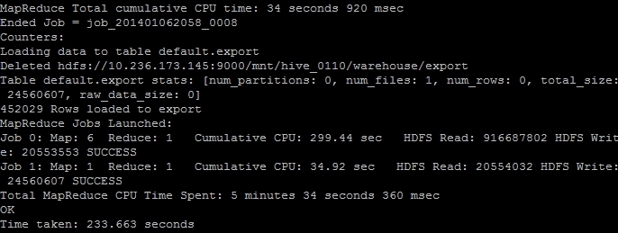
  • The result is saved as a tab delimited plaintext data file. We just have to find out its correct location and then transfer it from the Hadoop HDFS file system to the “normal” file system on the remote machine and then transfer it to our local computer. The (successful) end of the hive job should look like this on your ssh console:
    EMR_finish
    The line “Deleted hdfs://x.x.x.x:9000/mnt/hive_0110/warehouse/export” gives you the information where the file is located. You can transfer it with the following command:

    $ hdfs dfs -cat /mnt/hive_0110/warehouse/export/* > ~/export_file.txt

  • Now the data is in the home directory of the remote hadoop user in the file export_file.txt. With a secure file copy program such as scp or WinSCP you can download the file to your local machine. On a Linux machine, I should have converted the AWS SSH key in the Linux format (id_rsa and id_rsa.pub) and then added. With the following command I could download our results (replace x.x.x.x with your IP address or the Master-Host-DNS):

    $ scp your_username@x.x.x.x:export_file.txt ~/export_file.txt

  • After you verified that the file is intact, you can terminate your Elastic MapReduce instances.

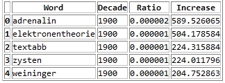
As a result you get a large text file with information on the ngram, decade, relative frequency and growth ratio in comparison with the previous decade. After converting this file into a more readable Excel document with this Python program, it looks like this:
ngrams_results

Values higher than 1 in the increase column means that this word has grown in importance while values lower than 1 means that this word had been used more frequently in the previous decade.

Here’s the top 30 results per decade:

  • 1900s: Adrenalin, Elektronentheorie, Textabb, Zysten, Weininger, drahtlosen, Mutterschutz, Plazenta, Tonerde, Windhuk, Perseveration, Karzinom, Elektrons, Leukozyten, Housz, Schecks, kber, Zentralwindung, Tarifvertrags, drahtlose, Straftaten, Anopheles, Trypanosomen, radioaktive, Tonschiefer, Achsenzylinder, Heynlin, Bastimento, Fritter, Straftat
  • 1910s: Commerzdeputation, Bootkrieg, Diathermie, Feldgrauen, Sasonow, Wehrbeitrag, Bolschewismus, bolschewistischen, Porck, Kriegswirtschaft, Expressionismus, Bolschewiki, Wirtschaftskrieg, HSM, Strahlentherapie, Kriegsziele, Schizophrenie, Berufsberatung, Balkankrieg, Schizophrenen, Enver, Angestelltenversicherung, Strahlenbehandlung, Orczy, Narodna, EKG, Besenval, Flugzeugen, Flugzeuge, Wirkenseinheit
  • 1920s: Reichsbahngesellschaft, Milld, Dawesplan, Kungtse, Fascismus, Eidetiker, Spannungsfunktion, Paneuropa, Krestinski, Orogen, Tschechoslovakischen, Weltwirtschaftskonferenz, RSFSR, Sachv, Inflationszeit, Komintern, UdSSR, RPF, Reparationszahlungen, Sachlieferungen, Konjunkturforschung, Schizothymen, Betriebswirtschaftslehre, Kriegsschuldfrage, Nachkriegsjahre, Mussorgski, Nachkriegsjahren, Nachkriegszeit, Notgemeinschaft, Erlik
  • 1930s: Reichsarbeitsdienst, Wehrwirtschaft, Anerbengericht, Remilitarisierung, Steuergutscheine, Huguenau, Molotov, Volksfront, Hauptvereinigung, Reichsarbeitsdienstes, Viruses, Mandschukuo, Erzeugungsschlacht, Neutrons, MacHeath, Reichsautobahnen, Ciano, Vierjahresplan, Erbkranken, Schuschnigg, Reichsgruppe, Arbeitsfront, NSDAP, Tarifordnungen, Vierjahresplanes, Mutationsrate, Erbhof, GDI, Hitlerjugend, Gemeinnutz
  • 1940s: KLV, Cibazol, UNRRA, Vollziehungsrath, Bhil, Verordening, Akha, Sulfamides, Ekiken, Wehrmachtbericht, Capsiden, Meau, Lewerenz, Wehrmachtsbericht, juedischen, Kriegsberichter, Rourden, Gauwirtschaftskammer, Kriegseinsatz, Bidault, Sartre, Riepp, Thailands, Oppanol, Jeftanovic, OEEC, Westzonen, Secretaris, pharmaceutiques, Lodsch
  • 1950s: DDZ, Peniteat, ACTH, Bleist, Siebenjahrplan, Reaktoren, Cortison, Stalinallee, Betriebsparteiorganisation, Europaarmee, NPDP, SVN, Genossenschaftsbauern, Grundorganisationen, Sputnik, Wasserstoffwaffen, ADAP, BverfGg, Chruschtschows, Abung, CVP, Atomtod, Chruschtschow, Andagoya, LPG, OECE, LDPD, Hakoah, Cortisone, GrundG
  • 1960s: Goldburg, Dubcek, Entwicklungszusammenarbeit, Industriepreisreform, Thant, Hoggan, Rhetikus, NPD, Globalstrategie, Notstandsgesetze, Nichtverbreitung, Kennedys, PPF, Pompidou, Nichtweiterverbreitung, neokolonialistischen, Teilhards, Notstandsverfassung, Biafra, Kiesingers, McNamara, Hochhuth, BMZ, OAU, Dutschke, Rusk, Neokolonialismus, Atomstreitmacht, Periodikums, MLF
  • 1970s: Zsfassung, Eurokommunismus, Labov, Sprechakttheorie, Werkkreis, Uerden, Textsorte, NPS, Legitimationsprobleme, Aktanten, Kurztitelaufnahme, Parlamentsfragen, Textsorten, Soziolinguistik, Rawls, Uird, Textlinguistik, IPW, Positivismusstreit, Jusos, UTB, Komplexprogramms, Praxisbezug, performativen, Todorov, Namibias, Uenn, ZSta, Energiekrise, Lernzielen
  • 1980s: Gorbatschows, Myanmar, Solidarnosc, FMLN, Schattenwirtschaft, Gorbatschow, Contadora, Sandinisten, Historikerstreit, Reagans, sandinistische, Postmoderne, Perestrojka, BTX, Glasnost, Zeitzeugen, Reagan, Miskito, nicaraguanischen, Madeyski, Frauenforschung, FSLN, sandinistischen, Contras, Lyotard, Fachi, Gentechnologie, UNIX, Tschernobyl, Beijing
  • 1990s: BSTU, Informationsamt, Sapmo, SOEP, Tschetschenien, EGV, BMBF, OSZE, Zaig, Posllach, Oibe, Benchmarking, postkommunistischen, Reengineering, Gauck, Osterweiterung, Belarus, Tatarstan, Beitrittsgebiet, Cyberspace, Goldhagens, Treuhandanstalt, Outsourcing, Modrows, Diensteinheiten, EZB, Einigungsvertrages, Einigungsvertrag, Wessis, Einheitsaufnahme
  • 2000s: MySQL, Servlet, Firefox, LFRS, Dreamweaver, iPod, Blog, Weblogs, VoIP, Weblog, Messmodells, Messmodelle, Blogs, Mozilla, Stylesheet, Nameserver, Google, Markenmanagement, JDBC, IPSEC, Bluetooth, Offshoring, ASPX, WLAN, Wikipedia, Messmodell, Praxistipp, RFID, Grin, Staroffice

Street Fighting Trend Research

One of the most intriguing tools for the Street Fighting Data Science approach is the new Google Trends interface (formerly known as Google Insights for Search). This web application allows to analyze the volume of search requests for particular keywords over time (from 2004 on). This can be very useful for evaluating product life-cycle – assuming a product or brand that is not being searched on Google is no longer relevant. Here’s the result for the most important products in the Samsung Galaxy range:

For the S3 and S4 model the patterns are almost the same:

  • Stage 1: a slow build-up starting in the moment on the product was first mentioned in the Internet
  • Stage 2: a sudden burst at the product launch
  • Stage 3: a plateau phase with additional spikes when product modifications are launched
  • Stage 4: a slow decay of attention when other products have appeared

The S2 on the other hand does not have this sudden burst at launch while the Galaxy Note does not decay yet but displays multiple bursts of attention.

But in South Korea, the cycles seem quite different:

If you take a look at the relative numbers, the Galaxy Note is much stronger in South Korea and at the moment is at no. 1 of the products examined.

An interesting question is: do these patterns also hold for other mobile / smartphone brands? Here’s a look at the iPhone generations as searched for by Google users:

The huge spike at the launch of the iPhone 5 hints at the most successful launch in terms of Google attention. But this doesn’t say anything about the sentiment of the attention. Interestingly enough, the iPhone 5 had a first burst at the same moment the iPhone 4S has been launched. The reason for this anomany: people were expecting that Apple would be launching the iPhone 5 in Sep/Oct 2011 but then were disappointed that the Cupertino launch event was only about a iPhone 4S.

Analyses like this are especially useful at the beginning of a trend research workflow. The next steps would involve digging deeper in the patterns, taking a look at the audiences behind the data, collecting posts, tweets and news articles for the peaks in the timelines, looking for correlations of the timelines in other data sets e.g. with Google Correlate, brand tracking data or consumer surveys.

Animated Twitter Networks

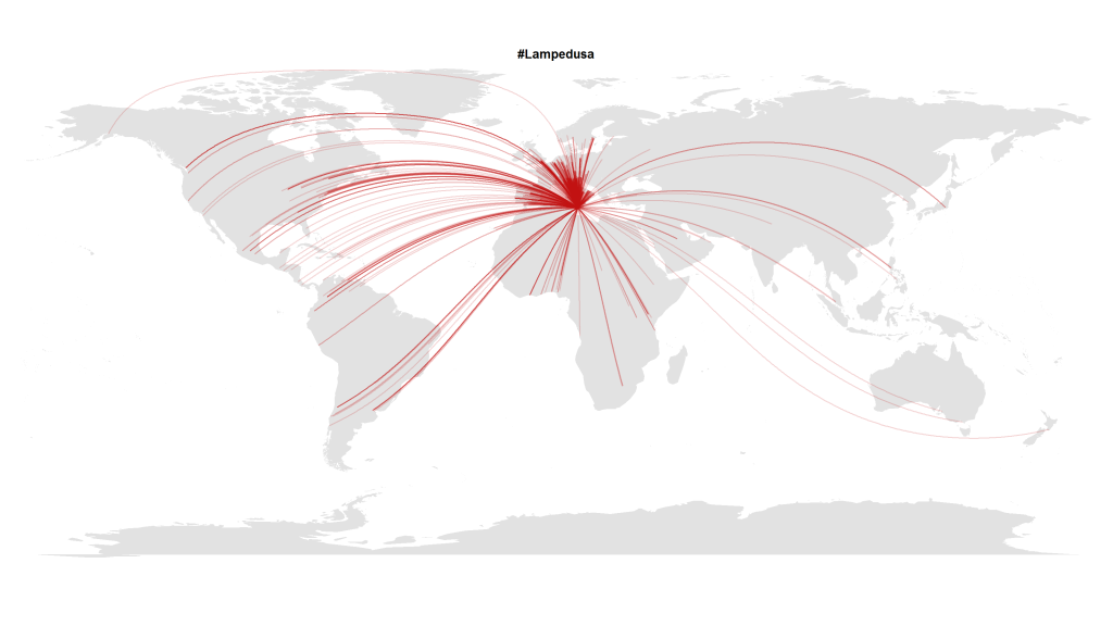
In this blogpost I presented a visualization made with R that shows how almost the whole world expresses its attention to political crises abroad. Here’s another visualization with Tweets in October 2013 that referred to the Lampedusa tragedy in the Mediterranean.

#Lampedusa on Twitter

But this transnational public space isn’t quite as static as it seems on these images. To show how these geographical hashtag links develop over time, I analyzed the timestamps of the (geo-coded) Tweets mentioning the hashtag #lampedusa. This is the resulting animation showing the choreography of global solidarity:

The code is quite straightforward. After collecting the Tweets via the Twitter Streaming API e.g. with Pablo Barberá’s R package streamR, I quantized the dates to hourly values and then calculated the animation frame by frame inspired by Jeff Hemsley’s approach.

One trick that is very helpful when plotting geospatial connections with great circles is the following snippet that correctly assembles lines that cross the dateline:

library("geosphere")
for (i in 1:length(l$long)) {
inter <- gcIntermediate(c(l$long[i], l$lat[i]), c(12.6, 35.5), n=500, addStartEnd=TRUE, breakAtDateLine=TRUE) if (length(inter) > 2) {
lines(inter, col=col, lwd=l$n[i])
} else {
lines(inter[[1]], col=col, lwd=l$n[i])
lines(inter[[2]], col=col, lwd=l$n[i])
}
}

Mining Research Interests – or: What Would Google Want to Know?

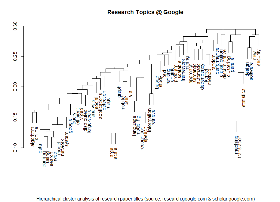
I am a regular visitor of Google’s research page where they post all of their latest and upcoming scientific papers. Lately I have thought whether it would be possible to statistically extract some of the meta-information from the papers. Here’s the result of the analysis of the papers’ titles produced with just a few lines of R code:

Research Topics @ Google


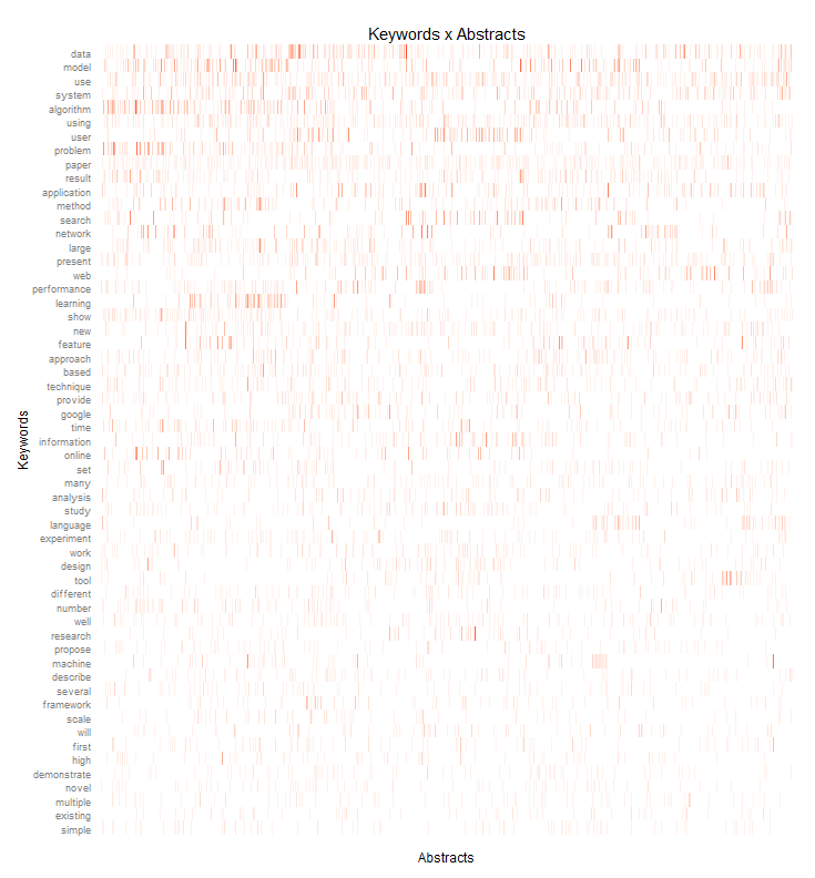
I clustered the data with a standard hierarchical cluster analysis to find out which terms tend to often go together in the paper titles. Then I took a deeper look at the abstracts – of all the papers that had abstracts that is. I processed the abstracts with the tm R package and draw the following heat-map that shows how often which of the most important keywords appear in each paper:

Keywords_Abstracts_google

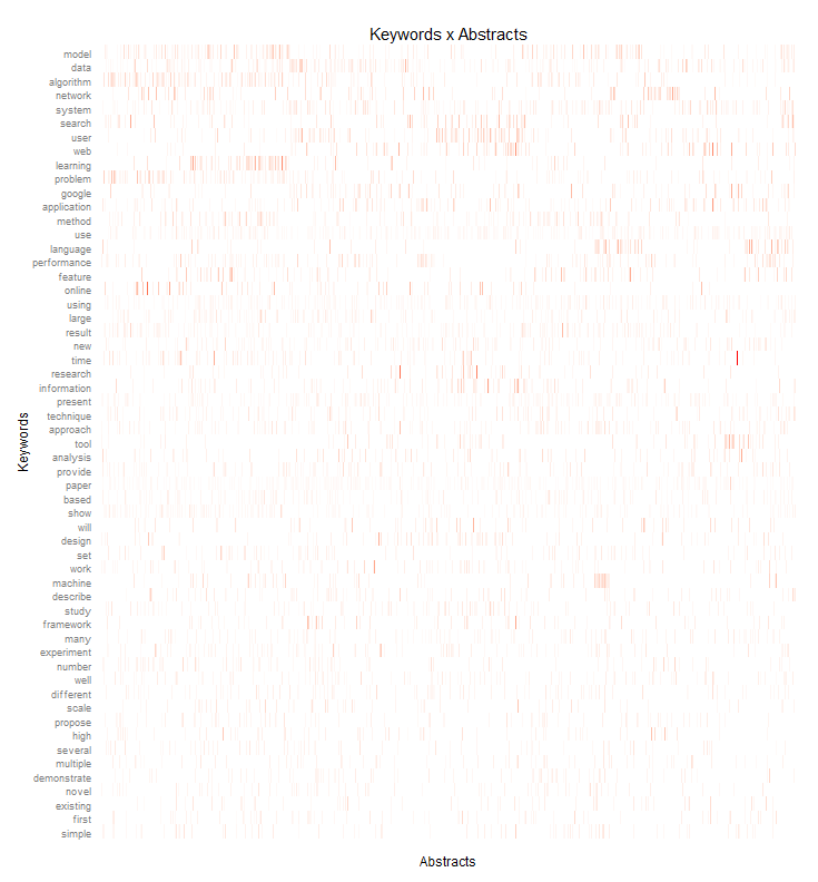
I did a similar heatmap but this time normalized by the term frequency – inverse document frequency measure. While the first heatmap shows the most frequently used terms, this weighted heatmap shows terms that are quite important in their respective research papers but normalizes this by the overall term frequency.

Keywords_Abstracts_google_tfidf

If you need input for playing buzzword bingo at the next Strata Conference in Santa Clara, you don’t have to look any further 😉

The Rise of the Chief Data Officer

Just a few months after Ogilvy & Mather created a new job position for a Chief Data Officer Todd Cullen, another WPP agency is following this example. Mindshare USA just appointed Bob Ivins as the company’s first Chief Data Officer directly reporting to the CEO Colin Kinsella.

Among the reasons for this move seems to be the growing importance of passively collected data in the agencies’ data warehouses and their clients’ marketing and enterprise software. Then there’s of course the massive data wealth that’s out there in the open: billions of tweets, check-ins, posts and comments by the modern digital population.

Now that data management platforms such as x+1, BlueKai or Adobe are among the standard tools in digital marketing and audience-buying – and the larger agencies even work with their own custom-created platforms – all in all data is becoming the new competitive edge.

This development gains further traction with a new development: Up to now, agencies were the only ones with full access to advertising data. They were the ones who did the ROI modelings and attribution analyses – and charged their clients for this service. But more and more advertisers are demanding their campaign data back in order to do their own analyses in combination with market and media surveys, customer data and retail data.

Big Data Business Models

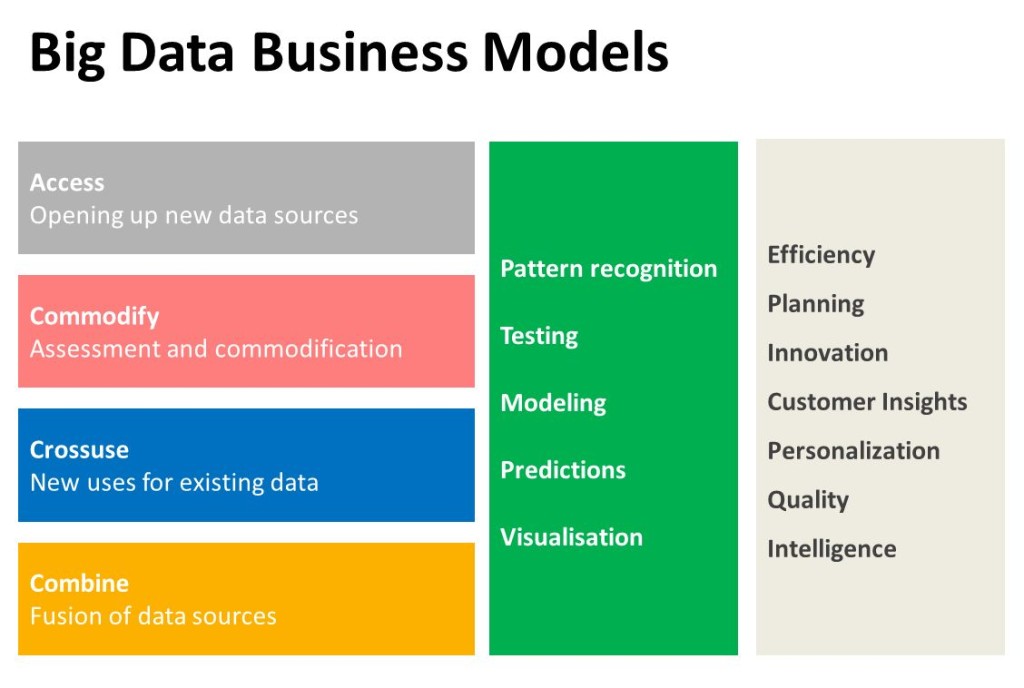
Agencies suddenly are in need to develop new offers for their clients that mean more than just evaluating media plans and campaign KPIs. Especially since the advent of real-time bidding and automated optimization, media planning has lost quite lot of importance for the agencies. I’d argue one of their new business fields will be data-driven:

  • identification of data-sources and data brokerage

  • analysis of their customers’ data-value

  • combination and refinement of data

  • real-time data management and data-driven learning

This all hints at a bright future for Data Scientists and Data Officers in advertising.