A risk is defined as the probability of an undesirable event to take place. Since most risks are not totally random but rather dependent of a range of influences, we try to quantify a risk function, that gives the probability for each set of influences. We then calculate the expected loss by multiplying the costs that are caused by the occurrence of this event with the risk, i.e. its probability.
Often, the influences can be changed by our actions. We might have a choice. So it makes sense to look for a course of actions that would minimize the loss function, i.e. lead to as little expected damages as possible.
Algorithms that run in many procedures and on many devices often make decisions. Prominent examples are credit scoring or shop recommendation systems. In both cases it is clear that the algorithm should be designed to optimize the economic outcome of its decision. In both cases, two risks emerge: The risk of a false negative (i.e. wrongly give credit to someone who cannot pay it back, resp. make a recommendation that does not fit the customer’s preferences), and the risk of a false positive (not granting credit to a person that would have been creditworthy, resp. not offering something that would have been exactly what the customer was looking for).
There is however an asymmetry in the losses of these two risks. For the vast majority of cases, it is far more easy to calculate the loss for a false negative than for the false positive. The cost of credit default is straightforward. The cost of someone not getting the money is however most certainly bigger than just the missed interests; the potential borrower might very well go away and never come back, without us ever realizing.
Even worse, while calculating risk is (more or less) just maths and statistics, different people might not even agree on the losses. In our credit scoring example: One might say, let’s just take what we know for sure, i.e. the opportunity costs of missed interests, the other might insist to evaluate a broader range of damages. The line where to stop is obviously arbitrary. So while the risk function can be made somehow objective, the loss function will be much more tricky and most of the time prone to doubt and discussion.
Collision decision
In the IoT – the world of connected devices, of programmable object, the problem of risks and losses becomes vital. Self-driving cars will cause accidents, too, even if they are much safer than human drivers. If a collision is inevitable, how should the car react? This was the key question ask by Majken Sander in our talk on algorithm ethics at Strata+Hadoop World. If it is just me in the car, a possible manoeuvre would turn the car sideways. If however my children sit next to me, I might very well prefer a frontal crash and rather have me injured than my passengers. Whatever I would see as the right way to act, it is clear that I want to make the decision myself. I would not want to have it decided remotely without my even knowing on what grounds.
Sometimes people mention that even for human casualties, a monetary calculation could be done -no matter how cruel that might sound. We could e.g. take the valuation of humans according to their life expectancy, insurance costs, or any other financial indicator. However, this is clearly not, how we would usually deal with lethal risks. “No man left behind” -how could we explain Saving-Private-Ryan-ish campaigns on economic grounds? Since the human casualty in the values of our society is regarded as total, not commensurable (even if a compensation can be defined), we get a singularity in our loss function. Our metric just doesn’t work here. Hence there will be no just algorithm to deal with a decision of that dimension.
Calculate risks, let losses be open
We will nevertheless have to find a solution. One suggestion for the car example is, that in risky situations, the car would re-delegate the driving back to a human to let them decide.
This can be generalized: Since the losses might be valuated differently by different people, it should always be well documented and fully transparent to the users, how the losses are calculated. In many cases, the loss function could be kept open. The algorithm could offer different sets of parameters to let the users decide on the behavior of product.
As a society we have to demand to be in charge defining the ethics behind the algorithms. It is a strong cause for regulation, I am convinced about that. It is not an economic, but a political task.
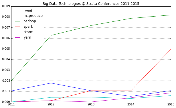
In one week, the 2015 edition of Strata Conference (or rather: Strata + Hadoop World) will open its doors to data scientists and big data practitioners from all over the world. What will be the most important big data technology trends for this year? As last year, I ran an analysis on the Strata abstract for 2015 and compared them to the previous years.
One thing immediately strikes: 2015 will be probably known as the “Spark Strata”:
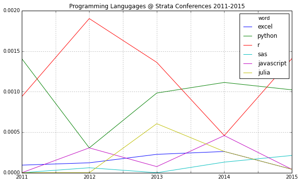
If you compare mentions of the major programming languages in data science, there’s another interesting find: R seems to have a comeback and Python may be losing some of its momentum:
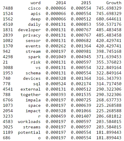
R is also among the rising topics if you look at the word frequencies for 2015 and 2014:
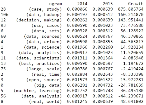
Now, let’s take a look at bigrams that have been gaining a lot of traction since the last Strata conference. From the following table, we could expect a lot more case studies than in the previous years:
This analysis has been done with IPython and Pandas. See the approach in this notebook.
Looking forward to meeting you all at Strata Conference next week! I’ll be around all three days and always in for a chat on data science.
Abstract: Data is the new media. Thus the postulates of our Slow Media Manifesto should be applicable on Big Data, too. Slow Data in this sense is meaningful data, relevant for society, driving creativity and scientific thinking. Slow Data is beautiful data.
From Slow Media to Slow Data
Five years ago we wrote the Slow Media Manifesto. We were concerned about the strange dichotomy by which people separated old media from new media to make their point about quality, ethics, and aesthetics. With Big Data, I now encounter a similar mindset. Just like people were scoffing social media to be just doodles, scribbling, or worse, I now see people scornfully raising their eyebrows about the lack of structure, missing consistency, and other alleged flaws they imagine Big Data to carry. As if “good old data” with a small sample size, representativeness, and other formalistic criteria would be a better thing as such. Again what these people see is just an evil new vice swamped over their mature businesses by unseasoned startups however, insanely well funded. I have gone through this argument twice already. It was wrong in the 90s when the web started, it was wrong again in the 2000s regarding social media, and it will not become right this time. Because it is not the technology paradigm that makes quality.
A mathematician, like a painter or a poet, is a maker of patterns. If his patterns are more permanent than theirs, it is because they are made with ideas. Beauty is the first test: there is no permanent place in the world for ugly mathematics.
Godfrey Harold Hardy
Data is the new media. I have written about this, too. The traditional concept of media becomes more and more directly intertwined with data, with data storytelling, data journalism, and their likes, indirectly because search, targeted advertising, content filtering, and other predictive technologies increasingly influence what we will find presented as media content.
Therefore I think it makes sense to take Slow Media and ask about Slow Data, too.
Highly curated small data
For what is useful above all is technique.
Godfrey Harold Hardy
Direct marketing data sets tend to be not very high quality (sorry CRM folks, but I know what I am talking about). Many records are only partly qualified, if at all. Moreover, the information on which the targeting is based is often outdated.
Small samples can enhance large heaps of data
In 2006 I oversaw a major market survey, the Typologie der Wünsche. This very expensive market research was conducted diligently according to the rules of the trade of social science. The questionnaire went through the toughest lectorship before it would be considered ready to be send out to the interviewers. The survey was done face to face, based on a cautiously drawn sample of 10.000 people per year. The results underwent permanent quality assurance. To be sure about the quality of the survey it was conducted by three independent research agencies. By doing this we could cross check plausibility.
Since my employer was also involved in direct marketing with a huge database of addresses, call centers, and logistics, we developed a method to use the highly curated market survey with its rather small sample to calibrate and enhance the “dirty” records of the CRM business. This was working so well that we started a cooperation with Deutsche Post to do the same, but on a much larger scale. Our small but precious data was matched with all 40 million addresses in Germany.
When working for MediaCom I was involved with a similar project. Television ratings are measured by expensive panels in most markets, usually run and funded by joint industry committees like BARB in the UK or AGF in Germany. Of course such a panel is restricted to just a few thousand households. Since in traditional broadcasting there are only some ten relevant TV channels in any market, this panel size is sufficient to support media planning. But internet usage is so much more fragmented that a panel of that sort would hardly make sense. So we took the data that we had collected via web tracking – again some 40 million records. We again found a way to infuse the TV panel data into the online data and could by that calculate the probabilities that the owner of a certain cookie would have had contact with a certain advertising campaign on TV or not. And again a small but highly curated and very specialized data set was used to greatly increase the value of the larger Big Data set.
Bringing scientific knowledge into Big Data
Archimedes will be remembered when Aeschylus is forgotten, because languages die and mathematical ideas do not.
Godfrey Harold Hardy
Another example where small but highly curated data is crucial for data science are data sets that contain scientific information which otherwise is not inherent in the data. Text mining works best when you can use quantitative methods without thinking about those difficult cultural concepts like ‘meaning’ or ‘semantics’. Detection of relevant content with ngram ranking, or text comparison based on cosine vector distance are the most powerful tools to analyze texts even in unfamiliar languages or alphabets. However, all the quantitative text mining procedures require the text to be preprocessed: All vocabulary with only grammatical function that would not add to the meaning has to be stripped off first. It is also useful to bring the words to their root form (picture verbs into infinitive, nouns into nominative singular). This indispensable work is done with special corpora, dictionaries, or better call it libraries, that contain all the required information. These corpora are handmade by linguists. Packages like Python’s NLTK have them incorporated in a handy way.
I am interested in mathematics only as a creative art.
Godfrey Harold Hardy
“Beautiful evidence” is what Edward Tufte calls good visualization. Information can truly be brought to us in a beautiful way. Data visualization as an art form had also entered the Sanctum of high arts when the group Asymptote was presented at Documenta 11 in 2002. Visual storytelling today has transformed. What used to be cartoons or engravings like this one here to illustrate the text, is now infographics that are the story.
Generative art is another data-driven art format. When I was an undergraduate The Fractal Geometry of Nature had finally tickled down to the math classes. With my Atari Mega ST I devoured all fractal code snippets I could get into my hands. What fascinated me most were not the (usually rather kitschy) colorful fractal images. I wanted to have fractal music, generative music that would evolve algorithmically from my code.
Although fractals as an art-thing where certainly more a fad, not well suited to turn into real art, generative art as such has since then become a strong branch in the Arts. Much of today’s music relies heavily on algorithmic patterns in many of its dimensions, from rhythm to tune, to overtone spectra. Also in video art, algorithmically rendered images are ubiquitous.
Art from data will further evolve. I trust we will see data fiction become a genre of its own.
Data as critique
… there is no scorn more profound, or on the whole more justifiable, than that of the men who make for the men who explain. Exposition, criticism, appreciation, is work for second-rate minds.
Godfrey Harold Hardy
Critique is the way to think in the alternative. Critique means not to trust what is sold to you as truth. Data is always ambiguous. Meaning is imposed upon data by interpretation. Critique is to deconstruct interpretation, to give room for other ways to interpret. The other stories we may draw from our data do not have to be more plausible, at all. Often the absurd is what unveils hidden aspects of our models. As long as our alternative interpretations are at least possible, we should follow these routes to see where they end. Data fiction is the means to turn data into a tool of critique.
Data science has changed our perception of how lasting we take our results to be. In data science we usually do not see a conclusion as true or permanent. Rather we hope that a correlation or pattern that we observe will remain stable, at least for a while. There is no hypothesis that we would accept and then tick off just because our test statistics turned significant. We would always continue to a/b-test alternative models, that would substitute an earlier winner of the test-game. In data science, we maximize critical thinking by not even seeing what we do as falsification because we would not have thought of the previous state as true in the first place. Truth in data science means just the most plausible interpretation at a time; ephemeral.
Slow Data accordingly means to use data to deconstruct the obvious, as well as to built alternatives.
Ethical data
A science is said to be useful if its development tends to accentuate the existing inequalities in the distribution of wealth, or more directly promotes the destruction of human life.
Godfrey Harold Hardy
The two use cases that dominate the discussion about Big Data are the right opposite of ethical: Targeted advertising, and mass surveillance. As Bruce Sterling points out, both are in essence just two aspects of the same thing that he calls ‘surveillance marketing’. I feel sad that this is what seams to be the prominent use of our work: To sell things to people who do not want them, and to keep people down.
However, I am confident that the benign uses of Big Data will soon offer such high incentive that we will awake from our military marketing nightmares. With open data we build a public space. All the most useful Big Data tools are all in the pubic domain anyway: Hadoop, Mesos, R, Python, Gephy, etc. etc.
Ethical data is data that makes a difference for society. Ethical data is relevant for people’s lives: To control traffic, to make agriculture more sustainable, to supply energy, to help plan cities and administer the states. This data will be crucial to facilitate our living together with ten billion people.
Slow Data is data that makes a difference for people’s lives.
Political data
It is never worth a first class man’s time to express a majority opinion. By definition, there are plenty of others to do that.
Godfrey Harold Hardy
“Code is Law” is the catch phrase of Lawrence Lessig famous bestseller on the future of democracy. From the beginning of the Internet revolution, there has been the discussion, whether our new forms of media and communication would lead to another revolution as well: a political one. Many of the media and platforms that rose over last decade show aspects of communal or even social systems – and hence might be called Social Media with good cause. It does not come as a surprise that we start to see the development of the communication platforms that are genuinely meant to support and at the same time to experiment with new forms of political participation, like Proxy-Voting or Liquid Democracy, which had been hardly conceivable without the infrastructure of the Web. Since these new forms of presenting, debating, and voting for policies have been started occurring just recently we can expect that many other varieties will appear, new concepts to translate the internet paradigm into social decision making. Nevertheless, how do these new forms of voting work? Are they really mapping the volonté generale into decisions? If so, will it work in a sustainable, stable, continuous way? And how to evaluate the systems, one compared to another? I currently work in a scientific research project on how to deal with these questions. Today I am not yet ready to present conclusions. Nonetheless, I already see that using data for quantitative simulation is a good approach to approximate the complex dynamics of future data-driven political decision-making.
Politics as defined by Aristotle means to have the freedom to make decisions based on ethics and beliefs and not driven by necessities, the latter is what he calls economics. To deal with law in this sense is similar to my text mining example above. If law is codified, it can be executed syntactically, indeed quite similar to a computer program. But to define what is just, what should be put into the laws, is not syntactical, at all. Ideally this would be exclusively political. I don’t think, algorithmic legislation would be desirable, I doubt that it would be even feasible.
Slow Data means to use data to explore new forms of political participation without rush.
Machine thinking
Chess problems are the hymn-tunes of mathematics.
Godfrey Harold Hardy
‘Could a machine think?’ is the core question of AI. The way we think about answering this question immediately lead us beyond computer science: What does it mean to think? What is consciousness? Since the 1980s there has been a fascinating exchange of arguments about the possibility of artificial intelligence, culminating in the Chinese Room debate between John Searle and the Churchlands. Searle and in an even more abstract way, David Chalmers made good points why a simulation of consciousness that would even pass the Turing test, would never become really conscious. Their counterparts, most prominent Douglas Hofstadter, would reject Chalmers neo-Kantianism as metaphysics.
Google has recently published an interesting paper on artificial visual intelligence. They trained mathematical models with random pictures from social media sites. And – surprise! – their algorithm came up with a concept of “What is a cat?”. The point is, nobody had told the algorithm to look for cat-like patterns. Are we witnessing the birth of artificial intelligence here? On the one hand, Google’s algorithm seams to do exactly what Hofstadter predicted. It is adaptive to environmental influences and translates the sensory inputs into something that we interpret as meaning. On the other side was the training sample far from random. The pictures were what people had pictured. It was a collaboratively curated set of rather small variety. The pattern the algorithm found was in fact imposed by “classic” consciousnesses, by the minds of “real” people.
Slow Data is the essence that makes our algorithm intelligent.
The beauty of scientific data
Beauty is the first test: there is no permanent place in this world for ugly mathematics.
Godfrey Harold Hardy
Now returning to Hardy’s quote from the beginning, when I was studying mathematics I was puzzled by the strange aestheticism that many mathematicians would force upon their train of thoughts. Times have changed since then. Today we have many theorems solved that were considered hard problems. Computational proofing has taken its role in mathematical epistemology. Proofs filling thousands of pages are not uncommon.
Science, physics in particular, is driven by accurate data. Kepler could dismiss the simple heliocentric model because Tycho Brahe had measured the movements of the planets to such accuracy that the model of circular orbits could no longer be maintained. Edwin Hubble discovered the structure of our expanding universe because Milton Humason and other astronomers at Mt. Wilson had provided for spectroscopic images of thousands of galaxies, exact enough to derive Hubble’s constant from the redshift of the prominent Fraunhofer lines. Einstein’s Special Theory of Relativity relies on the data of Michelson and Morley who had shown that light would travel at constant speed, no matter the angle to the direction of our earth’s travel around the sun it was measured against. Such uncompromisingly accurate data, collected in a painstaking struggle without any guarantee to pay off – this is what really brought the great breakthroughs in science.
Finally, while mathematics is turning partially into syntax, the core of physics at the same time unfolds in the strange blossoms of the most beautiful mathematics imaginable. In the intersect of cosmology, dealing with the very largest objective imaginable – the entirety of the cosmos, and quantum physics on the smallest scale lies the alien world of black holes, string theory, and quantum gravity. The scale of these phenomena, the fabric of space-time is likely defined by relating Planck’s constant to Newton’s constant and the speed of light is so unimaginably small – some 40 powers of magnitude smaller than the size of an electron – that we can’t expect to measure any data even near to it any time soon. We can only rely on our logic, our sense for mathematical harmony, and the creative mind.
Slow Data
Slow Data – for me the space of beautiful data is spanned by these aspects. I am confident that we do not need an update to our manifesto. However, I hope that we will see many examples of valuable data, of data that helps people, that creates experiences unseen, and that opens the doors to new worlds of our knowledge and imagination.
Appendix: Slow Media
The Slow Media movement was kicked off with the Slow Media Manifesto that Sabria David, Benedikt Koehler and I had written on new year’s day 2010. Immediately after we had published the manifesto, it was translated into Russian, French, and some other 20 languages.
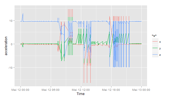
Yesterday, Jörg has written a blog post on Data Storytelling with Smartphone sensor data. Here’s a practical approach on how to analyze smartphone sensor data with R. In this example I will be using the accelerometer smartphone data that Datarella provided in its Data Fiction competition. The dataset shows the acceleration along the three axes of the smartphone:
x – sideways acceleration of the device
y – forward and backward acceleration of the device
z – acceleration up and down
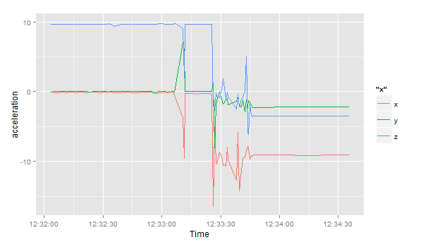
The interpretation of these values can be quite tricky because on the one hand there are manufacturer, device and sensor specific variations and artifacts. On the other hand, all acceleration is measured relative to the sensor orientation of the device. So, for example, the activity of taking the smartphone out of your pocket and reading a tweet can look the following way:
y acceleration – the smartphone had been in the pocket top down and is now taken out of the pocket
z and y acceleration – turning the smartphone so that is horizontal
x acceleration – moving the smartphone from the left to the middle of your body
z acceleration – lifting the smartphone so you can read the fine print of the tweet
And third, there is gravity influencing all the movements.
So, to find out what you are really doing with your smartphone can be quite challenging. In this blog post, I will show how to do one small task – identifying breakpoints in the dataset. As a nice side effect, I use this opportunity to introduce an application of the Twitter BreakoutDetection Open Source library (see Github) that can be used for Behavioral Change Point analysis.
This quick analysis of the acceleration in the x direction gives us 4 change points, where the acceleration suddenly changes. In the beginning, the smartphone seems to lie flat on a horizontal surface – the sensor is reading a value of around 9.8 in positive direction – this means, the gravitational force only effects this axis and not the x and y axes. Ergo: the smartphone is lying flat. But then things change and after a few movements (our change points) the last observation has the smartphone on a position where the x axis has around -9.6 acceleration, i.e. the smartphone is being held in landscape orientation pointing to the right.
Data storytelling has become a regular topic at data science conferences, and with good cause. First: The story is what gives meaning to the data, leads to people understanding our analysis, and supports the discussion of our findings, but second: Our interpretation of the data is at least to some extend arbitrary and subjective, and no harm is done to admit that. Compared however to stories without any data support, data-driven narratives have a far better chance to maintain their statement. No wonder, data-driven journalism is on the rise.
In social sciences, we are used to data that are already highly abstract. We ask people, “Can you remember this ad?” Without much questioning the concept behind using what we presume to be words of everyday language. Hence the interpretation is straight forward.
When we use measurements instead of verbal surveys, the situation is much more complicated (but also much more interesting). The data we collect, e.g. from tracking mobile phones, as such doesn’t tell much, at all.
A useful step-by-step way to get meaning into data by gradually abstracting was proposed by Pei et.al.: “Human Behavior Cognition Using Smartphone Sensors“, Sensors 2013, 13, 1402-1424; doi:10.3390/s130201402
My approach is just a simplification of theirs.
In the first layer, we collect the raw data – which often is a demanding task in its own right.Raw data is just tables with numbers. Of course we know how to interpret latitude and longitude. But even the location data is much richer than just coordinates. To interpret the other readings we need to have meta data.
With the data just collected, we still do not see much. We have absolute numbers that are encoded to an arbitrary scale. If e.g. we have distances or speed measurements, the numbers won’t tell us, if metric or imperial scale is applicable. We don’t know of any tolerances either, don’t see the bias in missing values, and so on. So we usually have to enrich the raw readings with meta data. This step is called data munging.
Now we start abstracting from the raw data. In this example of gyroscope data, collected on a smartphone, we see sharp spikes shooting out regularly. This is a typical hardware artefact to be found everywhere in sensor data. These artefacts are quite unique to a specific device and can be used to re-identify it, like a fingerprint.For the gyroscope data, collected e.g. with some fitness-tracker wristband, that would mean to calculate the number of steps walked. Thus, in the second layer, we derive events from the data. What an event is, might be highly arbitrary. Most tracking-gadgets count the number of steps significantly different, depending on the model chosen.
What somebody understands as the occurrence of certain event is also at least partly subjective. I might count some movement of mine as a step while someone else might already call it a leap. What we need to understand the events, is context.
I the third layer, we derive simple context, e.g. by adding location data, or other environmental information like temperature. Fitness tracker usually put the measured data into some simple context on a dashboard. Strava e.g. shows grade and change in altitude.Most fitness trackers do this in their dashboards by showing our training efforts in the context of the situation they could easily match with it. Did we run uphill or downhill?
The fourth layer is finally the rich context. What did really happen? The rich context is hardly ever to be drawn just from our data. Historic, cultural, or medical conditions add to that. We won’t tell a plausible story, if we don’t embed it in the panorama that our audience would expect us to experience, if they would have lived through the story in person. For rich context, we regularly need people’s opinions and personal situation. This is when data science finally gets married to classic social research: The questionnaire based interview – just ask people what they experienced while we measured what happened.
Data science lays the grounding for our pyramid, with social science at its pinnacle.
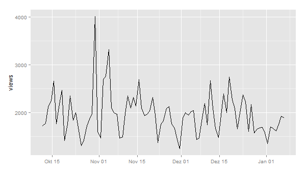
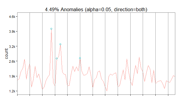
Today, the Twitter engineering team released another very interesting Open Source R package for working with time series data: “AnomalyDetection“. This package uses the Seasonal Hybrid ESD (S-H-ESD) algorithm to identify local anomalies (= variations inside seasonal patterns) and global anomalies (= variations that cannot be explained with seasonal patterns).
As a kind of warm up and practical exploration of the new package, here’s a short example on how to download Wikipedia PageView statistics and mine them for anomalies (inspired by this blog post, where this package wasn’t available yet):
First, we install and load the necessary packages:
Now, let’s look for anomalies. The usual way would be to feed a dataframe with a date-time and a value column into the AnomalyDetection function AnomalyDetectionTs(). But in this case, this doesn’t work because our data is much too coarse. It doesn’t seem to work with data on days. So, we use the more generic function AnomalyDetectionVec() that just needs the values and some definition of a period. In this case, the period is 7 (= 7 days for one week):
res = AnomalyDetectionVec(views$count, max_anoms=0.05, direction='both', plot=TRUE, period=7)
res$plot
In our case, the algorithm has discovered 4 anomalies. The first on October 30 2014 being an exceptionally high value overall, the second is a very high Sunday, the third a high value overall and the forth a high Saturday (normally, this day is also quite weak).
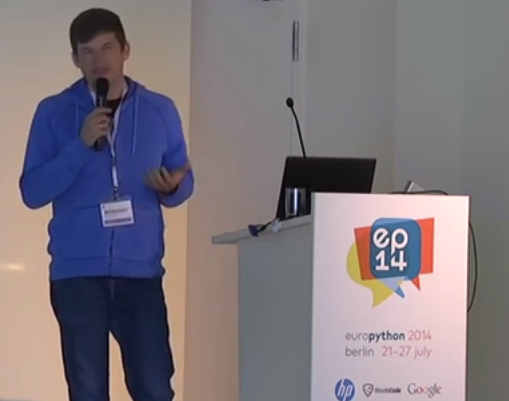
One of the most exciting applications of Social Media data is the automated identification, evaluation and prediction of trends. I already sketched some ideas in this blog post. Last year – and this was one of my personal highlights – I had the opportunity to speak at the PyData 2014 Berlin on the topic of Street Fighting Trend Research.
In my talk I presented some more general thoughts on trend research (or “coolhunting” as it is called nowadays) on the Internet. But at the core were three examples on how to identify research trends from the web (see this blogpost), how to mine conference proposals (see this analysis of Strata abstracts) and how to identify trending locations on Foursquare (see here). All three examples are also available as IPython Notebooks on my Github page. And here’s the recorded version of the talk.
The PyData conference was one of the best conferences I attended. Not only were the topics very diverse – ranging from GPU optimization to the representation of women in the PyData community – but also the people attending the conference were coming from different backgrounds: lawyers, engineers, physicists, computer scientists (of course) or statisticians. But still, with every talk and every conversation in the hallways, you could feel the wild euphoria connecting us all with the programming language and the incredible curiosity.
I already mentioned the Hastie & Tibshirani course on statistical learning as one of my personal highlights in data science last year. My second highlight is also an online course, also by leading experts on their field (this time: Big Data and data mining), also based on a (freely available) book and also by Stanford University professors: Jure Leskovec, Anand Rajamaran and Jeff Ullman’s course on “Mining Massive Datasets”.
If you’re interested in data science or data mining, chances are high that you have already been in touch with their book. It can safely be considered a standard work on the fascinating intersection of data mining algorithms, machine learning and Big Data. The 7 week course is the online version of the Stanford courses CS246 and the earlier version of CS345A.
The course is very dense and covers a lot of territory from the book, for example:
How does Map Reduce work and why is it important?
How can I retrieve frequently appearing combinations from very large sets of items such as shopping baskets?
How to retain information about a datastream that does not fit in memory?
What are the most common tasks in supervised machine learning and how to implement them?
How do I program an intelligent system for recommending movies?
How to compute optimal placements of online advertisements?
Some of the lectures are on a beginners to intermediate level, but some lectures cover very advanced topics. What I especially liked about this course is that a lot of the material covered really is state-of-the-art in data mining. Some algorithms – e.g. the BIGCLAM community detection and CUR matrix decomposition – had only been developed about year ago.
So, take a look at the book, and if you haven’t already: enroll at the Coursera course website to make sure you won’t miss the next session of this course.
One thing that’s particularly great about the Internet is the Sharing Economy. So much information, know-how, content is given out for free on a daily basis. Here’s three fascinating unpublished books that you can take a look at right now. And to make them even greater, you can always give the authors your feedback, bugs you’ve discovered or just a big thank you!
The first book from O’Reilly’s Early Release series is “Mastering Bitcoin” by Andreas Antonopoulos. If you want to learn more about how the new crypto-currency works or if you want to imagine how this concept will change the world or just understand how you can use the Bitcoin APIs to build your own tools, this is the place to start. I hope this book will give me lots of inspiration about analyzing and visualizing the Blockchain (see this blogpost).
“Deep Learning” is the somewhat humble title of the second book. This work by Yoshua Bengio, Ian J. Goodfellow and Aaron Courville (University of Montréal) on the theory and practice of neural networks a.k.a. deep learning could someday become a standard introduction. On their webpage, you can download and read the book chapter by chapter – but as this is work in progress, there could be quite a lot of updates in the future. So grab it while it is still fresh.
The third one is already a classic and very well received by the peer group: “Network Science” by Albert-László Barabási. This book explains the science of networks and social network analysis from the beginning (history- and concept-wise) right to the 21. century. From finding and identifying Terrorists to analyzing and optimizing organizational structure – this book abounds with colorful examples and real applications. Everyone who has been thinking “Yeah, network visualizations look pretty nice, but what’s the real use-case besides that?” should definitely take a look at this work. The best thing: it will stay free because it’s published under a Creative Commons license. Thanks, László!
We start with Kevin Murphy of Google talking about his textbook that has become a standard in the field. Then we turn to Hanna Wallach of Microsoft Research NYC and UMass Amherst and hear about the founding of WiML (Women in Machine Learning). Next we discuss academia’s relationship with business with Max Welling from the University of Amsterdam, program co-chair of the 2013 NIPS conference (Neural Information Processing Systems). Finally, we sit down with three pillars of the field Yann LeCun, Yoshua Bengio, and Geoff Hinton to hear about where the field has been and where it might be headed.
Downloading the first episode from January 1st right now.
2014 was a great year in data science – and also an exciting year for me personally from a very inspirational Strata Conference in Santa Clara to a wonderful experience of speaking at PyData Berlin to founding the data visualization company DataLion. But it also was a great year blogging about data science. Here’s the Beautiful Data blog posts our readers seemed to like the most:
Datalicious Notebookmania – My personal list of the 7 IPython notebooks I like the most. Some of them are great for novices, some can even be challenging for advanced statisticians and datascientists
Trending Topics at Strata Conferences 2011-2014 – An analysis of the topics most frequently mentioned in Strata Conference abstracts that clearly shows the rising importance of Python, IPython and Pandas.
Big Data Investment Map 2014 – I’ve been tracking and analysing the developments in Big Data investments and IPOs for quite a long time. This was the 2014 update of the network mapping the investments of VCs in Big Data companies.
How to create a location graph from the Foursquare API – In this post, I explain a way to make sense out of the Foursquare API and to create geospatial network visualizations from the data showing how locations in a city are connected via Foursquare checkins.
Text-Mining the DLD Conference 2014 – A very similar approach as I used for the Strata conference has been applied to the Twitter corpus refering to Hubert Burda Media DLD conference showing the trending topics in tech and media.
The crypto-currency Bitcoin and the way it generates “trustless trust” is one of the hottest topics when it comes to technological innovations right now. The way Bitcoin transactions always backtrace the whole transaction list since the first discovered block (the Genesis block) does not only work for finance. The first startups such as Blockstream already work on ways how to use this mechanism of “trustless trust” (i.e. you can trust the system without having to trust the participants) on related fields such as corporate equity.
So you could guess that Bitcoin and especially its components the Blockchain and various Sidechains should also be among the most exciting fields for data science and visualization. For the first time, the network of financial transactions many sociologists such as Georg Simmel theorized about becomes visible. Although there are already a lot of technical papers and even some books on the topic, there isn’t much material that allows for a more hands-on approach, especially on how to generate and visualize the transaction networks.
The paper on “Bitcoin Transaction Graph Analysis” by Fleder, Kester and Pillai is especially recommended. It traces the FBI seizure of $28.5M in Bitcoin through a network analysis.
So to get you started with R and the Blockchain, here’s a few lines of code. I used the package “Rbitcoin” by Jan Gorecki.
Here’s our first example, querying the Kraken exchange for the exchange value of Bitcoin vs. EUR:
library(Rbitcoin)
## Loading required package: data.table
## You are currently using Rbitcoin 0.9.2, be aware of the changes coming in the next releases (0.9.3 - github, 0.9.4 - cran). Do not auto update Rbitcoin to 0.9.3 (or later) without testing. For details see github.com/jangorecki/Rbitcoin. This message will be removed in 0.9.5 (or later).
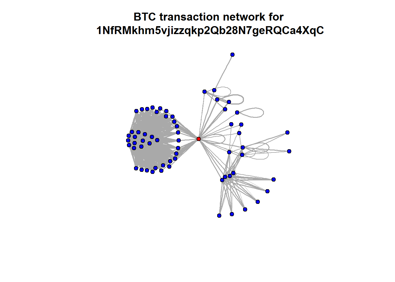
The last two examples all were based on aggregated values. But the Blockchain API allows to read every single transaction in the history of Bitcoin. Here’s a slightly longer code example on how to query historical transactions for one address and then mapping the connections between all addresses in this strand of the Blockchain. The red dot is the address we were looking at (so you can change the value to one of your own Bitcoin addresses):
wallet <- blockchain.api.process('15Mb2QcgF3XDMeVn6M7oCG6CQLw4mkedDi')
seed <- '1NfRMkhm5vjizzqkp2Qb28N7geRQCa4XqC'
genesis <- '1A1zP1eP5QGefi2DMPTfTL5SLmv7DivfNa'
singleaddress <- blockchain.api.query(method = 'Single Address', bitcoin_address = seed, limit=100)
txs <- singleaddress$txs

bc <- data.frame()
for (t in txs) {
  hash <- t$hash
  for (inputs in t$inputs) {
    from <- inputs$prev_out$addr
    for (out in t$out) {
      to <- out$addr
      va <- out$value
      bc <- rbind(bc, data.frame(from=from,to=to,value=va, stringsAsFactors=F))
    }
  }
}
After downloading and transforming the blockchain data, we’re now aggregating the resulting transaction table on address level:
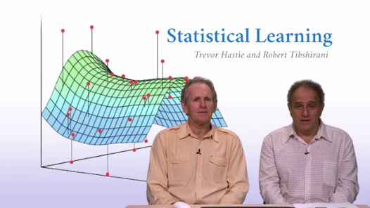
What I like most about the R and Python developer and user communities, is their incredible openness and generosity. One of the finest examples in the past year was the online course “Statistical Learning” taught by Stanford professors Trevor Hastie and Rob Tibshirani.
In this MOOC they explain very understandably (even for beginners) the basics of statistical modeling (or machine learning) techniques such as linear, polynomial and logistic regression, smoothing splines, Ridge regression, Lasso, Generalized Additive Models, various methods for classification (Classification Trees to random forests) and also unsupervised learning methods.
But the highlights of this course are the R labs between all units. In these sessions, the statistical theory is supplemented with many practical examples. It’s really fantastic to hear the authors explain and teach the (very essential) R packages they wrote themselves. For me, the course was also an impetus to learn even more about knitr. Especially if you’re used to IPython notebook, this combination of code and output can be very intuitive and useful. Even months after going through the course, I refer to my lab R code (see also here) when I need some quick templates for common statistical modelling tasks. I really liked the strong focus on cross validation methods – many basic courses on statistics focus only on the methods and not on how to estimate how well you’re predicting.
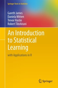
The course is based on the textbook “Introduction to Statistical Learning” (or short: ISL, download here) Hastie and Tibshirani wrote together with Gareth James and Daniela Witten. If you want to dive even deeper into the subject, you can also work through the more advanced work “Elements of Statistical Learning” (ESL, download).
So, if one of your New Year resolutions for 2015 is, learning how to do more with R, you should definitively take a look at this course. The next free class is starting on January 19.
“One hundred and sixty eight (68 men and 100 women) undergraduates from a small, private college in Pennsylvania participate d in this study.”
(L. McDermott, T. Pettijohn II: “The Influence of Clothing Fashion and Race on the Perceived Socioeconomic Status and Person Perception of College Students.” Psychology & Society, 2011, Vol. 4 (2) , 64 ‐ 75
Draper: “What do women want?”
Stirling: “Who cares!”
One of my colleagues at Max-Planck-Institut once came to me with a draft paper. It dealt with dimorphism in sexes and would present evidence, that most differences could be explained from genetic heritage. The method that was mandatory practice at this institute was social biology -every behavior should only occur with humans (and animals likewise), if a clear evolutionary advantage could be derived from it. Since it was the early 90s, the fight of science against postmodernism was still at its peak. Postmodernist thinking, like “it could just be our imposing social conventions into our methods to learn what we already knew”, was brusquely brushed away, because “we use the scientific method, don’t we?”.
In the paper, my colleague presented results of some surveys he had conducted that showed correlation of the perceived “beauty” of people on images with the (I forgot how he had quantified it) beauty of the subject’s spouse (I also forgot the thesis he would derive thereof). The correlation was very weak, like R²~0.6 or so. But because he had surveyed several hundred people, it became significant; it proved his absurd postulate.
The scientific method in general, but in quantitative social sciences in particular, has four steps to take:
1. Formulate the hypothesis
2. Draw a representative sample of observations
3. Test the hypothesis and prove it significant
4. Publish the results for review.
For now I do not want to focus on the strange reviewing practices that do not really publish results but rather keep them within closely confined boundaries of scientific journals, inaccessible for the public, only available for a small academic elite, so that a sound review hardly takes place.
I want to discuss the first three steps, because during the last 20 years, my professional field has undergone a dramatic paradigm shift, regarding these, while the forth is still holding for the time being.
The quantitative methods in social science originate from the age of the mass society within a nation state. These methods were developed as tools to help management and politics with their decisions. Alternatives to be tested were usually simple. The industrial production process would not allow for subtile variations in the product, thus it would be sufficient to present very few – usually two – varieties to the survey’s subjects. People’s lives would be likewise simple: a teacher’s wife would show a distinctive consumption pattern, as would a coal miner. It would be good enough to know people’s age, gender, and profession to generalize from one specimen to the whole group. Representativeness means, that one element of a set is used to represent the whole set – and not just with the properties, that would characterize the set itself (like male/female, Caucasian/Asian, etc.); the whole set would inherit all properties of its representative. It is counting the set as one, as Alain Badiou puts it.
We are so used to this aggregation of people into homogeneous sets, that we hardly realize its existence anymore. The concept of “target groups” in advertising is justified with this, too. Brands buy advertising by briefing the agency with gender, age, education of the people the campaign should reach. Prominent is the ABC-Audience in the UK, a rough segmentation of the populace just by their buying power and cultural capital.
In the mass society, up to the 1970s, this more or less seemed to make sense. People in their class or milieu would behave sufficiently predictable. Especially television consumption still mirrors this aspect of mass society: ratings and advertising effect could be calculated and even predicted from the TV measurement panels with scientific precision. 2006 I came in charge of managing one of the largest and longest running social surveys, the “Typologie der Wünsche“. Topics covered where consumption, brand preferences, and many aspects of people’s opinions and daily routine, surveyed by personal interview of 10,000 participants per year. Preparing a joint study with Roland Berger Strategy Consultants, I examined the buyers of car brands regarding all aspects of them being defined as a “target group”. The fascinating result was: while in the 1980s to the mid 1990s, buyers of car brands had been indeed quite homogeneous regarding their political opinions, ecological preferences, consumption of other brands, etc., this seemed to wane away over the last decade. The variance increased dramatically, so that to speak of “the buyer of a car brand” could be questioned. This was even more true for fast-moving consumer goods. Superficially, this could be explained by daily consumption becoming cheaper in proportion to average income, so poorer consumers where no longer as much restricted to certain goods as in earlier times. But the observation would prevail, even if just people with comparable wealth were taken into account.
Our conclusion: the end of mass media (that my employer was suffering from, like most traditional publishers), might come along with the end of mass society, too. The concept of aggretating people by objective criteria, by properties observable from the outside, like gender, income, or education, was getting under pressure.
For Israeli military strategist Martin van Creveld, this is also the underlying condition for what he calls the “Transfromation of War”. In military philosophy, the corresponding paradigm is the idea of soldiers and civilians, unfolded by von Clausewitz. Van Crefeld argues, that the constructs of Clausewitz’ theory, like ‘peoples’ (‘Völker’) had never existed in the first place. They were just stories told to organize war at industrial scale. And van Crefeld explicitly deconstructs the gender gap in battle. His book is full of quantitative proof that men, just regarded from the physical perspective, would make no better soldiers, than women. The the distributions of women and men in size, weight, physical strength etc. are mainly overlapping. Of course, the mean size of men is taller for a few centimeters than the size of women. This mean difference is significant, if you make a t-test. But as always, a significant mean difference says nothing about the individual. Most women are as tall as most men. Just some men are taller, and some women are smaller.
The fallacy of significance-testing should be obvious. It presumes the subjects would be originating from different universes, disjoint subsets of the population. Testing takes it for granted, that hypothesis and alternative are truly distinct, that only one can hold. This is hardly ever the case when humans are concerned. For most properties that we are studying in social research, the intra-set variance is much bigger than the variance between two sets, be it gender, be it age, education, hair color, or what ever criteria we choose to form the subsets. Women in most aspects are in average less similar one to each other, than the value of the mean difference of women and men.
This given, the logical next question would be, if the method had been correct, at all. The conditions of the industrial age made it only possible to serve their products to aggregates of people. Representative democracy also only gives the choice between a handful party programmes. And mass media could in principle not match individual preferences. So it seemed logic to place people in categories, too, without bothering that dichotomous variables like sex might not be appropriate to map people’s gender. Quantitative social research just reproduced the ideological restrictions of mass society.
With the Web, people suddenly had the choice, not only regarding media, but also regarding consumption. And -surprise!- people do act individually, and the actions are so random, that no correlation holds for more than a couple of weeks. “Multi-optional consumer” is a helpless way to express, that the silos of segmentation no longer make sense. Of course nobody has ever encountered a multi-optional person; on the individual level, people’s behavior is mostly continuous and perfectly consistent; it is just no longer about “what women want”.
The Web also presented for the first time a tool to collect data describing (nearly) everyone on the individual level. However, with trillions of data points on billions of users, every difference between subgroups becomes significant, anyway. Dealing with results like in the example of my colleague’s ethological study mentioned above, the problem comes from taking significance as absolute. No matter how small an effect is, as long as it is significant, it will be considered proven. But statistical inference was designed to suite sample sizes of some ten to some low in the thousands people. It is ill-suited to deal with big data.
The jokes about silly correlations with Google trends are thus totally correct. And this demonstrates also another aspect: significance and hypotheses testing is regarded as static while data remains dynamic. While at some point in time, a correlation of Google trends with other time series might just randomly become significant, it is highly unlikely, that this bogus correlation will survive. Data science, other than classic quantitative research, tends to deal with data in an agile way, which means, that nothing is regarded as fixed. But if we see our data as ephemeral, there is no need to come up with models that we restrict according to fixed proven hypothesis.
So the role of statistics for social science changes. Statistics is now the tool to deal with distributions as phenomena as such rather than just generalizing from small samples to an unknown population. We should use the stream of data as the life-condition in which our models would have to struggle to survive in. Like with biological evolution, we would not expect the assumptions to remain stable. We would rather expect, the boundary conditions to change, and our models would have to adjust; survival of the fittest model means: the fittest for now.
The philosophical justification for inference is the idea of the general comprehensibility of reality. Like St. Augustine we postulate that it is possible to extrapolate from perception (=measurement, data) to the world of things. But like our sensory organs have been evolving, driven by environmental change (and mutations in our genome), we should regard the knowledge we derive from data as “shadow on the cave wall” at best.
This is far better than it sounds: it gives us freedom to explore data rather than just test our made-up hypotheses, that would just perpetuate our presumptions.
Let’s leave statistical testing and significance where it belongs to: Quality assurance, material testing, physical measurements -engineering.
Let’s be honest, and drop it in the humanities.
Monday, I’ll be speaking on “Linked Data” at the 49th German Market Research Congress 2014. In my talk, there will be many examples of how to apply the basic approach and measurements of Social Network Analysis to various topics ranging from brand affinities as measured in the market-media study best for planning, the financial network between venture capital firms and start-ups and the location graph on Foursquare.
Because I haven’t seen many examples on using the Foursquare API to generate location graphs, I would like to explain my approach a little bit deeper. At first sight, the Foursquare API differs from many other Social Media APIs because it just allows you to access data about your own account. So, there is no general stream (or firehose) of check-in events that could be used to calculate user journeys or the relations between different places.
Fortunately, there’s another method that is very helpful for this purpose: You can query the API for any given Foursquare location to output up to five venues that were most frequently accessed after this location. This begs for a recursive approach of downloading the next locations for the next locations for the next locations and so on … and transform this data into the location graph.
I’ve written down this approach in an IPython Notebook, so you just have to find your API credentials and then you can start downloading your cities’ location graph. For Munich it looks like this (click to zoom):
Munich seen through Foursquare check-ins
The resulting network is very interesting, because the “distance” between the different locations is a fascinating mixture of
spatial distance: places that are nearby are more likely to be connected (think of neighborhoods)
temporal distance: places that can be reached in a short time are more likely to be connected (think of places that are quite far apart but can be reached in no time by highway)
affective/social distance: places that belong to a common lifestyle are more likely to be connected
Feel free to clone the code from my github. I’m looking forward to seeing the network visualizations of your cities.


 The first book from O’Reilly’s Early Release series is “
 The third one is already a classic and very well received by the peer group: “
 This new machine learning podcast
  2014 was a great year in data science – and also an exciting year for me personally from a very inspirational
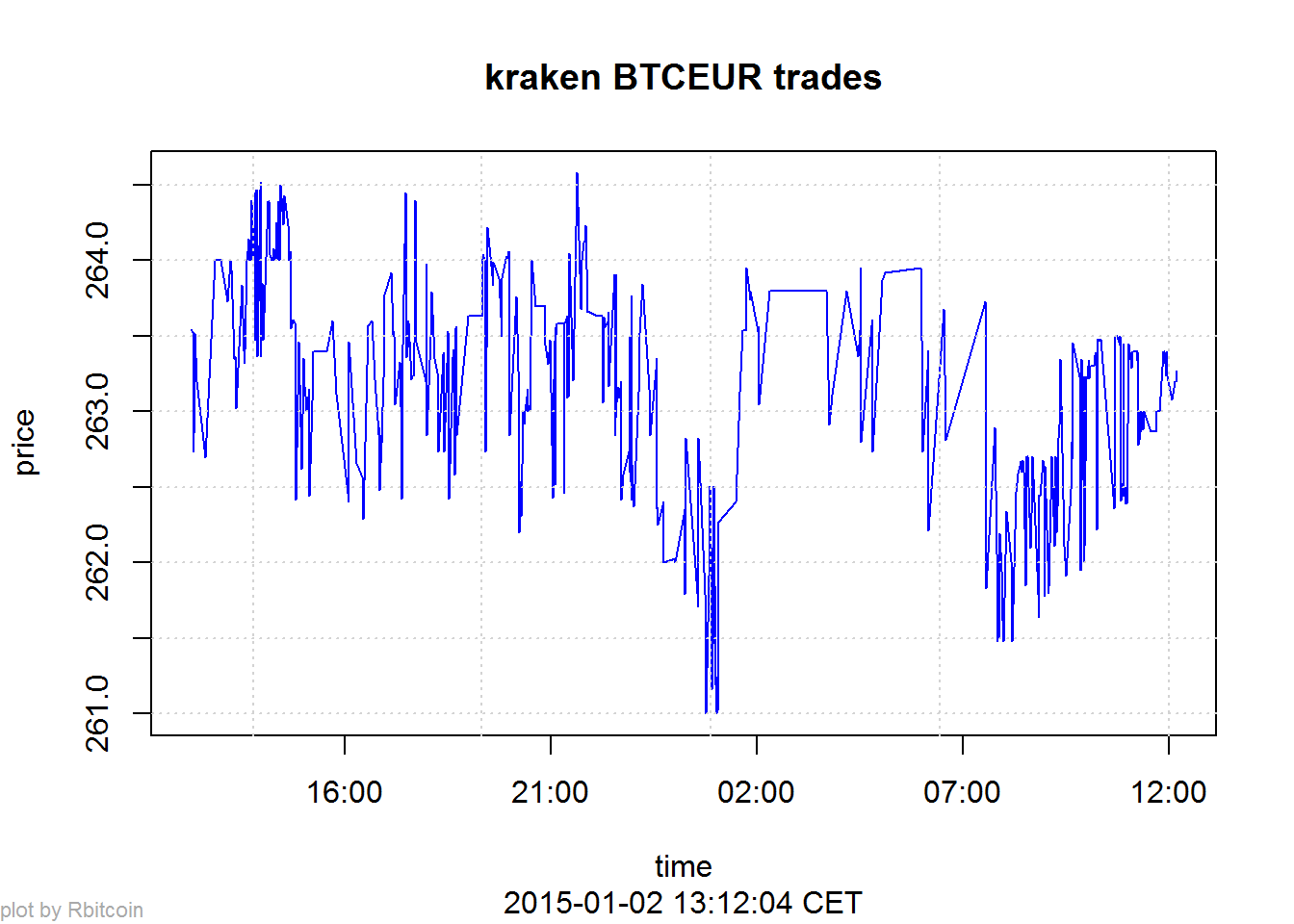
 The course is based on the textbook “Introduction to Statistical Learning” (or short: ISL,
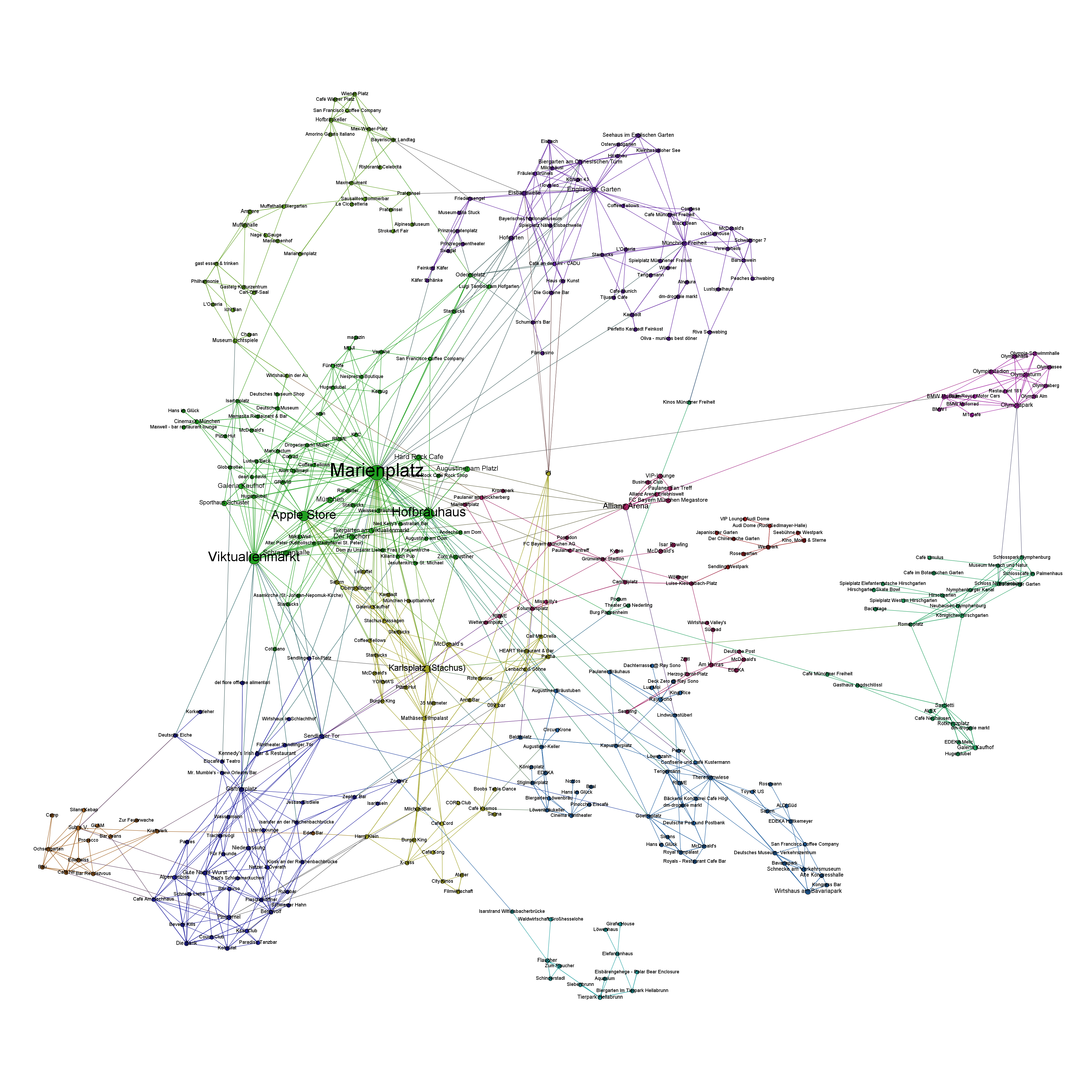