What will be the most promising startups in the Big Data field in the year 2013? Just like last year, we did a lot of research and analyses to compile our hotlist of 45 companies we think that could change the market in 2013 either through awesome product innovations or great funding rounds or take-overs. Our criteria for this hotlist were as follows:
- Main area of business should be related to big data challenges – i.e. aggregation, storage, retrieval, analysis or visualization of large, heterogeneous or real-time data.
- To satisfy the concept of being a startup, the company should be no older than 5 years old and not be majority owned by another company.
So, here’s the list of the top acts on the Big Data stage:
 10gen is the Company behind MongoDB. Thus 10gen has been right in the Epicenter of Big Data. MongoDB has become synonymous with scheme free data base technology. The heap of unstructred documents that wait to be indexed is growing exponentially and will continue to rise until most document generating processes are automated (and therefor only mapping structured data form some other source). 10gen received $42M of funding in 2012 among others by the intelligence community’s VC In-Q-Tel and Sequoia Capital.
 While MongoDB is a well known name in the NoSQL movement, you may not have heard of BitYota. This 2011 founded company that only left stealth mode in November 2012 promises to simplify Big Data storage with its Warehouse-as-a-Service approach that could be a very interesting offer for small and midsize companies with a high data analytics need. The BY management teams has a lot of experience by working the Big Data shift at companies such as Yahoo!, Oracle, Twitter and Salesforce. They received a surprising $12M in 2012 by the likes of Andreessen Horowitz, Globespan, Crosslink and others.
 Big Data analytics, integration and exploration will be a huge topic in 2013. ClearStory Data, the company co-founded by digital serial entrepreneur Sharmila Shahani-Mulligan, has drawn a lot of attention with a $9M A round in December 2012 by KPCB, Andreessen Horowitz and Google Ventures. ClearStory’s main promise of integrating all the different and heterogeneous data sources within and around companies should be a very attractive segment of the Big Data business in the coming years. We’re eagerly awaiting the launch of this company.
 And now for something completely different. Climate. Insurances have always been looking into the past, modelling risks and losses – usually based on aggregated data. Climate Corporation calculates micrometeorological predictions and promises to thus to be able to offer weather related insurances far more effective. We certainly will see more such technological approaces, bridging from one “Big Data Field” to another – like Climete Corp does with weather forcast and insurances. $42M funding in 2011 and another $50M in 2012 – weather data seems to be a very promising business.
 We already had this one on our last year’s list. Then in stealth mode, now – one year and $10M later – Continuuity have disclosed more of their business model. And we’re excited. When the Web started in the 90s, everyone got excited about the fantastic possibilities that html, cgi and the like would offer. But setting up a website was an expert task – just to keep the links consitent ment continuusly updating every page; this did not change until the easy-to-use content management systems where programmed, that we are all using today. With Big Data, its the same: we recognise, how great everything is in theory, but there are only few apps and the recurring tasks to maintain the environment are hardly aggregated into management tools. Continuuity builds a layer of standard APIs that translate into Hadoop and its periphery, so companies can concentrate on developing their applications instead of keeping their data running.
 Okay, this company is no longer a start-up age-wise. But it is representative of many other Big Data companies that will address a more and more important topic when it comes to the modern data environment: security. Dataguise has received $3.25M of funding in 2011 for its approach of protecting all the valuable information buried in your Hadoop clusters. Other companies on our shortlist in this field are Threat Metrix and Risk I/O.
 On our hotlist, we had a lot of Big Data start-ups focusing on finance or retail. One of our favorites, ERN offers an integrated payment and loyalty solution. The founding team of this British startup hails from companies like MasterCard, Telefónica o2 or Barclay Card, so they should have good insight into the needs of this market. Up to now, they have received $2M funding. But especially with the focus on mobile transactions, we believe this market holds a lot more than that.
 Database technology is at the core of the current Big Data revolution. But with all the talk about NoSQL, you shouldn’t say good-bye to SQL prematurely. 2013 could also be the year of the great SQL comeback. One of the people who could make this happen is NuoDB’s Jim Starkey. He developed one of the very first professional databases, Interbase, and invented the binary large object or: BLOB. Now he co-founded NuoDB and received $20M of funding in 2012 to re-invent SQL.
 Here’s another non-US Big Data start-up: Germany’s Parstream. Big Data does not always mean unstructred data. Check-out-transactions, sensor data, financial record or holiday bookings are just examples of data that comes usually well structured and is kept in flat tables. However these tables can become very very large – billions, even trillions of records, millions of columns. Parstream offers highly robust data base analytics in real time with extremely low latency. No matter how big your tables are – each cell is to be addressed in milliseconds standard SQL-Statements. This makes Parstream an interesting alternative to Google’s BigQuery for applications like web analytics, smart meetering, fraud detection etc. In 2012, they received $5.6M of funding.
 Of course, as in 2012, data viz will still be one of the most fascinating Big Data topics. Zooming into data is what we are used to do with data mining tools – to quickly cut any kind of cross section and drag-and-drop the results into well formated reports. However this was only working on static dumps. Zoomdata offers seamless data access on data streamed from any kind of input source in real time with state-of-the-art visualisation that users can swipe together from the menu in real time. Still at seed stage with $1.1M of funding, we’re looking forward to hearing from this company.


")
")

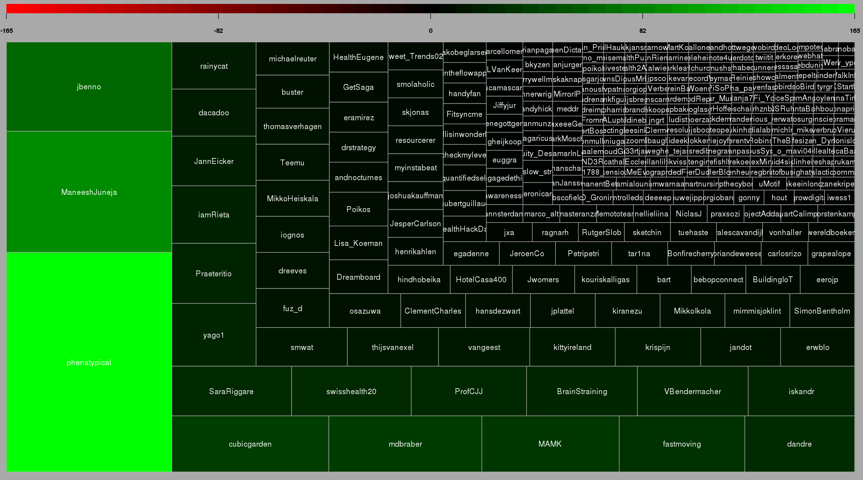
![[Wordcloud]](http://beautifuldata.net/wp-content/uploads/2013/05/wordcloud.png)