Identifying trends in the German Google n-grams corpus (Tutorial)

A lot of people still have a lot of respect for Hadoop and MapReduce. I experience it regularly in workshops with market researchers and advertising people. Hadoop’s image is quite comparable with Linux’ perceived image in the 1990s: a tool for professional users that requires a lot of configuration. But in the same way, there were some user-friendly distributions (e.g. Suse), there are MapReduce tools that require almost no configuration.

One favorite example is the ease and speed, you can do serious analytical work on the Google n-grams corpus with Hive on Amazon’s Elastic MapReduce platform. I adapted the very helpful code from the AWS tutorial on the English corpus to find out the trending German words (or 1-grams) for the last century. You need to have an Amazon AWS account and valid SSH keys to connect to the machines you are running the MapReduce programs on (here’s the whole hive query file).

  • Start your Elastic MapReduce cluster on the EMR console. I used 1 Master and 19 slave nodes. Select your AWS ssh authorization key. Remember: from this moment on, your cluster is generating costs. So, don’t forget to terminate the cluster after the job is done!
  • If your Cluster has been set-up and is running, note the Master-Node-DNS. Open a SSH client (e.g. Putty on Windows or ssh on Linux) and connect to the master node with the ssh key. Your username on the remote machine is “hadoop”.
  • Start “hive” and set some useful defaults for the analytical job:

    set hive.base.inputformat=org.apache.hadoop.hive.ql.io.HiveInputFormat;
    set mapred.min.split.size=134217728;

  • The first code snippet connects to the 1-gram dataset which resides on the S3 storage:

    CREATE EXTERNAL TABLE german_1grams (
    gram string,
    year int,
    occurrences bigint,
    pages bigint,
    books bigint
    )
    ROW FORMAT DELIMITED FIELDS TERMINATED BY '\t'
    STORED AS SEQUENCEFILE
    LOCATION 's3://datasets.elasticmapreduce/ngrams/books/20090715/ger-all/1gram/';

  • Now, we can use this database to perform some operations. The first step is to normalize the database, e.g. to transform all words to lower case and remove 1-grams that are no proper words. Of course you could further refine this step to remove stopwords or reduce the words to their stems by stemming or lemmatization.

    CREATE TABLE normalized (
    gram string,
    year int,
    occurrences bigint
    );

    And then we populate this table:

    INSERT OVERWRITE TABLE normalized
    SELECT
    lower(gram),
    year,
    occurrences
    FROM
    german_1grams
    WHERE
    year >= 1889 AND
    gram REGEXP "^[A-Za-z+'-]+$";

  • The previous steps should run quite fast. Here’s the step that really need to be run on a multi-machine cluster:

    CREATE TABLE by_decade (
    gram string,
    decade int,
    ratio double
    );

    INSERT OVERWRITE TABLE by_decade
    SELECT
    a.gram,
    b.decade,
    sum(a.occurrences) / b.total
    FROM
    normalized a
    JOIN (
    SELECT
    substr(year, 0, 3) as decade,
    sum(occurrences) as total
    FROM
    normalized
    GROUP BY
    substr(year, 0, 3)
    ) b
    ON
    substr(a.year, 0, 3) = b.decade
    GROUP BY
    a.gram,
    b.decade,
    b.total;

  • The final step is to count all the trending words and export the data:

    CREATE TABLE result_decade (
    gram string,
    decade int,
    ratio double,
    increase double );

    INSERT OVERWRITE TABLE result_decade
    SELECT
    a.gram as gram,
    a.decade as decade,
    a.ratio as ratio,
    a.ratio / b.ratio as increase
    FROM
    by_decade a
    JOIN
    by_decade b
    ON
    a.gram = b.gram and
    a.decade - 1 = b.decade
    WHERE
    a.ratio > 0.000001 and
    a.decade >= 190
    DISTRIBUTE BY
    decade
    SORT BY
    decade ASC,
    increase DESC;

  • The result is saved as a tab delimited plaintext data file. We just have to find out its correct location and then transfer it from the Hadoop HDFS file system to the “normal” file system on the remote machine and then transfer it to our local computer. The (successful) end of the hive job should look like this on your ssh console:
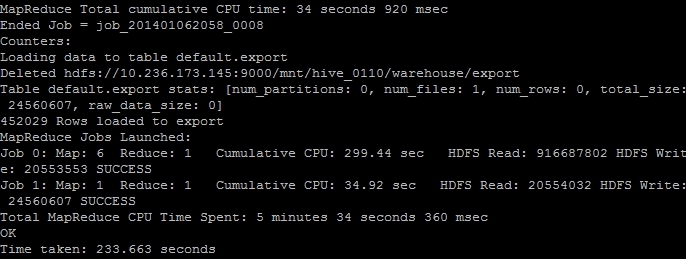
    EMR_finish
    The line “Deleted hdfs://x.x.x.x:9000/mnt/hive_0110/warehouse/export” gives you the information where the file is located. You can transfer it with the following command:

    $ hdfs dfs -cat /mnt/hive_0110/warehouse/export/* > ~/export_file.txt

  • Now the data is in the home directory of the remote hadoop user in the file export_file.txt. With a secure file copy program such as scp or WinSCP you can download the file to your local machine. On a Linux machine, I should have converted the AWS SSH key in the Linux format (id_rsa and id_rsa.pub) and then added. With the following command I could download our results (replace x.x.x.x with your IP address or the Master-Host-DNS):

    $ scp your_username@x.x.x.x:export_file.txt ~/export_file.txt

  • After you verified that the file is intact, you can terminate your Elastic MapReduce instances.

As a result you get a large text file with information on the ngram, decade, relative frequency and growth ratio in comparison with the previous decade. After converting this file into a more readable Excel document with this Python program, it looks like this:
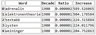
ngrams_results

Values higher than 1 in the increase column means that this word has grown in importance while values lower than 1 means that this word had been used more frequently in the previous decade.

Here’s the top 30 results per decade:

  • 1900s: Adrenalin, Elektronentheorie, Textabb, Zysten, Weininger, drahtlosen, Mutterschutz, Plazenta, Tonerde, Windhuk, Perseveration, Karzinom, Elektrons, Leukozyten, Housz, Schecks, kber, Zentralwindung, Tarifvertrags, drahtlose, Straftaten, Anopheles, Trypanosomen, radioaktive, Tonschiefer, Achsenzylinder, Heynlin, Bastimento, Fritter, Straftat
  • 1910s: Commerzdeputation, Bootkrieg, Diathermie, Feldgrauen, Sasonow, Wehrbeitrag, Bolschewismus, bolschewistischen, Porck, Kriegswirtschaft, Expressionismus, Bolschewiki, Wirtschaftskrieg, HSM, Strahlentherapie, Kriegsziele, Schizophrenie, Berufsberatung, Balkankrieg, Schizophrenen, Enver, Angestelltenversicherung, Strahlenbehandlung, Orczy, Narodna, EKG, Besenval, Flugzeugen, Flugzeuge, Wirkenseinheit
  • 1920s: Reichsbahngesellschaft, Milld, Dawesplan, Kungtse, Fascismus, Eidetiker, Spannungsfunktion, Paneuropa, Krestinski, Orogen, Tschechoslovakischen, Weltwirtschaftskonferenz, RSFSR, Sachv, Inflationszeit, Komintern, UdSSR, RPF, Reparationszahlungen, Sachlieferungen, Konjunkturforschung, Schizothymen, Betriebswirtschaftslehre, Kriegsschuldfrage, Nachkriegsjahre, Mussorgski, Nachkriegsjahren, Nachkriegszeit, Notgemeinschaft, Erlik
  • 1930s: Reichsarbeitsdienst, Wehrwirtschaft, Anerbengericht, Remilitarisierung, Steuergutscheine, Huguenau, Molotov, Volksfront, Hauptvereinigung, Reichsarbeitsdienstes, Viruses, Mandschukuo, Erzeugungsschlacht, Neutrons, MacHeath, Reichsautobahnen, Ciano, Vierjahresplan, Erbkranken, Schuschnigg, Reichsgruppe, Arbeitsfront, NSDAP, Tarifordnungen, Vierjahresplanes, Mutationsrate, Erbhof, GDI, Hitlerjugend, Gemeinnutz
  • 1940s: KLV, Cibazol, UNRRA, Vollziehungsrath, Bhil, Verordening, Akha, Sulfamides, Ekiken, Wehrmachtbericht, Capsiden, Meau, Lewerenz, Wehrmachtsbericht, juedischen, Kriegsberichter, Rourden, Gauwirtschaftskammer, Kriegseinsatz, Bidault, Sartre, Riepp, Thailands, Oppanol, Jeftanovic, OEEC, Westzonen, Secretaris, pharmaceutiques, Lodsch
  • 1950s: DDZ, Peniteat, ACTH, Bleist, Siebenjahrplan, Reaktoren, Cortison, Stalinallee, Betriebsparteiorganisation, Europaarmee, NPDP, SVN, Genossenschaftsbauern, Grundorganisationen, Sputnik, Wasserstoffwaffen, ADAP, BverfGg, Chruschtschows, Abung, CVP, Atomtod, Chruschtschow, Andagoya, LPG, OECE, LDPD, Hakoah, Cortisone, GrundG
  • 1960s: Goldburg, Dubcek, Entwicklungszusammenarbeit, Industriepreisreform, Thant, Hoggan, Rhetikus, NPD, Globalstrategie, Notstandsgesetze, Nichtverbreitung, Kennedys, PPF, Pompidou, Nichtweiterverbreitung, neokolonialistischen, Teilhards, Notstandsverfassung, Biafra, Kiesingers, McNamara, Hochhuth, BMZ, OAU, Dutschke, Rusk, Neokolonialismus, Atomstreitmacht, Periodikums, MLF
  • 1970s: Zsfassung, Eurokommunismus, Labov, Sprechakttheorie, Werkkreis, Uerden, Textsorte, NPS, Legitimationsprobleme, Aktanten, Kurztitelaufnahme, Parlamentsfragen, Textsorten, Soziolinguistik, Rawls, Uird, Textlinguistik, IPW, Positivismusstreit, Jusos, UTB, Komplexprogramms, Praxisbezug, performativen, Todorov, Namibias, Uenn, ZSta, Energiekrise, Lernzielen
  • 1980s: Gorbatschows, Myanmar, Solidarnosc, FMLN, Schattenwirtschaft, Gorbatschow, Contadora, Sandinisten, Historikerstreit, Reagans, sandinistische, Postmoderne, Perestrojka, BTX, Glasnost, Zeitzeugen, Reagan, Miskito, nicaraguanischen, Madeyski, Frauenforschung, FSLN, sandinistischen, Contras, Lyotard, Fachi, Gentechnologie, UNIX, Tschernobyl, Beijing
  • 1990s: BSTU, Informationsamt, Sapmo, SOEP, Tschetschenien, EGV, BMBF, OSZE, Zaig, Posllach, Oibe, Benchmarking, postkommunistischen, Reengineering, Gauck, Osterweiterung, Belarus, Tatarstan, Beitrittsgebiet, Cyberspace, Goldhagens, Treuhandanstalt, Outsourcing, Modrows, Diensteinheiten, EZB, Einigungsvertrages, Einigungsvertrag, Wessis, Einheitsaufnahme
  • 2000s: MySQL, Servlet, Firefox, LFRS, Dreamweaver, iPod, Blog, Weblogs, VoIP, Weblog, Messmodells, Messmodelle, Blogs, Mozilla, Stylesheet, Nameserver, Google, Markenmanagement, JDBC, IPSEC, Bluetooth, Offshoring, ASPX, WLAN, Wikipedia, Messmodell, Praxistipp, RFID, Grin, Staroffice

Mining Research Interests – or: What Would Google Want to Know?

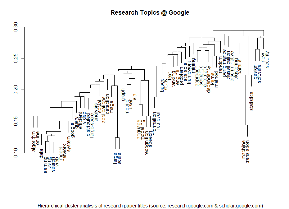
I am a regular visitor of Google’s research page where they post all of their latest and upcoming scientific papers. Lately I have thought whether it would be possible to statistically extract some of the meta-information from the papers. Here’s the result of the analysis of the papers’ titles produced with just a few lines of R code:

Research Topics @ Google


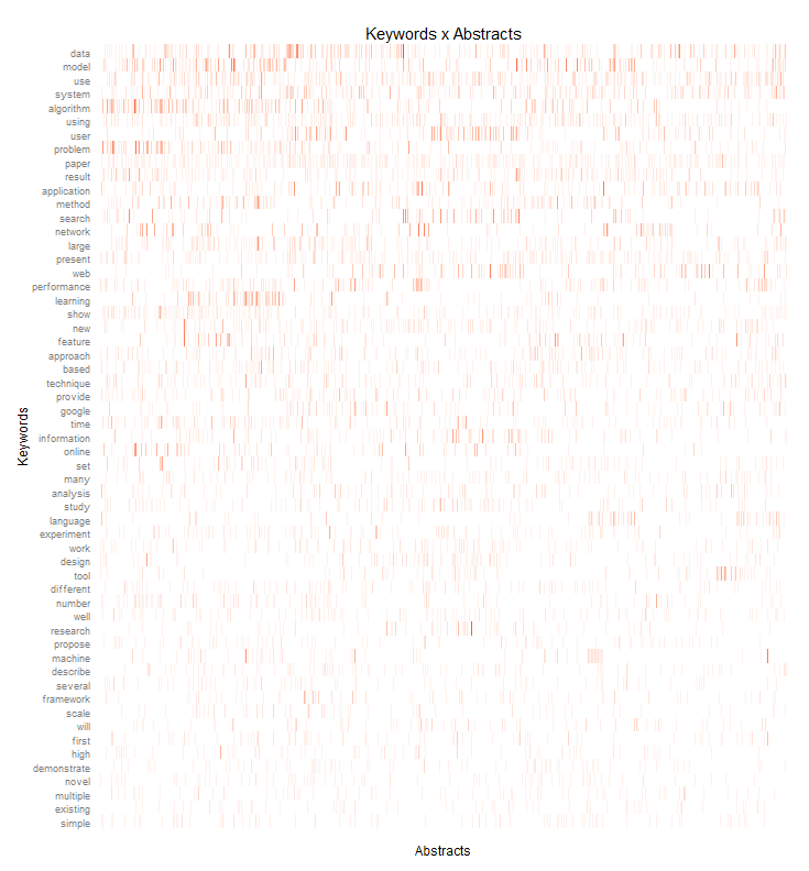
I clustered the data with a standard hierarchical cluster analysis to find out which terms tend to often go together in the paper titles. Then I took a deeper look at the abstracts – of all the papers that had abstracts that is. I processed the abstracts with the tm R package and draw the following heat-map that shows how often which of the most important keywords appear in each paper:

Keywords_Abstracts_google

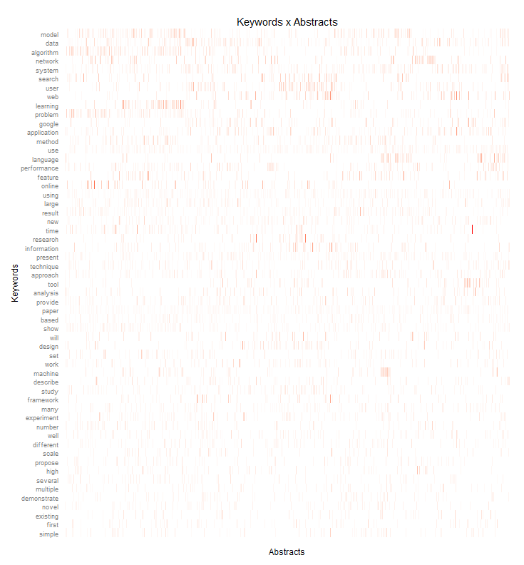
I did a similar heatmap but this time normalized by the term frequency – inverse document frequency measure. While the first heatmap shows the most frequently used terms, this weighted heatmap shows terms that are quite important in their respective research papers but normalizes this by the overall term frequency.

Keywords_Abstracts_google_tfidf

If you need input for playing buzzword bingo at the next Strata Conference in Santa Clara, you don’t have to look any further 😉

Mapping a Revolution

Twitter has become an important communications tool for political protests. While mass media are often censored during large-scale political protests, Social Media channels remain relatively open and can be used to tell the world what is happening and to mobilize support all over the world. From an analytic perspective tweets with geo information are especially interesting.

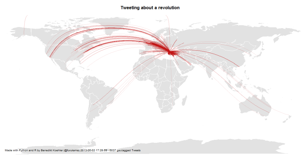
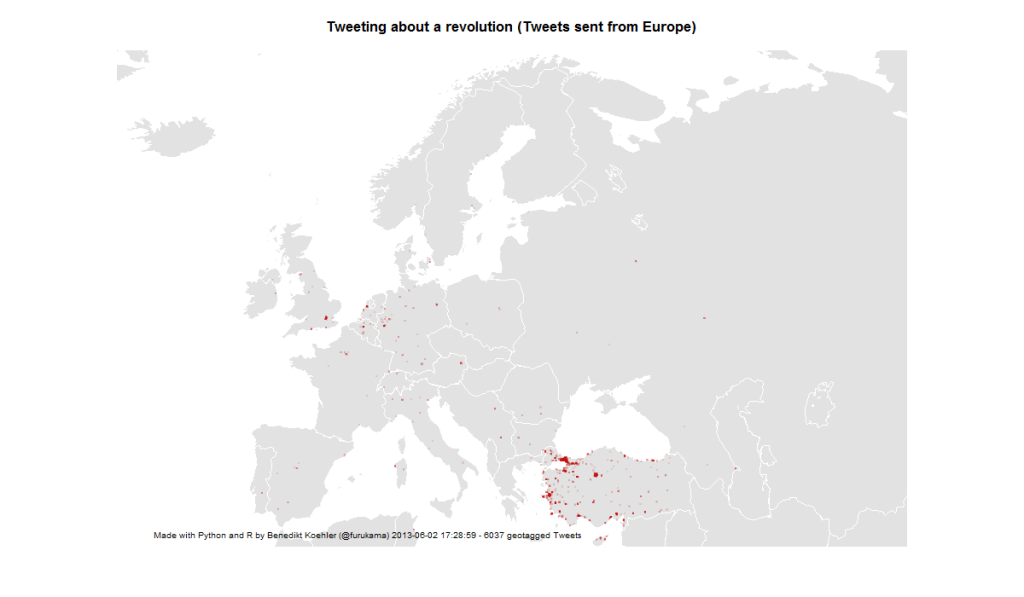
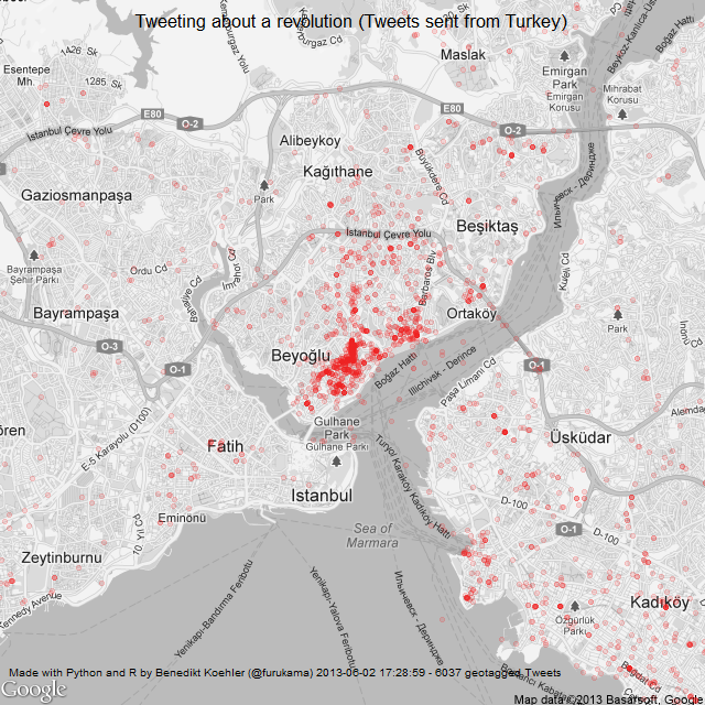
Here’s some maps I did on the basis of ~ 6,000 geotagged tweets from ~ 12 hours on 1 and 2 Jun 2013 referring to the “Gezi Park Protests” in Istanbul (i.e. mentioning the hashtags “occupygezi”, “direngeziparki”, “turkishspring”* etc.). The tweets were collected via the Twitter streaming API and saved to a CouchDB installation. The maps were produced by R (unfortunately the shapes from the map package are a bit outdated).

*”Turkish Spring” or “Turkish Summer” are misleading terms as the situation in Turkey cannot be compared to the events during the “Arab Spring”. Nonetheless I have included them in my analysis because they were used in the discussion (e.g. by mass media twitter channels) Thanks @Taksim for the hint.

International Attention for Gezi Park protests 1-2 Jun

On the next day, there even was one tweet mentioning the protests crossing the dateline:

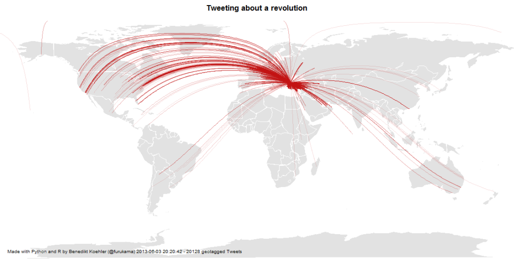
International Attention for Gezi Park protests 1-3 Jun

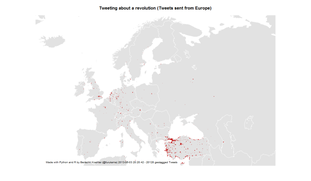
First, I took a look at the international attention (or even cosmopolitan solidarity) of the events in Turkey. The following maps are showing geotagged tweets from all over the world and from Europe that are referring to the events. About 1% of all tweets containing the hashtags carry exact geographical coordinates. The fact, that there are so few tweets from Germany – a country with a significant population of Turkish immigrants – should not be overrated. It’s night-time in Germany and I would expect a lot more tweets tomorrow.

European Attention for Gezi Park protests 1-2 Jun

14,000 geo-tagged tweets later the map looks like this:

European Attention for Gezi Park protests 1-3 Jun

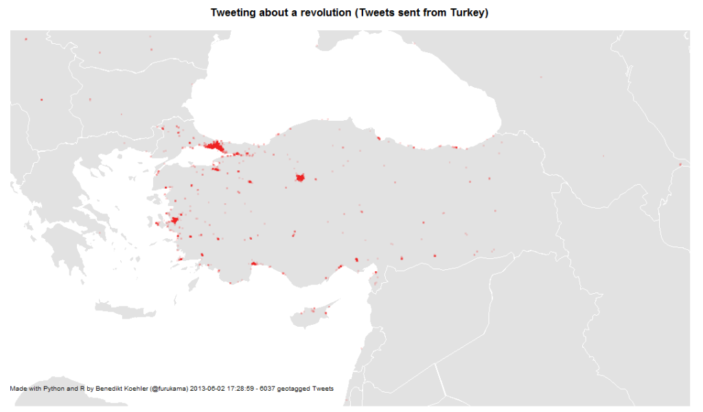
The next map is zooming in closer to the events: These are the locations in Turkey where tweets were sent with one of the hashtags mentioned above. The larger cities Istanbul, Ankara and Izmir are active, but tweets are coming from all over the country:

Turkish Tweets about the Gezi Park protests 1-2 Jun

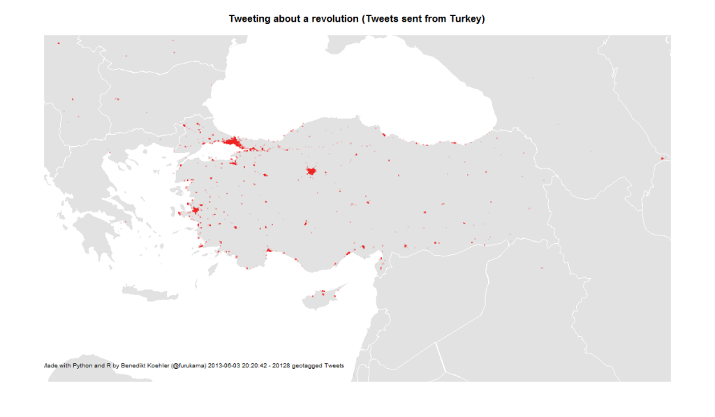
On June 3rd, the activity has spread across the country:

Turkish Tweets about the Gezi Park protests 1-3 Jun

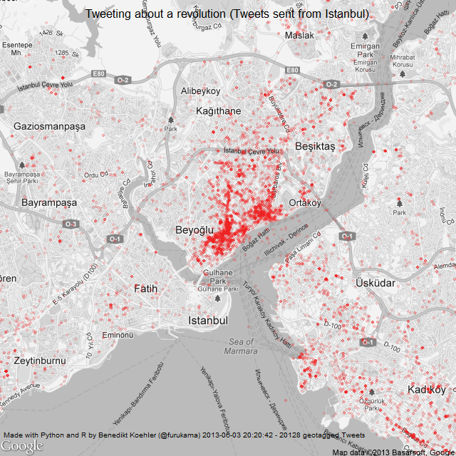
And finally, here’s a look at the tweet locations in Istanbul. The map is centered on Gezi Park – and the activity on Twitter as well:

Istanbul Tweets about Gezi Park protests 1-2 Jun

Here’s the same map a day later (I decreased the size of the dots a bit while the map is getting clearer):

Istanbul Tweets about Gezi Park protests 1-3 Jun

The R code to create the maps can be found on my GitHub.

Color analysis of Flickr images

Since I’ve seen this beautiful color wheel visualizing the colors of Flickr images, I’ve been fascinated with large scale automated image analysis. At the German Market Research association’s conference in late April, I presented some analyses that went in the same direction (click to enlarge):

Color values of Flickr images from Germany

On the image above you can see the color values ordered by their hue from images taken in Germany between August 2010 and April 2013. Each row represents the aggregation of 2.000 images downloaded from the Flickr API. I did this with the following R code:

bbox <- "5.866240,47.270210,15.042050,55.058140"
pages <- 10
maxdate <- "2010-08-31"
mindate <- "2010-08-01"
 
for (i in 1:pages) {
api <- paste("http://www.flickr.com/services/rest/?method=flickr.photos.search&format=json&api_key=YOUR_API_KEY_HERE &nojsoncallback=1&page=", i, "&per_page=500&bbox=", bbox, "&min_taken_date=", mindate, "&max_taken_date=", maxdate, sep="")
raw_data <- getURL(api, ssl.verifypeer = FALSE)

data <- fromJSON(raw_data, unexpected.escape="skip", method="R")
# This gives a list of the photo URLs including the information
# about id, farm, server, secret that is needed to download
# them from staticflickr.com
}

To aggregate the color values, I used Vijay Pandurangans Python script he wrote to analyze the color values of Indian movie posters. Fortunately, he open sourced the code and uploaded it on GitHub (thanks, Vijay!)

The monthly analysis of Flickr colors clearly hints at seasonal trends, e.g. the long and cold winter of 2012/2013 can be seen in the last few rows of the image. Also, the soft winter of 2011/2012 with only one very cold February appears in the image.

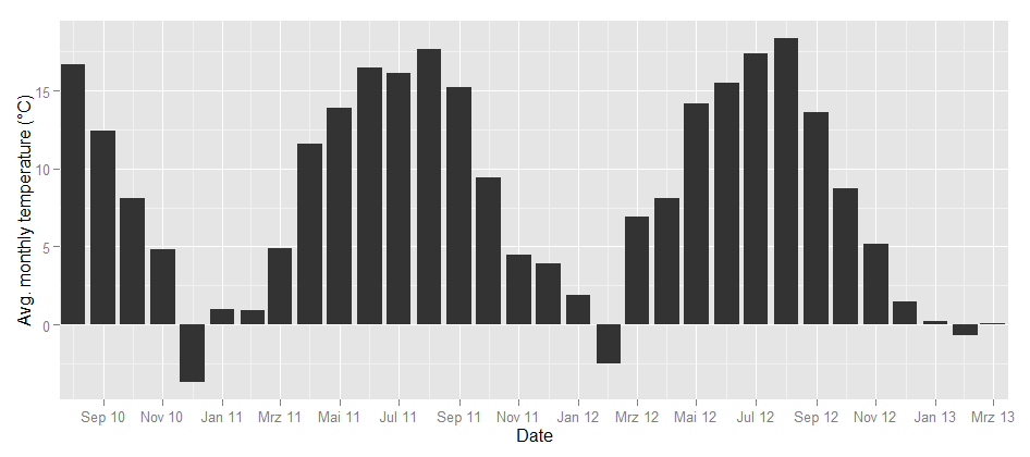
To take the analysis even further, I used weather data from the repository of the German weather service and plotted the temperatures for the same time frame:

Temperature in Germany

Could this be the same seasonality? To find out how the image color values above and the temperature curve below are related, I calculated the correlation between the dominance of the colors and the average temperature. Each month can not only be represented as a hue band, but also as a distribution of colors, e.g. the August 2010 looks like this:

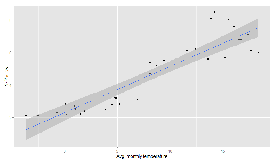
So there’s a percent value for each color and each month. When I correlated the temperature values and the color values, the colors with the highest correlations were green (positive) and grey (negative). So, the more green is in a color band, the higher the average temperature in this month. This is how the correlation looks like:

Temperature and color values

The model actually is pretty good:

> fit <- lm(temp~yellow, weather)
> summary(fit)
Call:
lm(formula = temp ~ yellow, data = weather)
Residuals:
Min 1Q Median 3Q Max
-5.3300 -1.7373 -0.3406 1.9602 6.1974

Coefficients:
Estimate Std. Error t value Pr(>|t|)
(Intercept) -5.3832 1.2060 -4.464 0.000105 ***
yellow 2.9310 0.2373 12.353 2.7e-13 ***
---
Signif. codes: 0 '***' 0.001 '**' 0.01 '*' 0.05 '.' 0.1 ' ' 1
Residual standard error: 2.802 on 30 degrees of freedom
Multiple R-squared: 0.8357, Adjusted R-squared: 0.8302
F-statistic: 152.6 on 1 and 30 DF, p-value: 2.695e-13

Of course, it can even be improved a bit by calculating it with a polynomial formula. With second order polynomials lm(temp~poly(yellow,2), weather), we even get a R-squared value of 0.89. So, even when the pictures I analysed are not always taken outside, there seems to be a strong relationship between the colors in our Flickr photostreams and the temperature outside.

Our Pythagorean World

Crystals like the flourite, calcite, or garnet here show properties, that can easily be expressed in mathematical terms. Social behavior seams to be random, however, data science can help us detect laws and patterns, that can be expressed in mathematical functions like the shape of the crystals.
Crystals like the flourite, calcite, or garnet here show properties, that can easily be expressed in mathematical terms. This inspired the legendary Pythagoras an his students to postulate the whole world to be genuinly mathematical. Social behavior seams to be random, however data science can help us detect laws and patterns, that can be expressed in mathematical functions like the shape of the crystals.
Our senses are adapted to detect of our environment, what is necessary for our survival. In that way, evolution turns St. Augustin’s postulate of our world as being naturally conceivable to our minds from its head onto the feet. What we define as laws of nature are just the mostly linear correlations and the most regular patterns we could observe in our world.

When I had my first computer with graphical capabilities (an Atari Mega ST) in 1986, I, like everybody else, started hacking fractals. Rather simple functions produced remarkably complex and unpredictable visualizations. It was clear, that there might be many more patterns and laws to be discovered in nature, as soon as we could enhance our minds and senses with the computer – structures and patterns way to subtle to be recognised with our unarmed eye. In that way, the computer became, what the microscope or the telescope hat been to the researchers at the dawn of modernity: an enhancement of our mind and senses.

“Number is an extension and separation of our most intimate and interrelating activity, our sense of touch” (McLuhan)

The origin of the word digital stems from digitus, Latin for the finger. Counting is to separate, to cluster and summarize – as Beda the Venerable did with his fingers when he coined the term digit. With the Net, human behavior became trackable in unprecedented totality. Our lives are becoming digitized, everything we do becomes quantified that is, put in quants.

With the first graphically capable computers, we could suddenly experience the irritating complexity of the fractals. Now we can put almost anything into our calculations – and we find patterns and laws everywhere.

What is quantified, can be fed into algorithms. Algorithms extend our mind into the realm of data. We are already used to algorithms recommending us merchandise, handling many services at home or in business, like supporting our driving a car by navigating us around traffic jams. With data based design and innovation processes, algorithms take part in shaping our things. Algorithms also start making ethical judgments – drones that decide autonomously on the taking or sparing the life of people, or – less dramatic but very effectiv though – financial services granting us a better or worse credit score. We have already mentioned “Posthuman Advertising” earlier.

The world is not only recognisable, the world in every detail is quantifiable. Our datarized word is the final victory of the Pythagoreans – all and everything to be expressed in mathematics. Data science in this way leads us to a similar revolution of mind, than that of the time of Copernicus, Galileo and Kepler.

Data Humanities

Mathematics is usually not regared as a science but as part of philosophy - although it has some relation to the "real world" - as shown in this 18 century cut.
Mathematics is usually not regared as a science but as part of philosophy – although it has some relation to the “real world” – as shown in this 18 century cut.
There is a reason why we differentiate science and the humanities. And although sociology, experimental psychology and even history nowadays deploy many scientific methods, the difference is still fundamental. Humantites deal with correlations; the causalities are way further speculative than the “laws of nature” that are formulated in physics or chemistry. Also the data that supports social research is always and inherrently biased, no matter how much care we take in sampling, representativeness and other precautions we might take.

In her remarkable talk at Strataconf, Kate Crawford warned us, that we should always suspect our “Big Data” sources as highly biased, since the standard tools of dealing with samples (as mentioned above) are usualy neglected when the data is collected.

Nevertheless, also the most biased data gives us valuable information – we just have to be careful with generalizing. Of course this is only relevant for data relating to humans using some kind of technology or service (like websites collecting cookie-data or people using some app on their phone). However, I am anyway much more interested in the humanities’ side of data: Data describing human behavior, data as an aditional dimension of people’s lives.

Taken all this, I suggest to call this field of behavior data “Data Humanities” rather than “Data Science”.

The immutability paradigm – or: how to add the “fourth dimension” to our data

Our brain is wired to experiencing the world as one consistent model of reality. New data we interpret either as confirmation of the model or as an update to replace one of its parameters with a new value. Our sensory organs also reduces the incoming stimuli, drop most of the impressions, preprocess what is identified as signals to simple patterns that are propagated to our mind. What we remember as the edge of our table – a straight line, limiting the surface – was in fact received as a fine grid of multicoloured pixels by our retina. For sake of saving computation and storage power, and to keep a stable, consistent view, we forsake the richness of information. And we use to build our data bases to work exactly that way.

One of the realy disruptive shifts in our business is imo to break this paradigm: “Make your source of truth immutable.” Nathan Marz (who has just yesterday left the Twitter team) tells us to have a base layer of incoming data. Nothing here gets updated or changed. New records are just attached. From such an immutable data source, we can reconstruct the state of our data set at any given point of time in the past; even if someone messes with the database, we could roll back without the need to reset everything. This rather unstructured worm is of course not fit to get access to information with low latency. In Marz’ paradigm it is the “source of truth”, is a repository to feed into a second level of more “classic” data bases that provides precalculated, prepopulated tables that can be accessed at real time.

What Nathan Marz advocates as a way to make data bases more tolerant against human fault entails in fact a deep, even philosophical perspective. With the classic database we would keep master data and transaction data in different tables. We would regard a master record as something that should provide one consistent view on the object recorded. Take a clients data base of some retailer: Address or payment information we would expect to be a static property of the client, to be kept “up to date” – if the person moves, we would update the record. Other information we would even regard as unchangeable: Name, gender or birthday for example. This is exactly how we would be looking at the world if we had remained at the state of the naive phenomenology of the early modern ages. Concepts like “identity” of a human being reflect this integral perspective of an object with master properties – ideas like “character” (individual or even bound to ethnicity or nation) stem from this taking an object as in reality being independent from the temporal state of data that we could comprehend. (Please excuse my getting rather abstract now.)

Temporal logic was developed not in philosophy but rather in computer science. The idea is, that those apodictical clauses of “true” or “false” – tertium non datur” – that we are used to deal with in propositional calculus since the time of the ancient Greeks, would not be correctly applicable to real world systems like people interacting with other in time. – The “classic” example would be a sentence like “I am hungry” that would never necessaryly be true or false because it would depend on the specific circumstances at that point in time when I would have stated it; nevertheless it should be regarded as a valid property to describe me at that time.

In such way, the immutable database might not reflect our gut feeling about reality, but it certainly is a far more accurate “source of truth”, and not only because it is more tolerant against human operators tampering with the data.

With the concept of one immutable source of truth, this “master record” is just a view on the data at one given point in time. We would finally have “the forth dimension” in our data.

Prediction vs. Description or: Data Science vs. Market Research

“My market research indicates that 50% of your customers are above the median age. But the shocking discovery was that 50% were below the median age.”
(Dilbert; read it somewhere, cant remember the source)

It was funny to see everyone at O’Reilly’s Strata Conference talk about data science and hear just the dinosaurs like Microsoft, Intel or SAP still calling it “Big Data”. Now, for me, too, data science is the real change; and I tell you, why:

What always annoyed me when working with market researchers: you never get an answer. All you get is a description of the sample. Drawing samples was for sure a difficult task 50 years ago. You had to send interviews arround, using a kish grid (does anyone remember this – at least outside Germany?). The data had to be coded into punch cards and clumsy software was used to plot elementary descriptives from ascii-letters. If you still use SPSS, you might know what I am talking about. When I studied statistics in the early 90s, testing hypotheses was much more important than predictions, and visualisaton was not invented yet. The typical presentation of a market researcher would thus start with describing the sample (50% male, 25% from 20 to 39 years, etc.) and in the end, they would leave the client with some more or less trivialy aggregated Excel-Tables.

When I became in charge of pricing ad breaks of a large TV network, all this research was useless for my purposes. My job required predicting the measured audiences of each of the approximately 40 ad breaks for every of our four national stations six weeks in advance. I had to make the decission in real time, no matter how accurate the information I calculated the risks on would have been.

Market research is bad in supporting real time management decissions. So managers tend to decide on their “gut feelings”. But the framework has changed. The last decade brought to us the possibility to access huge data sets with low latency and run highly multivariate models. You cant do online advertising targeting based on gut feelings.

But most market researchers would still argue that the analytics behind ad targeting are not market research because they would just rely on probabilistic decissions, on predictions based on correlations rather than causality. Machine learning does not test a hypothesis that was derived from a theoretical construct of ideas. It identifies patterns and the prediction would be taken as accurate just if the effect on the ROI would be better then before.

I can very well live with the researchers keeping to their custom as long as I may use my data to do the predictions I need. When attending Strata Conference, I realized this deep paradigm shift from market research, describing data as its own end to data science, getting to predicitons.

Maybe it is thus a good thing to differentiate between market research and data science.

(This is the first in a row of posts on our impressions at Strata this year; the others will follow quickly …)

Wikipedia Attention and the US elections

One of the most interesting challenges of data science are predictions for important events such as national elections. With all those data streams of billions of posts, comments, likes, clicks etc. there should be a way to identify the most important correlations to make predictions about real-world behavior such as: going to the voting booth and chosing a candidate.

A very interesting data source in this respect is the Wikipedia. Why? Because Wikipedia is

  1. a) open (data on page-views, edits, discussions are freely available on daily or even hourly basis),
  2. b) huge (WP currently ranks as #6 of all web sites worldwide and reaches about a quarter of all online users),
  3. c) specific (people visit the Wikipedia because they want to know something about some topic)

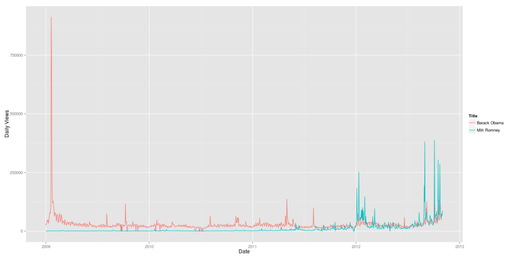
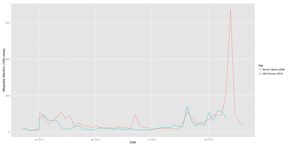
The first step was comparing the candidates Barack Obama and Mitt Romney over time. The resulting graph clearly shows the pivoting points of Obama’s presidential career (click to zoom):

Obama vs. Romney 2009-2012 (Wikipedia data)

But it also shows how strong Mitt Romney has been since the Republican primaries in January 2012. His Wikipedia page had attracted a lot more visitors in August and September 2012 than his presidential rival’s. Of course, this measure only shows attention, not sentiment. So it cannot be inferred from this data whether the peaks were positive or negative peaks. In terms of Wikipedia attention, Romney’s infamous 47% comments in September 2012 were more than 1/3 as important as Obama’s inauguration in January 2009.

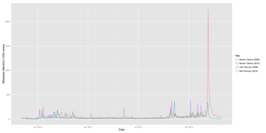
Now, let’s add some further curves to this graph: Obama’s and McCain’s Wikipedia attention during the last elections:

Obama vs. Romney 2012 compared to Obama vs. McCain 2008 (Wikipedia data)

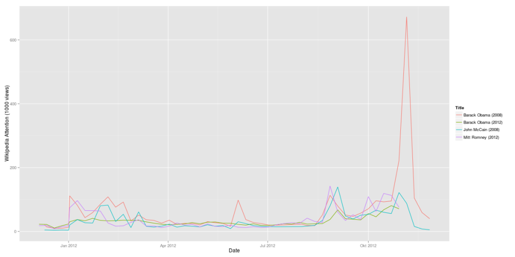
Here’s another version with weekly data:

Obama vs. Romney 2012 compared to Obama vs. McCain 2008 (Wikipedia data, weeks)

It’s almost instantly clear how much more attention Obama’s 2008 campaign (in red) gathered in comparison with his 2012 campaign (in green). On the other hand, Mitt Romney is at least when it comes to Wikipedia attention more interesting than McCain had been.

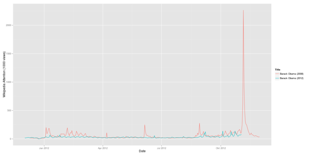
Here’s a comparison of Obama’s 2008 campaign vs. his 2012 campaign:

Obama 2008 vs. Obama 2012 (Wikipedia data)

The last question: Is Mitt Romney 2012 as strong as Obama had been in 2008? Here’s a direct comparison:

Obama 2008 vs. Romney 2012 (Wikipedia data, weekly)

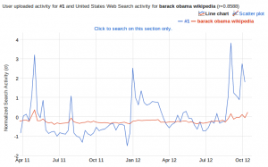
A side-remark: I also did a correlation of this data set with Google Correlate. And guess what: The strongest correlation of the data for Obama’s 2012 campaign is the Google search query for “barack obama wikipedia”. There still seem to be a huge number of people using Google as their Wikipedia search-engine.

Google Correlate result for the Wikipedia time series "Barack Obama"
Google Correlate result for the Wikipedia time series “Barack Obama”

But this result could also be interpreted the other way round: If there is a strong correlation between Wikipedia usage and Google search queries, this makes Wikipedia an even more important data source for analyses.

How content is propagated might tell what it’s about

Memes – images, jokes, content snippets that get spread virally on the net – have been a popular topic in the Net’s pop culture for some time. A year ago, we started thinking about, how we could operationalise the Meme-concept and detect memetic content. Thus we started the Human Meme Project (the name an innuendo on mixing culture and genetics). We collected all available links to images that had been posted on social networks together with the meta data that would go with these posts, like date and time, language, count of followers, etc.

With referers to some 100 million images, we could then look into the interesting question: how would “the real memes” get propagated and could we see differences in certain types of images regarding their pattern of propagation. Soon we detected several distinct pathes of content being spread. And after having done this for a while, these propagation patterns could tell us often more facts about an image than we could have extracted of the caption or the post’s text.

Case 1: detection of “Astroturfing” and “Twitter-bombing

Of course this kind of analysis is not limited to pictorial content. A good example how the insights of propagation analyses can be used is shown in sciencenews.org. Astroturfing or Twitter-bombing – flooding discussions with messages that would seam to be angry and very critical towards some candidate or some position, and would look like authentic rage at first sight, although in reality it would be machine generated Spam – could pose a thread to political discussion in social networks and even harm democratic elections.
This new type of “Black PR”, however can be detected by analysing the propagation pattern.

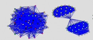
Two examples of how memetic images are shared within communities. The vertices represent the shared images, edges connect images posted by the same user. The left graph results of a set of images that get propagated with almost equal probability in the supporting community, the right graph shows an image that made its path into two disjoint communities before getting further spread.

Case 2: identification of insurgent pamphletesy

After the first wave of uprising in Northern Africa, the remaining regimes became more cautious and installed many kinds of surveillance and filter technologies on the Net. To avoid the governmental crawlers, insurgents started to write their pamphletes by hand in some calligraphic type that no OCR would decipher. These handwritten notes would get photographed and then posted on the social web with some insuspicous text. But what might have tricked out spooks in the good old times, would not deceive the data scientist. These calls for protests, although artfully disguised, leave a distinct trace on their way through Facebook, Twitter and the like. It is not our intention to deliver our findings to the tyrants to close their gap in surveillance. We are in fact convinced that similar approaces are already in place in many authoritarian regimes (and maybe some democracies as well). Thus we think the fact should be as widespread and recognised as possible.

Both examples show again, that just looking at the containers and their dynamic can be as fruitful to tell about their content, than a direct approach.

Twitter Germany will be based in Berlin – Taking a look at the numbers

What I really love about Twitter is that everything they do seems to be data-based. They’re so data-driven, they even analyze the ingredients of their lunch to ensure everyone at the company is living a healthy lifestyle. So, the decision for Berlin as their German headquarter cannot be a random or value-based decision. I bet, there’s been a lot of numbers crunching before announcing their new office. Let’s try and reverse-engineer this decision.

As a data basis I collected 4,377,832 tweets more or less randomly by connecting to the streaming API. Then I pulled all users mentioning one of the 30 leading German cities from Berlin to Aachen in their location field. Where there were Umlauts involved, I allowed for multiple variants, e.g. “Muenchen”, “Munchen” or “Munich” for “München”. Now I have 3,696 Twitter users from Germany that posted one or more tweets during the sample interval. That’s 0.08% of the original sample size. Although that’s not as much as I would have expected, let’s continue with the analysis.

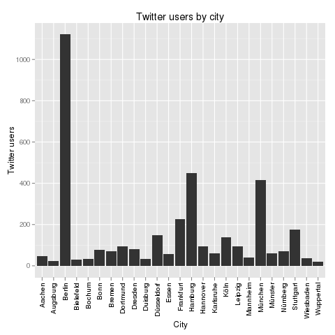
The first interesting thing is the distribution of the Twitter users by their cities. Here’s the result:

Twitter users by city

One thing should immediately be clear from this chart: Only Berlin, Hamburg and Munich had a real chance of becoming Twitter’s German HQ. The other cities are just Twitter ghost towns. In the press, there had been some buzz about Cologne, but from these numbers, I’d say that could only have been desinformation or whishful thinking.

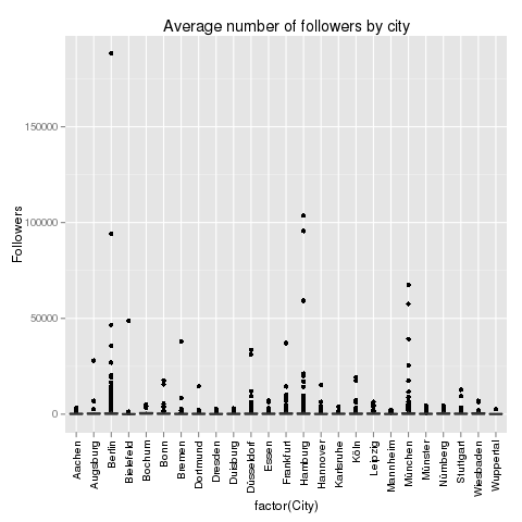
The next thing to look at is the influence of Twitter users in different German cities. Here’s a look at the follower data:

Average numbers of followers by city

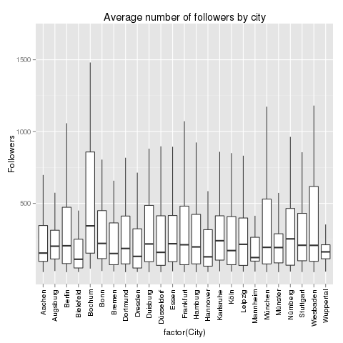
This does not help a lot. The distribution is heavily distorted by the outliers: Some Twitter users have a lot more followers than others. These Twitter users are marked by the black dots above the cities. But one thing is interesting: Berlin, Hamburg and Munich not only have the most Twitter users in our sample, but also the most and the highest outliers. With the outliers removed, the chart looks like this:

Average number of followers by city

The chart not only shows the median number of followers, but also the distribution of the data. Berlin, that should be clear from this chart, is not the German city where the Twitter users with most followers hail from. This should be awarded to Bochum (355 followers), Nuremberg (258 followers) or Augsburg (243 followers). But these numbers are not very reliable as the number of cases is quite low for these cities. If we focus on the Big 3, then Berlin is leading with 223 followers, then Munich with 209 followers and finally Hamburg with 200 followers. But it’s a very close race.

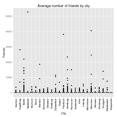
Next up, the number of friends. Which German city is leading the average number of friends on Twitter?

Average number of friends by city

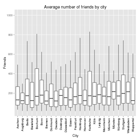
This chart is also distorted by outliers, but here it’s different cities: The user in the sample who is following the largest number of friends is located in Bielefeld. Of all things! Now, let’s remove the outliers:

Average number of friends by city

The cities with the larges average number of friends are: Bochum (again! 286 friends), Wiesbaden (224 friends) and Leipzig (208 friends). Our Big 3 are performing as follows: Berlin (183 friends), Hamburg (183 friends) and Munich (160 friends). Let’s take a look at the relation between followers and friends:

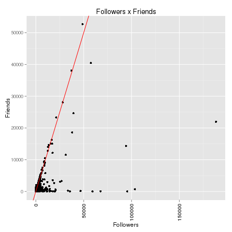
Followers x Friends

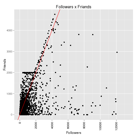
If we zoom in a bit on the data we can reproduce the “2000 phenomenon”:
2000 phenomenon

There clearly is some kind of artificial barrier at 2,000 friends on Twitter. Accounts that have between 100 and 2,000 followers never follow more than 2,000 followers. Most frequently, they follow just a little below of 2,000 people. After they gathered 2,000 followers themselves, this barrier has been broken and the maximal number of friends seems to grow with the number of followers. There’s only speculation about this phenomenon, but one of the most convincing explanation is: We are looking at spam bots that are programmed to stay below 2,000 friends until they have gathered more than 2,000 followers. Maybe Twitter has some spam fighting algorithms that are focusing at the 2,000 line. Update: See explanation in the comments to this article: Behind this anomaly is Twitter’s spam-fighting barrier that only allows 2,000 friends up to 2,000 followers. Beyond this, the limit for the maximum number of friends is limited by the number of followers + 10%.

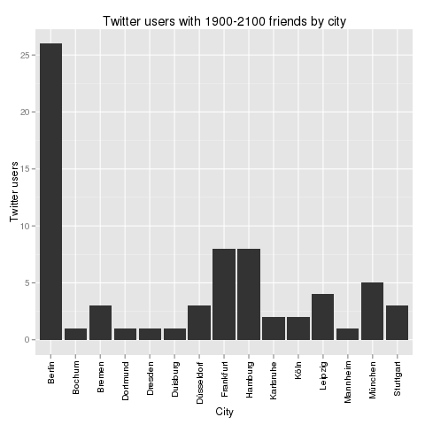
If those users are bots, then which city is bot capital? Let’s take a look at all Twitter users that have between 1,900 and 2,100 friends and segment them by city:

Twitter users by city

Again, Berlin is leading. But how do these numbers relate to the total numbers? Here’s the Bot Score for these cities: Berlin 2.3%, Hamburg 1.8% and Munich 1.2%. That’s one clear point for Munich.

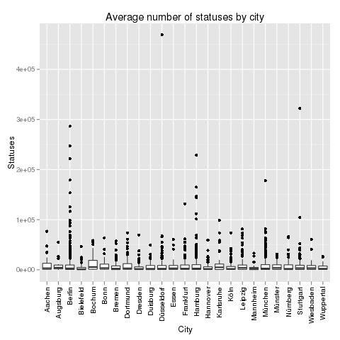
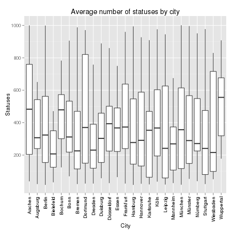
Finally, let’s take a look at Twitter statuses in these cities. Where do the most active Twitter users tweet from? Here’s a look at the full picture including outliers:

Average number of statuses by city

The city with the most active Twitter user surprisingly is not Bochum or Berlin, but Düsseldorf. And also Stuttgart seems to be very hot in this regard. But to really learn about activity, we have to remove the outliers again:

Average number of statuses by city

Without outliers, the most active Twitter cities in Germany are: Bochum (again!! 5514 statuses), Karlsruhe (4973) and Augsburg (4254). The Big 3 are in the midfield: Berlin (2845), Munich (2717) and Hamburg (2638).

Finally, there’s always the content. What are the users in the Big 3 cities talking about? The most frequently twittered words do not differ very much. In all three cities, “RT” is the most important word followed by a lot of words like “in”, “the” or “ich” that don’t tell much about the topics. It is much more interesting to look at word pairs (and especially at the pairs with the highest point wise mutual information (PMI). In Berlin, people are talking about “neues Buch” (new book – it’s a city of literature), “gangbang erotik” (hmm) and “nasdaq dow” (financial information seem to be important). In Munich, it’s “reise reisen” (Munich seems to love traveling), “design products” (very design oriented city) and “prost bier” (it’s a cliche, but it seems to be true). Compare this with Hamburg’s “amazon preis” (people looking for low prices), “social media” (Hamburg has a lot of online agencies) and “dvd blueray” (people watching a lot of TV).

Wrapping up, here are the final results:

          Berlin Munich Hamburg
Users          3      1       2
Followers      3      2       1
Friends        2      1       2
Bots          -3     -1      -2
Statuses       3      2       1
TOTAL          8      5       4

Congrats to Berlin!

[The R code that generated all the charts above can be found on my github.]

10 Points Why Market Research has to Change

(This is the transcript of a key-note speech by Benedikt and Joerg 2010 on the Tag der Marktforschung, the summit of the German Market Researchers’ Professional Association BVM – [1])

Market research as an offspring of industrial society is legitimized by the Grand Narrative of modernism. But this narrative does no longer describe reality in the 21st century – and particularly not for market research. The theatre of market research has left the Euclidian space of modernism and has moved on into the databases, networks and social communities. It is time for institutionalized market research to strike tents and follow reality.

“Official culture still strives to force the new media to do the work of the old media. But the horseless carriage did not do the work of the horse; it abolished the horse and did what the horse could never do.” H. Marshall McLuhan

1. Universally available knowledge

In facing the unimaginable abundance of structured information available anytime and everywhere via the Internet, the idea of genuine knowledge progress appears naïve. When literally the whole knowledge of the world is only one click away, research tends to become database search, meta analysis, aggregating existing research or data mining, i.e. algorithm-based analysis of large datasets.

2. Perpetual beta

What can be found in Wikipedia today is not necessarily the same that could be found a few weeks ago. Knowledge is in permanent flow. But this opposes the classic procedure in market research: raising a question, starting fieldwork, finding answers and finally publishing a paper or report. In software development, final versions have been long given way to releasing versions; what gets published is still a beta version, an intermediate result that gets completed and perfected in the process of being used. Market research will have to publish its studies likewise to be further evolving while being used.

3. Users replacing institutes

The ideal market researcher of yore, like an ethnologist, would enter the strange world of the consumers and would come back with plenty of information that could be spread like a treasure in front of the employer. Preconditions had been large panels, expensive technologies, and enormous amount of special knowledge. Only institutes were able to conduct the costly research. Today, however “common” Internet users can conduct online surveys with the usual number of observed cases.

4. Companies losing their clear boundaries

“Force and violence are justified in this [oiconomic] sphere because they are the only means to master necessity.” Hannah Arendt

In her main opus “The Human Condition” Hannah Arendt describes the Oikos, the realm of economy, as the place where the struggle for life takes place, where no moral is known, except survival. The Polis in opposition to this represents the principle of purposeless cohabitation in dignity: the public space where the Oikos with its necessities has no business.

When large corporations become relevant if not the only effective communication channels, they tend to take the role of public infrastructure. At the same time, by being responsible only to their shareholders, they withdraw from social or ethical discussions. As a result, their decisions could hardly be based on ethic principles. With research ethics, the crucial question is: Can our traditional ways of democratic control, based on values that we regard important, still be asserted – and if not, how we could change this.

5. From target groups to communities

The traditional concept of target groups implies that there are criteria, objective and externally observable, which map observed human behavior sufficiently plausible to future behavior or other behavioral observations. Psychological motives however are largely not interesting.

Contemporary styles of living are strongly aligning, making the people appear increasingly similar one to each other (a worker, a craftsman or a teacher all buy their furniture at the same large retailer); however, with the Internet there are more possibilities than ever to find like-minded people even for most remote niche interests.

Often these new communities are regarded as substitute for target groups. But communities are something completely different from target groups, characterized by their members sharing something real and subjective in common: be it common interest or common fate. Thus, objective criteria also become questionable in market research.

6. The end of the survey

Google, Facebook and similar platforms collect incredible bulks of data. By growth of magnitudes quantity reverts to quality: they don’t just become bigger, but become completely new kinds of objects (e.g. petabyte memory and teraflop databases).

Seen from the users’ perspective Google is a useful search engine. From a different perspective, Google is a database of desire, meaning, context, human ideas and concepts. Given these databases, data collection is no longer the problem: rather to get the meaning behind the numbers.

7. Correlations are the new causalities

“Effects are perceived, whereas causes are conceived. Effects always precede causes in the actual development order.” H. Marshall McLuhan

In marketing it is often not important if there is really some causality to be conceived. Some correlation suffices to imply a certain probability. When performance marketing watches how people get from one website to the other, without being able to explain why: then it is good enough to know, that it is just the case.

8. The end of models

“Only for the dilettante, man and job match.” Egon Friedell

There is, as sketched before, an option for market research without theory. To take profit from new data sources and tools, the future market researcher has to act like a hacker, utilizing interfaces, data and IT-infrastructures in a creative way to achieve something that was not originally intended by this technology. The era of the professional expert is over.

9. Objectivity is only a nostalgic remembrance

Objectivity is a historical construct, formed in the 19th century and being kept in the constellation of mass society, mass market and mass media for a remarkably long time. With social networks in the Internet you do not encounter objects or specimens, but human beings that are able to self-confidently answer the gaze.

10. We need new research ethics

The category of the “consumer” shows the connection between aiming to explore our fellows and the wish to manipulate them. Reciprocity, the idea to give the researched population something back, has not been part of traditional market research’s view of the world.

In the Internet on the other hand, reciprocity and participation are expected. This has pivotal implications for our research ethics, if we want to secure the future cooperation of the women and men, which would not want to get mass-surveyed and mass-informed either. Likewise, some existing ethical concepts have become obsolete, such as the anonymity of the participants: who takes part in a project as a partner, does not need and not want to stay anonymous.

“Handle so, dass du die Menschheit sowohl in deiner Person, als in der Person eines jeden anderen jederzeit zugleich als Zweck, niemals bloß als Mittel brauchst.” Immanuel Kant