Wikipedia Attention and the US elections

One of the most interesting challenges of data science are predictions for important events such as national elections. With all those data streams of billions of posts, comments, likes, clicks etc. there should be a way to identify the most important correlations to make predictions about real-world behavior such as: going to the voting booth and chosing a candidate.

A very interesting data source in this respect is the Wikipedia. Why? Because Wikipedia is

  1. a) open (data on page-views, edits, discussions are freely available on daily or even hourly basis),
  2. b) huge (WP currently ranks as #6 of all web sites worldwide and reaches about a quarter of all online users),
  3. c) specific (people visit the Wikipedia because they want to know something about some topic)

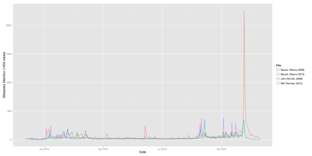
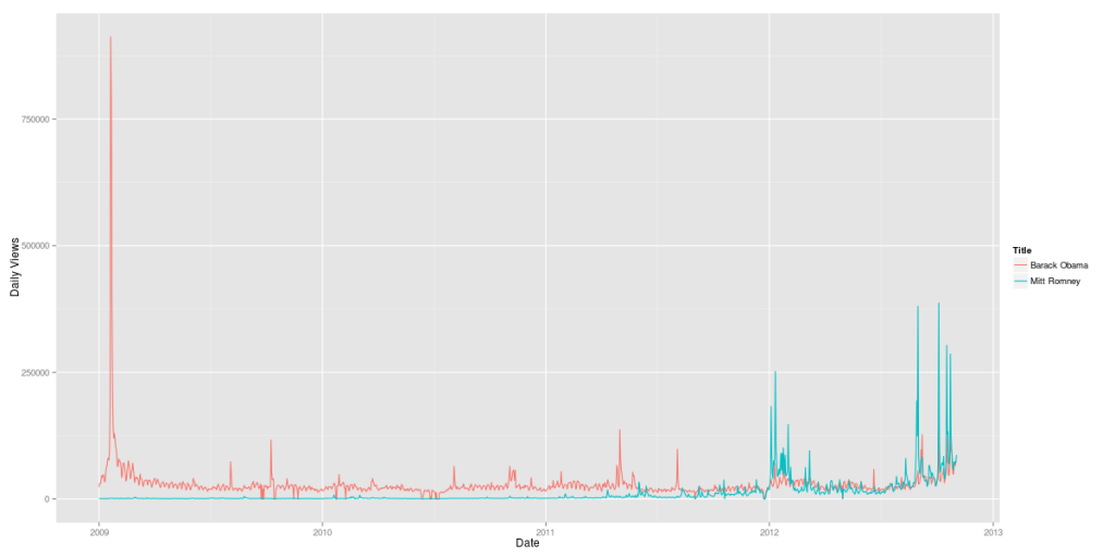
The first step was comparing the candidates Barack Obama and Mitt Romney over time. The resulting graph clearly shows the pivoting points of Obama’s presidential career (click to zoom):

Obama vs. Romney 2009-2012 (Wikipedia data)

But it also shows how strong Mitt Romney has been since the Republican primaries in January 2012. His Wikipedia page had attracted a lot more visitors in August and September 2012 than his presidential rival’s. Of course, this measure only shows attention, not sentiment. So it cannot be inferred from this data whether the peaks were positive or negative peaks. In terms of Wikipedia attention, Romney’s infamous 47% comments in September 2012 were more than 1/3 as important as Obama’s inauguration in January 2009.

Now, let’s add some further curves to this graph: Obama’s and McCain’s Wikipedia attention during the last elections:

Obama vs. Romney 2012 compared to Obama vs. McCain 2008 (Wikipedia data)

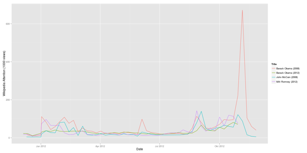
Here’s another version with weekly data:

Obama vs. Romney 2012 compared to Obama vs. McCain 2008 (Wikipedia data, weeks)

It’s almost instantly clear how much more attention Obama’s 2008 campaign (in red) gathered in comparison with his 2012 campaign (in green). On the other hand, Mitt Romney is at least when it comes to Wikipedia attention more interesting than McCain had been.

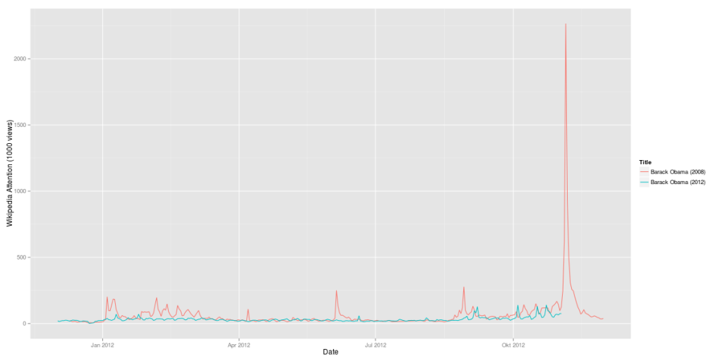
Here’s a comparison of Obama’s 2008 campaign vs. his 2012 campaign:

Obama 2008 vs. Obama 2012 (Wikipedia data)

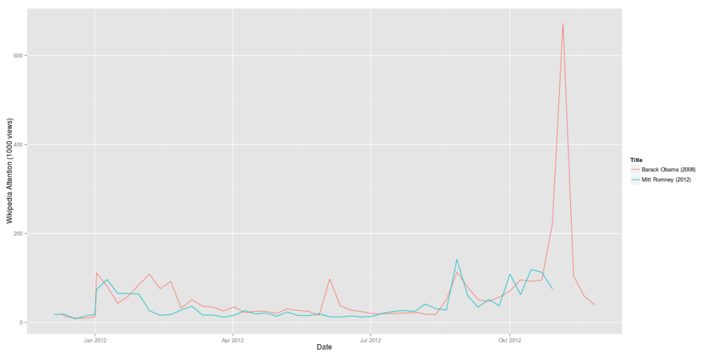
The last question: Is Mitt Romney 2012 as strong as Obama had been in 2008? Here’s a direct comparison:

Obama 2008 vs. Romney 2012 (Wikipedia data, weekly)

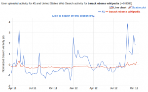
A side-remark: I also did a correlation of this data set with Google Correlate. And guess what: The strongest correlation of the data for Obama’s 2012 campaign is the Google search query for “barack obama wikipedia”. There still seem to be a huge number of people using Google as their Wikipedia search-engine.

Google Correlate result for the Wikipedia time series "Barack Obama"
Google Correlate result for the Wikipedia time series “Barack Obama”

But this result could also be interpreted the other way round: If there is a strong correlation between Wikipedia usage and Google search queries, this makes Wikipedia an even more important data source for analyses.

Big Data journal launches in 2013

A very clear indicator that a topic is not only an ephemeral hype is when there will be a scientific journal for this new topic. This has just happened with Big Data as Liebert publishers just announced at the Strata conference the launch of their peer-reviewed journal “Big Data” for 2013. It will be edited by O’Reilly’s Edd Dumbill.

But you don’t have to wait until the next year, but can already grab a special preview issue featuring five original articles for download right now.

All peer-reviewed articles will be published under a Creative Commons licence and therefore be available for free when they will be published.

Pastagram

While preparing and arranging today’s meal – Penne al Forno con Polpettine – to be documented and posted on Instagram, I thought: Why not preparing and arranging a pasta network with the help of the Instagram API and the Gephi network visualization software. I did this before for many other things such as Chinese cities or spring.

The special Instagram magic lies in the hashtags users are posting to their (and their friends’) images. These hashtags can be used to create social network datasets out of the image streams of the API. If someone is posting an image of their pasta dish and is tagging it with “#salmon”, then this tag is the link to all other images also tagged with “#salmon”. Theoretically one could do the next search for salmon and find out which images are referred to by this hashtag. This would produce a large map of human concepts plus their visualization in photographs.

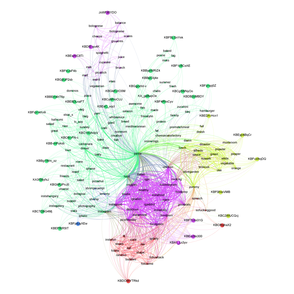
What I did was taking a really small sample of 40 pasta images posted to Instagram during the last week and calculated the links between a) images and b) hashtags. The result is a bimodal network: images are connected to hashtags; and hashtags are connected to images and other hashtags. This is the resulting network:

Pasta Social Network Analysis

I also created a version with all the images in the network as thumbnail, so you can see the different qualities in the image (brightness, colours, composition, filters etc.) Right now I am working an a way to automatically assemble and publish image based networks that would properly embed the images.

Some facts about pasta imagery on Instagram:

  • There’s dinner pasta (upper left) and lunch pasta (upper right). Lunch pasta tends to be more colorful and bright, while dinner pasta can be very dim arrangements on restaurant tables or unboxed pizza and pasta deliveries.
  • Another interesting category is tagged with “distasters”. This hashtags clearly corresponds to the images.
  • The most important hashtags are: pasta, food, chicken, foodporn, delicious, italian, cooking, yummy, foodgasm, foodie.
  • When looking at a larger sample of pasta pictures, the most important hashtags change a bit, but our small sample seems to be quite representative: pasta, food, foodporn, yummy, lunch, dinner, delicious, yum, italian, cheese, spaghetti, homemade …
  • Filters are very frequently used in pasta photography: only 22% of all images are posted without any filters.

Finally, here’s a look at the top five pasta images:

4 out of 5 are photographed by Japanese IGers. So the next thing to look at will be the regional distribution of food hashtags. To be continued.

Twitter Germany will be based in Berlin – Taking a look at the numbers

What I really love about Twitter is that everything they do seems to be data-based. They’re so data-driven, they even analyze the ingredients of their lunch to ensure everyone at the company is living a healthy lifestyle. So, the decision for Berlin as their German headquarter cannot be a random or value-based decision. I bet, there’s been a lot of numbers crunching before announcing their new office. Let’s try and reverse-engineer this decision.

As a data basis I collected 4,377,832 tweets more or less randomly by connecting to the streaming API. Then I pulled all users mentioning one of the 30 leading German cities from Berlin to Aachen in their location field. Where there were Umlauts involved, I allowed for multiple variants, e.g. “Muenchen”, “Munchen” or “Munich” for “München”. Now I have 3,696 Twitter users from Germany that posted one or more tweets during the sample interval. That’s 0.08% of the original sample size. Although that’s not as much as I would have expected, let’s continue with the analysis.

The first interesting thing is the distribution of the Twitter users by their cities. Here’s the result:
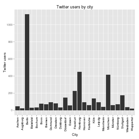
Twitter users by city

One thing should immediately be clear from this chart: Only Berlin, Hamburg and Munich had a real chance of becoming Twitter’s German HQ. The other cities are just Twitter ghost towns. In the press, there had been some buzz about Cologne, but from these numbers, I’d say that could only have been desinformation or whishful thinking.

The next thing to look at is the influence of Twitter users in different German cities. Here’s a look at the follower data:
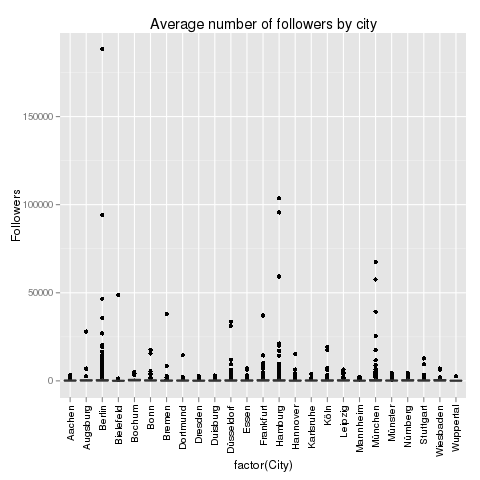
Average numbers of followers by city

This does not help a lot. The distribution is heavily distorted by the outliers: Some Twitter users have a lot more followers than others. These Twitter users are marked by the black dots above the cities. But one thing is interesting: Berlin, Hamburg and Munich not only have the most Twitter users in our sample, but also the most and the highest outliers. With the outliers removed, the chart looks like this:
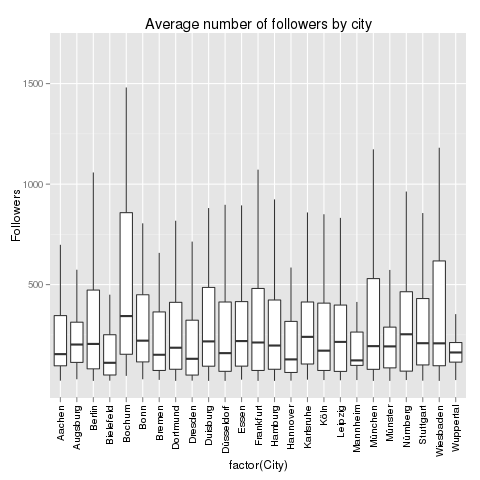
Average number of followers by city

The chart not only shows the median number of followers, but also the distribution of the data. Berlin, that should be clear from this chart, is not the German city where the Twitter users with most followers hail from. This should be awarded to Bochum (355 followers), Nuremberg (258 followers) or Augsburg (243 followers). But these numbers are not very reliable as the number of cases is quite low for these cities. If we focus on the Big 3, then Berlin is leading with 223 followers, then Munich with 209 followers and finally Hamburg with 200 followers. But it’s a very close race.

Next up, the number of friends. Which German city is leading the average number of friends on Twitter?
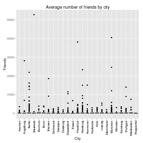
Average number of friends by city

This chart is also distorted by outliers, but here it’s different cities: The user in the sample who is following the largest number of friends is located in Bielefeld. Of all things! Now, let’s remove the outliers:
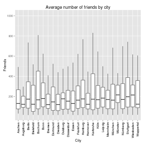
Average number of friends by city

The cities with the larges average number of friends are: Bochum (again! 286 friends), Wiesbaden (224 friends) and Leipzig (208 friends). Our Big 3 are performing as follows: Berlin (183 friends), Hamburg (183 friends) and Munich (160 friends). Let’s take a look at the relation between followers and friends:
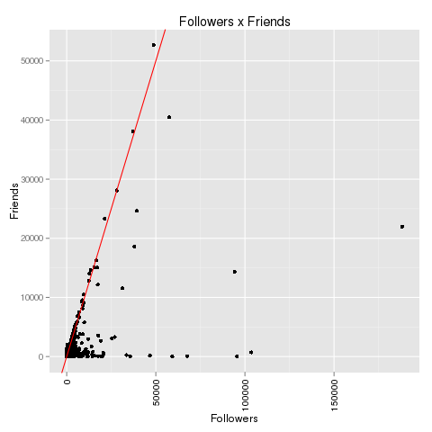
Followers x Friends

If we zoom in a bit on the data we can reproduce the “2000 phenomenon”:
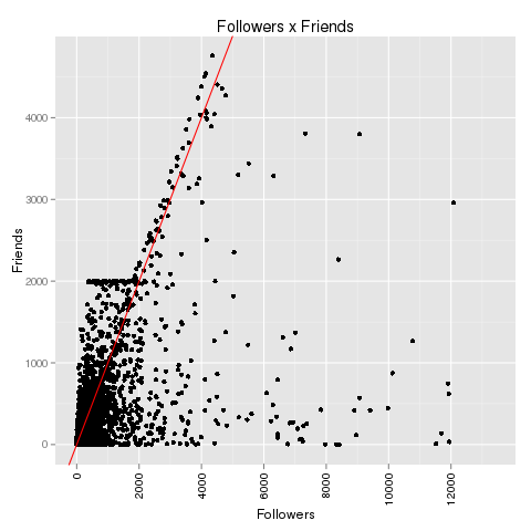
2000 phenomenon

There clearly is some kind of artificial barrier at 2,000 friends on Twitter. Accounts that have between 100 and 2,000 followers never follow more than 2,000 followers. Most frequently, they follow just a little below of 2,000 people. After they gathered 2,000 followers themselves, this barrier has been broken and the maximal number of friends seems to grow with the number of followers. There’s only speculation about this phenomenon, but one of the most convincing explanation is: We are looking at spam bots that are programmed to stay below 2,000 friends until they have gathered more than 2,000 followers. Maybe Twitter has some spam fighting algorithms that are focusing at the 2,000 line. Update: See explanation in the comments to this article: Behind this anomaly is Twitter’s spam-fighting barrier that only allows 2,000 friends up to 2,000 followers. Beyond this, the limit for the maximum number of friends is limited by the number of followers + 10%.

If those users are bots, then which city is bot capital? Let’s take a look at all Twitter users that have between 1,900 and 2,100 friends and segment them by city:
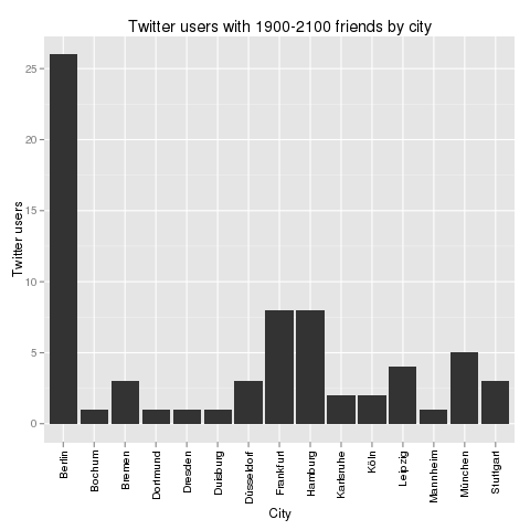
Twitter users by city

Again, Berlin is leading. But how do these numbers relate to the total numbers? Here’s the Bot Score for these cities: Berlin 2.3%, Hamburg 1.8% and Munich 1.2%. That’s one clear point for Munich.

Finally, let’s take a look at Twitter statuses in these cities. Where do the most active Twitter users tweet from? Here’s a look at the full picture including outliers:
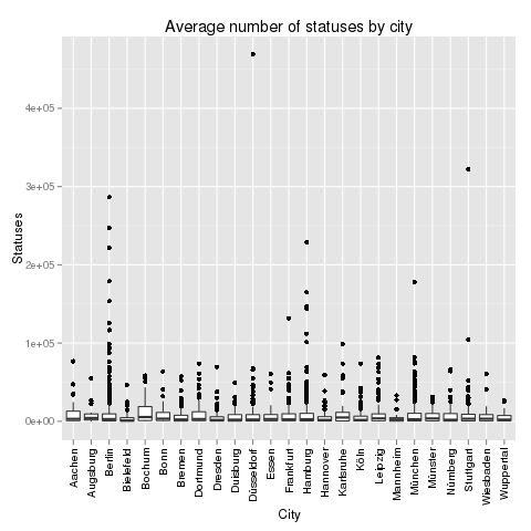
Average number of statuses by city

The city with the most active Twitter user surprisingly is not Bochum or Berlin, but Düsseldorf. And also Stuttgart seems to be very hot in this regard. But to really learn about activity, we have to remove the outliers again:
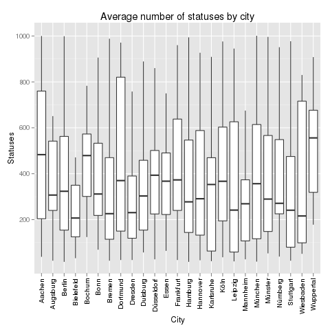
Average number of statuses by city

Without outliers, the most active Twitter cities in Germany are: Bochum (again!! 5514 statuses), Karlsruhe (4973) and Augsburg (4254). The Big 3 are in the midfield: Berlin (2845), Munich (2717) and Hamburg (2638).

Finally, there’s always the content. What are the users in the Big 3 cities talking about? The most frequently twittered words do not differ very much. In all three cities, “RT” is the most important word followed by a lot of words like “in”, “the” or “ich” that don’t tell much about the topics. It is much more interesting to look at word pairs (and especially at the pairs with the highest point wise mutual information (PMI). In Berlin, people are talking about “neues Buch” (new book – it’s a city of literature), “gangbang erotik” (hmm) and “nasdaq dow” (financial information seem to be important). In Munich, it’s “reise reisen” (Munich seems to love traveling), “design products” (very design oriented city) and “prost bier” (it’s a cliche, but it seems to be true). Compare this with Hamburg’s “amazon preis” (people looking for low prices), “social media” (Hamburg has a lot of online agencies) and “dvd blueray” (people watching a lot of TV).

Wrapping up, here are the final results:

          Berlin Munich Hamburg
Users          3      1       2
Followers      3      2       1
Friends        2      1       2
Bots          -3     -1      -2
Statuses       3      2       1
TOTAL          8      5       4

Congrats to Berlin!

[The R code that generated all the charts above can be found on my github.]
Telling stories with network data: Spring on Instagram

The days are getting longer, the first flowers come into bloom and a very specific set of hashtags are spreading through Social Media platforms – it’s spring again! In this blogpost I took a look at spring-related pictures on Instagram. Right now, the use of hashtags on Instagram has not entered the mainstream. For this analysis, I took a look at the latest 938 images tagged with “#spring”. The average rate was 12 spring-tagged pictures a day, but this rate will be increasing during the next days and weeks.

The following hashtags were most frequently used in combination with the #spring hashtag:

  1. Flower(s) (198 mentions, 2639 likes)
  2. Sun (160, 2018)
  3. Tree(s) (130, 2230)
  4. Nature (128, 2718)
  5. Love (119, 1681)
  6. Girl (107, 1469)
  7. Sky (89, 2057)
  8. Fashion (64, 924)
  9. Beautiful (61, 1050)
  10. Blue (59, 1234)

Although I would associate spring with green, the Instagram community has other preferences:

  1. Blue (59 mentions, 1234 likes)
  2. Pink (42, 396)
  3. Green (40, 444)
  4. White (29, 457)
  5. Yellow (22, 369)
  6. Red (17, 230)
  7. Black (16, 267)
  8. Brown (7, 117)
  9. Orange (7, 77)
  10. Grey (3, 50)

So these are the spring colors according to Instagram hashtags

Here are the top 15 most liked spring pictures on Instagram right now:

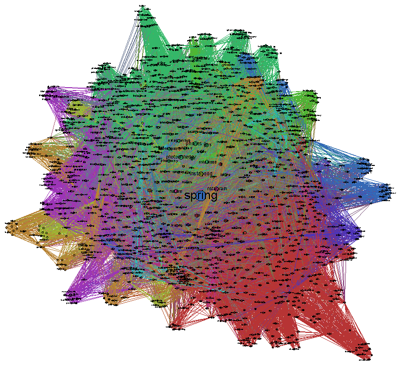
Here’s the tag network that is showing the relations between the 2445 other unique hashtags that appeared in connection with #spring (see PDF):

Instagram wouldn’t be half the fun without the various filters to apply to the images. But #spring is best enjoyed in natural form. 28% of all #spring posts were posted without any additional filter:

  1. Normal (261)
  2. X-Pro II (91)
  3. Rise (83)
  4. Amaro (81)
  5. Lo-fi (68)
  6. Hefe (54)
  7. Earlybird (48)
  8. Hudson (41)
  9. Sierra (34)
  10. Valencia (33)

Strata Conference – the first day

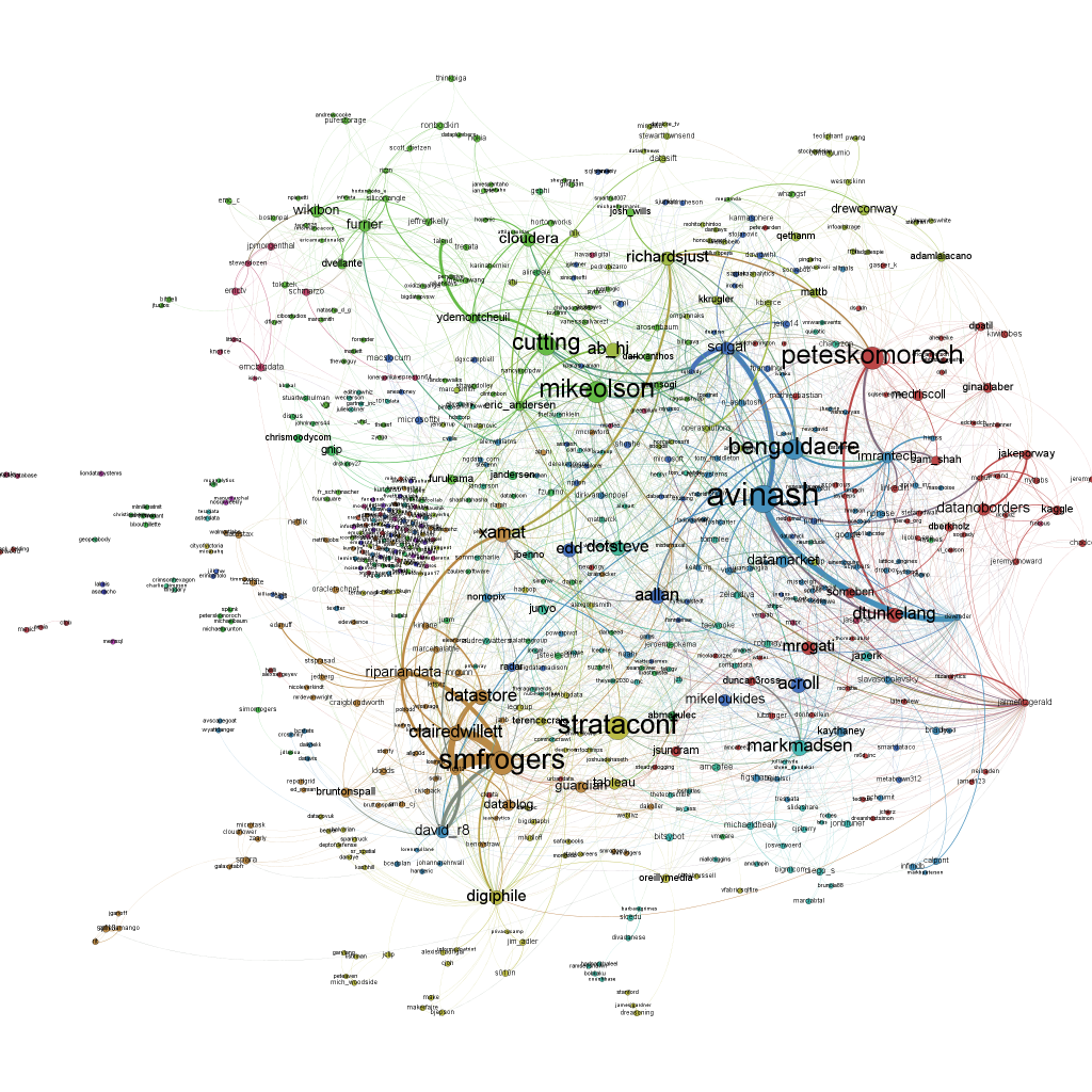
Here’s a network visualization of all tweets referring to the hashtag “#strataconf” (click to enlarge). The node size is representing the number of incoming links, i.e. the number of times this person has been mentioned in other people’s tweets:

This network map has been generated in three steps:

1) Data collection: I collected the twitter data with the open source application YourTwapperKeeper. This is the DIY version of the TwapperKeeper platform that had been very popular in the scientific community. Unfortunately after the acquisition by HootSuite it is no longer available to the general public, but John O’Brien has made the scripts available via his githup. I am running yTK on a Amazon EC2 instance. What it does is connecting to the Twitter Streaming API and fetching all tweets with “#strataconf” in realtime and additionally doing regular searches via the Search API to find tweets that had been overlooked by the Streaming API.

2) Data processing: What is so great about yTK: It offers different methods to fetch the tweets you collected. I am using the JSON API to get the tweets downloaded to my computer. This is done with a Python script. The script opens the JSON file and then scans the tweets for mentions or retweets with the following regular expressions I borrowed from Matthew Russell’s book Mining the Social Web:

rt_patterns = re.compile(r"(RT|via)((?:\b\W*@\w+)+)", re.IGNORECASE)
at_pattern = re.compile(r"@(\w+)", re.IGNORECASE)

Then I am using the very convenient library igraph to write the results in the generic graphml file format that can be processed by various network analysis tools. Basically I am just using this snipped of code on all tweets I found to generate the list of nodes:

if not tweet['from_user'].lower() in nodes:
    nodes.append(tweet['from_user'].lower())

… and edges:

for mention in at_pattern.findall(tweet['text']):
    mentioned.append(mention.lower())
    if not mention.lower() in nodes:
        nodes.append(mention.lower())
    edges.append((nodes.index(tweet['from_user'].lower()),nodes.index(mention.lower())))

The graph is generated with the following lines of code:

g = Graph(len(nodes), directed=True)
g.vs["label"] = nodes
g.add_edges(edges)

This is almost the whole code for processing the network data.

3) Visualization: The visualization of the graph is done with the wonderful cross-platform tool Gephi. To generate the graph above, I reduced the network to all nodes that have at least one other node referring to it. Then I sized the nodes according to their total number of degrees, that is how often they were mentioned in other people’s tweets or how often they were mentioning other users. The color is determined by the modularity clustering algorithm. Then I used the Force Atlas layout algorithm and voilà – here’s the network map.

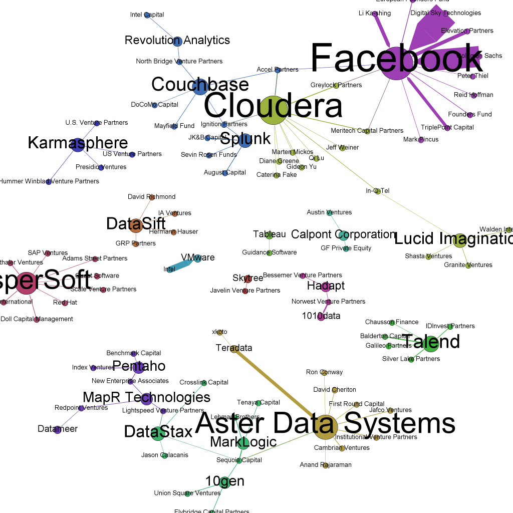
10 hot big data startups to watch this year

[Here’s the update for 2013]

Everybody knows Cloudera, MapR, Splunk, 10Gen and Hortonworks. But what about Platfora or Hadapt? These 10 startups are my bet on which big data companies will probably be game-changers in 2012:

Platfora aims at providing a “revolutionary BI and analytics platform that democratizes and simplifies the use of big data and Hadoop”. From what the website tells about Platfora approach, it is all about transforming Hadoop datasets into enterprise dashboards with multidimensional layouts, drill-down possibilities and predictive analytics and to generate big data insights. The founder, Ben Werther, had been product head at the data analytics company Greenplum before and Platfora VP Marketing hails from Solera, a company specialized in network forensic solutions. In September, they received $7.2M in Series A funding by Andreessen Horovitz, In-Q-Tel and Sutter Hill. In-Q-Tel is a company identifying and investing in solutions that could be valuable for the US intelligence community and especially the CIA.

Valley based SumoLogic tackles one of the central big data problems: log file analysis. With the help of their technologies Elastic Log Processing™ and LogReduce™, they claim to provide next generation logfile analysis on a petabyte scale. Co-founder and CEO Kumar Saurabh had been data architect at mint.com before. The company received $15M in January 2012 by Sutter Hill, Greylock Partners and Shlomo Kramer. SumoLogic left stealth mode only a few days ago, so try it while it is still fresh.

Hadapt is one of the few big data companies from the east-coast. Its USP seems to be the combination of the two elements of Hadoop and RDBMS. Their approach of combining SQL queries and Hadoop’s cluster processing claims to deliver significant performance gains over standalone Hadoop systems (Hive/HDFS). CEO Justin Borgmann had worked as product developer at the anti-counterfeit company COVECTRA before founding Hadapt. The product is now in closed beta mode. It reecived $9.5M of funding by Norwest and Bessemer in October 2011.

Continuuity is currently in stealth-mode, but the impressive names – Andreessen Horowitz, Battery and Ignitions – behind the first funding round of $2.5M sound very promising. The founder and CEO, Jonathan Gray, worked for a personalized news site before. Unfortunately, that’s all that can be said about this very covert start-up right now.

Kontagent is a bit older and already offers a product. This San Francisco based company has already received $17.5M in funding. While not a big data company per se, what Kontagent is doing is a big data challenge par excellence: tracking 15,000 clicks and messages a second sent from over 1,000 social and mobile applications. Their solution kSuite provides application developers and marketers with advanced analytical and visualization features.

Domo claims to provide a new form of business intelligence providing an SaaS executive management dashboard accessible by all kinds of devices. It has received $63M of funding by investors such as IVP and Benchmark. Its founder and CEO, Josh James, had been previously known for founding data analytics company Omniture. This seems to be one of Domo’s strongest asset. Right now, Domo is accepting first users in their early-adopter program.

Metamarkets is all about detecting patterns and changes in large data flows such as transactions, traffic or social events. But the San Francisco-based startup not only identifies changes, but offers predictive analytics that can forecast future traffic or demands. Founder David Soloff had previously been Director Information Products at the media management software company Rapt that had been acquired by Microsoft in 2008. Metamarkets have received $8.5M of funding in two rounds so far. And they have a beautiful dashboard.

DataStax (formerly known as Riptano) is one of the companies that are growing in the Big Data ecosystem by delivering consulting, support and training for software solutions such as Cassandra in this case. Up to know, they have secured $13.7M of funding by the like of Sequoia Capital and Lightspeed.

Odiago should also be considered a hot startup. Its founder, Christophe Bisciglia, had previously founded Cloudera after leaving Google where he had been a Senior Software engineer. Right now, Odiago’s first product, wibidata, is in beta stage: a software solution including Hadoop, HBase and Avro for managing and analyzing large sets of userdata, structured or unstructured.

Cupertino based Karmasphere is another Big Data meets Business Intelligence solution startup we should watch. They received another $6M of funding last year, making it $11M in total. They have a variety of products out, including a Amazon AWS based cloud analytics solution.

Big Data and the end of the middle management

Big data as substitution for people? That sounds like a cyberneticist’s daydream to you? Michael Rappa, Director of the Institute for Advanced Analytics at the North Carolina State University does not think so. In this FORBES interview, he explains the advantages of a “data-driven corporate culture”:

“Data has a potentially objective quality. It accelerates consensus,” said Rappa. “If you feel that you can trust your data scientists and the models they build, if your team can buy into a culture that values data, the grey areas that open the door to political infighting disappear.”

Actually, I don’t buy this. Data (and especially data visualizations) certainly have a kind of objective aura. They seem to just be there. The whole micropolitical process that went into defining measures, indicators and algorithms is hidden behind this objective aura of (big) numbers. But where there were fights about corporate strategy, tactics and processes, there will also be data-based fights about these things – although maybe a bit nerdier and more esoteric and difficult for the rest of the management to understand.

A more pessimistic view is proposed by the Columbia Journalism Review: Here data-based decision-making (aka “clickocracy”) is seen as a threat to journalistic quality because journalists will start to optimize their own writing the minute they feel they are monitored in a big data clickstream:

[A]udiences now provide feedback unintentionally through online metrics (the running tally of which articles get clicked on the most). Reporters—who fear that a lack of clicks could cost them their jobs—watch these tallies, as do editors and publishers, because higher metrics mean higher online ad revenues.

Social Network Analysis of the Twitter conversations at the WEF in Davos

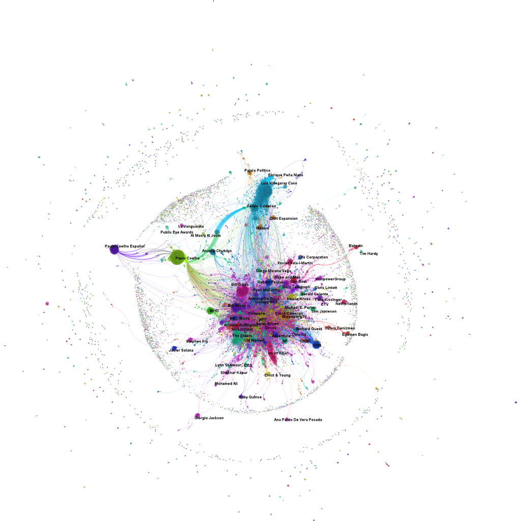
The minute, the World Economic Forum at Davos said farewell to about 2,500 participants from almost 100 countries, our network analytical machines switched into production mode. Here’s the first result: a network map of the Twitter conversations related to the hashtags “#WEF” and “#Davos”. While there are only 2,500 participants, there are almost 36,000 unique Twitter accounts in this global conversation about the World Economic Forum. Its digital footprint is larger than the actual event (click on map to enlarge).

There are three different elements to note in this visualization: the dots are Twitter accounts. As soon as somebody used one of the two Davosian hashtags, he became part of our data set. The size of the notes relates to its influence within the network – the betweenness centrality. The better nodes are connecting other nodes, the more influential they are and the larger they are drawn. The lines are mentions or retweets between two or more Twitter accounts. And finally, the color refers to the subnetworks or clusters generated by replying or retweeting some users more often than others. In this infographic, I have labelled the clusters with the name of the node that is in the center of this cluster.

Big data – problem or solution?

One particular interesting question about Big Data is: Is Big Data a problem or a solution? Here’s a video (via Inside Bigdata) by Cindy Saracco that’s clearly about the first option. Big Data is a challenge for corporations that can be characterized by the following three dimensions:

  • Sleeping data: There is a lot of data that is not currently used by corporations because of its size or performance issues with using very large data sets
  • Messy data: There is a lot of data that is unstructured or semi-structured and cannot be analyzed with regular business intelligence methods
  • Lack of imagination: There is a lot of data where it’s not clear, what exactly could be analyzed or which questions could be answered with it

On the other hand, there are people like Jeff Jonas, IBM’s Big Data Chief Scientist, who think the opposite: “Big Data is something really cool and marvellous that happens when you get enough data together.” I really like Jonas’ video series on Business Insider (see here, here and here) that explains what is so great about Big Data:


So, from the first perspective Big Data is a problem for corporations to handle large data sets and from the second perspective, it’s a fascinating puzzle that requires playing with a lot of pieces in order to spot the hidden pattern.