Big Data Investment Map 2014

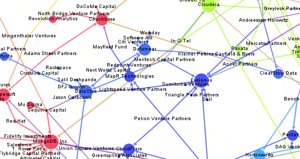
Here’s an updated version of our Big Data Investment Map. I’ve collected information about ca. 50 of the most important Big Data startups via the Crunchbase API. The funding rounds were used to create a weighted directed network with investments being the edges between the nodes (investors and/or startups). If there were multiple companies or persons participating in a funding round, I split the sum between all investors.

This is an excerpt from the resulting network map – made with Gephi. Click to view or download the full graphic:

BigDataInvestmentMap_2014_Small

If you feel, your company is missing in the network map, please tell us in the comments.

The size of the nodes is relative to the logarithmic total result of all their funding rounds. There’s also an alternative view focused on the funding companies – here, the node size is relative to their Big Data investments. Here’s the list of the top Big Data companies:

Company Funding
(M$, Source: Crunchbase API)
VMware 369
Palantir Technologies 343
MongoDB, Inc. 231
DataStax 167
Cloudera 141
Domo 123
Fusion-io 112
The Climate Corporation 109
Pivotal 105
Talend 102

And here’s the top investing companies:

Company Big Data funding
(M$, Source: Crunchbase API)
Founders Fund 286
Intel 219
Cisco 153
New Enterprise Associates 145
Sequoia Capital 109
General Electric 105
Accel Partners 86
Lightspeed Venture Partners 72
Greylock Partners 63
Meritech Capital Partners 62

We can also use network analytical measures to find out about which investment company is best connected to the Big Data start-up ecosystem. I’ve calculated the Betweenness Centrality measure which captures how good nodes are at connecting all the other nodes. So here are the best connected Big Data investors and their investments starting with New Enterprise Associates, Andreessen Horowitz and In-Q-Tel (the venture capital firm for the CIA and the US intelligence community).

Investor Centrality Big Data Companies
1 New Enterprise Associates 0.0863 GraphLab, MapR Technologies, Fusion-io, MongoDB, Inc., WibiData, Pentaho, CloudFlare, The Climate Corporation, MemSQL
2 Andreessen Horowitz 0.0776 ClearStory Data, Domo, Fusion-io, Databricks, GoodData, Continuuity, Platfora
3 In-Q-Tel 0.0769 Cloudera, Recorded Future, Cloudant, MongoDB, Inc., Platfora, Palantir Technologies
4 Founders Fund 0.0623 Declara, CrowdFlower, The Climate Corporation, Palantir Technologies, Domo
5 SV Angel 0.0602 Cloudera, Domo, WibiData, Citus Data, The Climate Corporation, MemSQL
6 Khosla Ventures 0.0540 ParStream, Metamarkets, MemSQL, ClearStory Data, The Climate Corporation
7 IA Ventures 0.0510 Metamarkets, Recorded Future, DataSift, MemSQL
8 Data Collective 0.0483 Trifacta, ParStream, Continuuity, Declara, Citus Data, Platfora, MemSQL
9 Hummer Winblad Venture Partners 0.0458 NuoDB, Karmasphere, Domo
10 Battery Ventures 0.0437 Kontagent, SiSense, Continuuity, Platfora

Text-Mining the DLD Conference 2014

Once a year, the cosmopolitan digital avantgarde gathers in Munich to listen to keynotes on topics all the way from underground gardening to digital publishing at the DLD, hosted by Hubert Burda. In the last years, I did look at the event from a network analytical perspective. This year, I am analyzing the content, people were posting on Twitter in order to make comparisons to last years’ events and the most important trends right now.

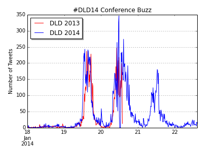
To do this in the spirit of Street Fighting Trend Research, I limited myself to openly available free tools to do the analysis. The data-gathering part was done in the Google Drive platform with the help of Martin Hawksey’s wonderful TAGS script that is collecting all the tweets (or almost all) to a chosen hashtag or keyword such as “#DLD14” or “#DLD” in this case. Of course, there can be minor outages in the access to the search API, that appear as zero lines in the data – but that’s not different to data-collection e.g. in nanophysics and could be reframed as adding an extra challenge to the work of the data scientist 😉 The resulting timeline of Tweets during the 3 DLD days from Sunday to Tuesday looks like this:

Twitter Buzz for #DLD14

You can clearly see three spikes for the conference days, the Monday spike being a bit higher than the first. Also, there is a slight decline during lunch time – so there doesn’t seem to be a lot food tweeting at the conference. To produce this chart (in IPython Notebook) I transformed the Twitter data to TimeSeries objects and carefully de-duplicated the data. In the next step, I time shifted the 2013 data to find out how the buzz levels differed between last years’ and this years’ event (unfortunately, I only have data for the first two days of DLD 2013.

DLD14_Buzz_Comp_Comparison

The similarity of the two curves is fascinating, isn’t it? Although there still are minor differences: DLD14 began somewhat earlier, had a small spike at midnight (the blogger meeting perhaps) and the second day was somewhat busier than at DLD13. But still, not only the relative, but also the absolute numbers were almost identical.

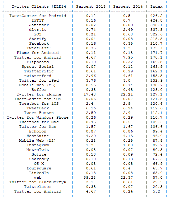
Now, let’s take a look at the devices used for sending Tweets from the event. Especially interesting is the relation between this years’ and last years’ percentages to see which devices are trending right now:

DLD14_Clients

The message is clear: mobile clients are on the rise. Twitter for Android has almost doubled its share between 2013 and 2014, but Twitter for iPad and iPhone have also gained a lot of traction. The biggest losers is the regular Twitter web site dropping from 39 per cent of all Tweets to only 22 per cent.

The most important trending word is “DLD14”, but this is not surprising. But the other trending words allow deeper insights into the discussions at the DLD: This event was about a lot of money (Jimmy Wales billion dollar donation), Google, Munich and of course the mobile internet:

DLD14_Words

Compare this with the top words for DLD 2013:

DLD13_Words

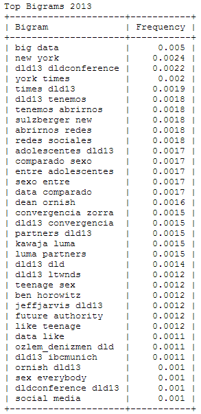
Wait – “sex” among the 25 most important words at this conference? To find out what’s behind this story, I analyzed the most frequently used bigrams or word combinations in 2013 and 2014:

DLD13_Bigrams DLD14_Bigrams

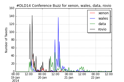
With a little background knowledge, it clearly shows that 2013’s “sex” is originating from a DJ Patil quote comparing “Big Data” (the no. 1 bigram) with “Teenage Sex”. You can also find this quotation appearing in Spanish fragments. Other bigrams that were defining the 2013 DLD were New York (Times) and (Arthur) Sulzberger, while in 2014 the buzz focused on Jimmy Wales, Rovio and the new Xenon processor and its implications for Moore’s law. In both years, a significant number of Tweets are written in Spanish language.

DLD14_Buzzwords_Comp

UPDATE: Here’s the  IPython Notebook with all the code, this analysis has been based on.

Trending Topics at Strata Conferences 2011-2014

To fill the gap until this year’s Strata Conference in Santa Clara, I thought of a way to find out trends in big data and data science. As this conference should easily be the leading edge gathering of practitioners, theorists and followers of big data analytics, the abstracts submitted and accepted for Strataconf should give some valuable input. So, I collected the abstracts from the last Santa Clara Strata conferences and applied some Python nltk magic to it – all in a single IPython Notebook, of course.

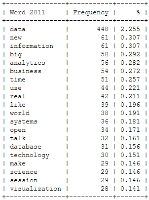
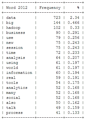
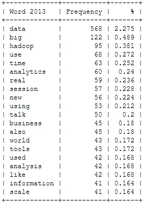
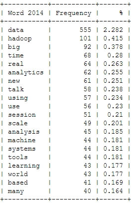
Here’s a look at the resulting insights. First, I analyzed the most frequent words, people used in their abstracts (after excluding common English language stop words). As a starter, here’s the Top 20 words for the last four Strata conferences:

Strata_Words_2011 Strata_Words_2012 Strata_Words_2013 Strata_Words_2014

This is just to check, whether all the important buzzwords are there and we’re measuring the right things here: Data – check! Hadoop – check! Big – check! Business – check! Already with this simple frequency count, one thing seems very interesting: Hadoop didn’t seem to be a big topic in the community until 2012. Another random conclusion could be that 2011 was the year where Big Data really was “new”. This word loses traction in the following years.

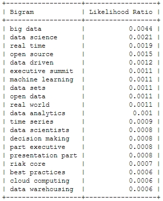
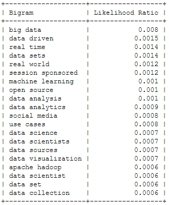
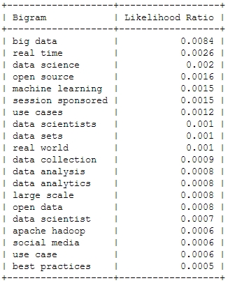
And now for something a bit more sophisticated: Bigrams or frequently used word combinations:

2011
Strata_Bigrams_2011
2012
Strata_Bigrams_2012
2013
Strata_Bigrams_2013
2014
Strata_Bigrams_2014

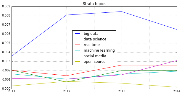
Of course, the top bigram through all the years is “big data”, which is not entirely unexpected. But you can clearly see some variation among the Top 20. Looking at the relative frequency of the mentions, you can see that the most important topic “Big Data” will probably not be as important in this years conference – the topical variety seems to be increasing:

Strata_Bigrams

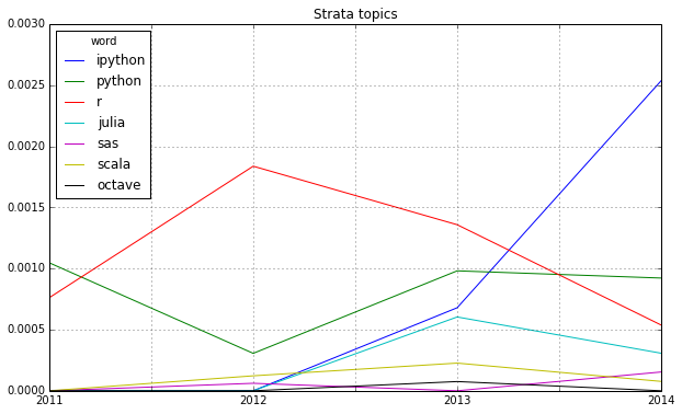
Looking at some famous programming and mathematical languages, the strong dominance of R seems to be broken by Python or IPython (and its Notebook environment) which seems to have established itself as the ideal programming tool for the nerdy real-time presentation of data hacks. \o/

Strata_Lang

Another trend can be seen in the following chart: Big Data seems to become more and more faceted over the years. The dominant focus on business applications of data analysis seems to be over and the number of different topics discussed on the conference seems to be increasing:

Strata_Fields

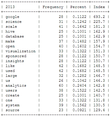
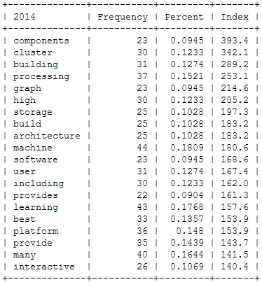
Finally, let’s take a more systematic look at rising topics at Strata Conferences. To find out which topics were gaining momentum, I calculated the relative frequencies of all the words and compared them to the year before. So, here’s the trending topics:

Strata_Trends_2012 Strata_Trends_2013 Strata_Trends_2014

These charts show that 2012 was indeed the “Hadoop-Strata” where this technology was the great story for the community, but also the programming language R became the favorite Swiss knife for data scientists. 2013 was about applications like Hive that run on top of Hadoop, data visualizations and Google seemed to generate a lot of buzz in the community. Also, 2013 was the year, data really became a science – this is the second most important trending topic. And this was exactly the way, I experienced the 2013 Strata “on the ground” in Santa Clara.

What will 2014 bring? The data suggests, it will be the return of the hardware (e.g. high performance clusters), but also about building data architectures, bringing data know-how into organizations and on a more technical dimension about graph processing. Sounds very promising in my ears!

Identifying trends in the German Google n-grams corpus (Tutorial)

A lot of people still have a lot of respect for Hadoop and MapReduce. I experience it regularly in workshops with market researchers and advertising people. Hadoop’s image is quite comparable with Linux’ perceived image in the 1990s: a tool for professional users that requires a lot of configuration. But in the same way, there were some user-friendly distributions (e.g. Suse), there are MapReduce tools that require almost no configuration.

One favorite example is the ease and speed, you can do serious analytical work on the Google n-grams corpus with Hive on Amazon’s Elastic MapReduce platform. I adapted the very helpful code from the AWS tutorial on the English corpus to find out the trending German words (or 1-grams) for the last century. You need to have an Amazon AWS account and valid SSH keys to connect to the machines you are running the MapReduce programs on (here’s the whole hive query file).

  • Start your Elastic MapReduce cluster on the EMR console. I used 1 Master and 19 slave nodes. Select your AWS ssh authorization key. Remember: from this moment on, your cluster is generating costs. So, don’t forget to terminate the cluster after the job is done!
  • If your Cluster has been set-up and is running, note the Master-Node-DNS. Open a SSH client (e.g. Putty on Windows or ssh on Linux) and connect to the master node with the ssh key. Your username on the remote machine is “hadoop”.
  • Start “hive” and set some useful defaults for the analytical job:

    set hive.base.inputformat=org.apache.hadoop.hive.ql.io.HiveInputFormat;
    set mapred.min.split.size=134217728;

  • The first code snippet connects to the 1-gram dataset which resides on the S3 storage:

    CREATE EXTERNAL TABLE german_1grams (
    gram string,
    year int,
    occurrences bigint,
    pages bigint,
    books bigint
    )
    ROW FORMAT DELIMITED FIELDS TERMINATED BY '\t'
    STORED AS SEQUENCEFILE
    LOCATION 's3://datasets.elasticmapreduce/ngrams/books/20090715/ger-all/1gram/';

  • Now, we can use this database to perform some operations. The first step is to normalize the database, e.g. to transform all words to lower case and remove 1-grams that are no proper words. Of course you could further refine this step to remove stopwords or reduce the words to their stems by stemming or lemmatization.

    CREATE TABLE normalized (
    gram string,
    year int,
    occurrences bigint
    );

    And then we populate this table:

    INSERT OVERWRITE TABLE normalized
    SELECT
    lower(gram),
    year,
    occurrences
    FROM
    german_1grams
    WHERE
    year >= 1889 AND
    gram REGEXP "^[A-Za-z+'-]+$";

  • The previous steps should run quite fast. Here’s the step that really need to be run on a multi-machine cluster:

    CREATE TABLE by_decade (
    gram string,
    decade int,
    ratio double
    );

    INSERT OVERWRITE TABLE by_decade
    SELECT
    a.gram,
    b.decade,
    sum(a.occurrences) / b.total
    FROM
    normalized a
    JOIN (
    SELECT
    substr(year, 0, 3) as decade,
    sum(occurrences) as total
    FROM
    normalized
    GROUP BY
    substr(year, 0, 3)
    ) b
    ON
    substr(a.year, 0, 3) = b.decade
    GROUP BY
    a.gram,
    b.decade,
    b.total;

  • The final step is to count all the trending words and export the data:

    CREATE TABLE result_decade (
    gram string,
    decade int,
    ratio double,
    increase double );

    INSERT OVERWRITE TABLE result_decade
    SELECT
    a.gram as gram,
    a.decade as decade,
    a.ratio as ratio,
    a.ratio / b.ratio as increase
    FROM
    by_decade a
    JOIN
    by_decade b
    ON
    a.gram = b.gram and
    a.decade - 1 = b.decade
    WHERE
    a.ratio > 0.000001 and
    a.decade >= 190
    DISTRIBUTE BY
    decade
    SORT BY
    decade ASC,
    increase DESC;

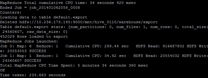
  • The result is saved as a tab delimited plaintext data file. We just have to find out its correct location and then transfer it from the Hadoop HDFS file system to the “normal” file system on the remote machine and then transfer it to our local computer. The (successful) end of the hive job should look like this on your ssh console:
    EMR_finish
    The line “Deleted hdfs://x.x.x.x:9000/mnt/hive_0110/warehouse/export” gives you the information where the file is located. You can transfer it with the following command:

    $ hdfs dfs -cat /mnt/hive_0110/warehouse/export/* > ~/export_file.txt

  • Now the data is in the home directory of the remote hadoop user in the file export_file.txt. With a secure file copy program such as scp or WinSCP you can download the file to your local machine. On a Linux machine, I should have converted the AWS SSH key in the Linux format (id_rsa and id_rsa.pub) and then added. With the following command I could download our results (replace x.x.x.x with your IP address or the Master-Host-DNS):

    $ scp your_username@x.x.x.x:export_file.txt ~/export_file.txt

  • After you verified that the file is intact, you can terminate your Elastic MapReduce instances.

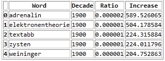
As a result you get a large text file with information on the ngram, decade, relative frequency and growth ratio in comparison with the previous decade. After converting this file into a more readable Excel document with this Python program, it looks like this:
ngrams_results

Values higher than 1 in the increase column means that this word has grown in importance while values lower than 1 means that this word had been used more frequently in the previous decade.

Here’s the top 30 results per decade:

  • 1900s: Adrenalin, Elektronentheorie, Textabb, Zysten, Weininger, drahtlosen, Mutterschutz, Plazenta, Tonerde, Windhuk, Perseveration, Karzinom, Elektrons, Leukozyten, Housz, Schecks, kber, Zentralwindung, Tarifvertrags, drahtlose, Straftaten, Anopheles, Trypanosomen, radioaktive, Tonschiefer, Achsenzylinder, Heynlin, Bastimento, Fritter, Straftat
  • 1910s: Commerzdeputation, Bootkrieg, Diathermie, Feldgrauen, Sasonow, Wehrbeitrag, Bolschewismus, bolschewistischen, Porck, Kriegswirtschaft, Expressionismus, Bolschewiki, Wirtschaftskrieg, HSM, Strahlentherapie, Kriegsziele, Schizophrenie, Berufsberatung, Balkankrieg, Schizophrenen, Enver, Angestelltenversicherung, Strahlenbehandlung, Orczy, Narodna, EKG, Besenval, Flugzeugen, Flugzeuge, Wirkenseinheit
  • 1920s: Reichsbahngesellschaft, Milld, Dawesplan, Kungtse, Fascismus, Eidetiker, Spannungsfunktion, Paneuropa, Krestinski, Orogen, Tschechoslovakischen, Weltwirtschaftskonferenz, RSFSR, Sachv, Inflationszeit, Komintern, UdSSR, RPF, Reparationszahlungen, Sachlieferungen, Konjunkturforschung, Schizothymen, Betriebswirtschaftslehre, Kriegsschuldfrage, Nachkriegsjahre, Mussorgski, Nachkriegsjahren, Nachkriegszeit, Notgemeinschaft, Erlik
  • 1930s: Reichsarbeitsdienst, Wehrwirtschaft, Anerbengericht, Remilitarisierung, Steuergutscheine, Huguenau, Molotov, Volksfront, Hauptvereinigung, Reichsarbeitsdienstes, Viruses, Mandschukuo, Erzeugungsschlacht, Neutrons, MacHeath, Reichsautobahnen, Ciano, Vierjahresplan, Erbkranken, Schuschnigg, Reichsgruppe, Arbeitsfront, NSDAP, Tarifordnungen, Vierjahresplanes, Mutationsrate, Erbhof, GDI, Hitlerjugend, Gemeinnutz
  • 1940s: KLV, Cibazol, UNRRA, Vollziehungsrath, Bhil, Verordening, Akha, Sulfamides, Ekiken, Wehrmachtbericht, Capsiden, Meau, Lewerenz, Wehrmachtsbericht, juedischen, Kriegsberichter, Rourden, Gauwirtschaftskammer, Kriegseinsatz, Bidault, Sartre, Riepp, Thailands, Oppanol, Jeftanovic, OEEC, Westzonen, Secretaris, pharmaceutiques, Lodsch
  • 1950s: DDZ, Peniteat, ACTH, Bleist, Siebenjahrplan, Reaktoren, Cortison, Stalinallee, Betriebsparteiorganisation, Europaarmee, NPDP, SVN, Genossenschaftsbauern, Grundorganisationen, Sputnik, Wasserstoffwaffen, ADAP, BverfGg, Chruschtschows, Abung, CVP, Atomtod, Chruschtschow, Andagoya, LPG, OECE, LDPD, Hakoah, Cortisone, GrundG
  • 1960s: Goldburg, Dubcek, Entwicklungszusammenarbeit, Industriepreisreform, Thant, Hoggan, Rhetikus, NPD, Globalstrategie, Notstandsgesetze, Nichtverbreitung, Kennedys, PPF, Pompidou, Nichtweiterverbreitung, neokolonialistischen, Teilhards, Notstandsverfassung, Biafra, Kiesingers, McNamara, Hochhuth, BMZ, OAU, Dutschke, Rusk, Neokolonialismus, Atomstreitmacht, Periodikums, MLF
  • 1970s: Zsfassung, Eurokommunismus, Labov, Sprechakttheorie, Werkkreis, Uerden, Textsorte, NPS, Legitimationsprobleme, Aktanten, Kurztitelaufnahme, Parlamentsfragen, Textsorten, Soziolinguistik, Rawls, Uird, Textlinguistik, IPW, Positivismusstreit, Jusos, UTB, Komplexprogramms, Praxisbezug, performativen, Todorov, Namibias, Uenn, ZSta, Energiekrise, Lernzielen
  • 1980s: Gorbatschows, Myanmar, Solidarnosc, FMLN, Schattenwirtschaft, Gorbatschow, Contadora, Sandinisten, Historikerstreit, Reagans, sandinistische, Postmoderne, Perestrojka, BTX, Glasnost, Zeitzeugen, Reagan, Miskito, nicaraguanischen, Madeyski, Frauenforschung, FSLN, sandinistischen, Contras, Lyotard, Fachi, Gentechnologie, UNIX, Tschernobyl, Beijing
  • 1990s: BSTU, Informationsamt, Sapmo, SOEP, Tschetschenien, EGV, BMBF, OSZE, Zaig, Posllach, Oibe, Benchmarking, postkommunistischen, Reengineering, Gauck, Osterweiterung, Belarus, Tatarstan, Beitrittsgebiet, Cyberspace, Goldhagens, Treuhandanstalt, Outsourcing, Modrows, Diensteinheiten, EZB, Einigungsvertrages, Einigungsvertrag, Wessis, Einheitsaufnahme
  • 2000s: MySQL, Servlet, Firefox, LFRS, Dreamweaver, iPod, Blog, Weblogs, VoIP, Weblog, Messmodells, Messmodelle, Blogs, Mozilla, Stylesheet, Nameserver, Google, Markenmanagement, JDBC, IPSEC, Bluetooth, Offshoring, ASPX, WLAN, Wikipedia, Messmodell, Praxistipp, RFID, Grin, Staroffice

Street Fighting Trend Research

One of the most intriguing tools for the Street Fighting Data Science approach is the new Google Trends interface (formerly known as Google Insights for Search). This web application allows to analyze the volume of search requests for particular keywords over time (from 2004 on). This can be very useful for evaluating product life-cycle – assuming a product or brand that is not being searched on Google is no longer relevant. Here’s the result for the most important products in the Samsung Galaxy range:

For the S3 and S4 model the patterns are almost the same:

  • Stage 1: a slow build-up starting in the moment on the product was first mentioned in the Internet
  • Stage 2: a sudden burst at the product launch
  • Stage 3: a plateau phase with additional spikes when product modifications are launched
  • Stage 4: a slow decay of attention when other products have appeared

The S2 on the other hand does not have this sudden burst at launch while the Galaxy Note does not decay yet but displays multiple bursts of attention.

But in South Korea, the cycles seem quite different:

If you take a look at the relative numbers, the Galaxy Note is much stronger in South Korea and at the moment is at no. 1 of the products examined.

An interesting question is: do these patterns also hold for other mobile / smartphone brands? Here’s a look at the iPhone generations as searched for by Google users:

The huge spike at the launch of the iPhone 5 hints at the most successful launch in terms of Google attention. But this doesn’t say anything about the sentiment of the attention. Interestingly enough, the iPhone 5 had a first burst at the same moment the iPhone 4S has been launched. The reason for this anomany: people were expecting that Apple would be launching the iPhone 5 in Sep/Oct 2011 but then were disappointed that the Cupertino launch event was only about a iPhone 4S.

Analyses like this are especially useful at the beginning of a trend research workflow. The next steps would involve digging deeper in the patterns, taking a look at the audiences behind the data, collecting posts, tweets and news articles for the peaks in the timelines, looking for correlations of the timelines in other data sets e.g. with Google Correlate, brand tracking data or consumer surveys.

Animated Twitter Networks

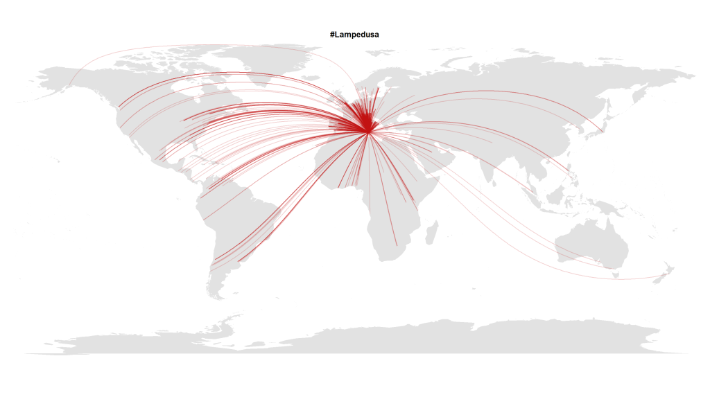
In this blogpost I presented a visualization made with R that shows how almost the whole world expresses its attention to political crises abroad. Here’s another visualization with Tweets in October 2013 that referred to the Lampedusa tragedy in the Mediterranean.

#Lampedusa on Twitter

But this transnational public space isn’t quite as static as it seems on these images. To show how these geographical hashtag links develop over time, I analyzed the timestamps of the (geo-coded) Tweets mentioning the hashtag #lampedusa. This is the resulting animation showing the choreography of global solidarity:

The code is quite straightforward. After collecting the Tweets via the Twitter Streaming API e.g. with Pablo Barberá’s R package streamR, I quantized the dates to hourly values and then calculated the animation frame by frame inspired by Jeff Hemsley’s approach.

One trick that is very helpful when plotting geospatial connections with great circles is the following snippet that correctly assembles lines that cross the dateline:

library("geosphere")
for (i in 1:length(l$long)) {
inter <- gcIntermediate(c(l$long[i], l$lat[i]), c(12.6, 35.5), n=500, addStartEnd=TRUE, breakAtDateLine=TRUE) if (length(inter) > 2) {
lines(inter, col=col, lwd=l$n[i])
} else {
lines(inter[[1]], col=col, lwd=l$n[i])
lines(inter[[2]], col=col, lwd=l$n[i])
}
}

Mining Research Interests – or: What Would Google Want to Know?

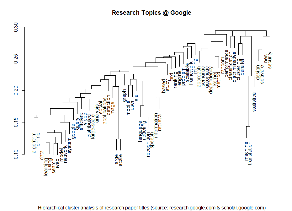
I am a regular visitor of Google’s research page where they post all of their latest and upcoming scientific papers. Lately I have thought whether it would be possible to statistically extract some of the meta-information from the papers. Here’s the result of the analysis of the papers’ titles produced with just a few lines of R code:

Research Topics @ Google


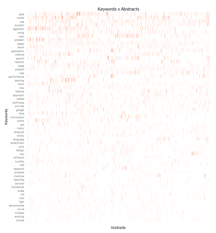
I clustered the data with a standard hierarchical cluster analysis to find out which terms tend to often go together in the paper titles. Then I took a deeper look at the abstracts – of all the papers that had abstracts that is. I processed the abstracts with the tm R package and draw the following heat-map that shows how often which of the most important keywords appear in each paper:

Keywords_Abstracts_google

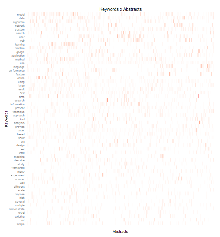
I did a similar heatmap but this time normalized by the term frequency – inverse document frequency measure. While the first heatmap shows the most frequently used terms, this weighted heatmap shows terms that are quite important in their respective research papers but normalizes this by the overall term frequency.

Keywords_Abstracts_google_tfidf

If you need input for playing buzzword bingo at the next Strata Conference in Santa Clara, you don’t have to look any further 😉

The Rise of the Chief Data Officer

Just a few months after Ogilvy & Mather created a new job position for a Chief Data Officer Todd Cullen, another WPP agency is following this example. Mindshare USA just appointed Bob Ivins as the company’s first Chief Data Officer directly reporting to the CEO Colin Kinsella.

Among the reasons for this move seems to be the growing importance of passively collected data in the agencies’ data warehouses and their clients’ marketing and enterprise software. Then there’s of course the massive data wealth that’s out there in the open: billions of tweets, check-ins, posts and comments by the modern digital population.

Now that data management platforms such as x+1, BlueKai or Adobe are among the standard tools in digital marketing and audience-buying – and the larger agencies even work with their own custom-created platforms – all in all data is becoming the new competitive edge.

This development gains further traction with a new development: Up to now, agencies were the only ones with full access to advertising data. They were the ones who did the ROI modelings and attribution analyses – and charged their clients for this service. But more and more advertisers are demanding their campaign data back in order to do their own analyses in combination with market and media surveys, customer data and retail data.

Big Data Business Models

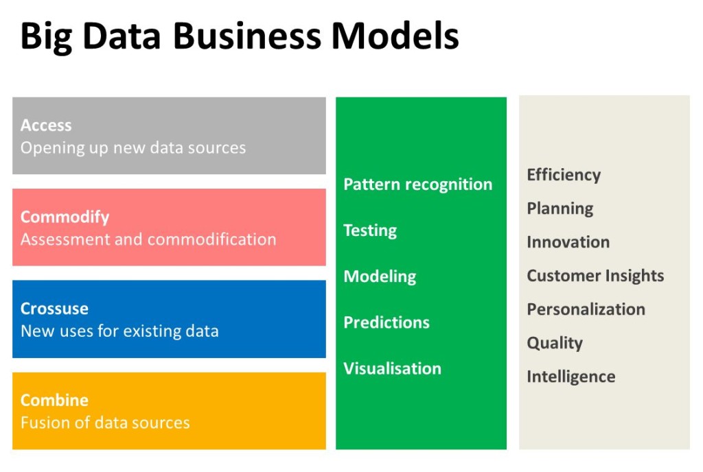
Agencies suddenly are in need to develop new offers for their clients that mean more than just evaluating media plans and campaign KPIs. Especially since the advent of real-time bidding and automated optimization, media planning has lost quite lot of importance for the agencies. I’d argue one of their new business fields will be data-driven:

  • identification of data-sources and data brokerage

  • analysis of their customers’ data-value

  • combination and refinement of data

  • real-time data management and data-driven learning

This all hints at a bright future for Data Scientists and Data Officers in advertising.

Cosmopolitan Public Spaces

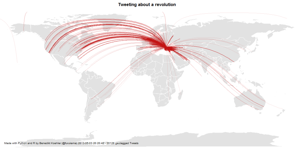
Mentions of the Gezi Park protests on Twitter

In my PhD and post-doc research projects at the university, I did a lot of research on the new cosmopolitanism together with Ulrich Beck. Our main goal was to test the hypothesis of an “empirical cosmopolitanization”. Maybe the term is confusing and too abstract, but what we were looking for were quite simple examples for ties between humans that undermine national borders. We were trying to unveil the structures and processes of a real-existing cosmopolitanism.

I looked at a lot of statistics on transnational corporations and the evolution of transnational economic integration. But one of the most exciting dimensions of the theory of cosmopolitanism is the rise of a cosmopolitan public sphere. This is not the same as a global public that can be found in features such as world music, Hollywood blockbusters or global sports events. A cosmopolitan public sphere refers to solidarity with other human beings.

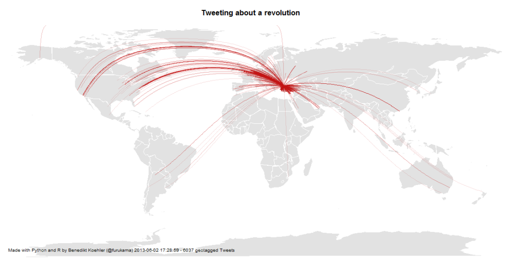
When I discovered the discussions on Twitter about the Gezi Park protests in Istanbul, this kind of cosmopolitan solidarity seems to assume a definite form: The lines that connect people all over Europe with the Turkish protesters are not the usual international relations, but they are ties that e.g. connect Turkish emigrants, political activists, “Wutbürger” or generally political aware citizens with the events in Istanbul. Because only about 1% of all tweets carry information about the geo-position of the user, you should imagine about 100 times more lines to see the true dimension of this phenomenon.

Mapping a Revolution

Twitter has become an important communications tool for political protests. While mass media are often censored during large-scale political protests, Social Media channels remain relatively open and can be used to tell the world what is happening and to mobilize support all over the world. From an analytic perspective tweets with geo information are especially interesting.

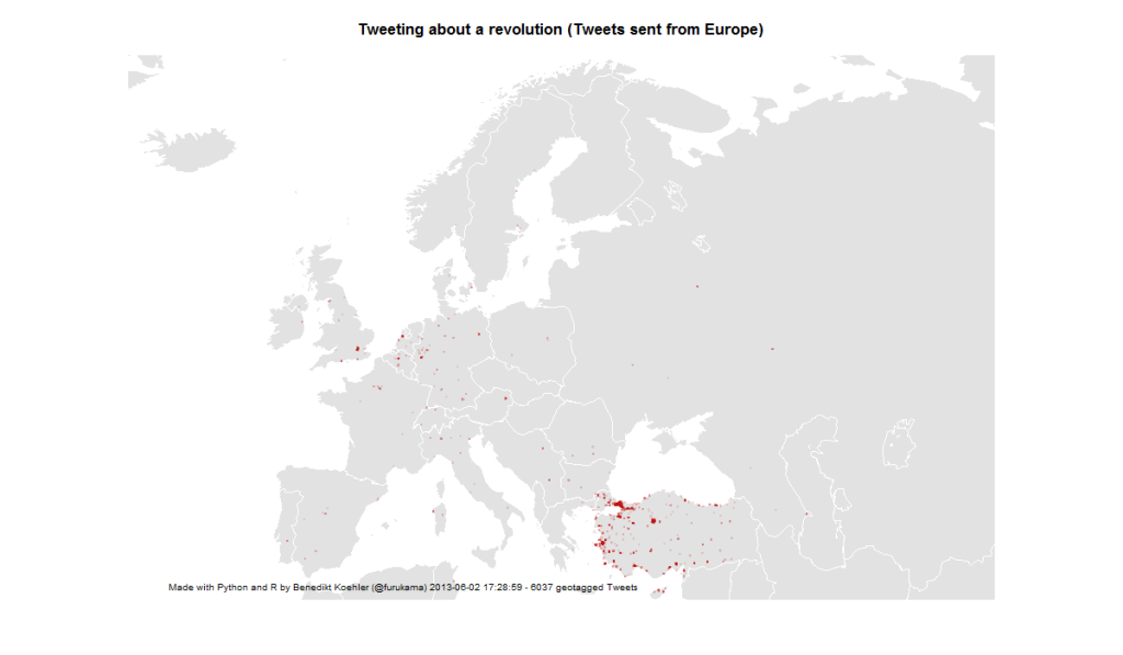
Here’s some maps I did on the basis of ~ 6,000 geotagged tweets from ~ 12 hours on 1 and 2 Jun 2013 referring to the “Gezi Park Protests” in Istanbul (i.e. mentioning the hashtags “occupygezi”, “direngeziparki”, “turkishspring”* etc.). The tweets were collected via the Twitter streaming API and saved to a CouchDB installation. The maps were produced by R (unfortunately the shapes from the map package are a bit outdated).

*”Turkish Spring” or “Turkish Summer” are misleading terms as the situation in Turkey cannot be compared to the events during the “Arab Spring”. Nonetheless I have included them in my analysis because they were used in the discussion (e.g. by mass media twitter channels) Thanks @Taksim for the hint.

International Attention for Gezi Park protests 1-2 Jun

On the next day, there even was one tweet mentioning the protests crossing the dateline:

International Attention for Gezi Park protests 1-3 Jun

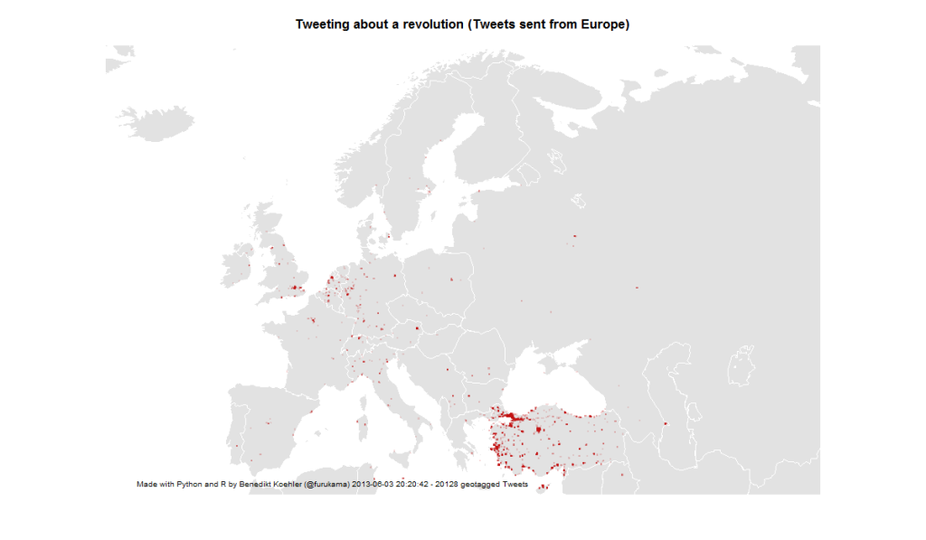
First, I took a look at the international attention (or even cosmopolitan solidarity) of the events in Turkey. The following maps are showing geotagged tweets from all over the world and from Europe that are referring to the events. About 1% of all tweets containing the hashtags carry exact geographical coordinates. The fact, that there are so few tweets from Germany – a country with a significant population of Turkish immigrants – should not be overrated. It’s night-time in Germany and I would expect a lot more tweets tomorrow.

European Attention for Gezi Park protests 1-2 Jun

14,000 geo-tagged tweets later the map looks like this:

European Attention for Gezi Park protests 1-3 Jun

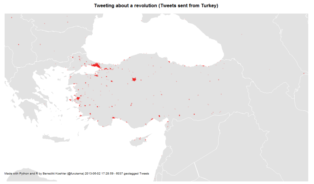
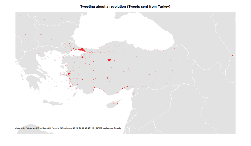
The next map is zooming in closer to the events: These are the locations in Turkey where tweets were sent with one of the hashtags mentioned above. The larger cities Istanbul, Ankara and Izmir are active, but tweets are coming from all over the country:

Turkish Tweets about the Gezi Park protests 1-2 Jun

On June 3rd, the activity has spread across the country:

Turkish Tweets about the Gezi Park protests 1-3 Jun

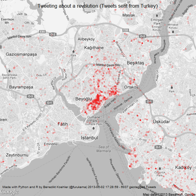
And finally, here’s a look at the tweet locations in Istanbul. The map is centered on Gezi Park – and the activity on Twitter as well:

Istanbul Tweets about Gezi Park protests 1-2 Jun

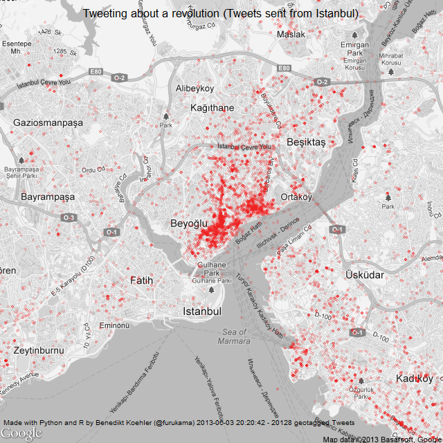
Here’s the same map a day later (I decreased the size of the dots a bit while the map is getting clearer):

Istanbul Tweets about Gezi Park protests 1-3 Jun

The R code to create the maps can be found on my GitHub.

Color analysis of Flickr images

Since I’ve seen this beautiful color wheel visualizing the colors of Flickr images, I’ve been fascinated with large scale automated image analysis. At the German Market Research association’s conference in late April, I presented some analyses that went in the same direction (click to enlarge):

Color values of Flickr images from Germany

On the image above you can see the color values ordered by their hue from images taken in Germany between August 2010 and April 2013. Each row represents the aggregation of 2.000 images downloaded from the Flickr API. I did this with the following R code:

bbox <- "5.866240,47.270210,15.042050,55.058140"
pages <- 10
maxdate <- "2010-08-31"
mindate <- "2010-08-01"
 
for (i in 1:pages) {
api <- paste("http://www.flickr.com/services/rest/?method=flickr.photos.search&format=json&api_key=YOUR_API_KEY_HERE &nojsoncallback=1&page=", i, "&per_page=500&bbox=", bbox, "&min_taken_date=", mindate, "&max_taken_date=", maxdate, sep="")
raw_data <- getURL(api, ssl.verifypeer = FALSE)

data <- fromJSON(raw_data, unexpected.escape="skip", method="R")
# This gives a list of the photo URLs including the information
# about id, farm, server, secret that is needed to download
# them from staticflickr.com
}

To aggregate the color values, I used Vijay Pandurangans Python script he wrote to analyze the color values of Indian movie posters. Fortunately, he open sourced the code and uploaded it on GitHub (thanks, Vijay!)

The monthly analysis of Flickr colors clearly hints at seasonal trends, e.g. the long and cold winter of 2012/2013 can be seen in the last few rows of the image. Also, the soft winter of 2011/2012 with only one very cold February appears in the image.

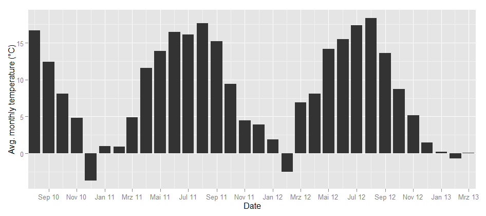
To take the analysis even further, I used weather data from the repository of the German weather service and plotted the temperatures for the same time frame:

Temperature in Germany

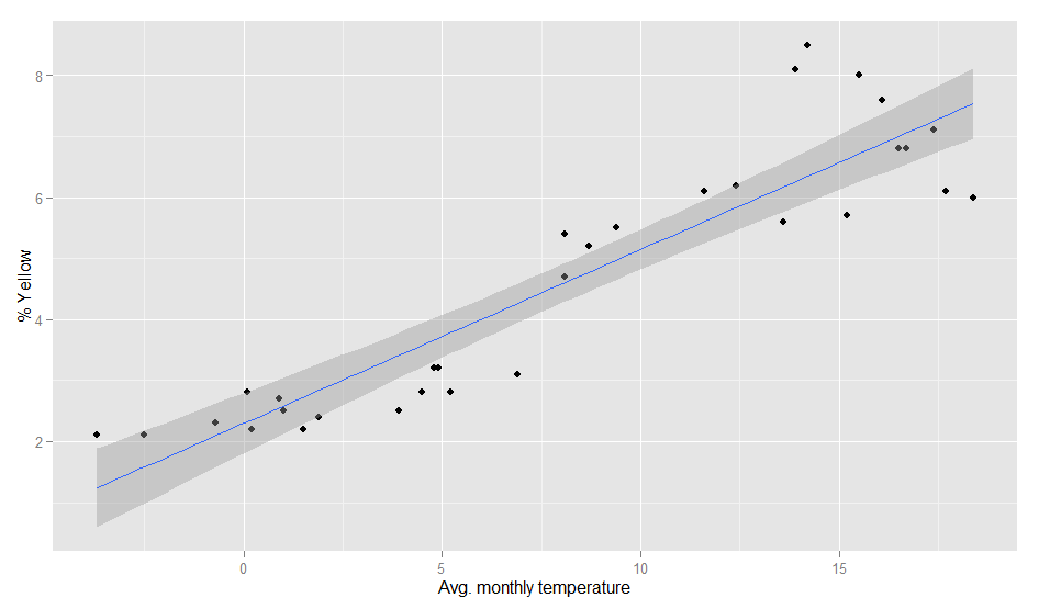
Could this be the same seasonality? To find out how the image color values above and the temperature curve below are related, I calculated the correlation between the dominance of the colors and the average temperature. Each month can not only be represented as a hue band, but also as a distribution of colors, e.g. the August 2010 looks like this:

So there’s a percent value for each color and each month. When I correlated the temperature values and the color values, the colors with the highest correlations were green (positive) and grey (negative). So, the more green is in a color band, the higher the average temperature in this month. This is how the correlation looks like:

Temperature and color values

The model actually is pretty good:

> fit <- lm(temp~yellow, weather)
> summary(fit)
Call:
lm(formula = temp ~ yellow, data = weather)
Residuals:
Min 1Q Median 3Q Max
-5.3300 -1.7373 -0.3406 1.9602 6.1974

Coefficients:
Estimate Std. Error t value Pr(>|t|)
(Intercept) -5.3832 1.2060 -4.464 0.000105 ***
yellow 2.9310 0.2373 12.353 2.7e-13 ***
---
Signif. codes: 0 '***' 0.001 '**' 0.01 '*' 0.05 '.' 0.1 ' ' 1
Residual standard error: 2.802 on 30 degrees of freedom
Multiple R-squared: 0.8357, Adjusted R-squared: 0.8302
F-statistic: 152.6 on 1 and 30 DF, p-value: 2.695e-13

Of course, it can even be improved a bit by calculating it with a polynomial formula. With second order polynomials lm(temp~poly(yellow,2), weather), we even get a R-squared value of 0.89. So, even when the pictures I analysed are not always taken outside, there seems to be a strong relationship between the colors in our Flickr photostreams and the temperature outside.

Social Sensors

“So, what’s the mood of America?”
Interface, 1994

One of the most fascinating novels so far on data-driven politics is Neal Stephenson’s and J. Frederick George’s “Interface“, first published in 1994. Although written almost 20 years ago, many of the technologies discussed in this book, would still be cutting edge if employed right now in 2013. One of the most original political devices is the PIPER wristwatch, a device for watching political content such as debates or candidate’s news coverage, while analyzing the wearers’ emotional reaction to these images in real-time by measuring bodily reactions such as pulse, blood pressure or galvanic skin response. This device is a miniaturized polygraph embedded in a controlled political feedback loop.

Social sensors on Twitter for conversations and trends in modern arts

What’s really interesting about the PIPER project: These sensors are not applied to all Americans or to a sample of them, but to a rather small number of types. Here are some examples from a rather extensive list of the types that are monitored this way (p. 360-1):

  • irrelevant mouth breather
  • 400-pound tab drinker
  • burger-flipping history major
  • bible-slinging porch monkey
  • pretentious urban-lifestyle slave
  • formerly respectable bankruptcy survivor

In the novel, the interface of this technology is described as follows:

By examining those graphs in detail, Ogle could assess the emotional status of any one of the PIPER 100. But they provided more detail than Ogle could really handle during the real-time stress of a major campaign event. So Aaron had come up with a very simple, general color-coding scheme […] Red denoted fear, stress, anger, anxiety. Blue denoted negative emotions centered in higher parts of the brain: disagreement, hostility, a general lack of receptiveness. And green meant that the subject liked what they saw. (p. 372)

This immediately grabbed my attention because this is exactly what we are doing in advanced market research projects at the moment: Segmenting a population (in this case: the US electorate) in different personae that represent a larger and more important relevant part of the population under study. And a similar approach is used in innovation research, where one would also focus on “lead-users” that are ahead of their peers when it comes to the identification and experimentation with trends in their respective subject.

Quite recently, this kind of approach has surfaced in various academic publications on Twitter analysis and prediction under the name of “social sensors” (e.g. Sakaki, Okazaki and Matsuo on Twitter earthquake detection or Uddin, Amin, Le, Abdelzaher, Szymanski and Guyen on the right choice of Twitter sensors). The idea is, not to monitor the whole Twitter firehose or everything that is being posted about some hashtag (this would be the regular Social Media Monitoring approach), but to select a smaller number of Twitter accounts that have a history of delivering fast and reliable information.

Wikipedia Attention for the Presidential Elections (Update)

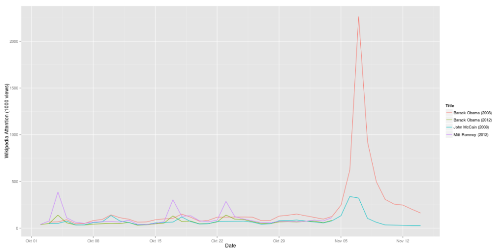
Here’s another update on the analysis of Wikipedia data for the presidential candidates. What’s quite interesting, the attention value vor Mitt Romney is almost at the same level where Barack Obama has been four years ago. And Barack Obama is exactly where John McCain has been 2008:

Obama vs. Romney 2012 compared to Obama vs. McCain 2008 (Wikipedia data)

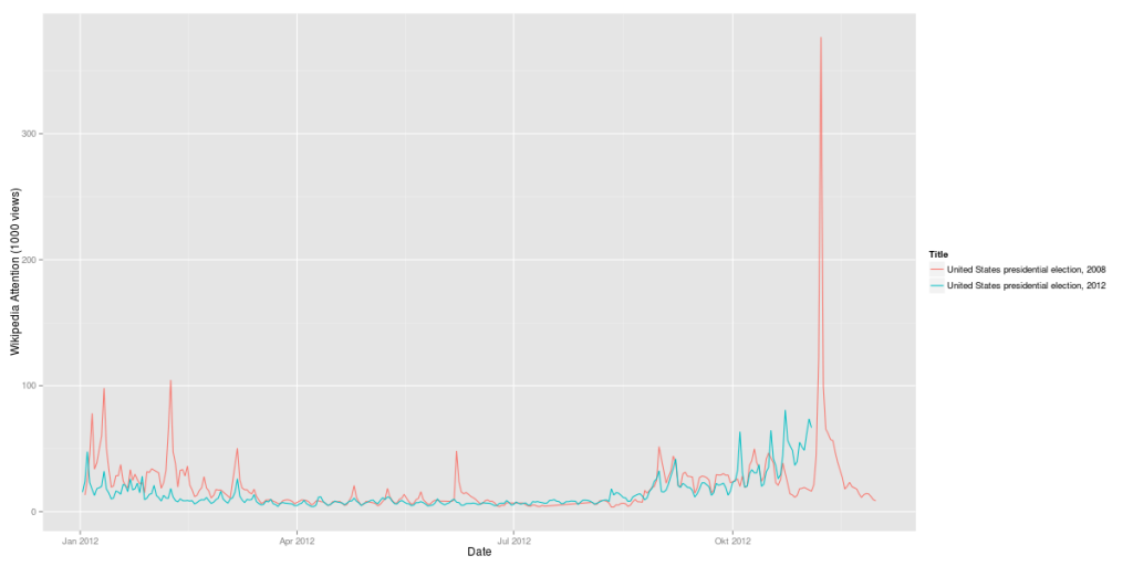
But one thing has changed: The elections as such are much more interesting to the Wikipedia users than they were 2008:

US Presidential Elections 2012 vs. 2008 (Wikipedia, daily visits)

2012 there is no pre-ballot gap as there has been four years ago.

Why the 2012 US elections are more exciting than 2008

Here’s an addition to my last post on using Wikipedia data to analyse attention for the US presidential elections 2012. Here’s another look at the interest not for the candidates’ Wikipedia pages but the general pages for the elections 2008 and 2012. Compared to the candidates’ pages, the attention for the general election page is much lower than for the candidates. Here’s the average values for October 2012:

  1. Mitt Romney (2012): 98,138 Views / day
  2. Barack Obama (2012): 63,104 Views / day
  3. United States presidential election, 2012 (2012): 38,770
  4. United States presidential election, 2008 (2008): 27,907

This monthly average hints at the 2012 elections being very exciting as the general election pages on Wikipedia have seen a 39% traffic increase compared to last elections. This also hold for the following time-series:

US Presidential Elections 2012 vs. 2008 (Wikipedia, daily visits)

While the attention for the election pages in 2012 did not reach the level it had during the 2008 primaries, from mid October the 2012 campaigns were much more interesting according to the Wikipedia numbers. In 2008 we have seen a drop in attention before election day, in 2012 the suspense seems to build up.

Algorithmic Glass Bead Games – Why predicting Twitter trends will not change the world

The last hours, I’ve seen a lot of tweets mentioning this great new algorithm by MIT professor Devavrat Shah. The UK Wired, The Verge, Gigaom, The Atlantic Wire and Forbes all posted stories on this fantastic discovery. And this has only been the weekend. Starting next week, there will be a lot more articles celebrating this breakthrough in machine learning.

At first, I was very enthusiastic as well and tweeted the MIT press release. A new algorithm – great stuff! But then slowly, I began to think about this whole thing. This new algorithm claims to predict trending topics on Twitter. But this is a lot different from an algorithm predicting e.g. the outcome of presidential elections or other external events. Trending topics are nothing more than the result of an algorithm themselves:

Trends are determined by an algorithm and are tailored for you based on who you follow and your location. This algorithm identifies topics that are immediately popular, rather than topics that have been popular for a while or on a daily basis, to help you discover the hottest emerging topics of discussion on Twitter that matter most to you.

So, what Shah et al developed is an algorithm that is predicting the outcome of an algorithm. A lot of the coverage suggests that this new algorithm could be very useful for Twitter – because then they would not have to wait for the results of their own algorithm that is defining trends but could use the much brand new algorithm that gives the results 1.5 hours in advance:

The algorithm could be of great interest to Twitter, which could charge a premium for ads linked to popular topics.

What’s next? A Stanford professor that develops an algorithm that can predict the outcome of the Shah algorithm some 1.5 hours in advance? Or what about Google? Maybe someone will invent an algorithm predicting the PageRank for web pages? Oh, wait, something like this has already been invented. Maybe you’ll better know this under its acronym “SEO” or “Search Engine Optimization”.