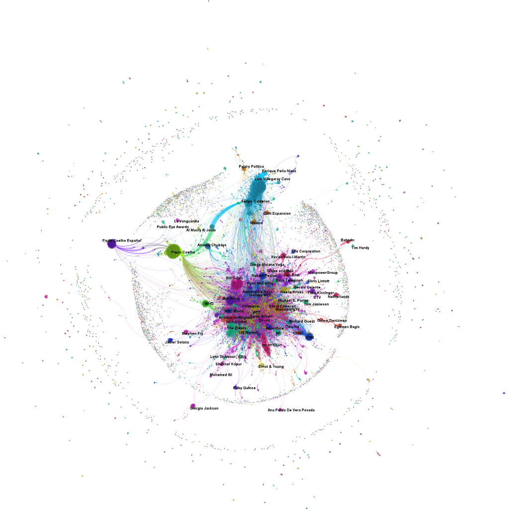
The minute, the World Economic Forum at Davos said farewell to about 2,500 participants from almost 100 countries, our network analytical machines switched into production mode. Here’s the first result: a network map of the Twitter conversations related to the hashtags “#WEF” and “#Davos”. While there are only 2,500 participants, there are almost 36,000 unique Twitter accounts in this global conversation about the World Economic Forum. Its digital footprint is larger than the actual event (click on map to enlarge).
There are three different elements to note in this visualization: the dots are Twitter accounts. As soon as somebody used one of the two Davosian hashtags, he became part of our data set. The size of the notes relates to its influence within the network – the betweenness centrality. The better nodes are connecting other nodes, the more influential they are and the larger they are drawn. The lines are mentions or retweets between two or more Twitter accounts. And finally, the color refers to the subnetworks or clusters generated by replying or retweeting some users more often than others. In this infographic, I have labelled the clusters with the name of the node that is in the center of this cluster.


