One of the most interesting challenges of data science are predictions for important events such as national elections. With all those data streams of billions of posts, comments, likes, clicks etc. there should be a way to identify the most important correlations to make predictions about real-world behavior such as: going to the voting booth and chosing a candidate.
A very interesting data source in this respect is the Wikipedia. Why? Because Wikipedia is
- a) open (data on page-views, edits, discussions are freely available on daily or even hourly basis),
- b) huge (WP currently ranks as #6 of all web sites worldwide and reaches about a quarter of all online users),
- c) specific (people visit the Wikipedia because they want to know something about some topic)
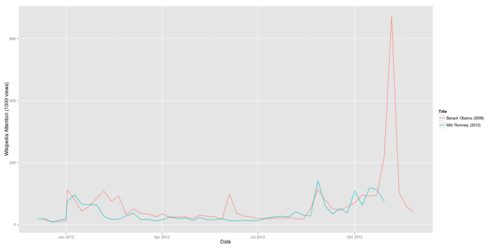
The first step was comparing the candidates Barack Obama and Mitt Romney over time. The resulting graph clearly shows the pivoting points of Obama’s presidential career (click to zoom):
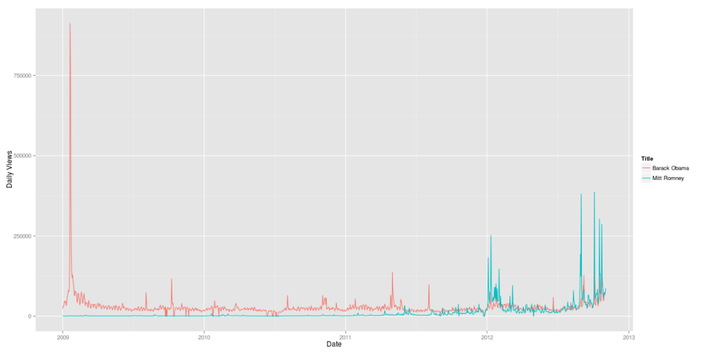
But it also shows how strong Mitt Romney has been since the Republican primaries in January 2012. His Wikipedia page had attracted a lot more visitors in August and September 2012 than his presidential rival’s. Of course, this measure only shows attention, not sentiment. So it cannot be inferred from this data whether the peaks were positive or negative peaks. In terms of Wikipedia attention, Romney’s infamous 47% comments in September 2012 were more than 1/3 as important as Obama’s inauguration in January 2009.
Now, let’s add some further curves to this graph: Obama’s and McCain’s Wikipedia attention during the last elections:
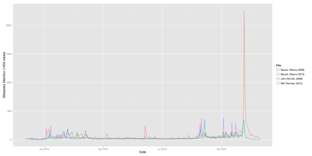
Here’s another version with weekly data:
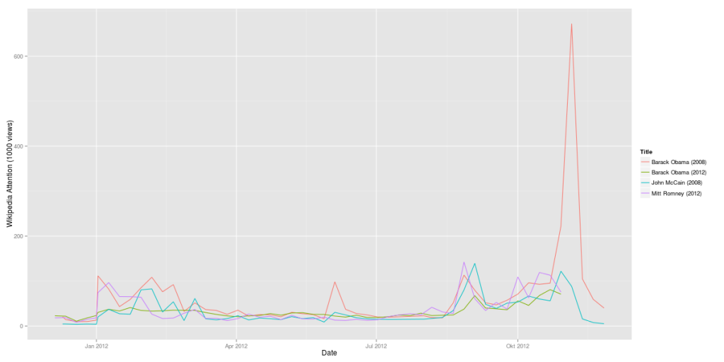
It’s almost instantly clear how much more attention Obama’s 2008 campaign (in red) gathered in comparison with his 2012 campaign (in green). On the other hand, Mitt Romney is at least when it comes to Wikipedia attention more interesting than McCain had been.
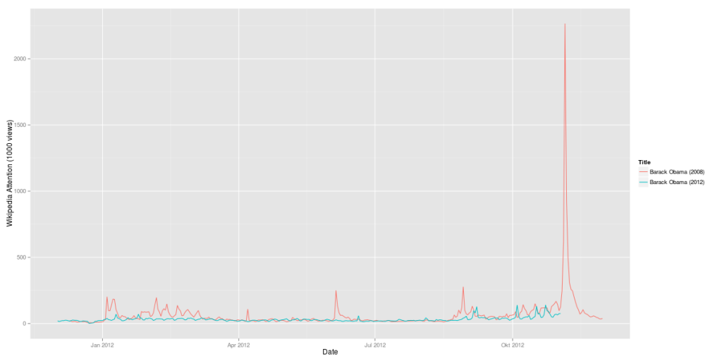
Here’s a comparison of Obama’s 2008 campaign vs. his 2012 campaign:
The last question: Is Mitt Romney 2012 as strong as Obama had been in 2008? Here’s a direct comparison:
A side-remark: I also did a correlation of this data set with Google Correlate. And guess what: The strongest correlation of the data for Obama’s 2012 campaign is the Google search query for “barack obama wikipedia”. There still seem to be a huge number of people using Google as their Wikipedia search-engine.
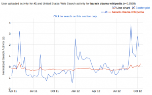
But this result could also be interpreted the other way round: If there is a strong correlation between Wikipedia usage and Google search queries, this makes Wikipedia an even more important data source for analyses.
