The crypto-currency Bitcoin and the way it generates “trustless trust” is one of the hottest topics when it comes to technological innovations right now. The way Bitcoin transactions always backtrace the whole transaction list since the first discovered block (the Genesis block) does not only work for finance. The first startups such as Blockstream already work on ways how to use this mechanism of “trustless trust” (i.e. you can trust the system without having to trust the participants) on related fields such as corporate equity.
So you could guess that Bitcoin and especially its components the Blockchain and various Sidechains should also be among the most exciting fields for data science and visualization. For the first time, the network of financial transactions many sociologists such as Georg Simmel theorized about becomes visible. Although there are already a lot of technical papers and even some books on the topic, there isn’t much material that allows for a more hands-on approach, especially on how to generate and visualize the transaction networks.
The paper on “Bitcoin Transaction Graph Analysis” by Fleder, Kester and Pillai is especially recommended. It traces the FBI seizure of $28.5M in Bitcoin through a network analysis.
So to get you started with R and the Blockchain, here’s a few lines of code. I used the package “Rbitcoin” by Jan Gorecki.
Here’s our first example, querying the Kraken exchange for the exchange value of Bitcoin vs. EUR:
library(Rbitcoin)
## Loading required package: data.table
## You are currently using Rbitcoin 0.9.2, be aware of the changes coming in the next releases (0.9.3 - github, 0.9.4 - cran). Do not auto update Rbitcoin to 0.9.3 (or later) without testing. For details see github.com/jangorecki/Rbitcoin. This message will be removed in 0.9.5 (or later).
wait <- antiddos(market = 'kraken', antispam_interval = 5, verbose = 1)
market.api.process('kraken',c('BTC','EUR'),'ticker')
## market base quote timestamp market_timestamp last vwap ## 1: kraken BTC EUR 2015-01-02 13:12:03 <NA> 263.2 262.9169 ## volume ask bid ## 1: 458.3401 263.38 263.22
The function antiddos makes sure that you’re not overusing the Bitcoin API. A reasonable query interval should be one query every 10s.
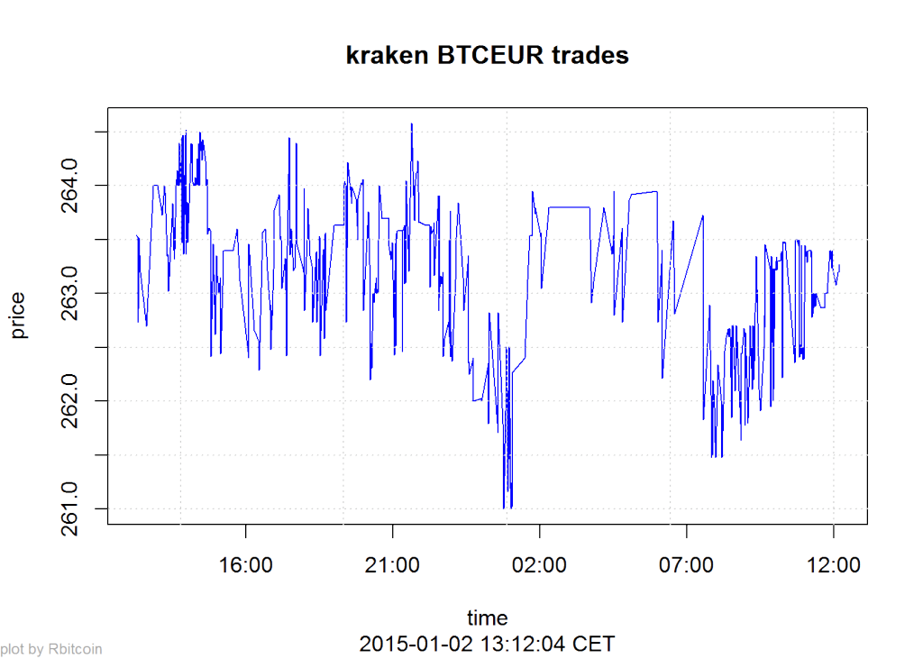
Here’s a second example that gives you a time-series of the lastest exchange values:
trades <- market.api.process('kraken',c('BTC','EUR'),'trades')
Rbitcoin.plot(trades, col='blue')
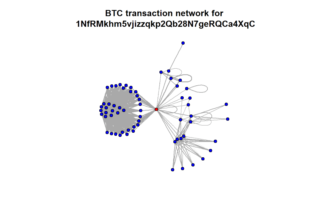
The last two examples all were based on aggregated values. But the Blockchain API allows to read every single transaction in the history of Bitcoin. Here’s a slightly longer code example on how to query historical transactions for one address and then mapping the connections between all addresses in this strand of the Blockchain. The red dot is the address we were looking at (so you can change the value to one of your own Bitcoin addresses):
wallet <- blockchain.api.process('15Mb2QcgF3XDMeVn6M7oCG6CQLw4mkedDi')
seed <- '1NfRMkhm5vjizzqkp2Qb28N7geRQCa4XqC'
genesis <- '1A1zP1eP5QGefi2DMPTfTL5SLmv7DivfNa'
singleaddress <- blockchain.api.query(method = 'Single Address', bitcoin_address = seed, limit=100)
txs <- singleaddress$txs

bc <- data.frame()
for (t in txs) {
  hash <- t$hash
  for (inputs in t$inputs) {
    from <- inputs$prev_out$addr
    for (out in t$out) {
      to <- out$addr
      va <- out$value
      bc <- rbind(bc, data.frame(from=from,to=to,value=va, stringsAsFactors=F))
    }
  }
}
After downloading and transforming the blockchain data, we’re now aggregating the resulting transaction table on address level:
library(plyr)
btc <- ddply(bc, c("from", "to"), summarize, value=sum(value))
Finally, we’re using igraph to calculate and draw the resulting network of transactions between addresses:
library(igraph)
btc.net <- graph.data.frame(btc, directed=T)
V(btc.net)$color <- "blue"
V(btc.net)$color[unlist(V(btc.net)$name) == seed] <- "red"
nodes <- unlist(V(btc.net)$name)
E(btc.net)$width <- log(E(btc.net)$value)/10
plot.igraph(btc.net, vertex.size=5, edge.arrow.size=0.1, vertex.label=NA, main=paste("BTC transaction network for\n", seed))


